There’s a quiet moment many designers reach after years of doing things “right.” The grid works. The hierarchy is clean. The system scales. The feedback is positive.
And yet, something feels off.
This usually isn’t a lack of skill. It’s the result of having too much of it — refined taste, restraint, and deep familiarity with systems. Over time, those strengths can flatten emotional range.
In corporate environments especially, this distance is rewarded. Neutrality scales. Personality introduces risk. The result is a visual culture that functions perfectly while saying very little. Many designers feel this tension long before they can name it — a sense that something human has been smoothed out along the way.
That discomfort is important. It’s not a failure. It’s usually the first signal that another kind of design language is needed.
Advertisment
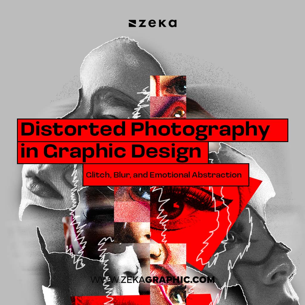
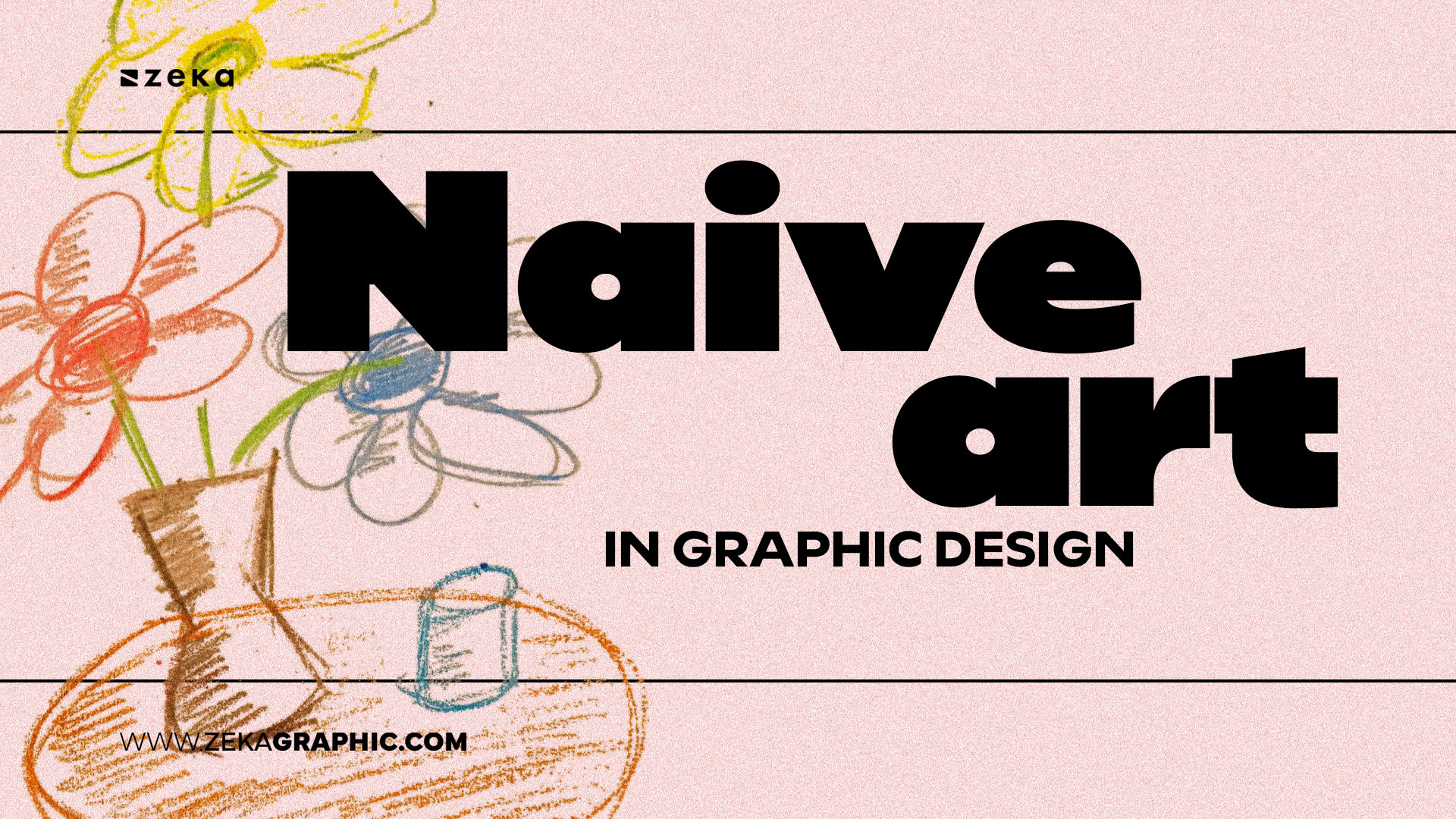
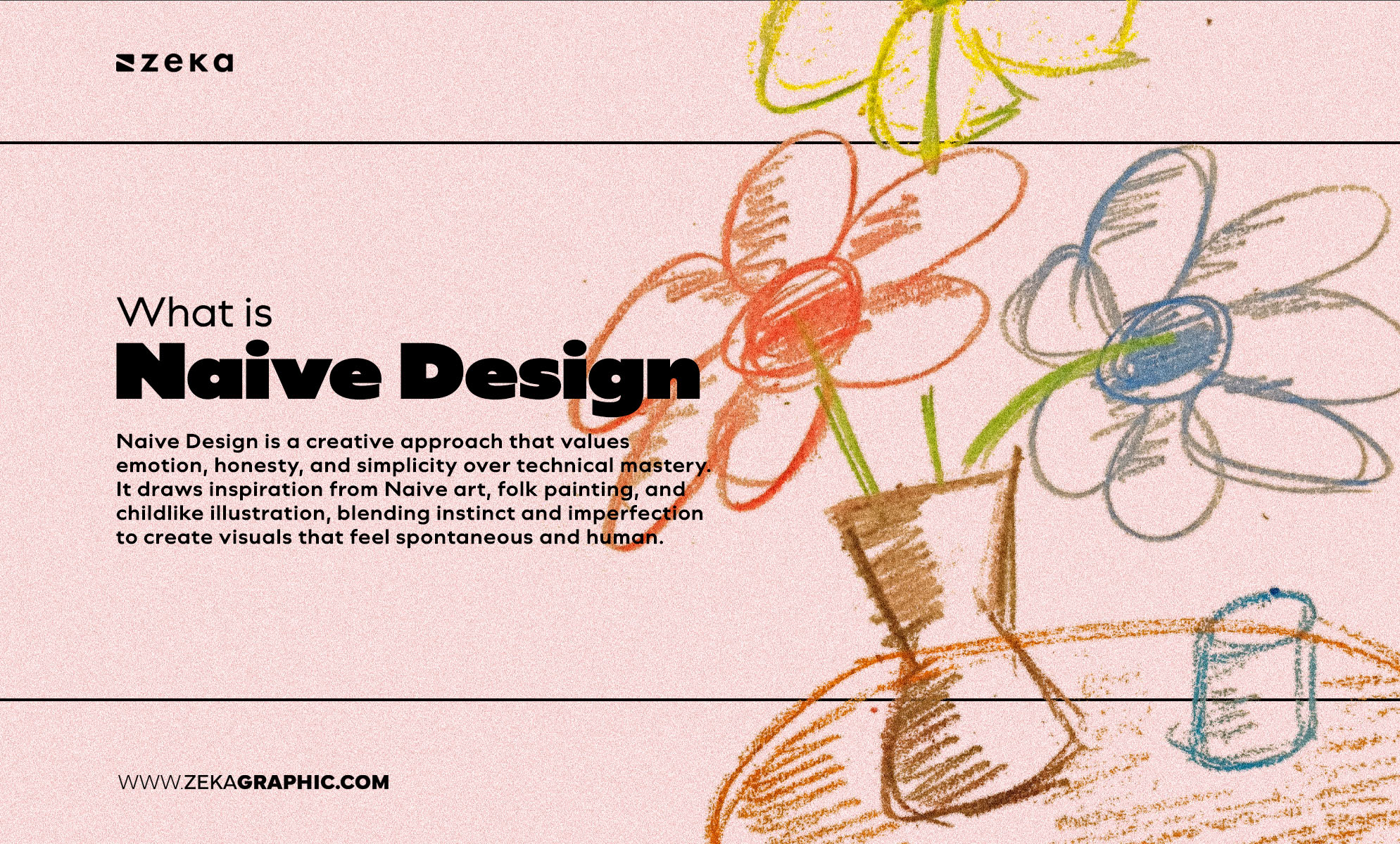
Naive graphic design is a deliberate visual language that prioritizes emotional clarity and human presence over technical display. It draws inspiration from Naive art, folk painting, and childlike illustration, blending instinct and imperfection to create visuals that feel spontaneous and human.
In contemporary usage, the term “naive graphic design” refers to an intentional aesthetic choice — not a lack of training or professionalism.
Instead of smooth gradients or pixel-perfect alignment, Naive Design embraces asymmetry, raw textures, and authentic marks. Think hand-drawn illustrations, uneven typography, or playful compositions that don’t follow strict grids. It’s an aesthetic that says: “I’m made by a person, not a program.”
Unlike Flat Design or Minimalism, which prioritize functionality and cleanliness, Naive Design is emotion-driven. It connects through imperfection — the crooked smile in a character illustration or the slightly off-kilter logo that feels alive.
Naive design is not about lacking skill — it’s about choosing imperfection deliberately to express warmth, emotion, and identity.
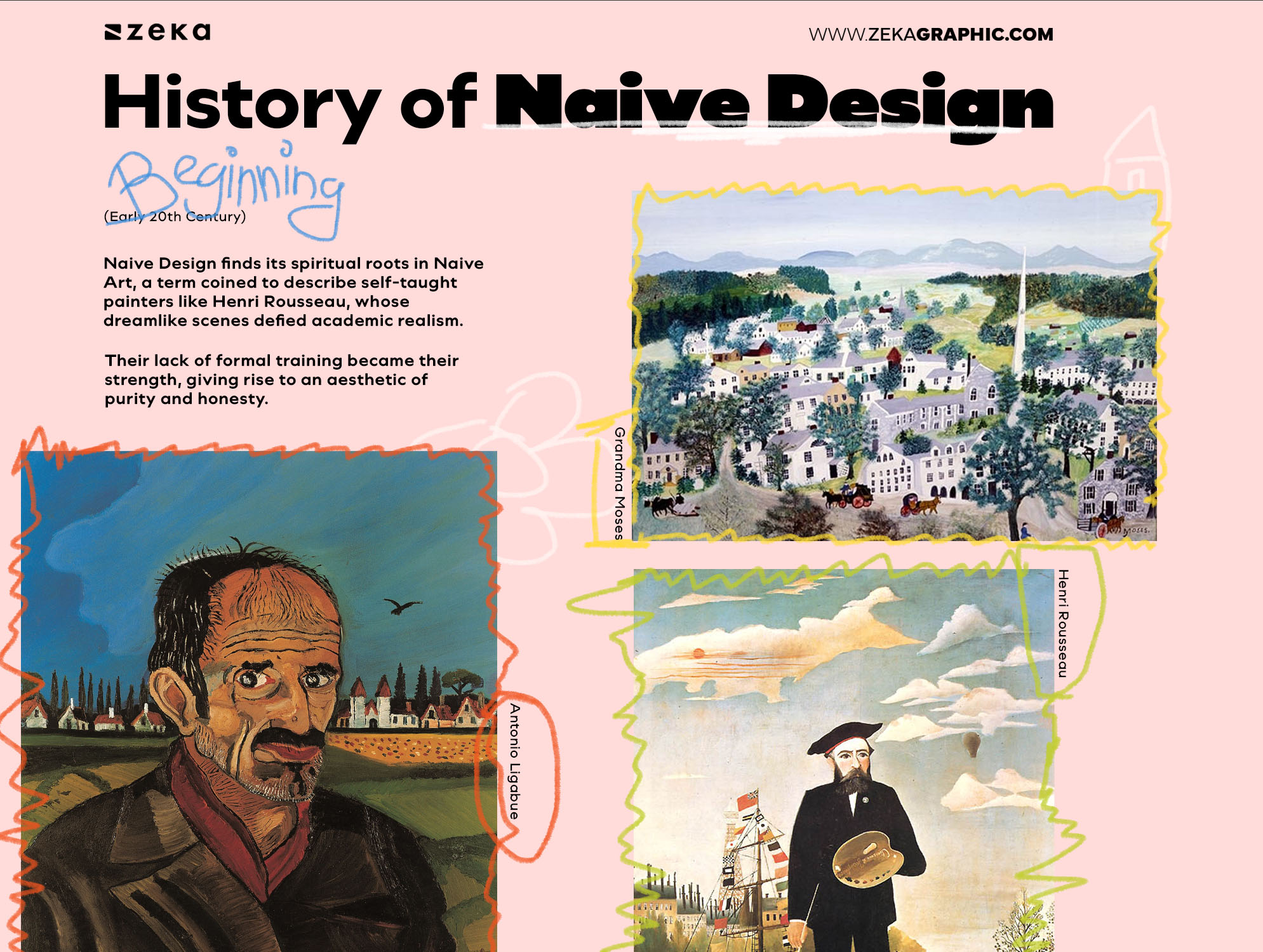
Naive Design finds its spiritual roots in Naive Art, a term coined to describe self-taught painters like Henri Rousseau, whose dreamlike scenes defied academic realism. Artists like Rousseau, Séraphine Louis,Antonio Ligabue and Grandma Moses painted with raw sincerity — their lack of formal training became their strength, giving rise to an aesthetic of purity and honesty.
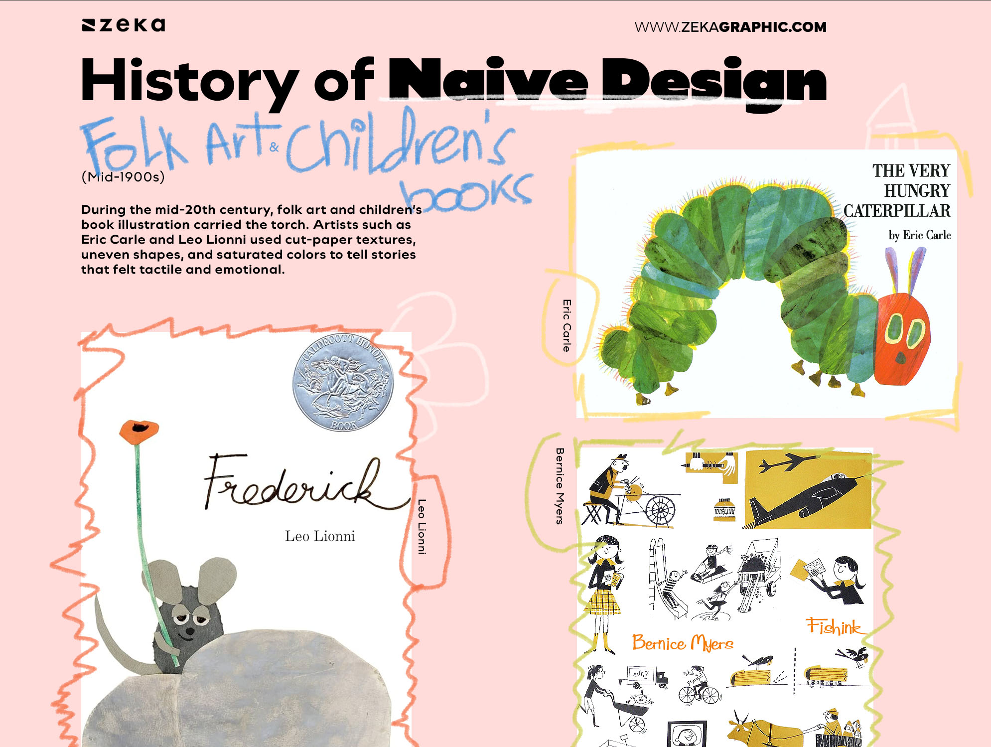
During the mid-20th century, folk art and children’s book illustration carried the torch. Artists such as Eric Carle, Bernice Myers and Leo Lionni used cut-paper textures, uneven shapes, and saturated colors to tell stories that felt tactile and emotional.
This era reinforced the idea that visual simplicity could hold emotional depth. As digital tools standardized precision, this visual language didn’t disappear — it went dormant, waiting for a cultural reason to return.
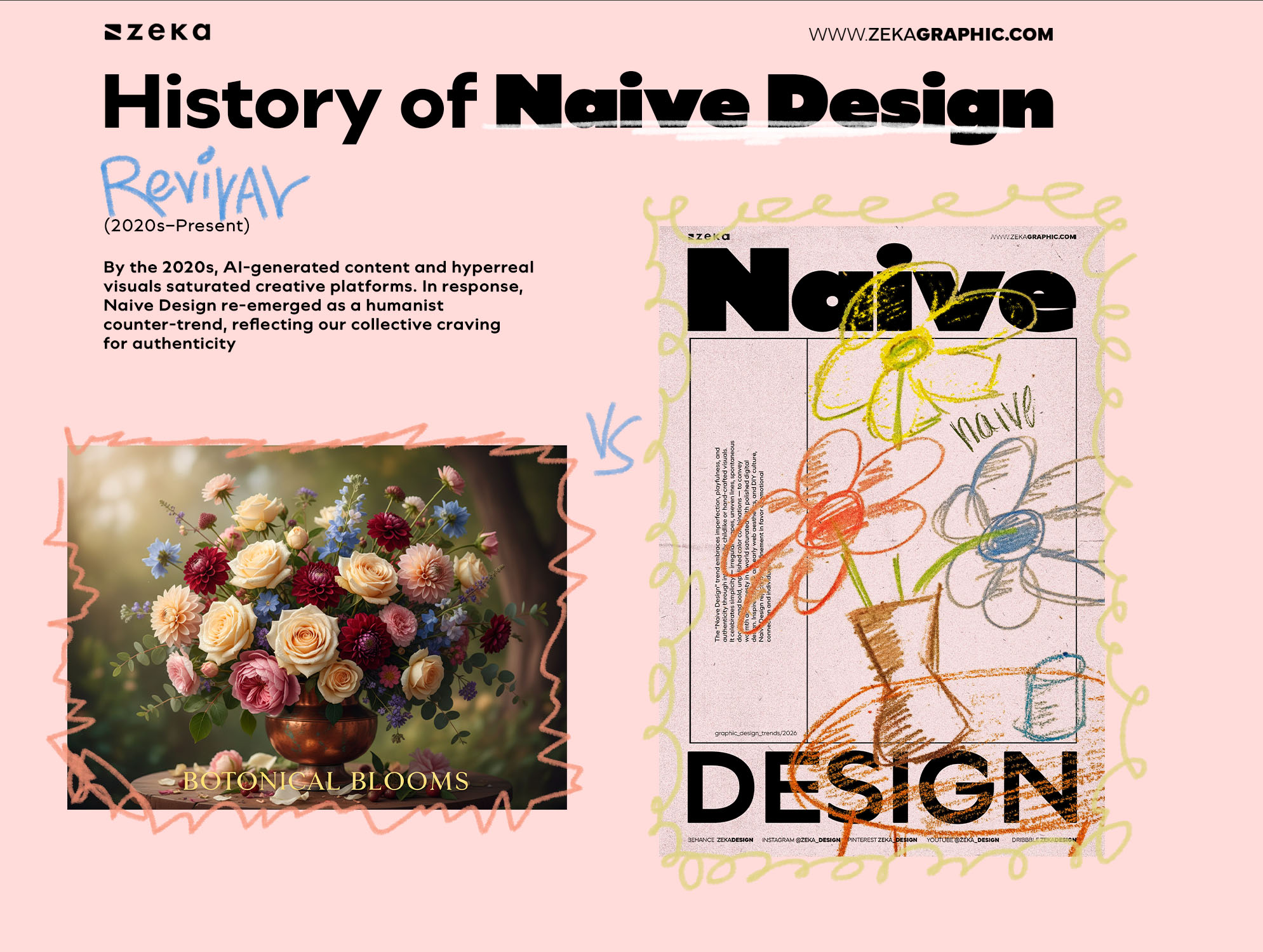
By the 2020s, AI-generated content and hyperreal visuals saturated creative platforms. In response, Naive Design re-emerged as a humanist counter-trend, reflecting our collective craving for authenticity. In 2026 and beyond, expect to see Naive Design influence branding, editorial layouts, and digital illustration — not as nostalgia, but as rebellion through sincerity.
Across these phases, naivety remained consistent — not as a style, but as a posture: a refusal to trade emotional honesty for technical approval.
Advertisment
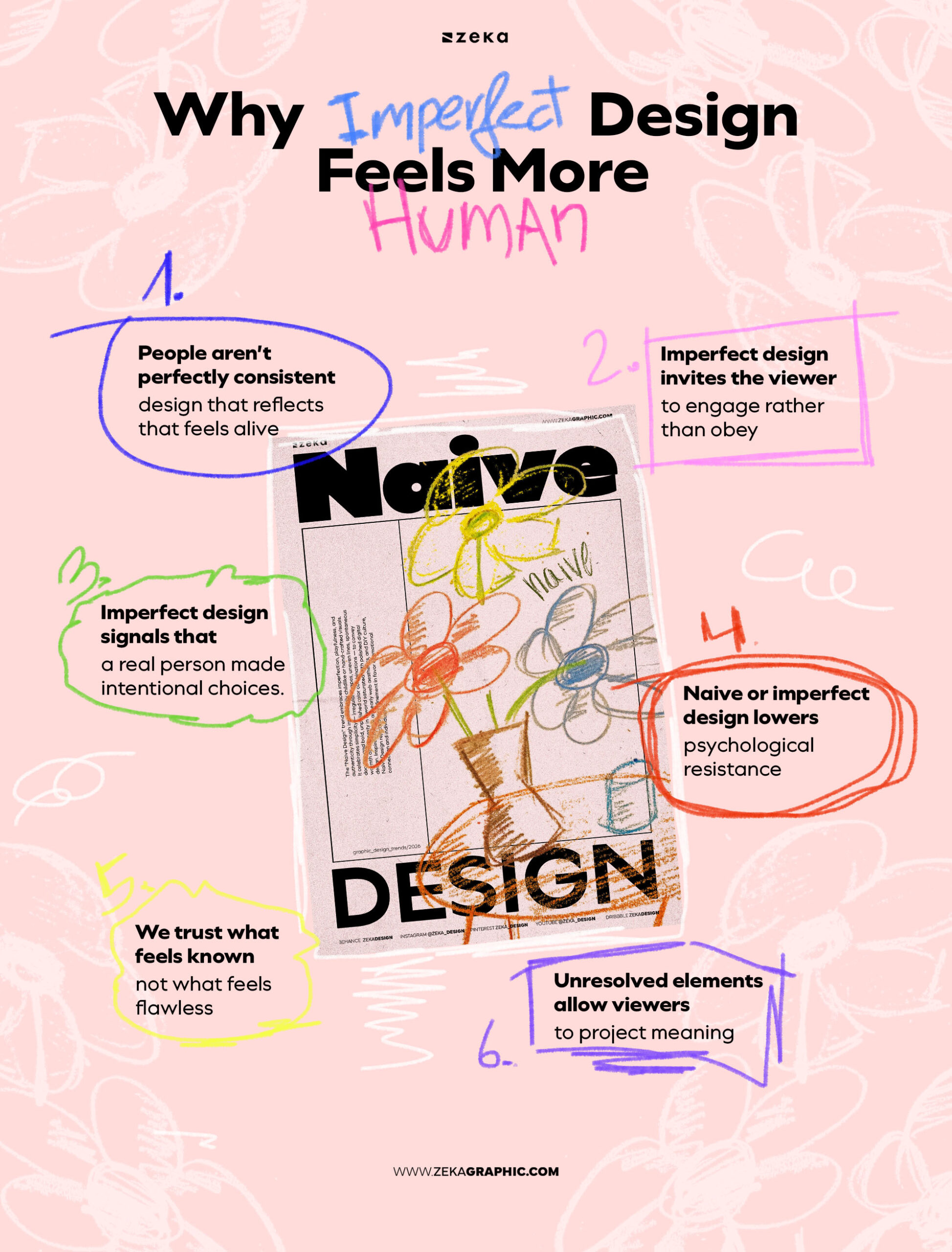
Imperfect design feels approachable because it behaves the way people do. We pause. We repeat ourselves. We leave edges unresolved. When design mirrors that rhythm, it signals presence rather than performance. Someone made this. Someone chose it.
Naive graphic design lowers the emotional guard between message and viewer. Highly polished work often communicates authority and distance; it asks to be admired or approved.
Imperfect work does the opposite as it invites participation. It leaves room for interpretation, even for projection and the viewer doesn’t feel instructed—they feel included.
We trust what feels familiar, and familiarity often comes from small inconsistencies: uneven spacing, lines that don’t resolve perfectly, type that feels drawn rather than placed.
Advertisment
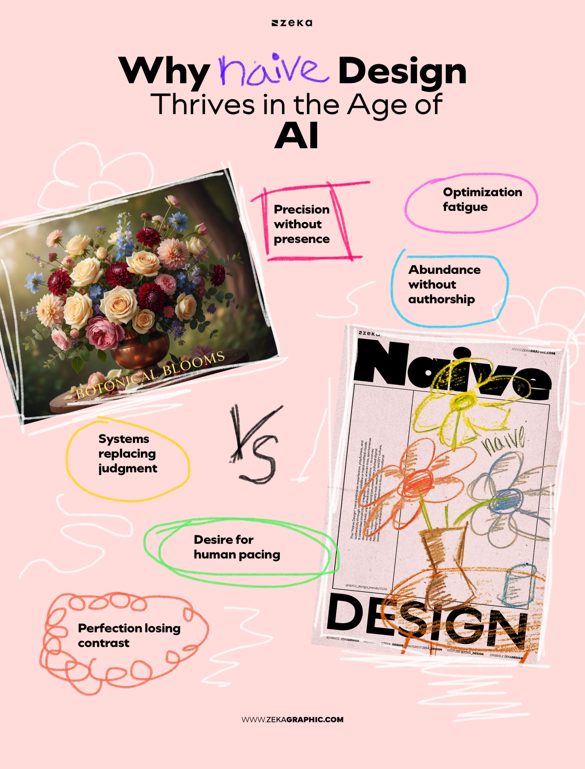
Timing matters and Naive graphic design isn’t resurfacing by accident—it’s responding to saturation as AI-generated visuals and template-driven systems become widespread, design has started to feel interchangeable. Perfect gradients, flawless compositions, endless variations—technically impressive, yet increasingly indistinct.
Precision has become cheap.
In this environment, intentional imperfection creates contrast without noise. It slows the eye. It resists instant resolution. Where AI excels at optimization, naive graphic design values judgment—knowing when to stop, what to leave unresolved, and where to let character remain.
This isn’t nostalgia or resistance to technology. It’s recalibration. Designers aren’t rejecting tools; they’re reclaiming authorship and Naivety becomes a way to reassert intention in a landscape shaped by automation—proof that not everything meaningful needs to be optimized, scaled, or generated at speed.
Seen this way, naive graphic design isn’t anti-AI. It’s post-AI: a reminder that emotional clarity doesn’t come from abundance, but from choice.
What enables that recognition isn’t chaos, but simplification with intent. Detail is reduced so meaning can surface. Accuracy gives way to clarity. Forms become visual shorthand rather than literal representation. This is why naive graphic design feels simple without feeling empty.
Imperfection plays a central role — not as error, but as evidence. Uneven lines, awkward spacing, and irregular rhythm signal that choices were made and not fully corrected. That human cadence contrasts with mechanical precision.
Visually, naive graphic design tends to share a small set of recurring traits — not as rules, but as patterns of choice.
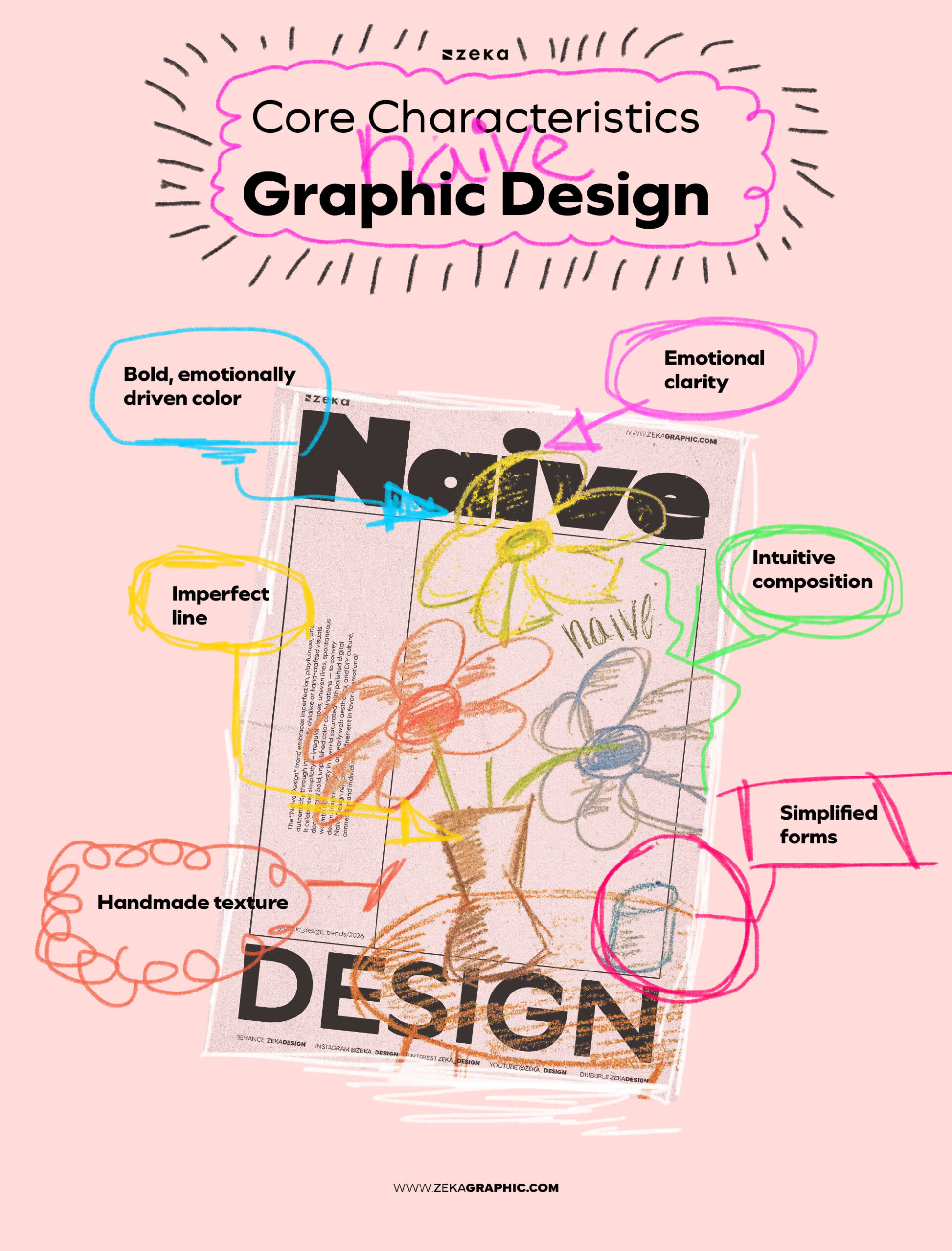
No single trait defines naive graphic design. What defines it is posture.
Beneath the looseness is restraint. Beneath the simplicity is judgment. Beneath the imperfection is intent. Naive graphic design works when the designer knows exactly what to let go — and what to protect.
Once this language becomes recognizable, the natural question isn’t what does it look like?
It’s who uses it well — and why it works.
Advertisment
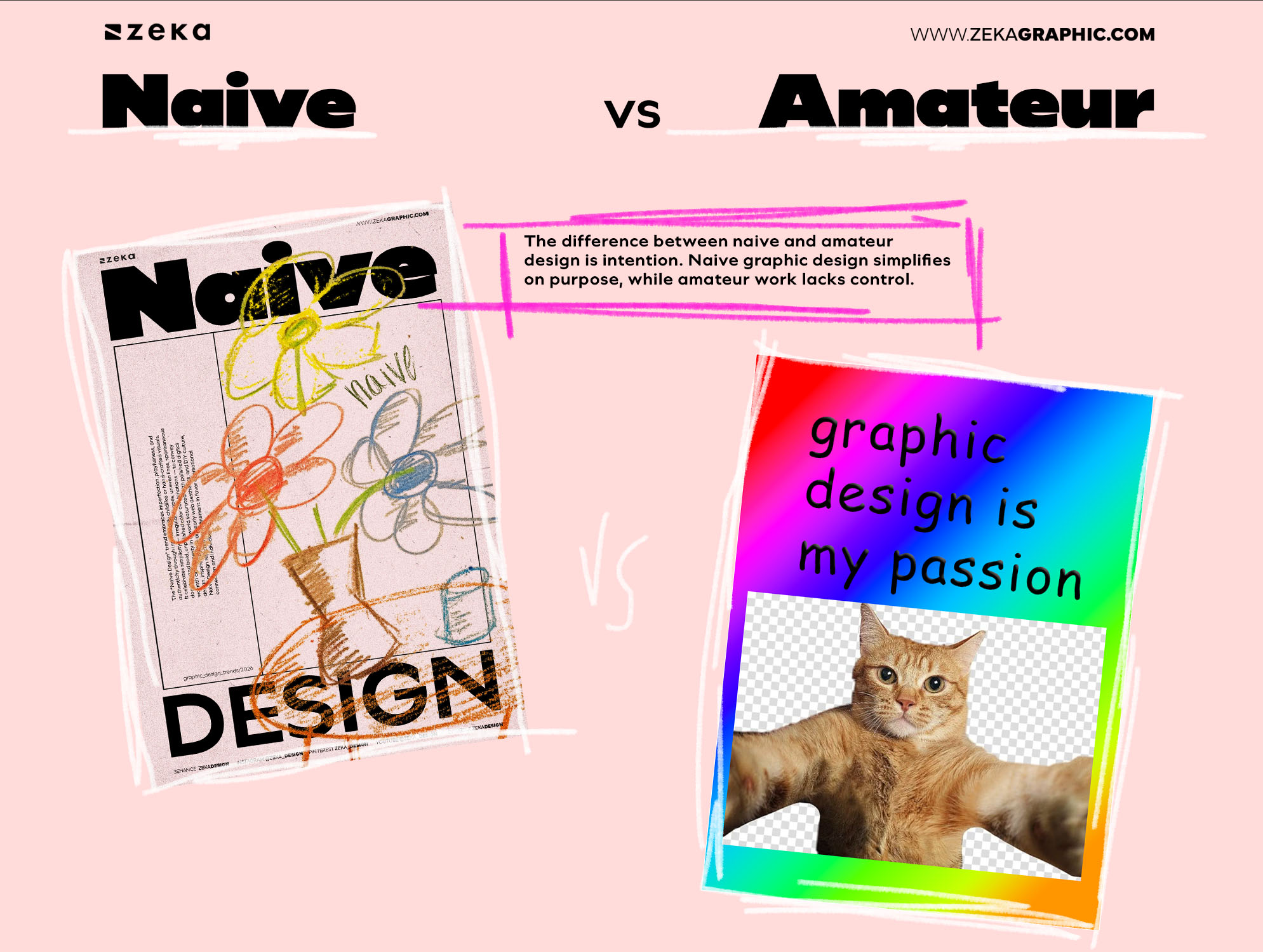
The difference between naive and amateur design is intention. Naive graphic design simplifies on purpose, while amateur work lacks control. In naive design, choices feel considered even when execution is loose. Spacing, rhythm, and hierarchy may appear informal, but they still guide attention and meaning.
Amateur design often reveals uncertainty — too many ideas, inconsistent logic, or accidental errors. Naive design, by contrast, feels calm in its restraint. It knows what to remove, not just what to add. The line is crossed not by imperfection, but by the absence of clarity.
Advertisment
To understand naive graphic design, it helps to look at the people who used it deliberately, not accidentally. This isn’t about biography or art criticism — it’s about mindset and influence. These figures demonstrate how naive aesthetics function across art, illustration, branding, and commercial design.
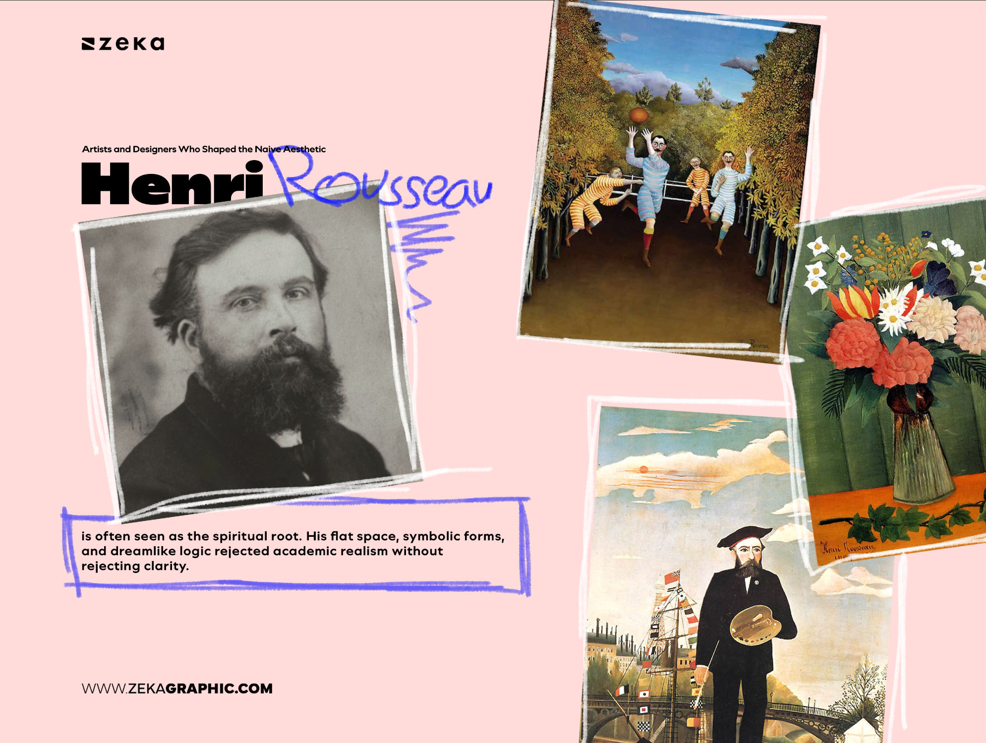
Henri Rousseau is often seen as the spiritual root. His flat space, symbolic forms, and dreamlike logic rejected academic realism without rejecting clarity. His work shows how intuition can feel complete rather than unfinished.
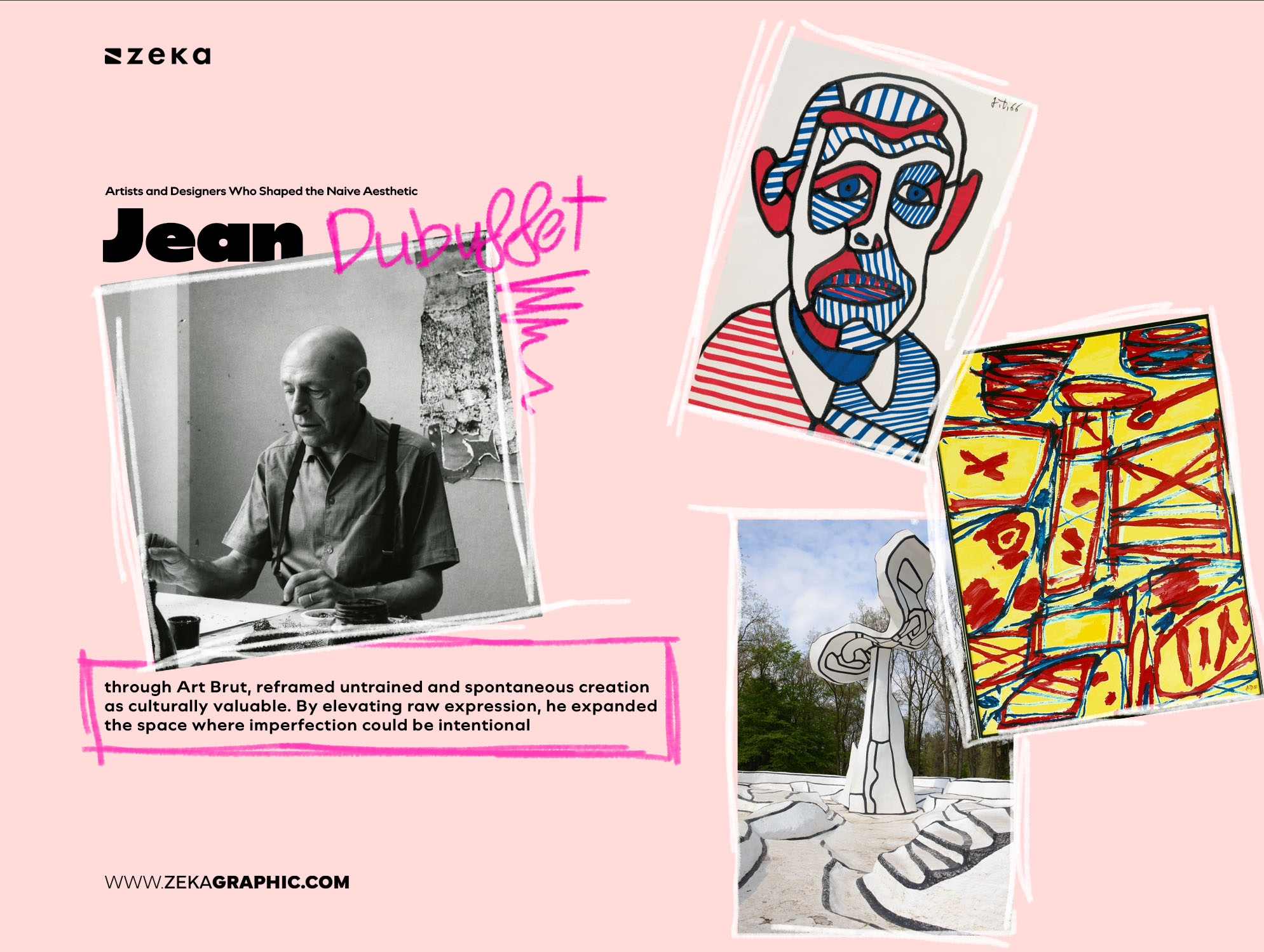
Jean Dubuffet, through Art Brut, reframed untrained and spontaneous creation as culturally valuable. By elevating raw expression, he expanded the space where imperfection could be intentional — a foundation for naive aesthetics in contemporary design and illustration.
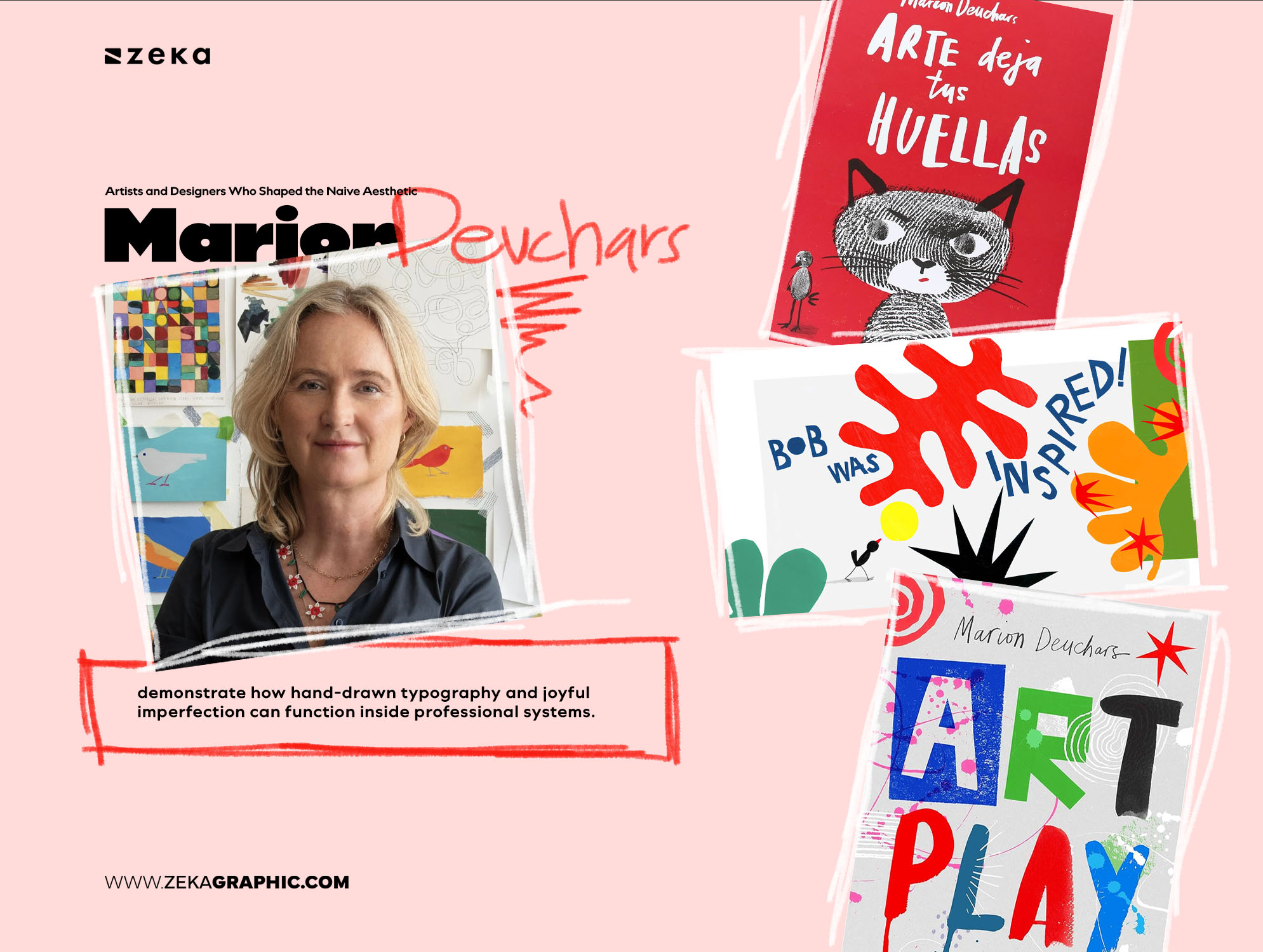
In modern practice, designers like Marion Deuchars demonstrate how hand-drawn typography and joyful imperfection can function inside professional systems. Her work proves that naive sensibility scales when guided by judgment.
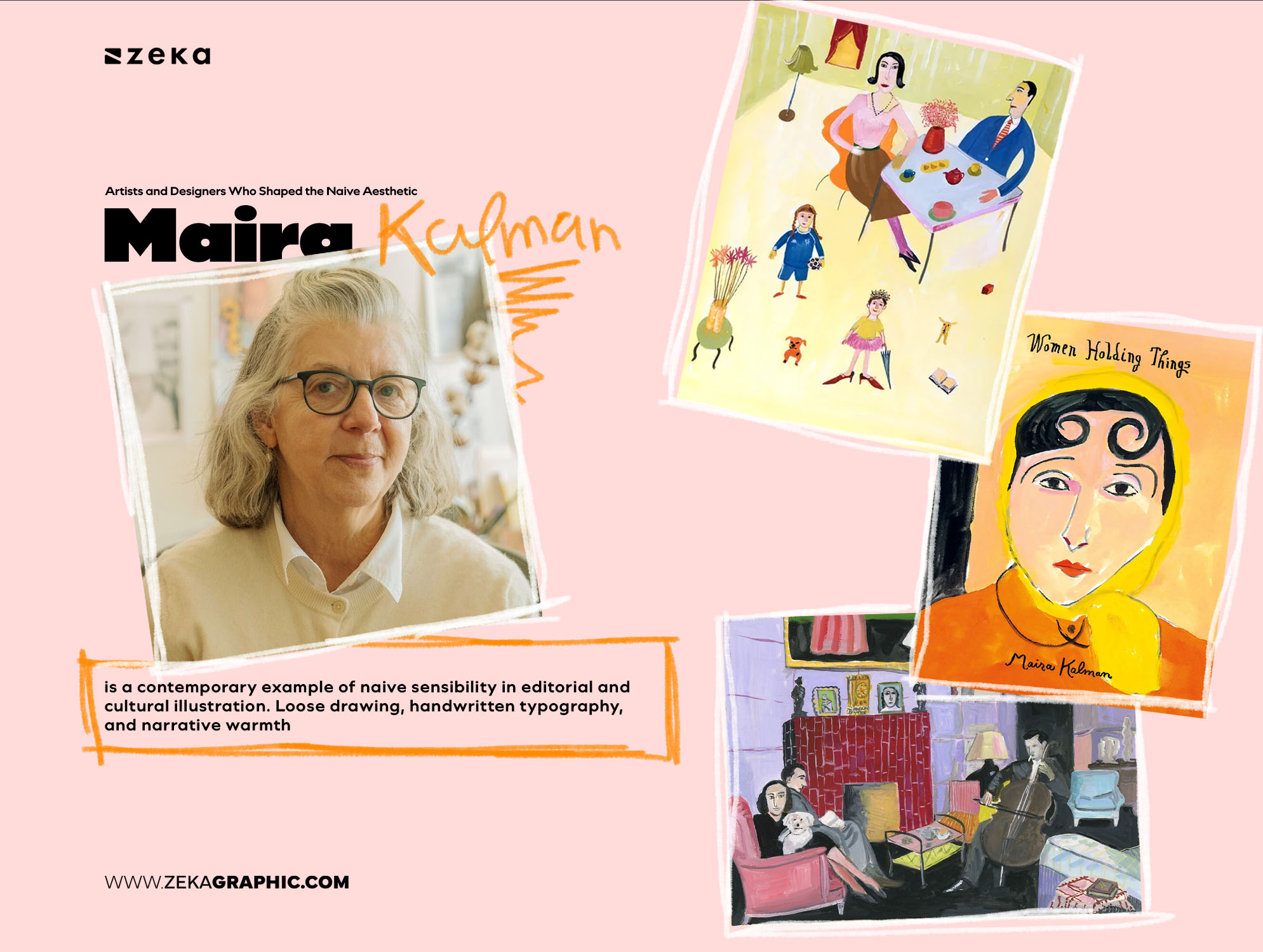
Maira Kalman is a contemporary example of naive sensibility in editorial and cultural illustration. Loose drawing, handwritten typography, and narrative warmth — guided by judgment, not refinement. Her work shows how naive aesthetics operate in serious, adult contexts.
Beyond individuals, folk art and children’s illustration remain the deepest influence: storytelling through symbols, repetition, and emotional honesty. These traditions persist not as nostalgia, but as visual memory.
What these figures share isn’t style — it’s intention. Naivety used consciously, not defensively.
Advertisment
Naive graphic design works best where personality, emotional connection, and memorability matter more than polish or scale. In these contexts, naivety acts as a signal of voice — communicating values and tone before words are read.
It performs especially well in:
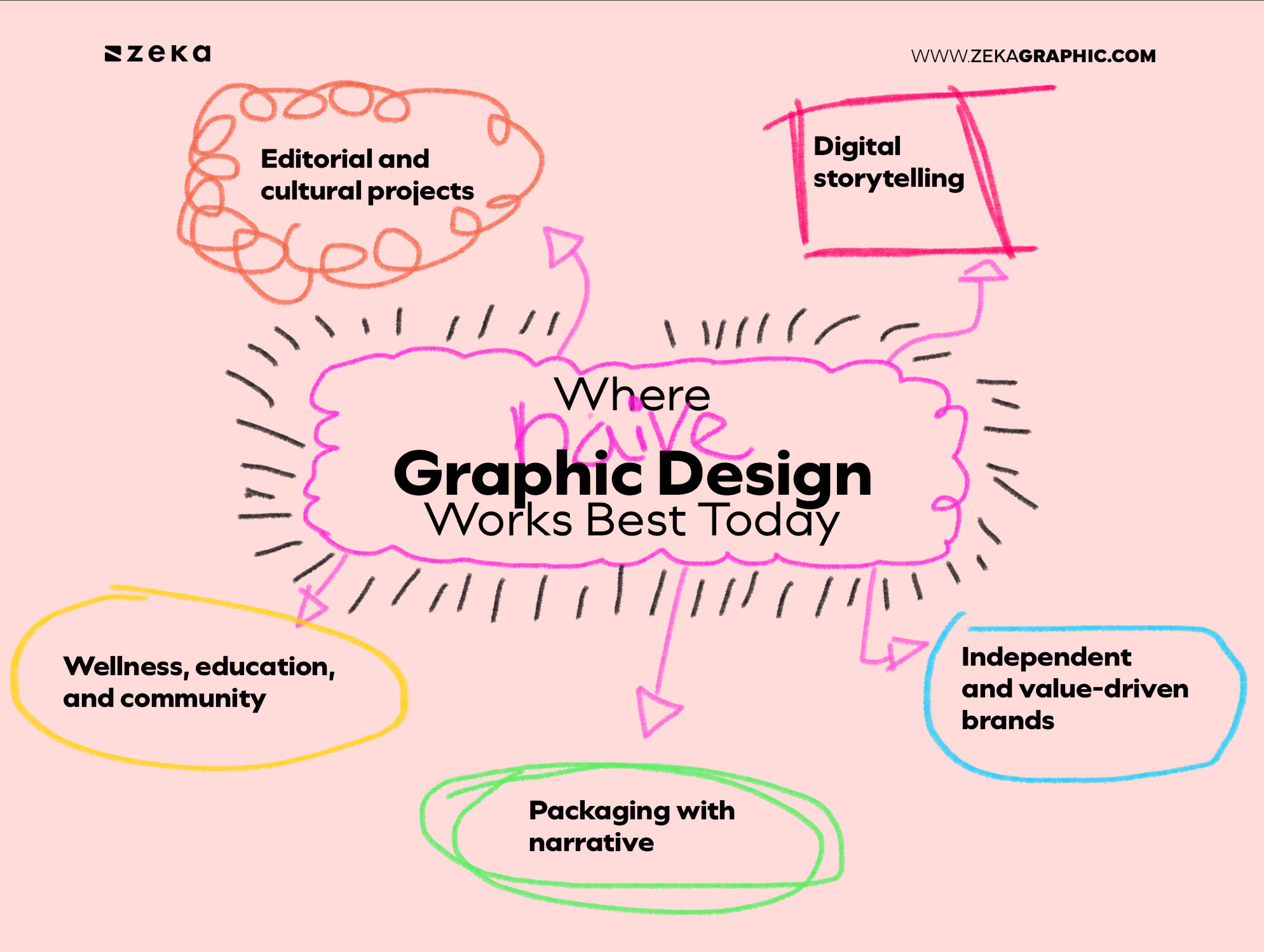
In these spaces, visual sincerity builds trust faster than refinement.
However, naive design is not universal. It struggles in environments that require neutrality, precision, or institutional authority — such as financial systems, technical documentation, or highly regulated corporate communication.
Used strategically, naive graphic design differentiates.
Used everywhere, it becomes noise.
Understanding where it belongs is what prevents it from becoming a trend applied without context.
Advertisment
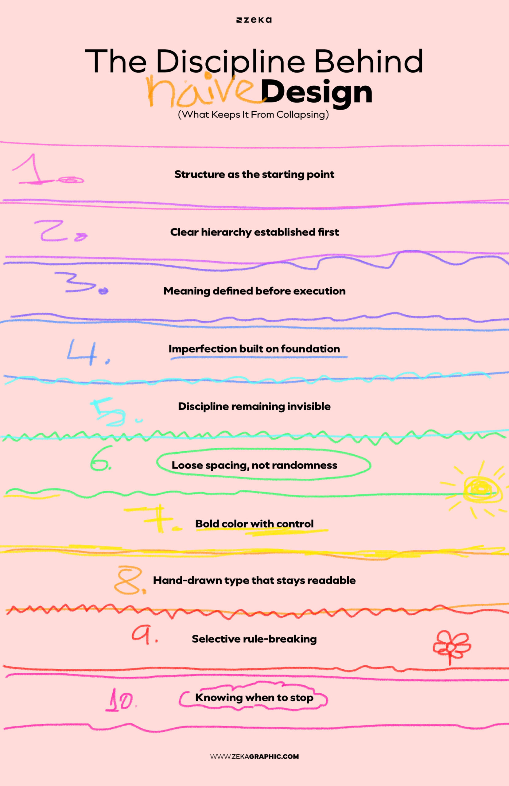
Naive graphic design only works when structure comes first. Hierarchy must already be clear. Meaning must already be decided. Without that foundation, imperfection doesn’t feel human — it feels careless.
The discipline is invisible, but essential. Spacing is loose, not random. Color is bold, not uncontrolled. Type feels drawn, but still readable. Every irregularity sits on top of an underlying order the viewer never sees.
This is why naive design is harder than it looks. It asks the designer to know the rules well enough to break them selectively — and to stop before expression turns into noise.
Advertisment
Designing naively starts with structure, not looseness. Clear intent, simple hierarchy, and strong conceptual decisions come first. Only then do hand-drawn elements, symbolic imagery, or imperfect forms enter — not as decoration, but as expression layered onto control.
The most effective naive graphic design balances intuition with restraint. It allows irregularity while protecting meaning.
Naivety works only when it feels chosen, not accidental.
Naive graphic design is not a step backward, nor a rejection of skill. It is a conscious move toward emotional precision — a way of designing that values recognition, warmth, and presence over surface perfection.
In a visual culture obsessed with optimization, naivety reminds us of something essential:
clarity is not always clean, and trust is rarely polished.
Advertisment
Pin it for later!
If you found this post useful you might like to read these post about Graphic Design Inspiration.
Advertisment
If you like this post share it on your social media!
Advertisment


Want to make your Business Grow with Creative design?
Advertisment

Advertisment