Nobody is born knowing everything, and this also can be applied to graphic design, as part of the learning process is to try things and make mistakes, and the most well-known and professional designers have a beginning in this industry and made mistakes, some of them are really common and that is why I made this list with the most common errors made by beginner designers to save you time and avoid them.
Advertisment
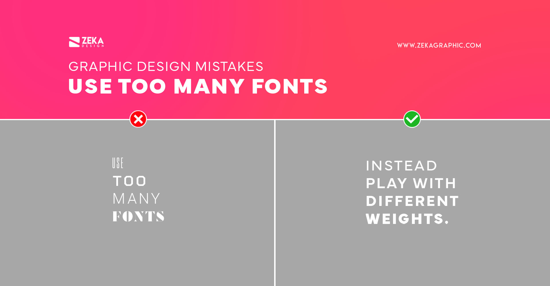
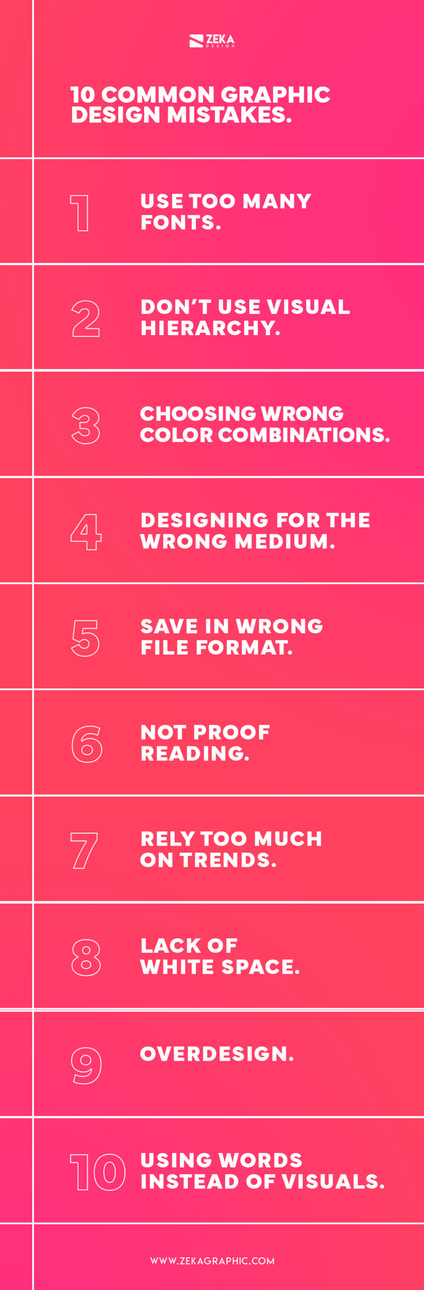
The first mistake many beginner graphic designers make is using too many fonts in their design projects, this can cause the message to be hard to understand as it doesn’t follow any font psychology, and also it makes your design distracting, as there are too many elements making it look amateur.
This also applies in logo design, by adding too many fonts to your logo, it will make it look amateur, instead, you can limit yourself to one or two fonts that work well together, or if you want a pro tip, use the same font but with different weights, this will make your design look cleaner, professional and with a clear message.
Advertisment
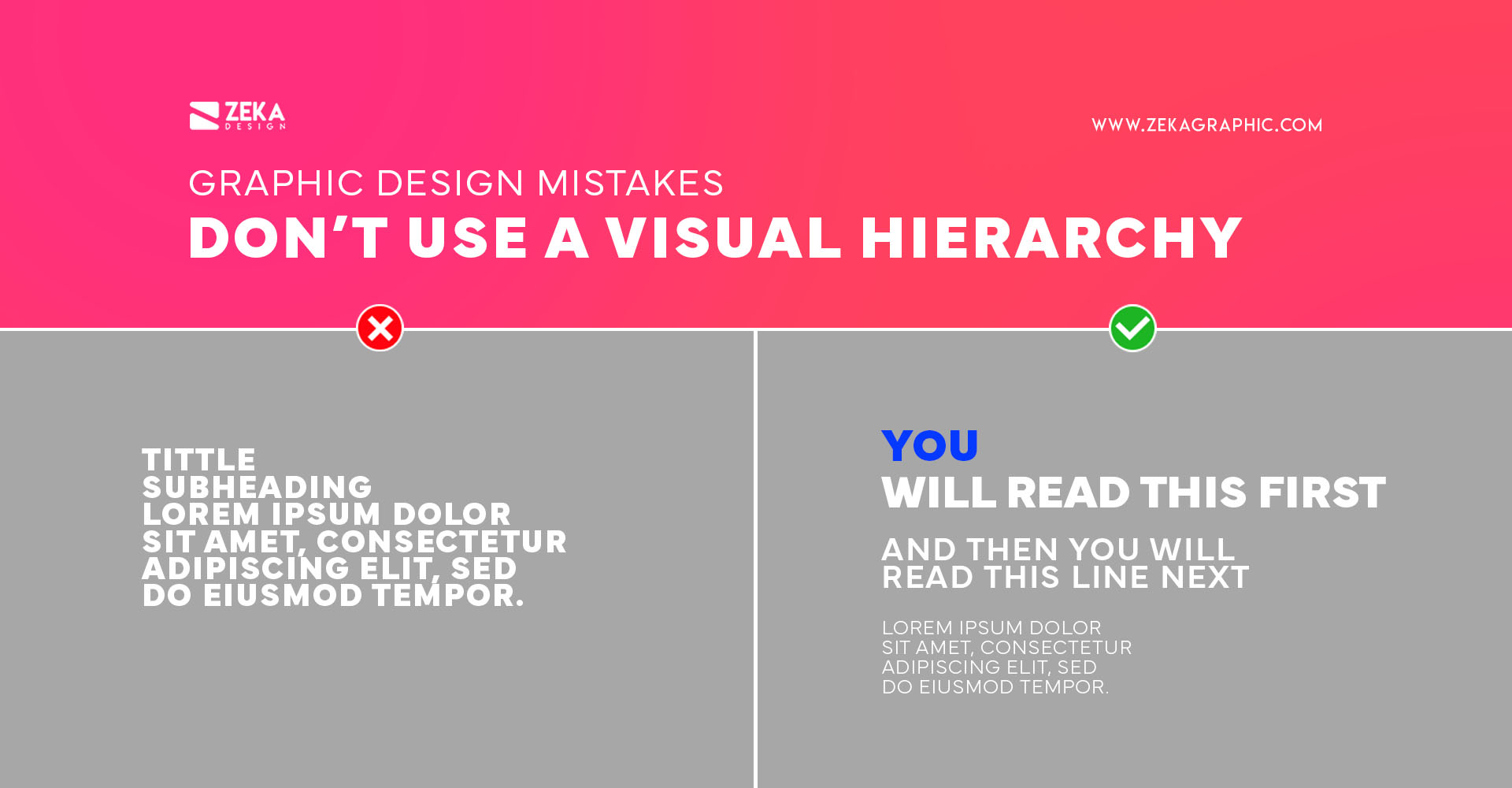
When designing a poster, website, or any visual asset you need to understand what is the message you want to transmit and what is the most important information, in graphic design we use visual hierarchy to organize these elements and make the viewer much easier to understand the important information and what order they should read our design.
Some beginner designers don’t apply a visual hierarchy to their designs making it look chaotic and hard to identify the important information as their eyes are jumping from one side to another without any order, instead learn visual hierarchy principles and apply them to your designs to create order.
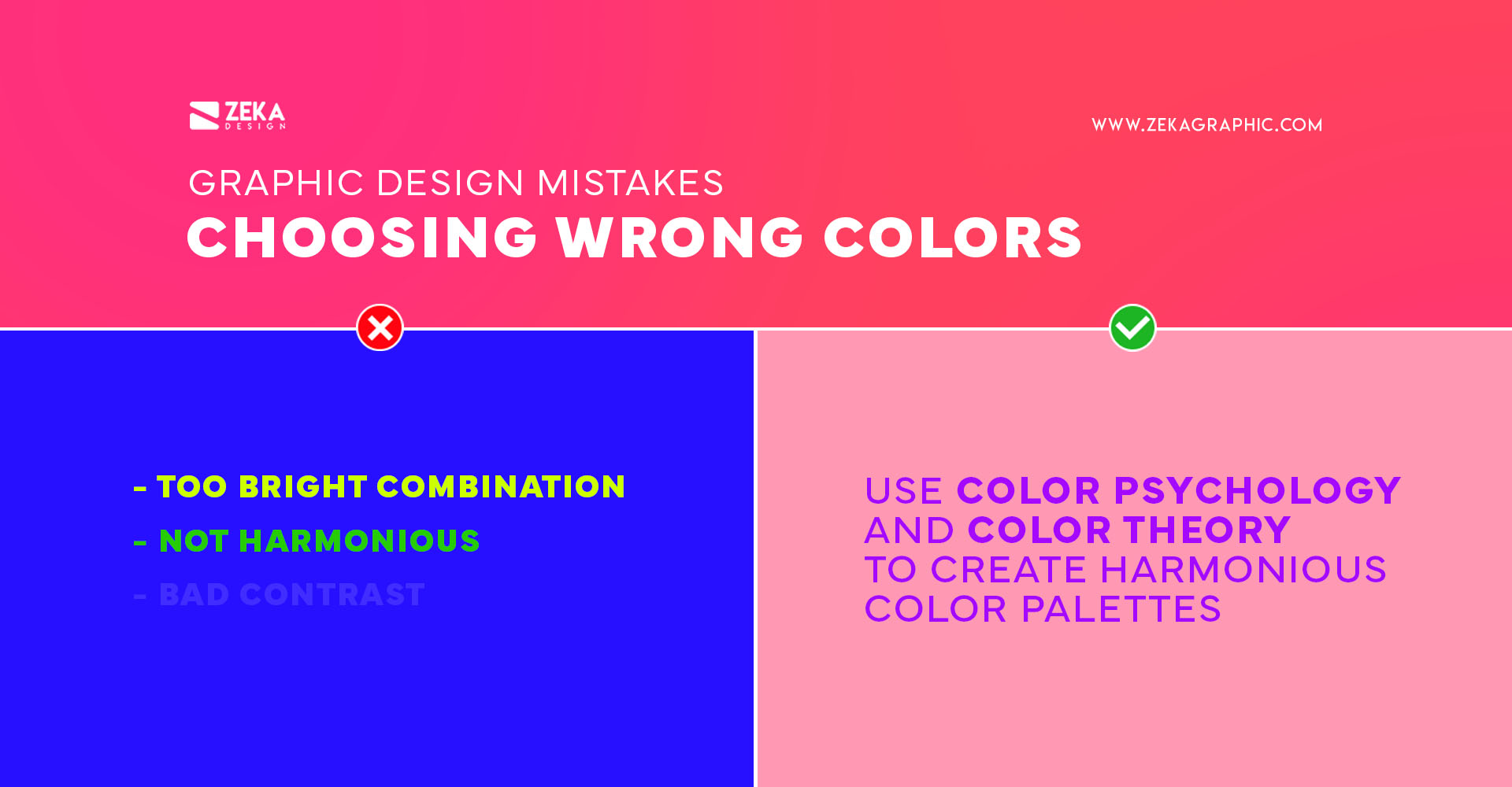
Colors have their own meaning and there are associated with different feelings and emotions, and common mistake made by beginner designers is to choose the wrong color for their design making the message hard to understand or making the viewer perceive the contrary message, instead you can read my post about color psychology and learn the different meanings of them.
Another mistake made by beginner designers is to ignore color theory and use bad color palettes making the design look bad and amateur, also if you use too many bright colors and don’t use contrast, this will make your design hard to read, instead, you need to learn color theory to understand how color interact with each other and use correct color palettes.
Advertisment
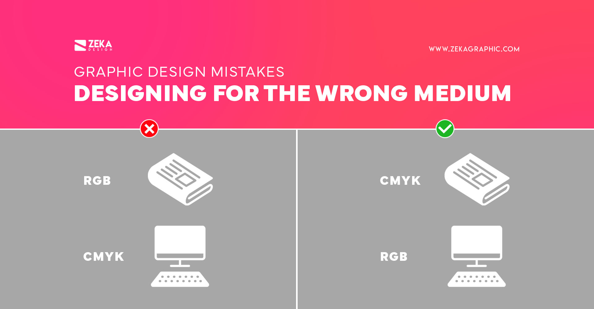
Some beginner designers are working on a poster and they are using one color palette and on their screen, it looks great, but later they are surprised when printing the design and the colors don’t match with the ones you use in your design software, this is a common error made by beginners designers and it’s designing for the wrong medium and choose the incorrect color mode.
This can be easily corrected by knowing in which medium your design will be shown, if it’s printed media, you need to create your document in CMYK color mode, and if it’s for digital media like social media or website, you need to use RGB and this will avoid you many inconvenient surprises.
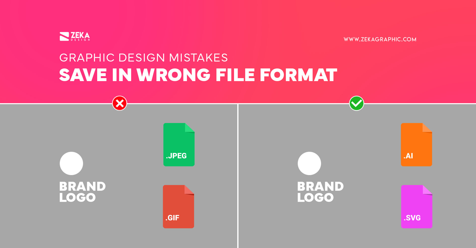
There are two types of image files, raster images, and vectors, the first one is made up of pixels and the second one is made of geometric lines and curves, the main difference between these two types of files is that the vector images can be scaled to any size without losing quality, and raster images will lose quality.
A common error made by non-designers and beginner designers is by saving their designs in the wrong format for example saving a logo design in .jpeg, making them lose quality when it’s scaled, if you plan to scale your design like a logo design you must save it in a Vector file like .PDF or .SVG. If you want to know more about the different types of file formats in graphic design, I have a complete guide about file formats you can read it.
Advertisment
You already have finished your poster design and sent it to print, you are walking by the street and saw your poster on the wall and want to take a look and suddenly you saw that instead of Sunday you have written “Sonday” making it instantly look bad. This mistake can happen to any designer as It has nothing to do with skill, but with lack of attention.
To avoid this type of mistake that makes your design automatically look amateur, and unprofessional, and makes the viewer lose trust in the message, you need to proofreading several times your design once is finished and correct any spelling mistakes you have missed the first time.

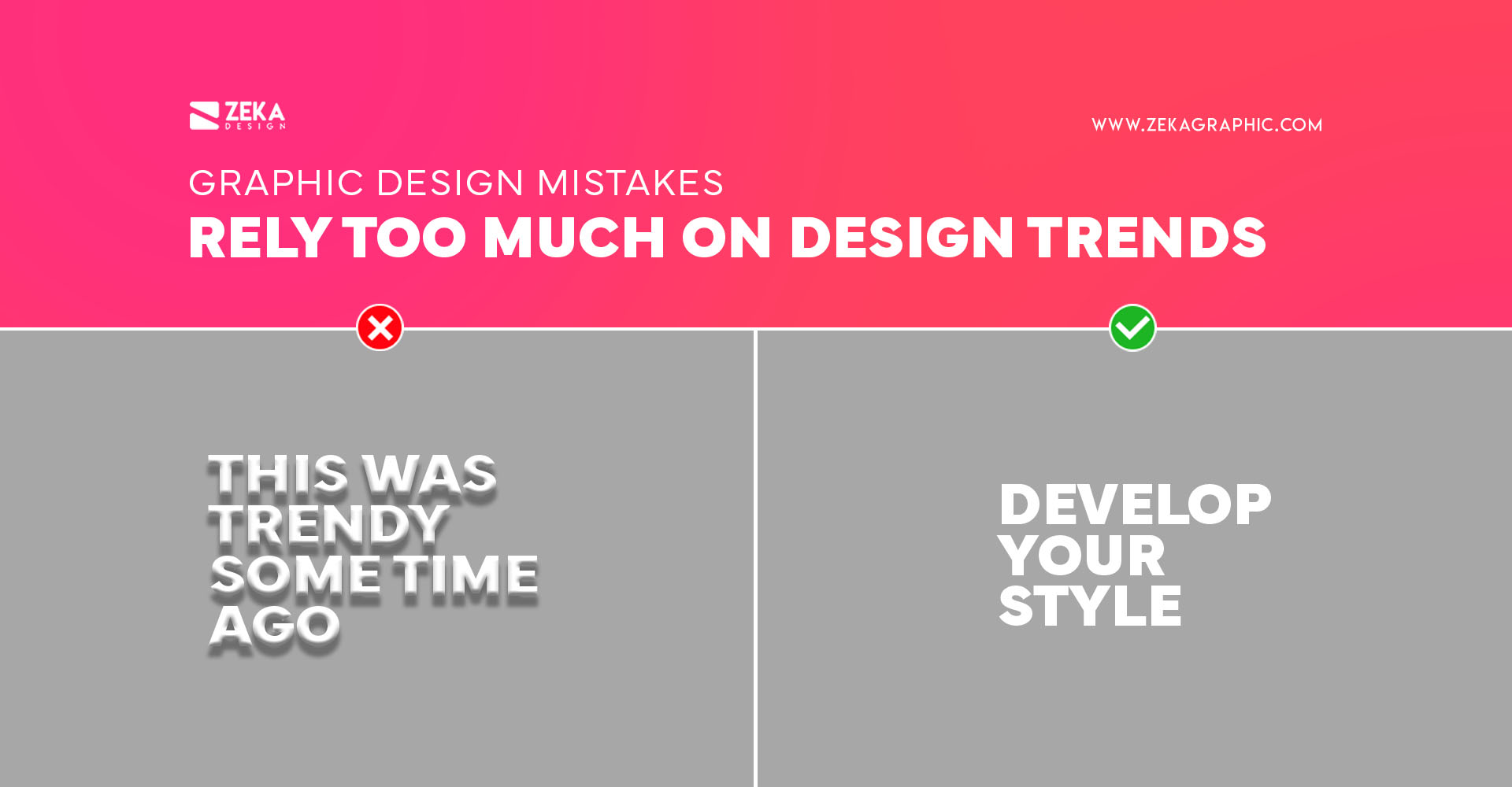
Design trends look awesome and they are everywhere, some of them can stay for many years, but others can easily disappear in months, making designs that have used these trends look outdated although they are relatively actual, that is why you should know about this trends but don’t rely too much on them, as it will make you an average designer and you will be forced to change your portfolio constantly.
Instead, you can see the new graphic design trends and try to apply some of them to your formed style, this will make your design projects don’t look the same as each other, and they will not be outdated in some months.
Advertisment
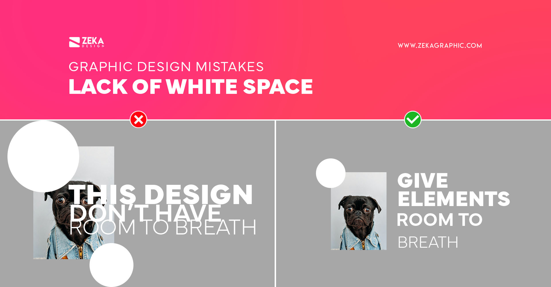
Many beginner designers and non-designers underestimate the importance of empty space and they tend to have “horror vacui” trying to fill each space of their designs, but this is a great mistake, as you will saturate your design making that the message will get lost in too many elements, this will make that your design is perceived as cheap and unprofessional.
Instead, learn white space and try to apply it to your designs giving each element of your design room to breathe, by applying white space to your design will automatically make it look cleaner, sophisticated and the message is clear, another pro tip is to apply visual hierarchy principles and minimalist principles making your design look professional.
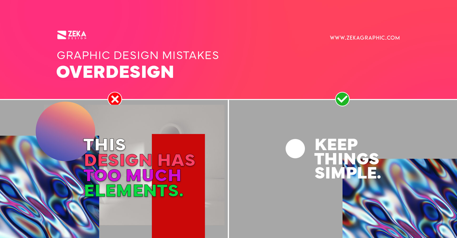
Overdesigning is a common mistake made by beginner designers or students who learn how to use Photoshop, Illustrator, or a new design technique, making them want to use all the filters and tools these programs give to them at the same time making your design look saturated with filters, effects, colors, and shapes.
Instead, choose a certain aesthetic for your design and follow it, and you don’t need to use all the effects and filters of Photoshop in the same design if you want to practice and learn how to use these tools, you can apply them on different projects and try to make a clean and nice looking design applying these filters and effects.
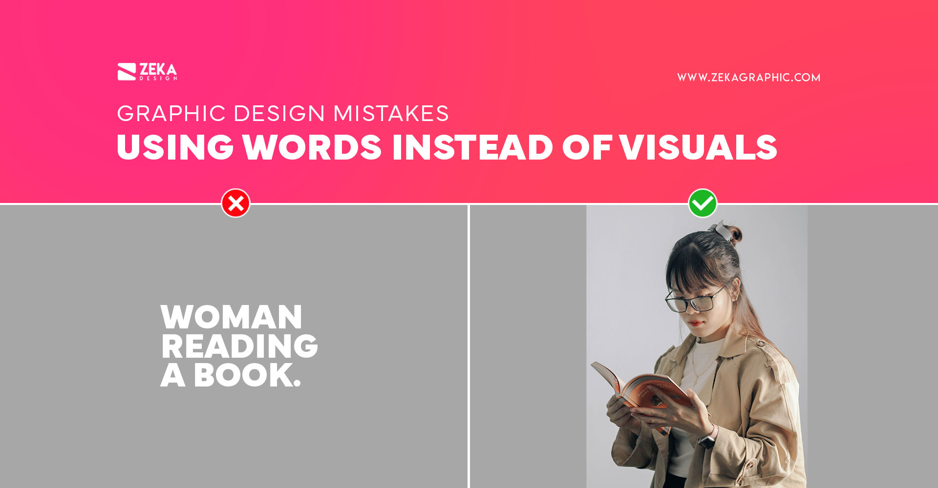
We, graphic designers, work with visual elements to communicate certain messages through color, shapes, and fonts, that is why we need to avoid using too much text and instead try to communicate these messages through unconscious elements like color or fonts, applying font psychology and color psychology.
Beginner designers tend to include too much text in their visuals making the audience get bored really fast by having too many words to read, instead, they can use shapes, images, or visuals that communicate the message, much faster and effectively.
Advertisment
Mistakes are part of the process of every designer, you need to make them, identify and correct them to continue your learning path, but to save you some time and avoid you to make these mistakes I made this list to help you identify the common errors and correct them to make your design projects look better and more professional.
Hope you find this post useful and if you want to learn more about graphic design you can read these guides.
Pin it for later!
Pin it for later!
If you found this post useful you might like to read these post about Graphic Design Inspiration.
Advertisment
Written by
If you like this post share it on your social media!
Advertisment


Advertisment

Advertisment