Perfect images are everywhere.
Clean. Fast. Instantly understandable.
But many of them feel emotionally empty.
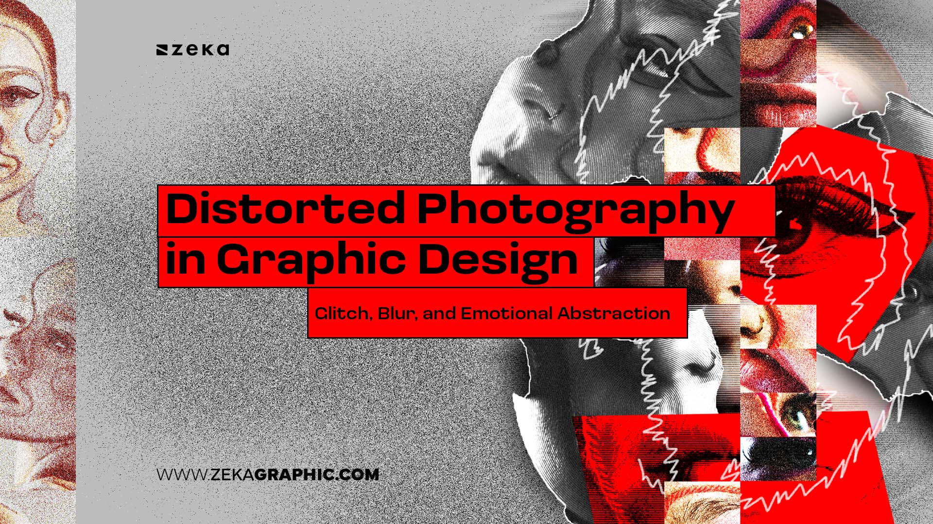
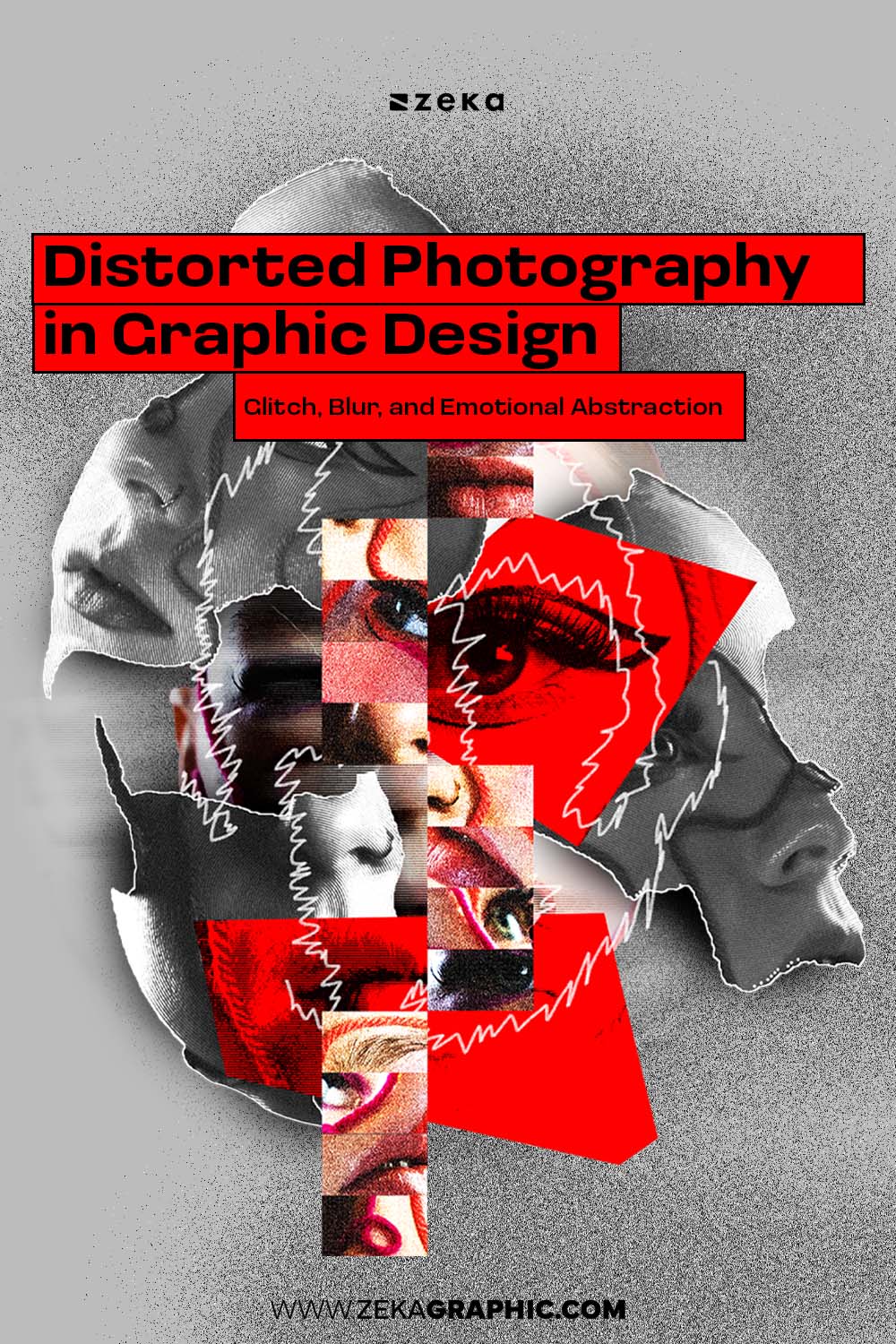
Distorted photography in graphic design appears when clarity alone stops being expressive. As visual culture becomes more polished and optimized, designers are pushing beyond literal representation to create mood, tension, and atmosphere.
Distortion adds friction. Texture. Uncertainty.
It slows perception just enough to make an image feel human again.
Rather than visual noise, distorted photography becomes a way to reintroduce emotion, subjectivity, and presence into digital design — something increasingly visible across Graphic Design Trends 2026, where atmosphere and emotional impact are starting to matter more than visual perfection.
Advertisment
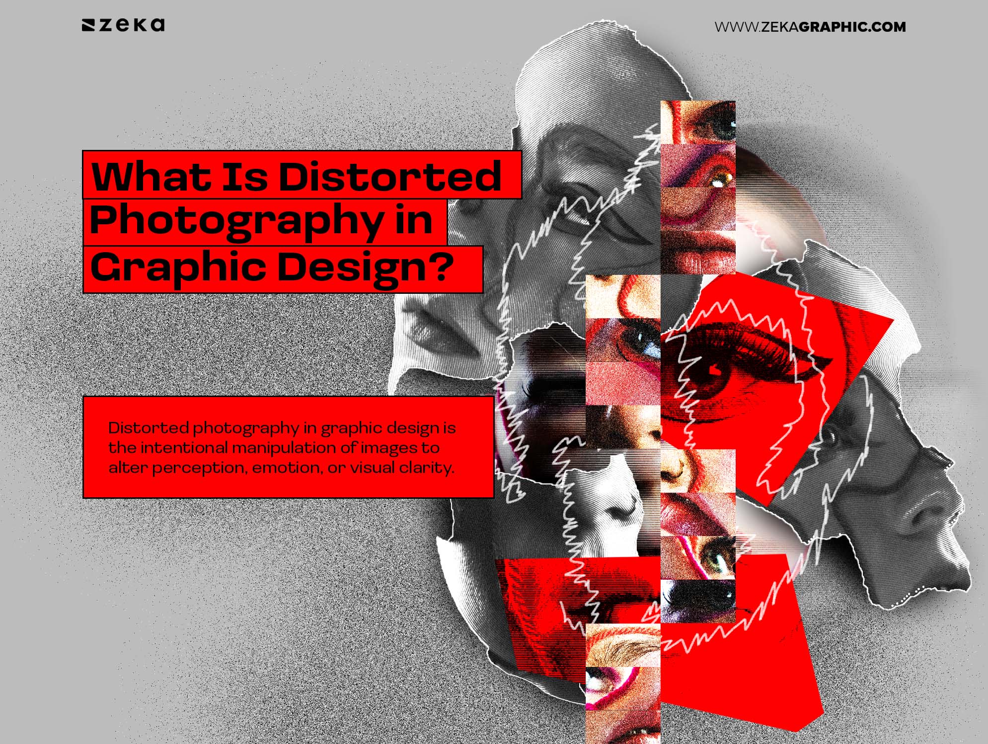
First of all, let’s understand what distorted photography is, the term Distroted Photography in graphic design is the intentional manipulation of images to alter perception, emotion, or visual clarity.
Instead of presenting reality exactly as it appears, designers use techniques like glitch, blur, warping, pixelation, grain, stretching, or degradation to create atmosphere and psychological impact.
The goal isn’t perfection. It’s expression.
Distortion transforms photography from simple documentation into something more interpretive, emotional, and visually unstable — allowing designers to communicate tension, memory, movement, or ambiguity in ways clean imagery often cannot.
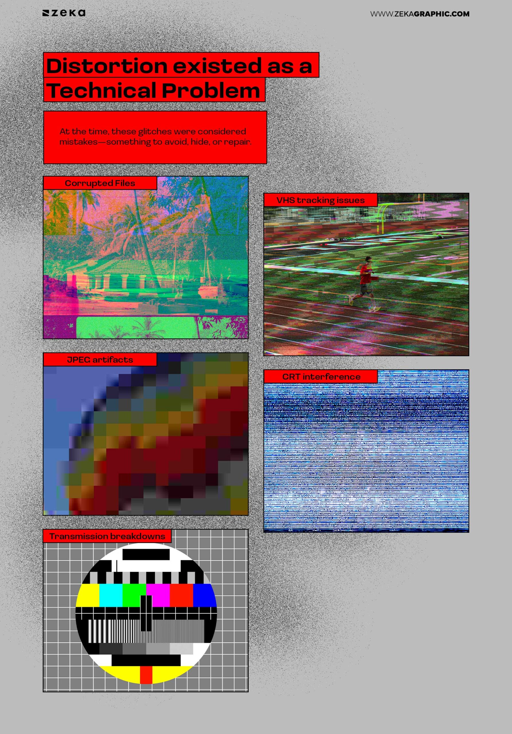
Distortion didn’t begin as an aesthetic choice. It began as failure.
Before it appeared in posters, album covers, or branding, distortion existed as a technical problem. During the late 1980s, 1990s, and early 2000s, corrupted files, VHS tracking errors, JPEG artifacts, CRT Interefrences and signal glitches exposed how unstable digital systems really were. Images tore apart, colors shifted, and frames duplicated unexpectedly.
At the time, these imperfections were seen as mistakes to fix.
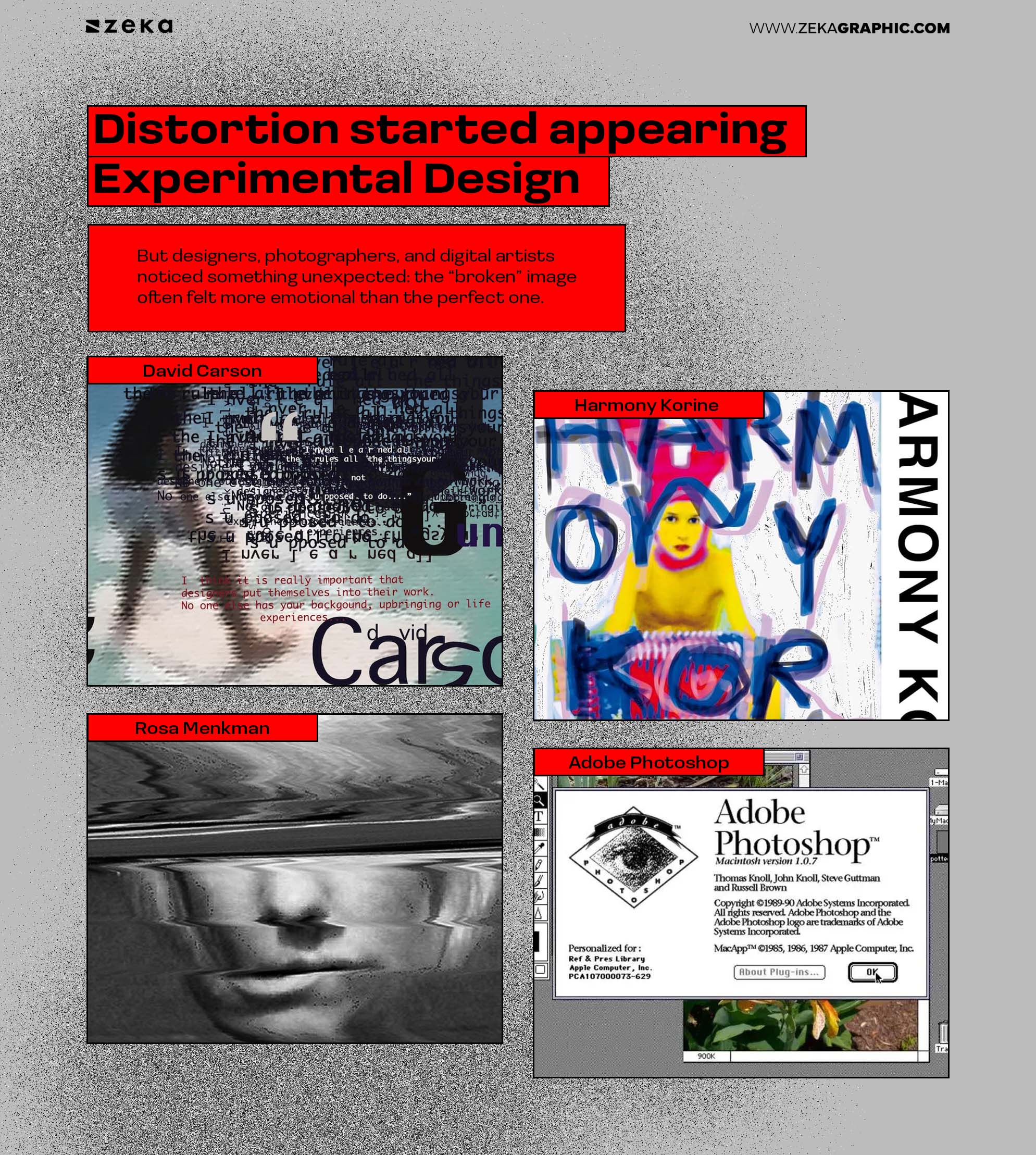
But designers, photographers, and digital artists noticed something unexpected: the “broken” image often felt more emotional than the perfect one.
A glitched portrait felt unstable.
A blurred figure felt distant.
A warped environment felt psychological rather than literal.
What started as technical failure slowly became visual language.
By the late 1990s and early 2000s, distortion started appearing in experimental design, underground web culture, and music visuals. David Carson pushed visual chaos against rigid design systems, while Harmony Korine embraced blur and raw imperfection. Around the same time, Rosa Menkman helped establish glitch as an intentional artistic practice.
As tools like Adobe Photoshop became more accessible, distortion became something designers could control instead of avoid.
By the 2010s, distorted photography had spread across fashion editorials, music artwork, experimental posters, streetwear branding, and motion graphics. After years of ultra-clean minimalism, distortion brought texture, instability, and emotion back into digital design.
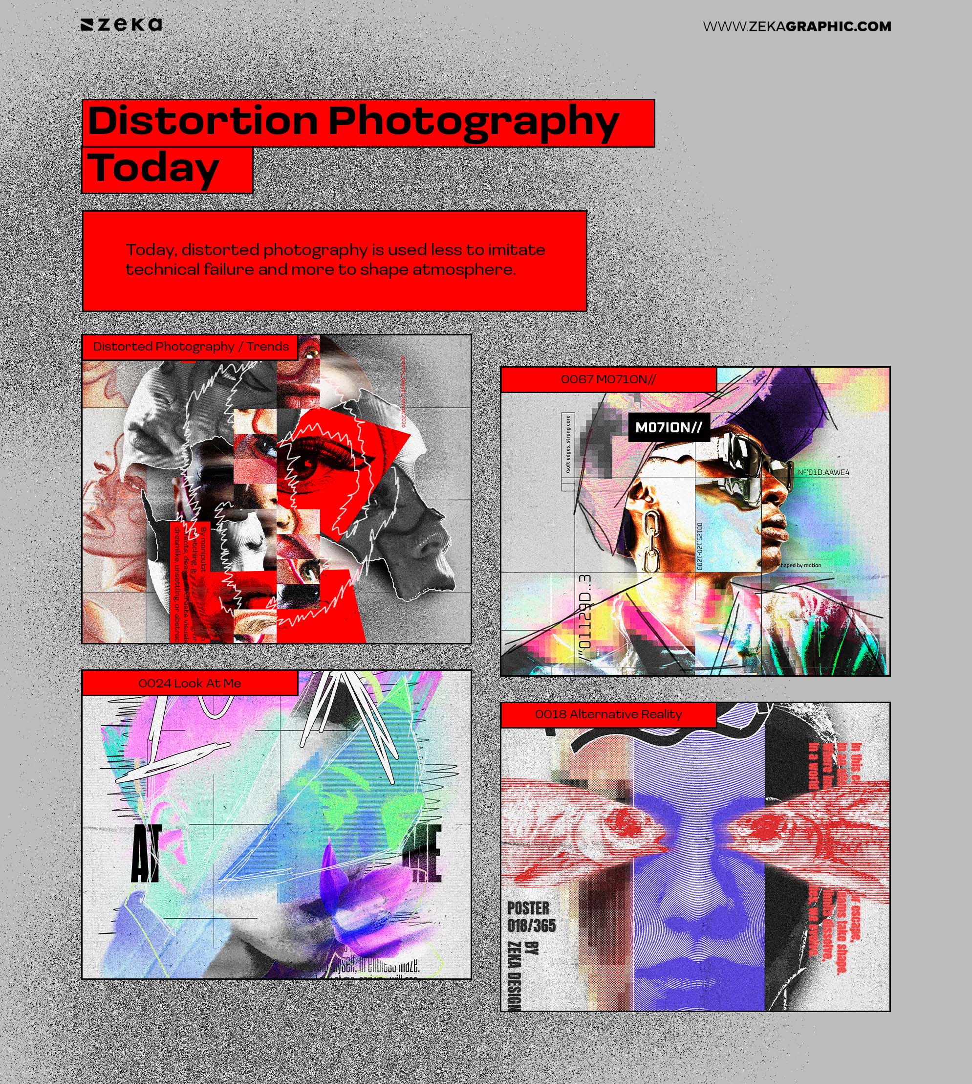
Today, distorted photography is used less to imitate technical failure and more to shape atmosphere. It adds movement, tension, memory, and friction to otherwise static compositions. Photography stops documenting reality and starts interpreting it.
Advertisment
Distorted photography in graphic design isn’t one look. It’s a set of visual decisions that shape how an image is perceived, remembered, and emotionally processed.
Each type of distortion communicates something different.
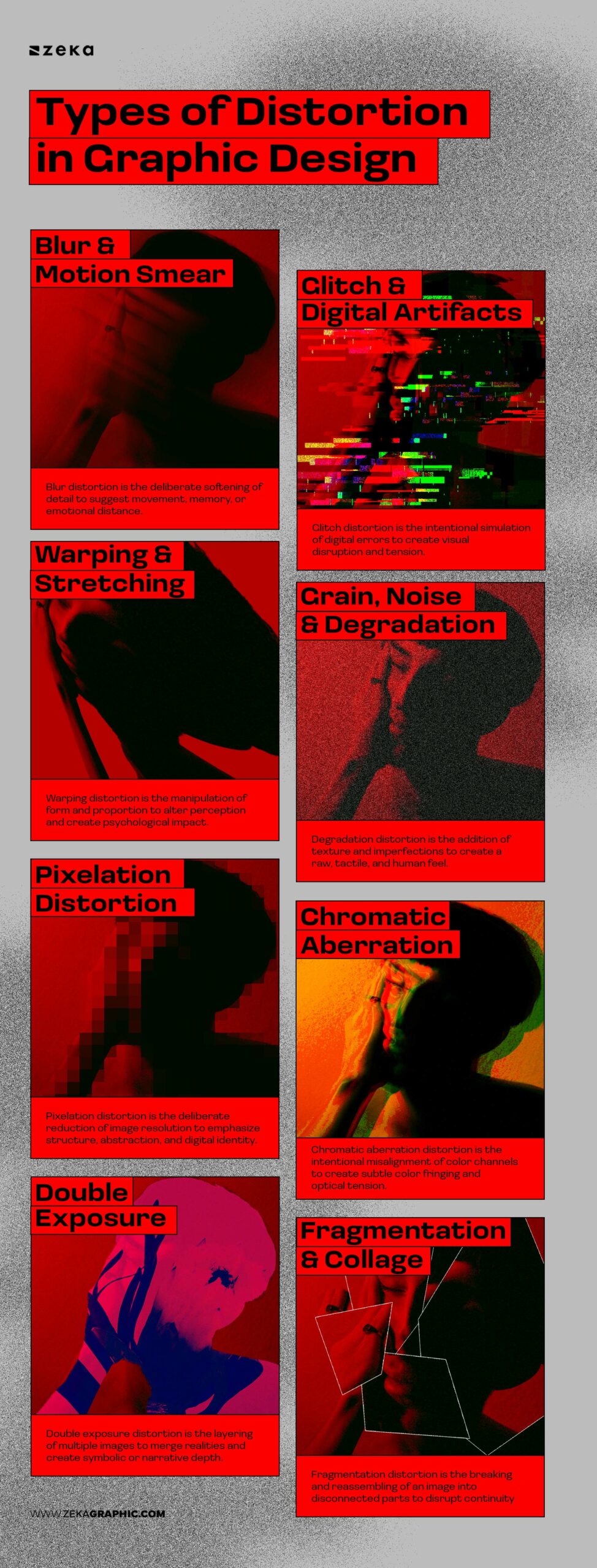
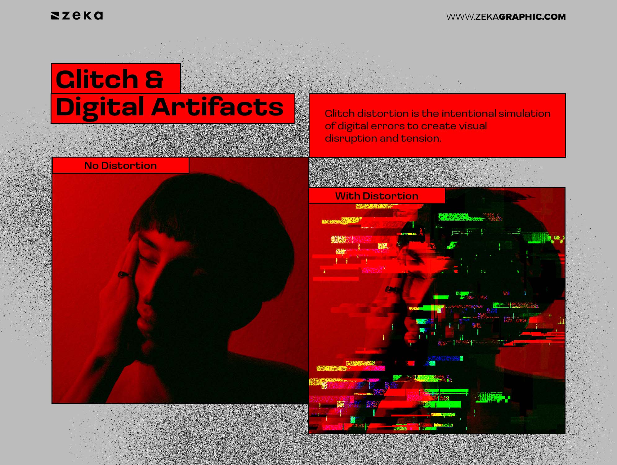
Glitch distortion is the intentional simulation of digital errors to create visual disruption and tension.
Glitch introduces rupture.
Pixel shifts, duplicated frames, compression noise, and broken edges create the feeling that something is interrupting the image. The result is tension—visual and emotional.
Designers use glitch when the message involves disruption, critique, or instability. The image doesn’t present itself as neutral. It resists passive consumption and asks to be interpreted.
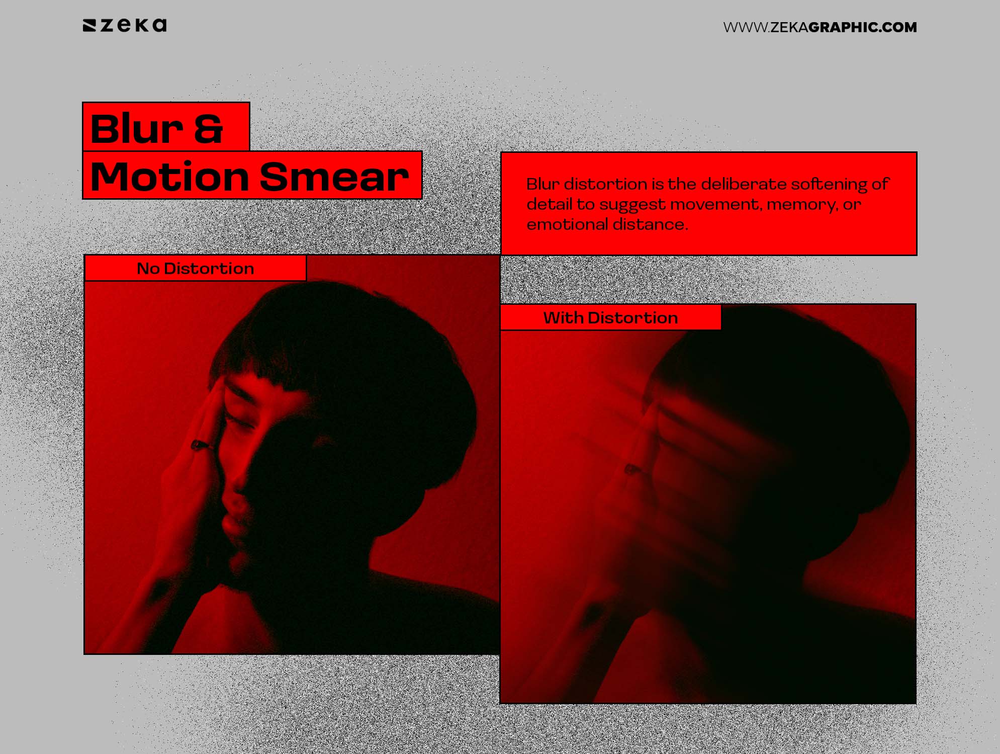
Blur distortion is the deliberate softening of detail to suggest movement, memory, or emotional distance.
Blur removes certainty. It suggests movement, memory, or emotional distance rather than technical imprecision. A blurred subject feels fleeting—something remembered rather than observed.
In editorial and music-related design, blur often functions as emotional abstraction. It communicates mood without spelling out narrative, allowing the viewer to fill in meaning.
Advertisment
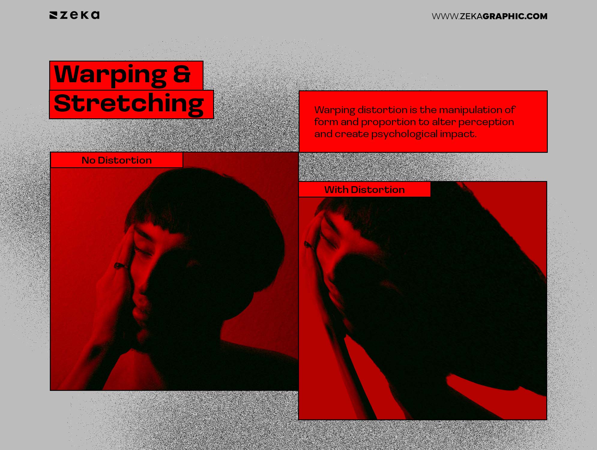
Warping distortion is the manipulation of form and proportion to alter perception and create psychological impact.
Warping bends reality. Faces elongate. Environments twist. Proportions collapse. This form of distortion leans into psychological clarity rather than visual clarity.
Used deliberately, warping shifts an image from descriptive to interpretive. It expresses discomfort, instability, or altered perception—states that straightforward photography struggles to carry.
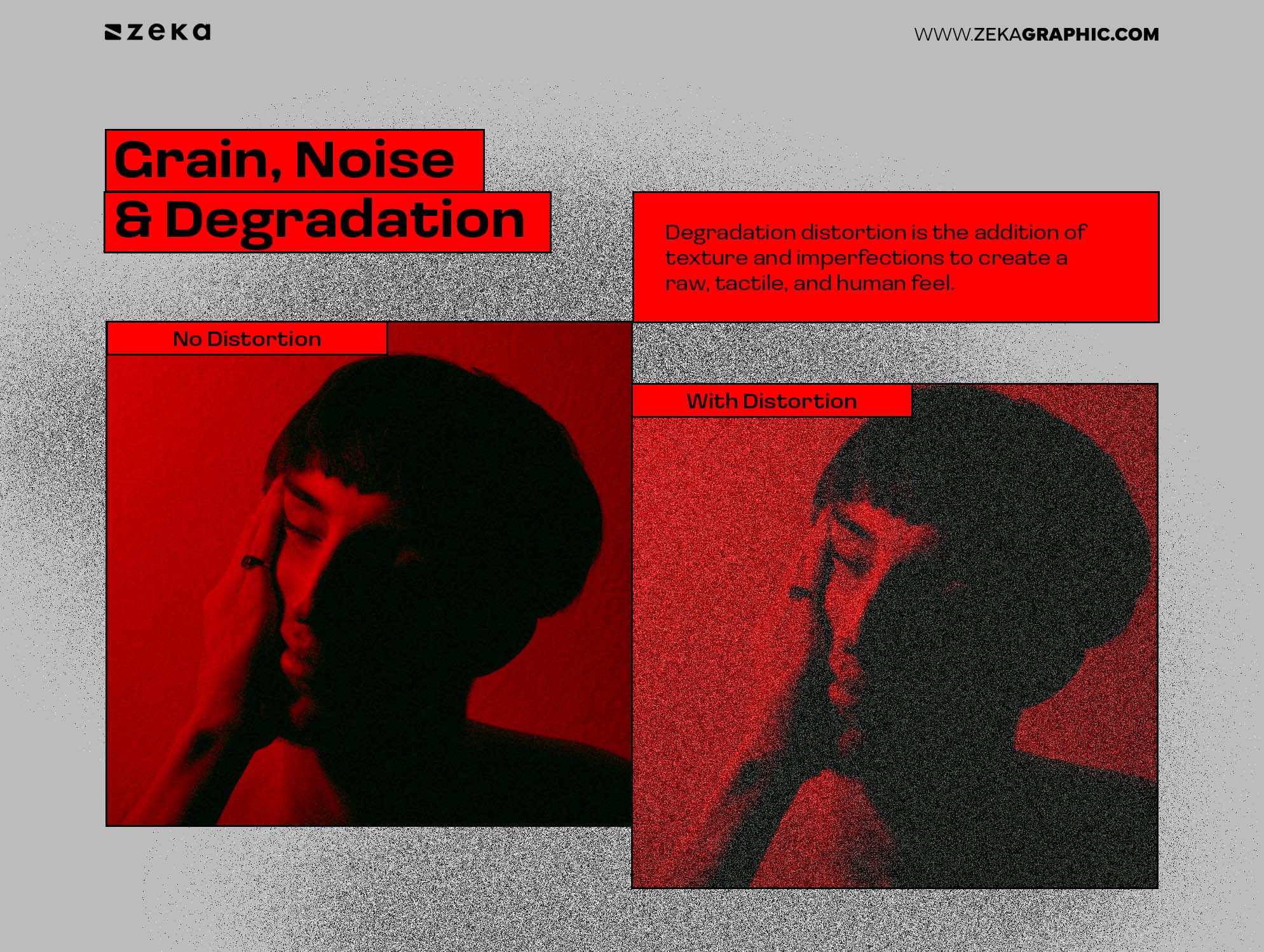
Degradation distortion is the addition of texture and imperfections to create a raw, tactile, and human feel.
Degradation adds texture and intimacy. Grain softens perfection. Noise introduces friction. Degraded images feel handled rather than generated—less polished, more lived-in.
Designers often use this approach to counter hyper-clean branding, restoring a sense of material presence. The image feels touched, worn, or personal.
Pixelation distortion is the deliberate reduction of image resolution to emphasize structure, abstraction, and digital identity.
Pixelation simplifies the image into visible blocks. Details dissolve into grids of color, turning realism into a constructed surface. Instead of hiding the digital nature of the image, pixelation exposes it.
Designers use pixelation to create a sense of nostalgia, anonymity, or technological presence. It can obscure identity, reference early digital aesthetics, or transform images into bold, graphic compositions that feel both raw and controlled.
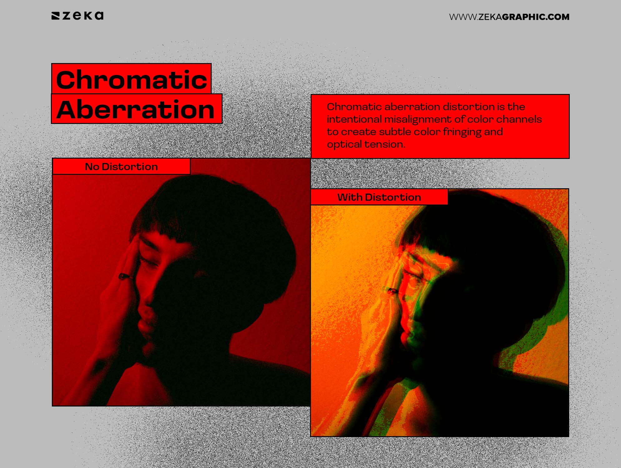
Chromatic aberration distortion is the intentional misalignment of color channels to create subtle color fringing and optical tension.
Chromatic aberration splits the image at its edges. Reds, greens, and blues drift slightly apart, creating halos and color outlines that feel both technical and unstable. It mimics lens imperfections—but when exaggerated, it becomes expressive rather than corrective.
Designers use chromatic aberration to introduce a sense of digital imperfection and visual vibration. It adds energy without overwhelming the composition, often used in posters, music visuals, and experimental branding to create a futuristic yet slightly distorted reality.
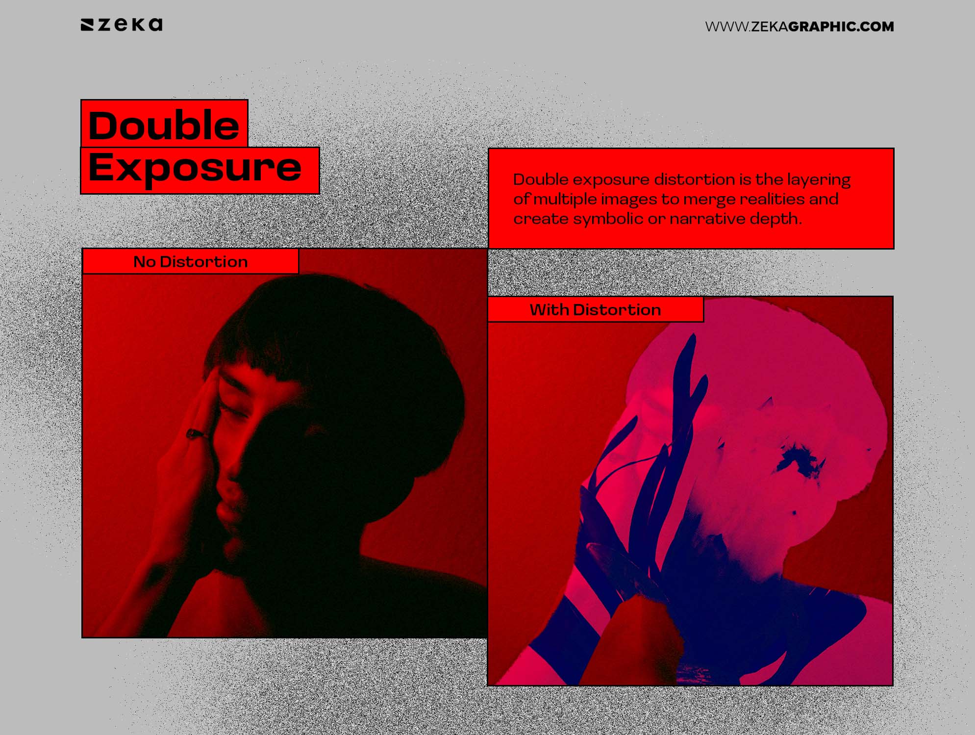
Double exposure distortion is the layering of multiple images to merge realities and create symbolic or narrative depth.
Double exposure blends moments into one frame. Subjects overlap with textures, landscapes, or secondary figures, dissolving clear boundaries between elements. The result feels atmospheric—less about accuracy, more about association.
Designers use double exposure to communicate duality, identity, or emotion. It’s especially effective in editorial and album artwork, where storytelling matters more than literal representation. The image becomes interpretive, inviting viewers to connect meanings across layers.
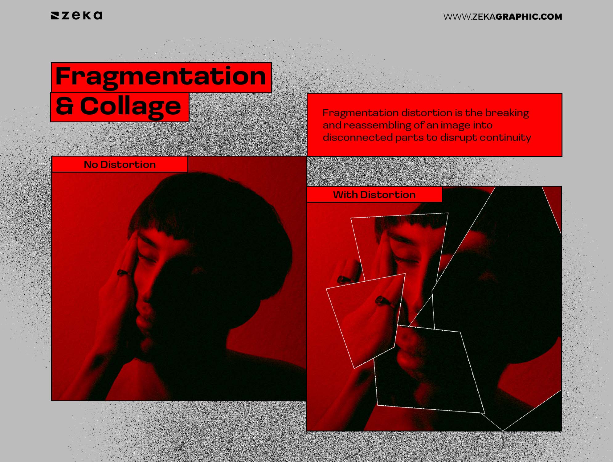
Fragmentation distortion is the breaking and reassembling of an image into disconnected parts to disrupt continuity and create visual tension.
Fragmentation interrupts cohesion. Sections of the image are cut, shifted, repeated, or misaligned. Faces may split. Objects may appear in multiple positions at once. The composition feels constructed rather than captured.
Designers use fragmentation to challenge perception and control visual rhythm. It draws attention to structure, contrast, and composition, often used in experimental layouts, fashion editorials, and contemporary poster design where disruption becomes the focal point.
Advertisment
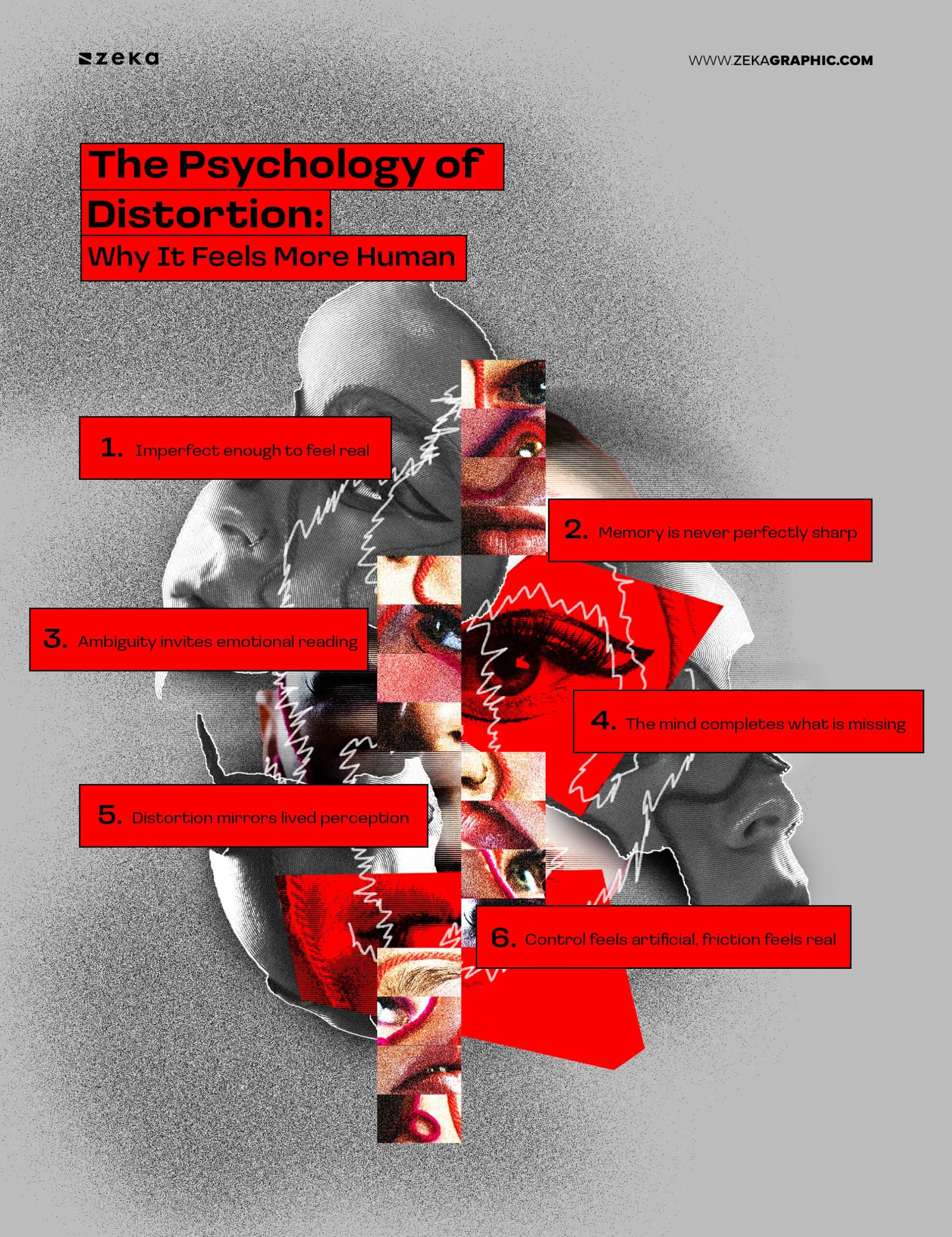
Distorted photography resonates because it mirrors how people actually perceive the world.
Not as perfect frames. But as fragments filtered through emotion, memory, and attention.
Clean images close the loop instantly. They answer every visual question at once. Distorted images leave gaps—and those gaps invite participation.
The brain doesn’t just recognize them. It works on them.
That effort creates emotional friction, which strengthens memory. This is why distorted visuals tend to linger longer than polished ones.
There’s also vulnerability at play. A flawed image feels closer to lived experience. It signals interpretation instead of authority, emotion instead of control. In a landscape saturated with optimized visuals, imperfection reads as human.
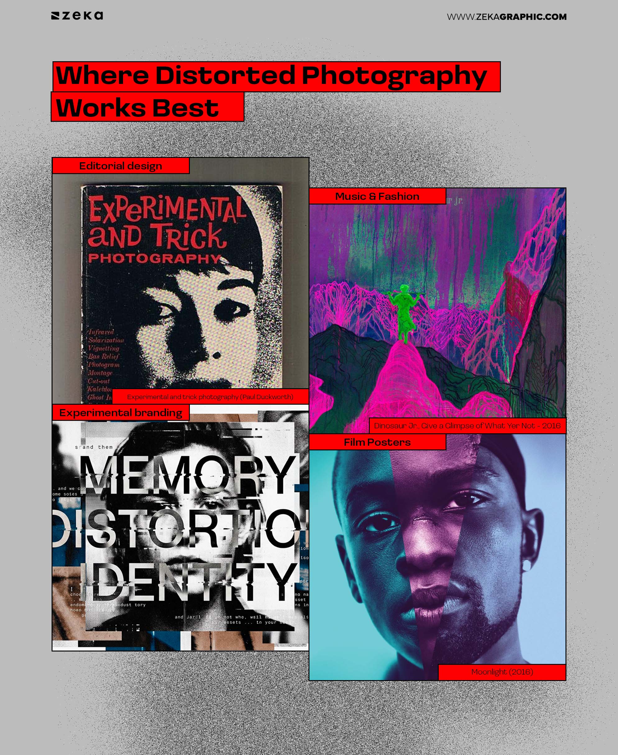
Distorted photography graphic design works best where emotion matters more than speed.
You’ll see it thrive in:
In these contexts, distortion adds depth rather than friction. The image isn’t required to explain—it’s allowed to suggest.
Where it fails is just as important. Interfaces that demand speed, precision, or immediate comprehension collapse under abstraction. In those cases, distortion becomes noise instead of meaning.
The style is powerful—but situational.
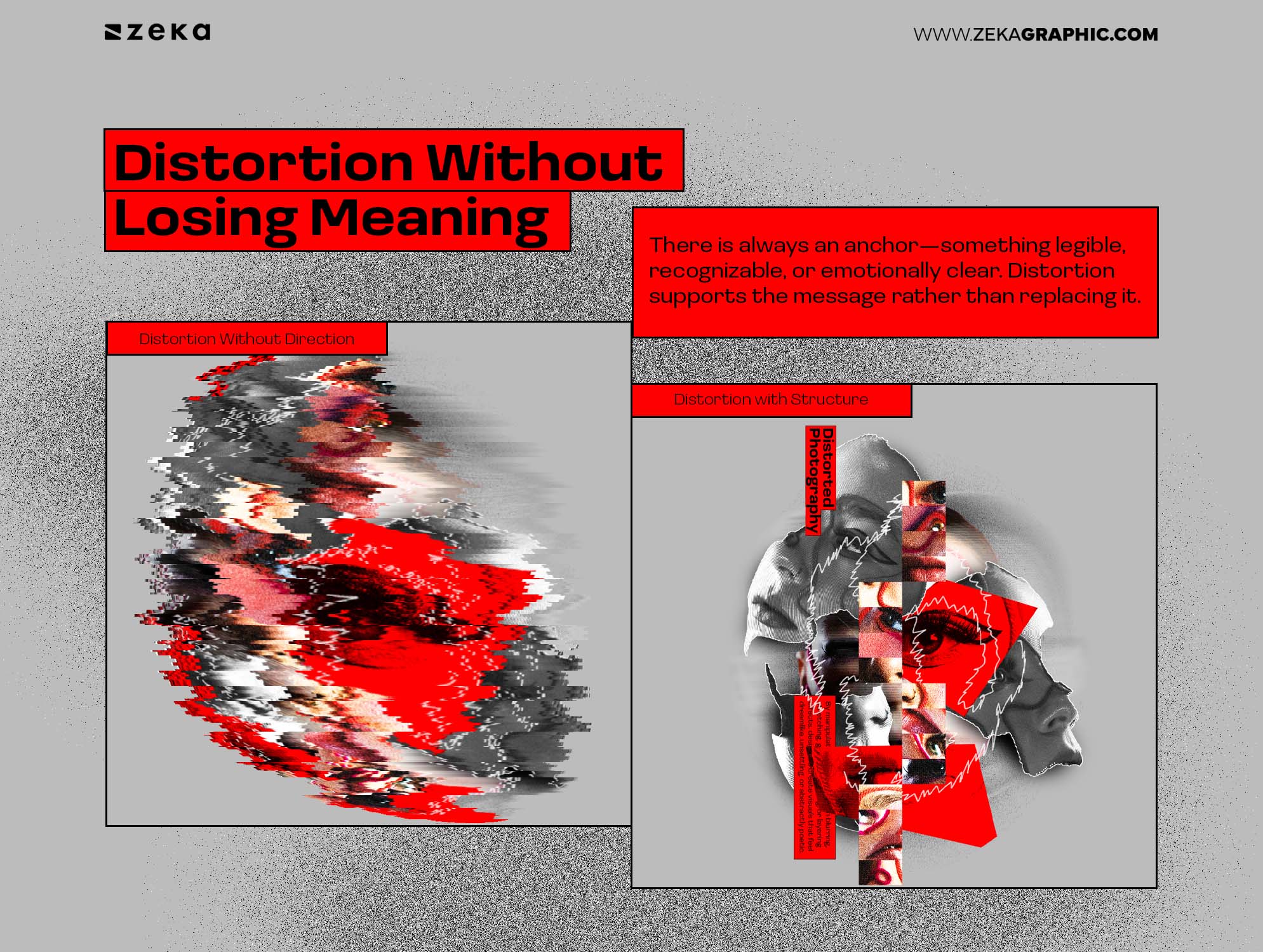
The strongest distorted photography doesn’t abandon structure. It bends it.
There is always an anchor—something legible, recognizable, or emotionally clear. Distortion supports the message rather than replacing it.
This is what prevents over-processing. When distortion becomes the subject instead of the vehicle, emotion flattens into effect.
The distinction is intention.
Distortion works when it answers a question the image couldn’t answer otherwise. When it avoids clarity instead of deepening meaning, it loses purpose.
Advertisment
Distorted photography in graphic design reflects a larger shift away from visual certainty.
Designers are no longer asking how clearly an image explains itself—but how deeply it resonates.
Distortion allows photography to move beyond representation into interpretation. It introduces emotion where clarity falls short and meaning where perfection feels hollow.
In 2026, this isn’t about breaking rules. It’s about restoring humanity to images that have become too easy to understand.
Advertisment
Pin it for later!
If you found this post useful you might like to read these post about Graphic Design Inspiration.
Advertisment
If you like this post share it on your social media!
Advertisment


Want to make your Business Grow with Creative design?
Advertisment

Advertisment