The hardest part of designing a logo is not the software or the budget. It is the blank canvas staring back at you.
A great logo is rarely the most complicated one. It is usually the simplest idea, executed well, that captures everything a brand stands for in a single glance.
The best logo design ideas do not come from copying whatever is trending. They come from your brand’s story, personality, and the feeling you want people to remember long after they first see it.
To get you past that blank canvas, here is a collection of ideas across every style, from modern and minimal to bold and unexpected. Before you start, it helps to know the main types of logos to choose from.
Advertisment
Before the ideas, a quick reminder of what you are actually aiming for, because the goalposts guide every choice you make.
The strongest logos are simple, memorable, versatile, and meaningful. They work in a single color; they scale from a tiny app icon to a billboard, and they say something true about the brand. If a mark survives all four tests, you are on the right track.
Keep those qualities in mind, and every idea below becomes sharper, because an idea is only as good as the brand it serves. Your logo is also just one piece of your wider brand identity, so it should feel at home next to your colors, fonts, and voice rather than fighting them.
A great idea is only the beginning. The execution is what separates a concept on a napkin from a logo a brand can actually use.
Start by sketching several directions on paper, then design in black and white first so you focus on shape and balance before color. Test your favorite at large and tiny sizes, and gather honest feedback before you commit to one. Try it on a real mockup too, like a sign, a business card, or a phone screen, since that is where a logo lives.
If you want a head start, you can begin from a ready-made logo template and customize the colors, fonts, and layout to fit your brand. Tools like these turn a rough idea into something polished in minutes, which is ideal when you need options to react to rather than a blank page.
Advertisment
If you want a logo that feels current, the best modern concepts lean on simplicity and quiet confidence rather than decoration.
For more direction, these are the logo trends shaping 2026, and they are a goldmine of fresh starting points. The trick with modern styling is restraint, since one strong choice almost always beats five competing ones.
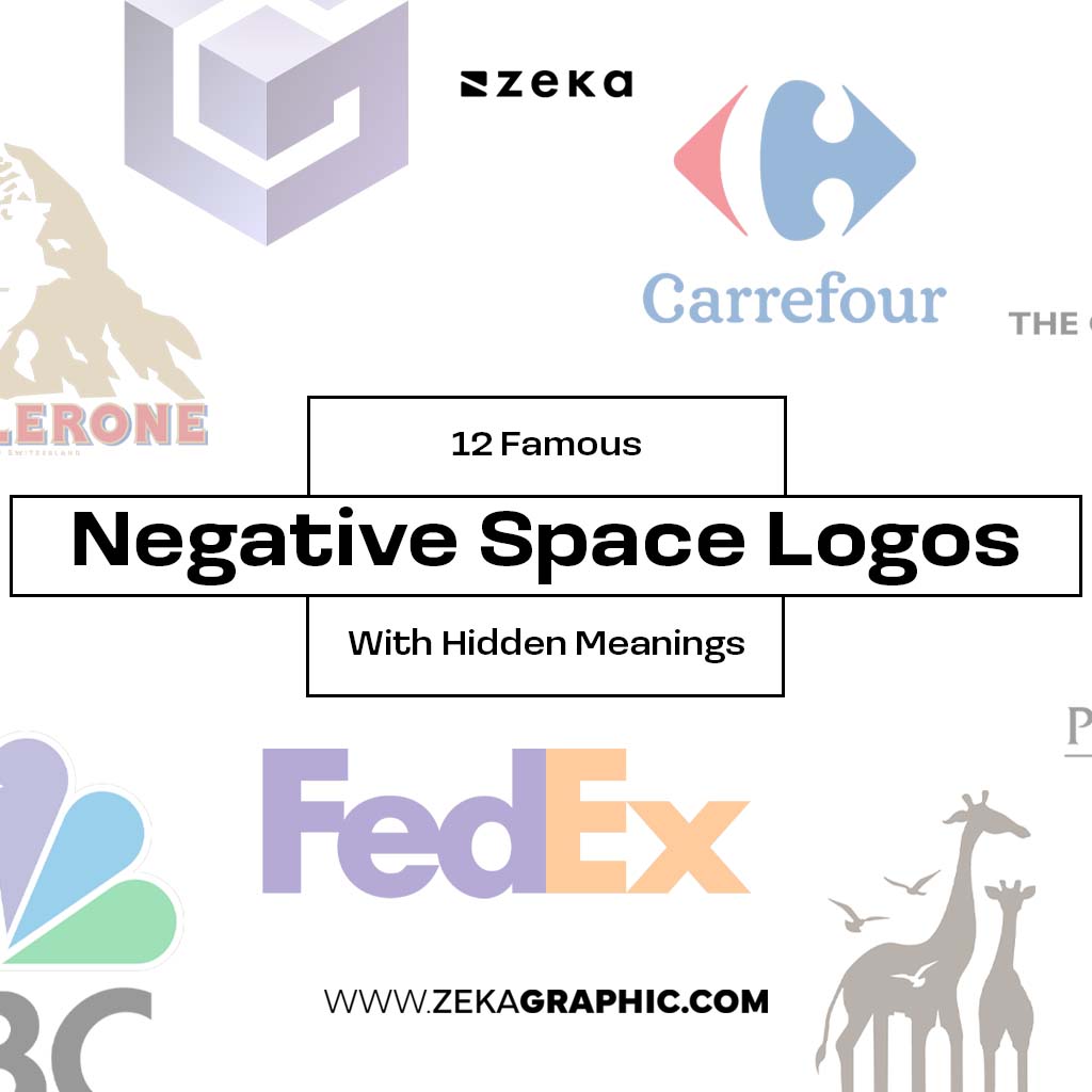
The most memorable logos often hide a clever idea in plain sight, waiting for the viewer to spot it.
Ideas like these reward a second look, which is exactly what makes them stick in memory. A clever concept also gives people a small story to tell about your brand, and that word of mouth is priceless.
If you want to stand apart, the most original concepts push well past the obvious choices.
The goal is not to be different for its own sake, which usually backfires. It is to be unmistakably you, so that nobody could swap your mark for a competitor’s.
Sometimes the strongest logo is just your name, done beautifully and with intent.
A wordmark turns your full brand name into the logo, while a lettermark uses your initials for something cleaner and more compact. The font does the heavy lifting here, so it is worth understanding how fonts shape what your logo says before you choose one. A serif feels established and trustworthy, a sans-serif feels modern and approachable, and a script feels personal and elegant. A small custom tweak to a single letter can make even a plain wordmark feel ownable and impossible to copy.
A strong symbol can become shorthand for your entire brand, the way a single shape now means a whole company.
Aim for a simple, ownable shape that still works at the size of an app icon. Pictorial marks show a recognizable object, while abstract marks use shape and color to suggest an idea or feeling. If your brand lives on phones, follow the rules for designing a logo that works as an app icon, where clarity at tiny sizes is everything. A good symbol earns its keep when it can eventually stand alone without the name beside it, the way the best brands no longer need to spell themselves out.
1. How do I come up with a logo idea?
Start with your brand, not the design. List your values, personality, and what makes you different, then sketch shapes, symbols, and words that capture those ideas. The best concepts usually come from many rough sketches, so give yourself permission to draw plenty of bad ones first.
2. What are the main types of logos?
The most common types are wordmarks, lettermarks, pictorial marks, abstract marks, mascots, combination marks, and emblems. Each suits a different kind of brand, so choosing the right type is one of the first creative decisions you will make.
3. What makes a good logo?
A good logo is simple, memorable, versatile, and relevant to the brand. It should work in a single color, scale to any size without losing clarity, and still feel right years from now. Meaning always matters more than decoration.
4. What colors should I use for a logo?
Choose colors that match the emotion you want your brand to trigger, since color carries strong psychological associations. Many of the strongest logos use just one or two colors, and every one should still work in plain black and white.
5. Should I use a logo template or hire a designer?
Both have their place, and neither is the wrong answer. Templates and AI tools are fast, affordable, and perfect for startups, side projects, or testing an idea before you invest. A professional designer is worth it when you need a fully custom, ownable identity that no one else could have. Many brands start from a template to find their direction, then refine it with a designer as they grow.
Advertisment
The best logo design ideas are not the flashiest ones. They are the ones who capture a brand in the simplest possible form.
Start with meaning, keep it simple, and do not be afraid to sketch a hundred versions before you land on one. The first idea is rarely the best, and the tenth often is.
Whether your brand is modern, playful, or completely unexpected, the right idea is already there in your story. Your job is simply to notice it and draw it out into something people will remember.
Advertisment
Pin it for later!
If you found this post useful you might like to read these post about Graphic Design Inspiration.
Advertisment
If you like this post share it on your social media!
Advertisment


Want to make your Business Grow with Creative design?
Advertisment

Advertisment