For a graphic designer is very important the fonts we use in our design layout, each font has its own attributes and feelings, and the font choice will also depend on what we are looking for in our design and its aesthetic, if you need to write long texts you will look for good readability, and for tittle or small pieces of text you will look more for the aesthetic of the typeface.
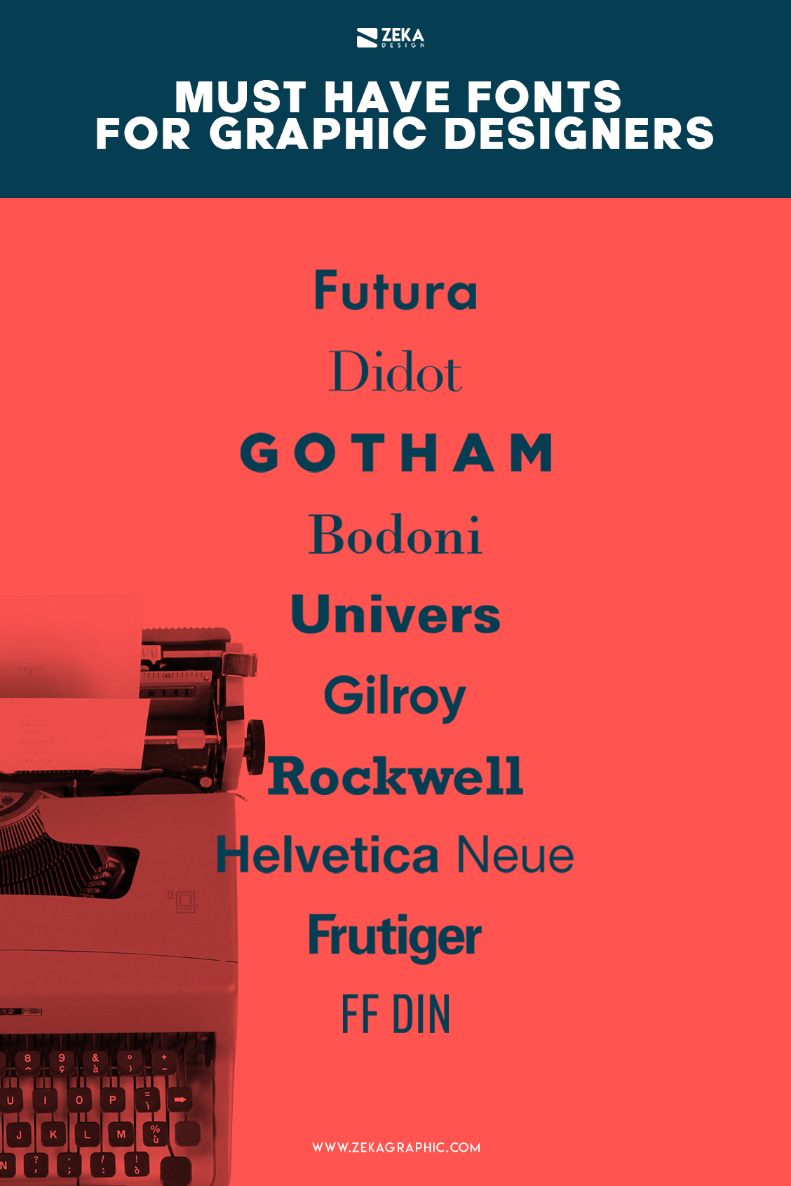
Nowadays there is a big choice of incredible typefaces you can use for different types of graphic design projects, and sometimes it can be hard to choose one font for your design, that is why I make this selection of 10 Typefaces every graphic designer should have that always will look amazing in your font combination! Also you can check out Creative Fabrica to obtain incredible free fonts!
Advertisment
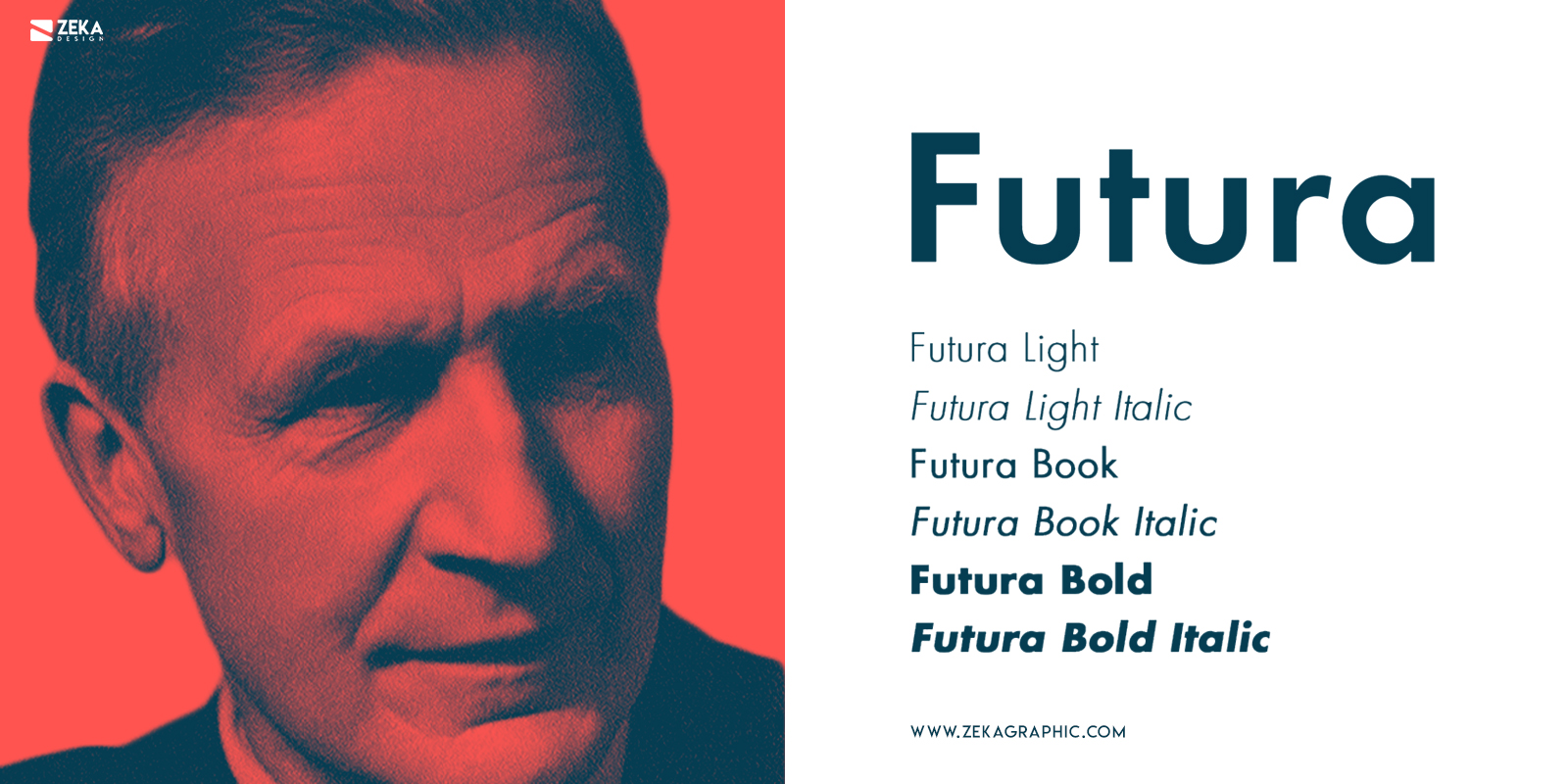
My first choice in this list is Futura, a San Serif typeface designed by Paul Renner in 1927 inspired by Bauhaus graphic design style, Futura is one of the earliest modernist fonts created and it was one of the most important fonts used in the Bauhaus movement despite Paul Renner wasn’t involved with the Bauhaus movement.
The Futura font is inspired by pure shapes like circles, squares, or triangles following the Bauhaus ideology based on functional geometry, and this made Futura one of the favorite geometric fonts for designers. This font is one of the most versatile san serifs and makes your design layout look modern and contemporary without stealing the main focus.
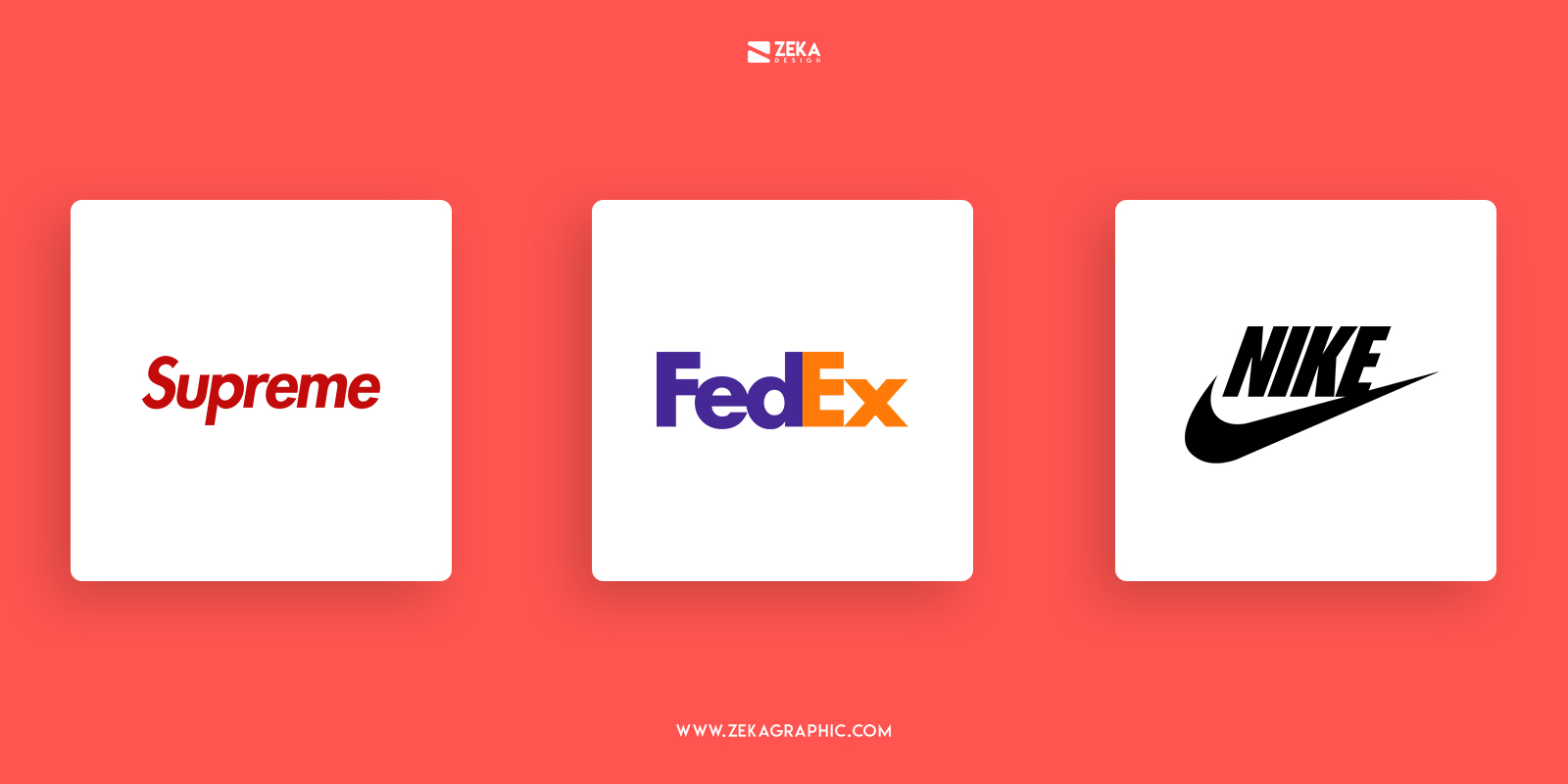
Futura font is one of the most versatile San Serif Typefaces due to his extended family including different fonts and weights that helps Futura adapt to any kind of design project and it works really well on digital and printed environments, this attribute made Futura being used in many logos as Volkswagen, Supreme or FedEx, advertisement design for Volkswagen or Absolut Vodka, and of course, it was used by Wes Anderson and Stanley Kubrick for some of their movie poster design as Space Odyssey and Eyes Wide Shut, it also was used for movie posters as V for Vendetta or American Beauty.
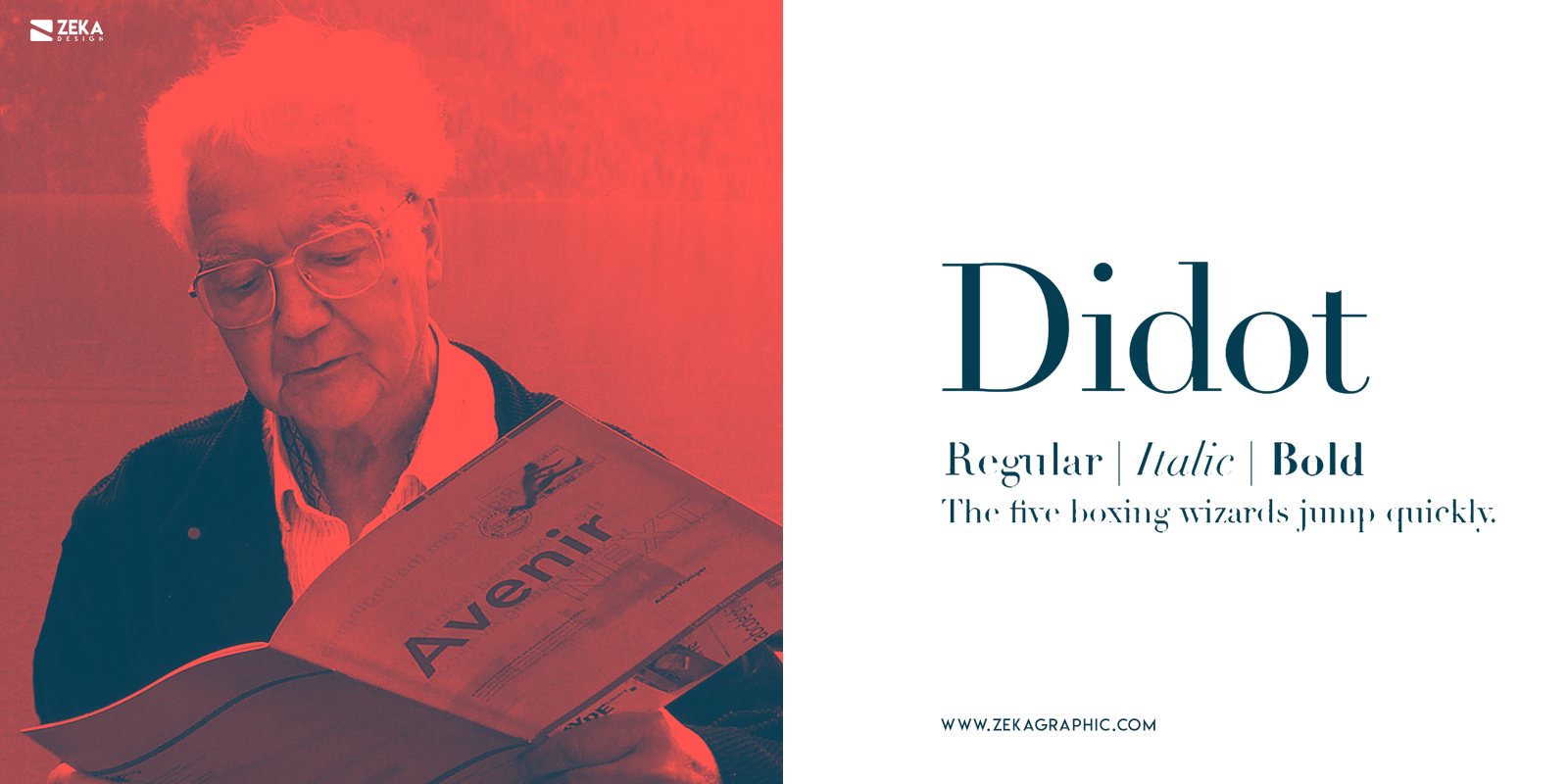
The Didot Typeface is a Serif Typography redesigned by iconic typography designer Adrian Frutiger in 1991 and it’s the version available distributed by Linotype, but this redesign is based on the original Didot Typeface designed by Parisian-based Didot Family in the 18th century and that is why Didot is considered a fashionable font for almost 200 years.
Firmin Didot in Paris and Giambattista Bodoni in Parma which we will talk about later on this post are considered the fathers of the Modern and Neoclassical classification of typefaces. Didot typeface has an increased stroke contrast, condensed armature, hairline strokes, vertical stress and flat serifs.
These attributes make Didot’s typeface perfect for titles or big headers, but unsuitable for body copy due to the high contrast level of this typeface making it difficult to read in some cases. The Didot typeface is a perfect choice if you want to make your design layout look more luxurious and elegant.
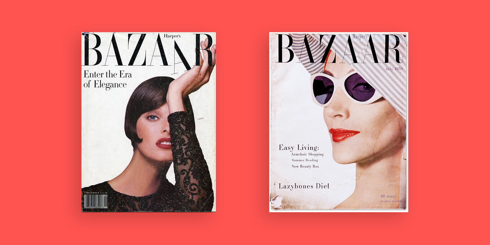
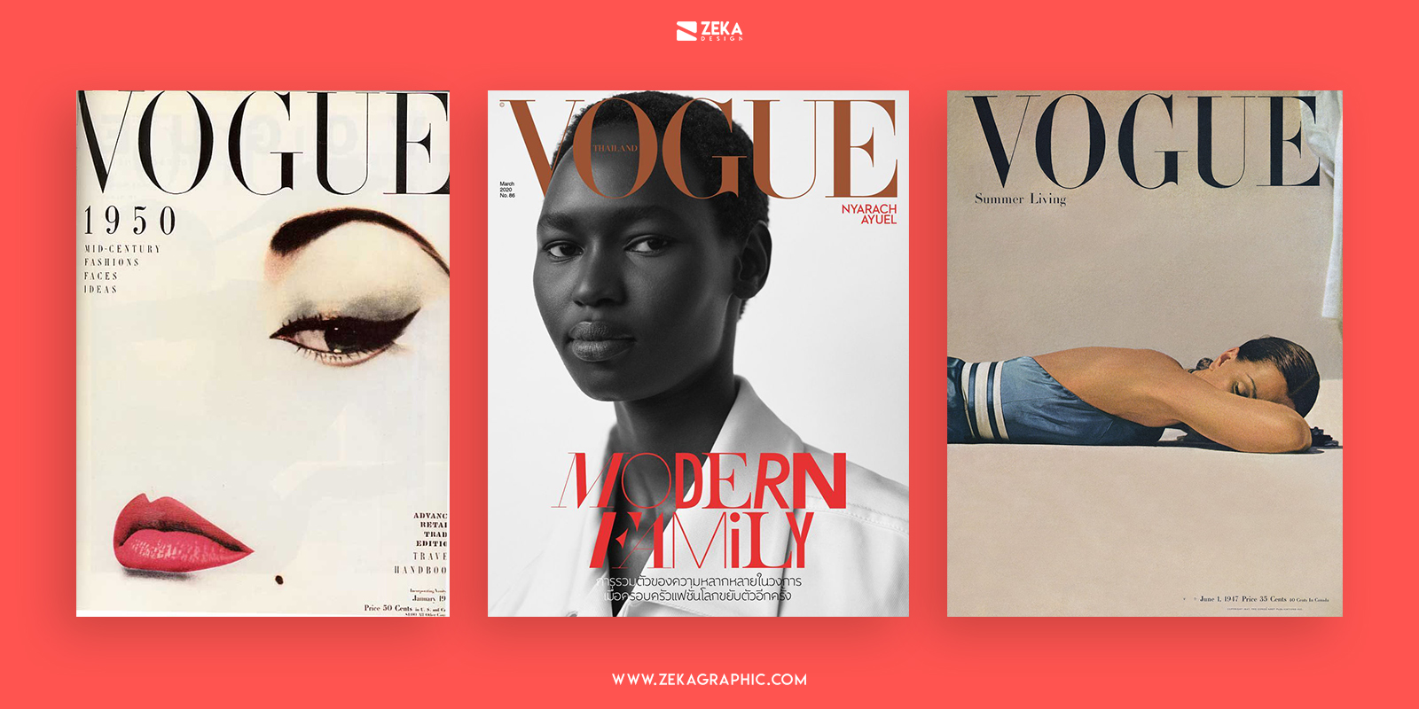
This font was originally redesigned in 1991 to being part of the new Harper’s Bazaar being a complete success, being Harper’s Bazaar a milestone in fashion publishing. The Didot Typeface also appeared in alongside CBS eye logo, Apple, Adobe and more recently in new ZARA Logo Design, and Didot Typeface is really suitable for fashion companies that is why is not a surprise to see this font as early mentioned in Harper’s Bazaar but also appeared in Vogue and some works of designer Louis Vuitton.
Advertisment
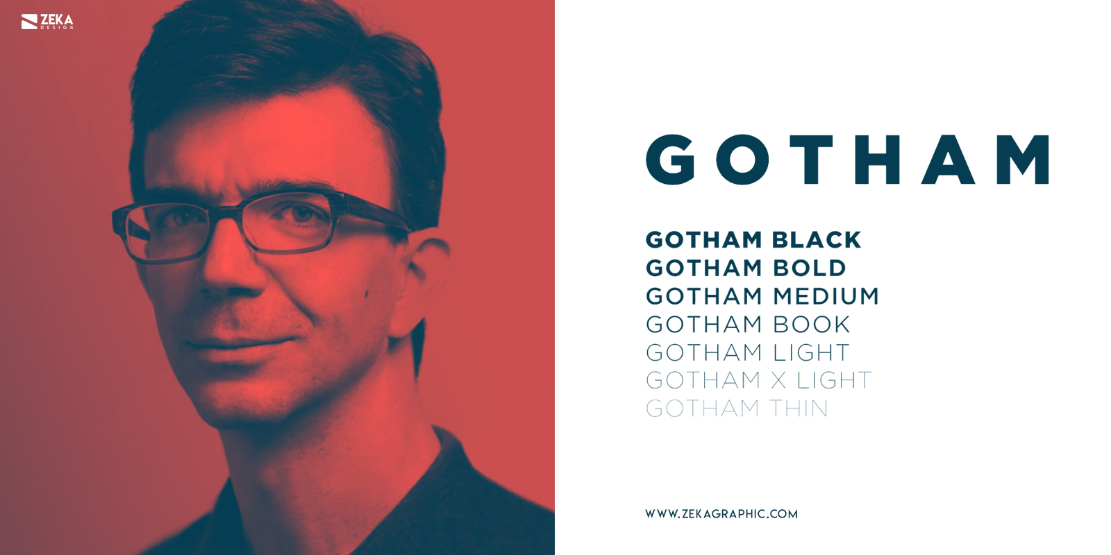
Gotham is a Typeface designed by American type designers Tobias Frere-Jose with Hesse Ragan and commercially released in 2000. Gotham letters are straightforward and non-negotiable but despite that has a great personality and transmit sincerity, and everything written with Gotham is perceived as truth due to its anatomy.
What makes this font special is the fact that it was inspired by the city of New York, taking as inspiration more than 1000 signs and lettering from New York City. The Gotham font is a geometric font and it’s the pure example of American Design Style, making Gotham really suitable for big headers and tittle working really well in Prints and digital surfaces, this fact made Gotham really popular for Print Posters and Web Designers.
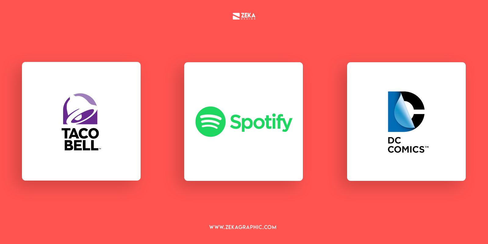
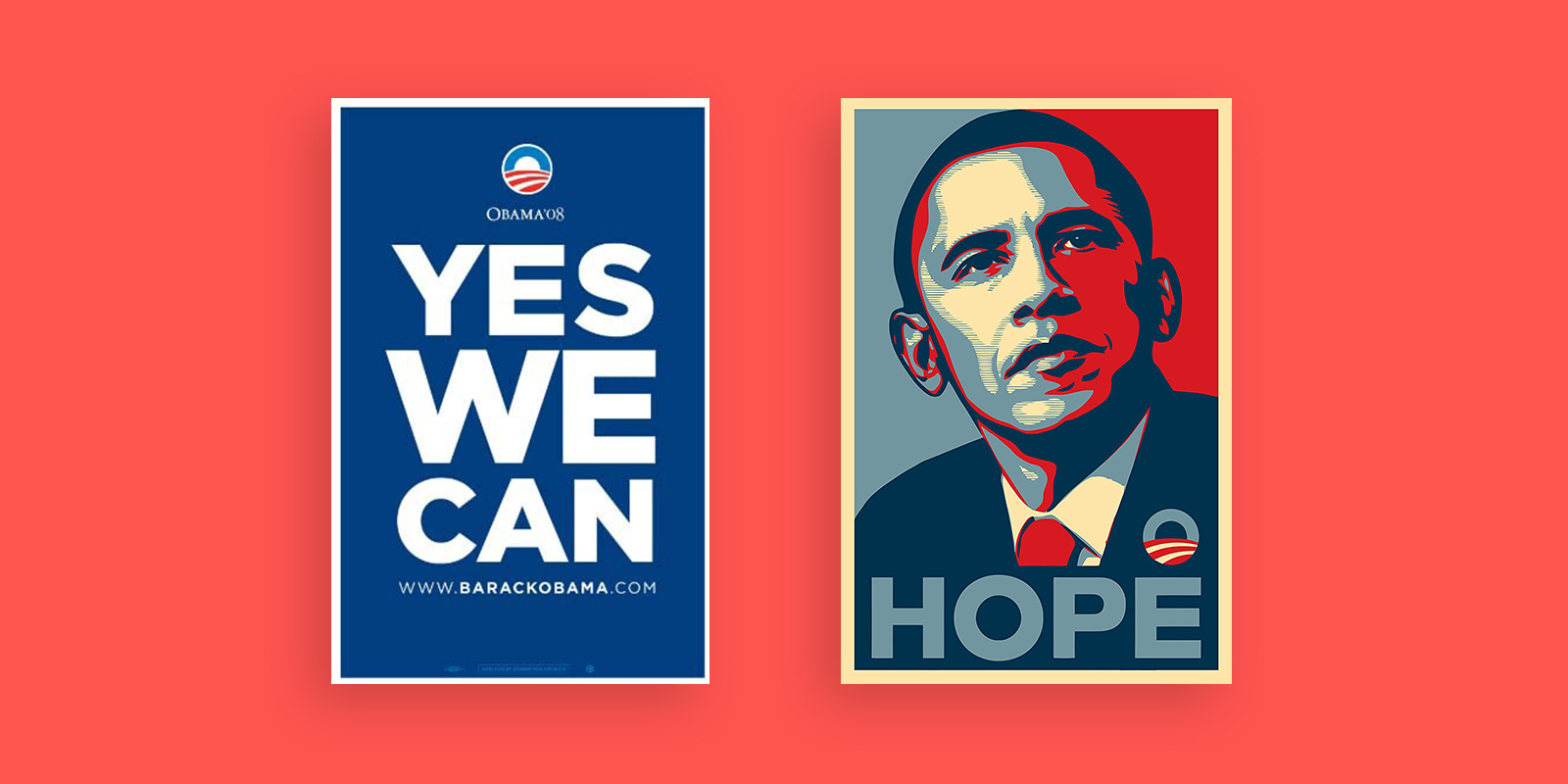
Gotham typeface has a big font family with a huge selection of weights and widths. The American Design Style and his Personality make Gotham appear on the famous Barack Obama “Yes We Can” campaign poster design, also this font is really popular for logo design purposes and you can see it on famous logos as Discovery, New Taco Bell Logo Design, HTML5, DC Comics, Spotify or Polaroid alongside many other logos.
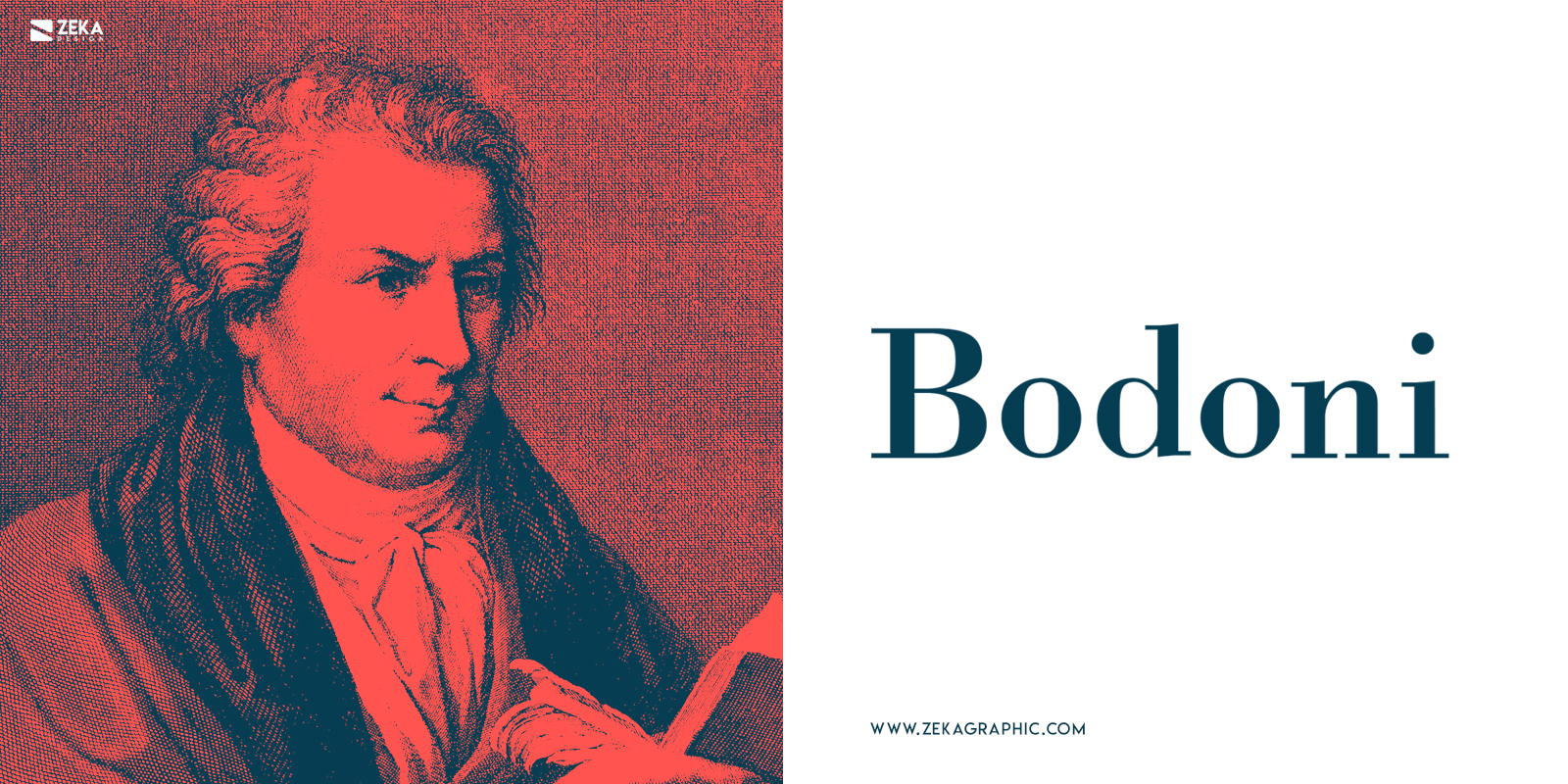
Bodoni was originally designed by Giambattista Bodoni in 1798 inspired by his French competitor Didot Typeface which I talked about before in this post. Bodoni is a transitional serif font from a more serious Baskerville typeface, the current version of Bodoni typeface was redesigned in 1911 by Morris Fuller Benton and now is commercialized by Linotype.
As it happens with Didot, Bodoni Typeface is used for a luxury and elegant look, but the difference between Didot is that Bodoni is a more compressed and exaggerated typeface. Bodoni is an elegant typeface with modern and high contrast serifs, the unbracketed serifs and some geometric styling have made Bodoni a really popular font for Logo Design and titles.
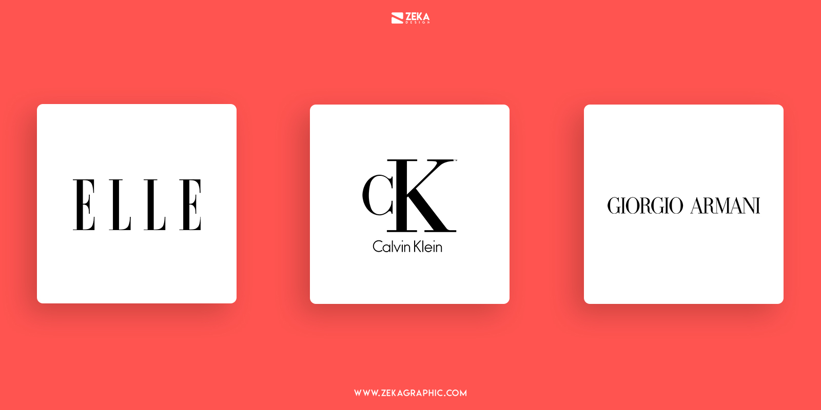
Bodoni typeface has been used for many fashion magazine headers as Harper’s Baazar and the classic architecture magazine Metropolis, it’s also a very popular font for a logo design and it is present in Guerlain, Elizabeth Arden, Giorgio Armani, the classic “CK” for Calvin Klein and the fashion magazine Elle Logo.
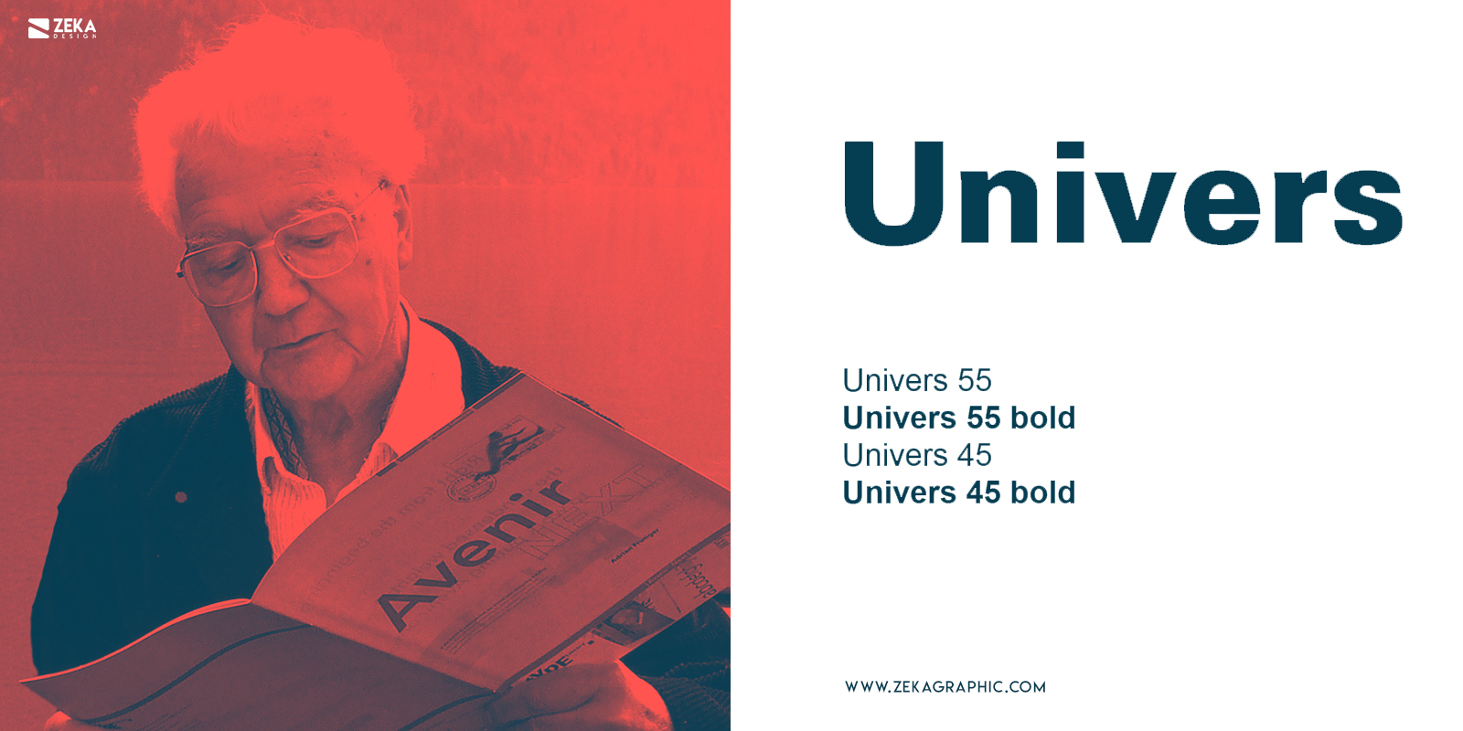
Univers Typeface is the first mega font family covering 21 different font weights, it was originally designed by iconic Swiss typography designer Adrian Frutiger in 1957, and if you want to know the most iconic typefaces of the 1950’s you can check this post where I talk about it!.
Univers typeface is based on 1898’s Akzidenz-Grotesk typeface and the fact that Univers typeface lacks superfluous features of any type make this font really versatile, distinctive and adaptable to any kind of graphic design project. It’s a clean, functional, and very legible typeface that made Univers really used in different design layouts and graphic design projects, it can work really well for magazine layouts, flyer design and web design.
This high readability made Univers a popular font for graphic designers and it was used for many corporate branding projects, you can see Univers on Apple laptop keyboards before switching to the VAG Rounded, Bay Area Rapid Transit System, Germany’s Frankfurt International Airpot signs and Montreal Metro System alongside many other design projects.
Advertisment
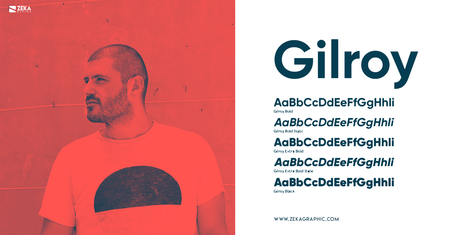
Gilroy is a relatively young typeface compared with some we already have seen on this post, it was designed in 2016 by typographic designer Radomir Tinkov and contains 20 different styles and weights.
This typeface is a modern sans serif font with geometric details perfect for modern graphic design layouts. It was designed with powerful OpenType features in mind and it supports a large number of languages including Cyrillic and this font works really well for web design, print design, signage, corporate branding, and editorial design.
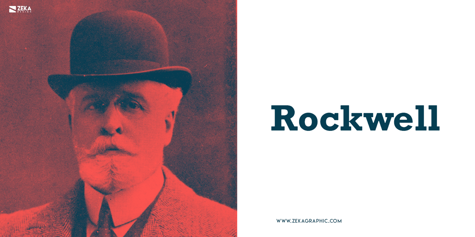
The original name for Rockwell was Litho Antique and it was produced by Inland Type Foundry in 1910 and designed by William Schraubstadter originally, later it was revived by Morris Fuller Benton in the 1920s and named Rockwell and lastly the last version of Rockwell was released in 1934 by Monotype and it was redesigned by Frank Hinman Pierpont.
Rockwell is a Geometric Slab Serif constructed almost by straight lines, perfect circles, and sharp angles. The x-height with the stroke width helps Rockwell to provide a strong presence with some blocky feel, and the perfect use for Rockwell typeface is for headlines in printed or digital surfaces, but it’s not suitable for body copy because it will be hard to read it.
This typeface is really popular among graphic designers with a clear American style, and it was used in many design layouts, poster design and logo designs, some of the places you can see this font are Guinness Book of Records, Malibu Rum Logo design, Marshall Amplifiers and you also can see Rockwell font in some Vogue posters and magazine advertising.
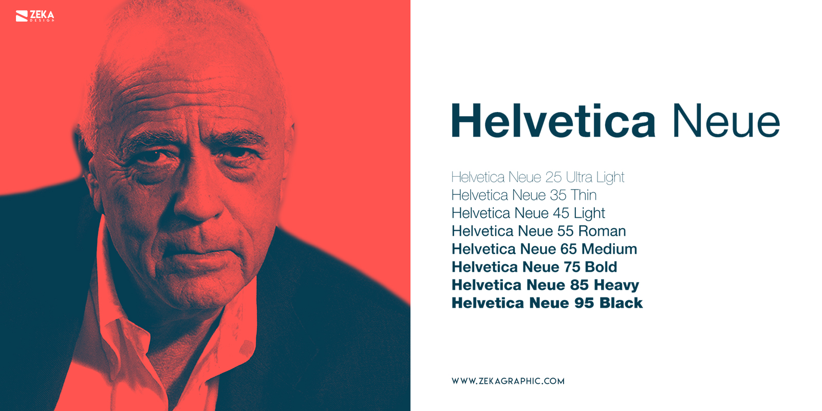
Helvetica it’s the most popular typeface in history and it is an obvious entrance on this list, I already have talked about Helvetica in my post about the most iconic fonts of the 1950s which you can check!. Helvetica was designed by Swiss Typographer Max Miedinger in 1957 and originally released by the name “Neue Haas Grotesk” and it was inspired by Akzidenz Grotesk typeface which was released in 1896.
In 1961 Stempel Type Foundry acquired Haas Type Foundry and it was then when they renamed the “Neue Haas Grotesk” to Helvetica for commercial purposes and it was a complete success. The Helvetica name comes from “Helvetia” the Latin name for Switzerland and they took this decision to transmit the Spirit and heritage from this typeface.
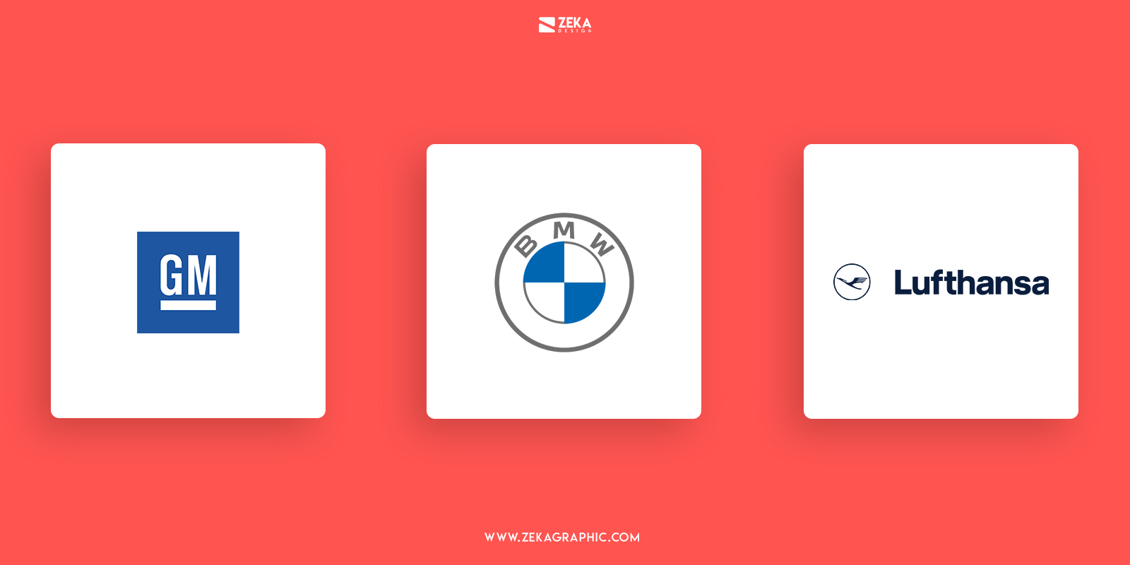
Helvetica typeface is one of these fonts that can be used for everything, this font follows the Bauhaus principles to embrace the function over the esthetic, and that is why Helvetica’s main focus is to support the reading process making it a font which the main goal is clear communication. This fact made Helvetica a really popular font for any kind of graphic design project and you can see it on tons of logo designs, some of them are BMW, Panasonic, Jeep, Lufthansa, General Motors, Microsoft, American Airlines, Toyota and the list goes.
Advertisment
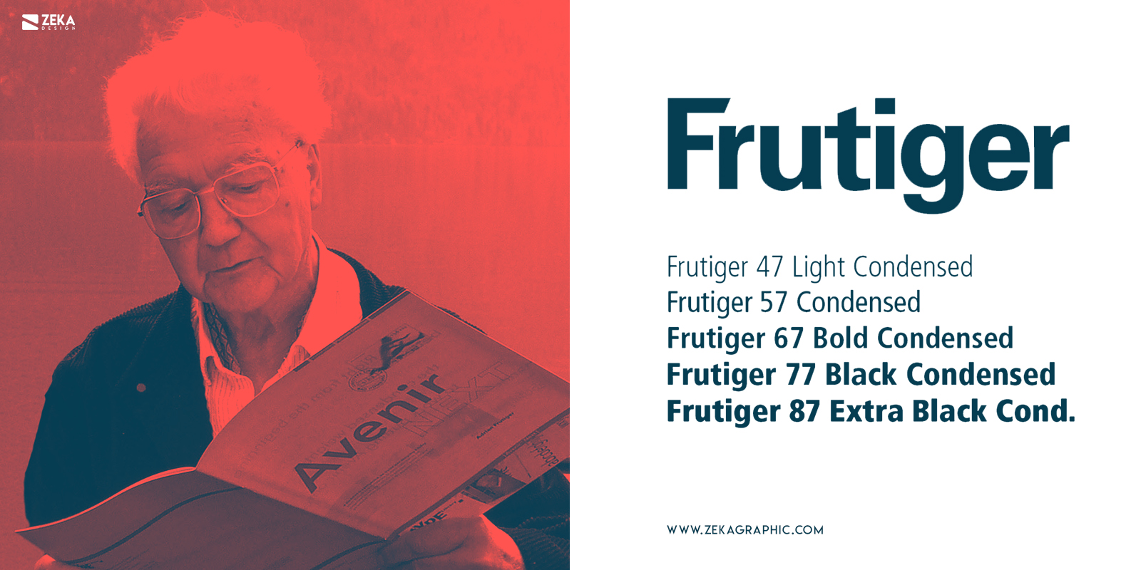
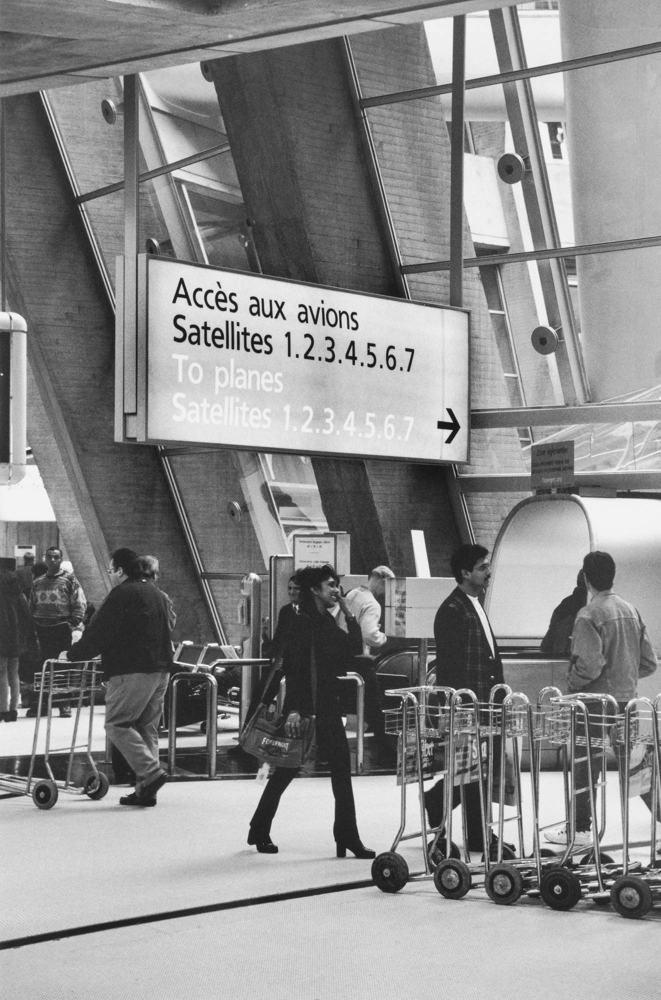
Frutiger is a typeface designed by an iconic typography designer that we already have mentioned on this post, Adrian Frutiger who is also the designer for famous fonts as Avenir or Univers, Frutiger Typeface was originally designed in 1968 to be used inside France’s Charles de Gaulle Airport signages.
The main focus on Frutiger Typeface is readability, the intention was to be easy to read in large distances and different angles. Frutiger font combines the legibility of humanistic sans serif typeface with geometric lines of Univers font, these attributes make Frutiger a distinctive font ideal for different types of uses.
In 1976 Adrian Frutiger expanded this typeface and commercially released by Stempel Typeface Foundry, this makes that this font was used in a great variety of graphic design projects and logo design and nowadays you can see Frutiger Typeface on brand identities of the British Royal Navy, Telefonica O2, DHL, Flickr logo design and Nutella logo alongside many other design projects.
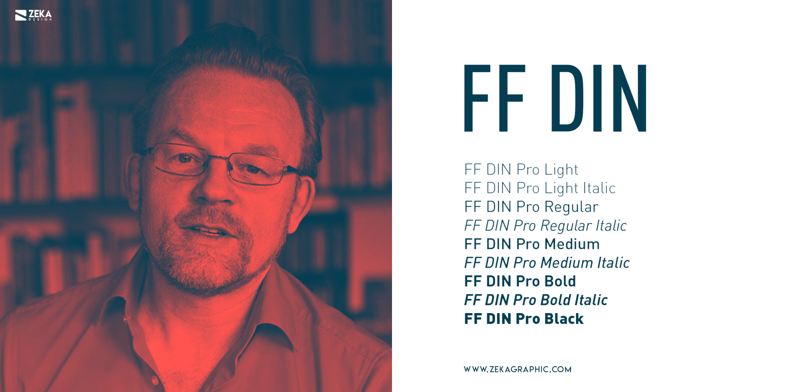
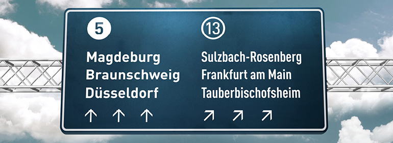
The last typeface on this list is FF Din, a San Serif mega font family with 55 different styles and weights, it was designed in 1995 and 2000 years by Dutch typography designer Albert-Jan Pool. The DIN type style refers to industrial-strength sans serif design and this acronym comes from the german name “Deutsches Institut für Nurmung” which translated will be German Institute for Standardization, and this font was originally made for the identification of railroad cars in Germany.
The FF Din typeface was originally inspired by German Standards Organization font number DIN 1451 which was used in German public administration and Signage. The FF Din typeface has more height than width making it a perfect choice for vertical signage, and the different style variation makes FF Din perfect for Headlines and Large copy, but despite this factor, we can also use FF Din in different Graphic Design projects as a brand and identity design, headers, and Logo Design.
We can see FF Din typeface on German railroad signage and it also was used by a famous brand as Adidas and Panasonic alongside many other design projects.
Advertisment
As I mentioned at the beginning of this post, there is a wide option of incredible typefaces you can choose for your graphic design project, but sometimes this big variety can make graphic designer confused about which font is better, that is why I created this list, with the 10 typefaces that are always a good choice for any design project!
Hope you find this post useful and make your font choice easier, and if you want to discover more about typography design you can read my beguinner’s guide about typography or you can check this post about the most iconic 1950’s typefacesor see my other typography design posts.
If you found this post useful you might like to read these post about Typography Design Inspiration.
Advertisment
Written by
If you like this post share it on your social media!


Advertisment

Advertisment