It might be a surprise that logos like Nike, Adidas or apple, are not included in that list due to to the fact that they are big companies present worldwide, but their logos were made in their beginnings and practically didn’t need any big change, what we will look on that list, are big companies which need to rebrand their entire brand and identity design.
For big companies with many years of existence and already build a reputation as some we will see in this post it’s really important to have a good a distinctive brand and identity design to preserve they are already building a reputation and transmit new ideas and philosophies of the company, that is why these companies make huge investments on their logo design, there is no room for mistake, and having the right logo for their companies can make the difference between success and failure.
Advertisment
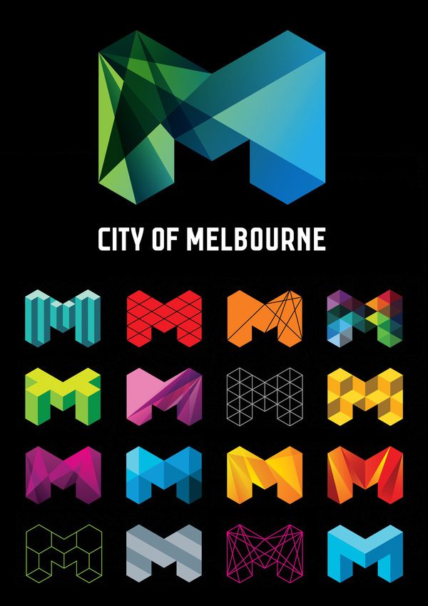
In 2009 the city of Melbourne was evolving and it started to define the city as a trendy and progressive city adapted to the new changes and today’s world, that is why they need a new logo design to represent these new changes in the city.
The new logo design for Melbourne City was designed by the Sydney office of Landor Associates has become an iconic image for Melbourne due to the sharp lines and variants shades of green and blue which represent Melbourne new corporate power and the new values of the city, modern, vibrant and cool, characteristics which this Logo Design achieved.
Landor Associates also designed a whole brand and identity design their new logo for the city of Melbourne has and positive impact in the city and good adaptability on it, this logo achieved to captivate the vibrant and dynamic city of Melbourne, that is why it was greeted with positive reviews.
Advertisment
Every 4 years there is a big event in the world, and it’s the Olympics, and due to big money earnings and the competitive behavior of the host cities which want to host a better Olympic Games that the previous to increase their reputation, that is why every 4 years the city which host this event make a huge investment.
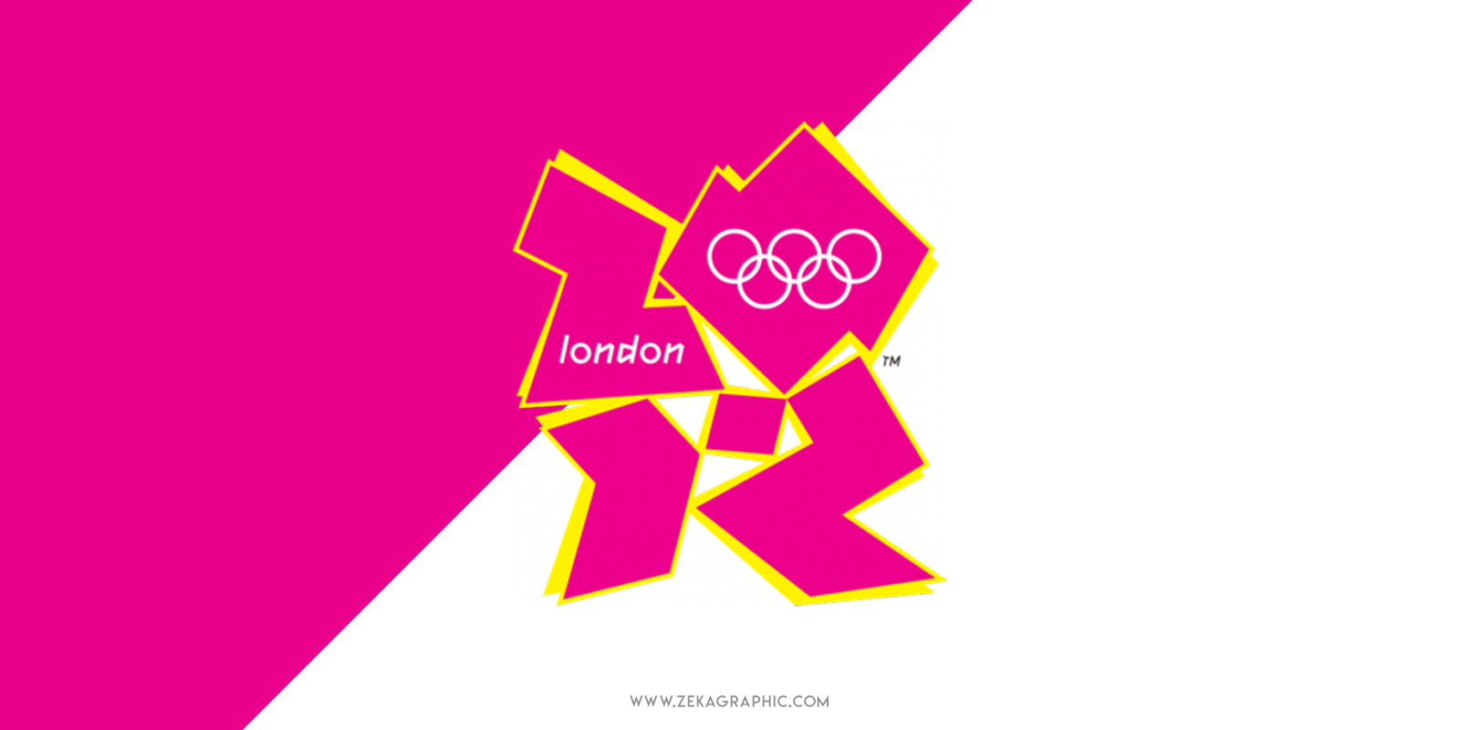
This investment not only goes to sports centers or tourist attractions, but it also includes the investment in logo design and brand and identity design, that’s the case of the city of London which spent $625,000 on its Olympic Logo Design.
The idea of the designer was to recall the cubism art style and recreate the London architecture style, but due to the abstract anatomy of the logo it was received with a lot of criticism and many people dislike it because it didn’t feature any cultural insight or historical landmarks.
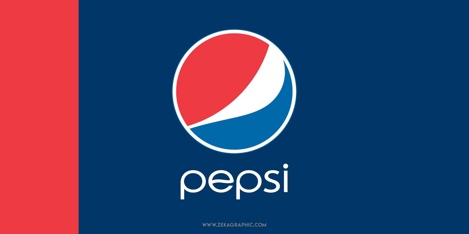
Everybody knows Pepsi because they are a well-established company in a worldwide market, and it’s also well known for their battle with Coca Cola to dominate the sweet carbonated drinks sector. That is the context to understand the price Pepsi paid for their new logo design and brand and identity design.
As we talked about in the introduction, as Pepsi was already a well-known brand, they wanted to preserve their original colors but adapt their brand to the current trend of flat design, and the red color is more prominent in the new Pepsi Logo.
The principal reason for this logo rebranding was to adapt Pepsi brand to current design standards and compete with Coca Cola and increase their presence globally, at the moment they didn’t succeed in overcoming Coca Cola, but talking strictly about design, it was a complete success.
Advertisment
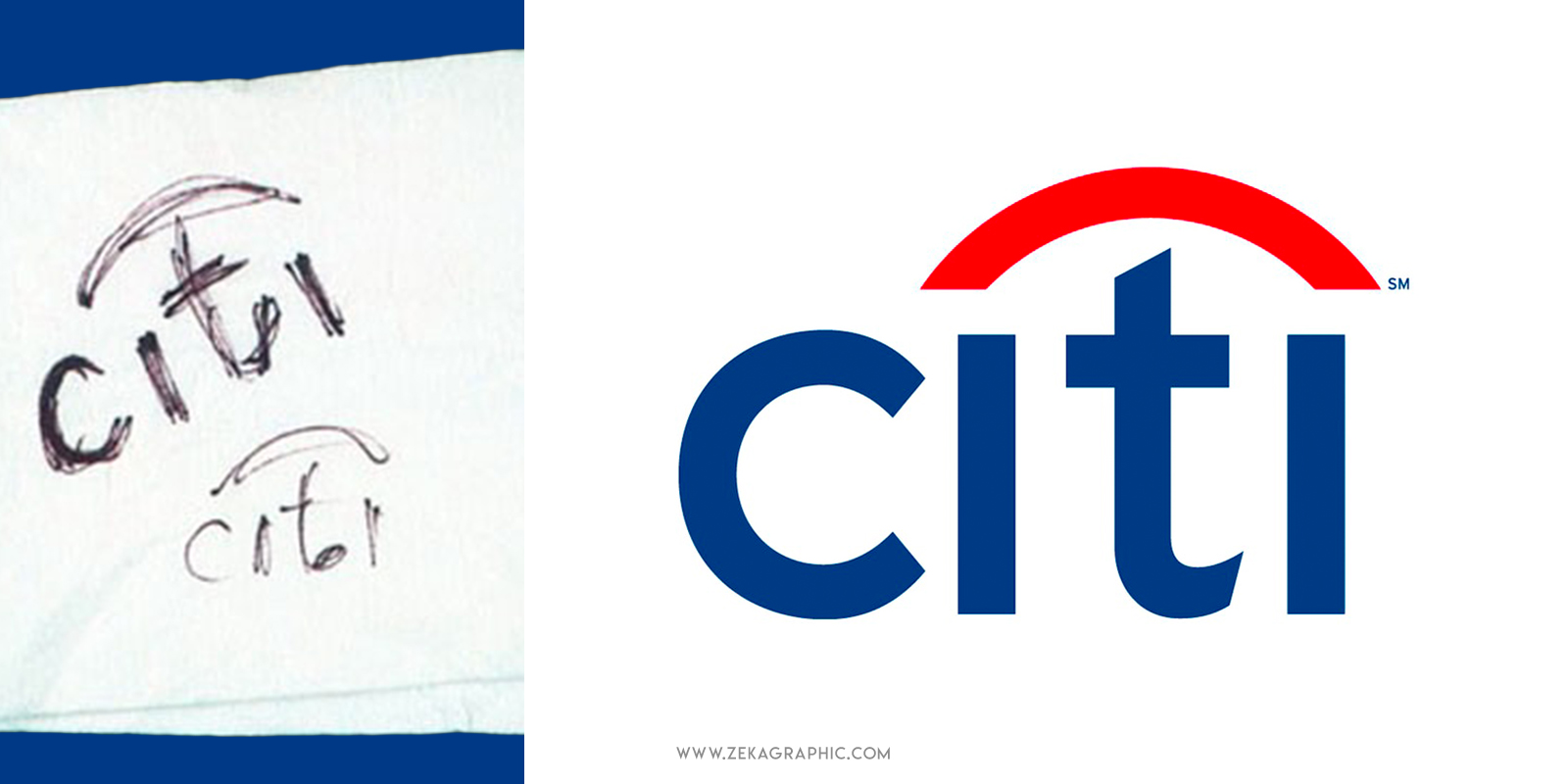
Maybe if we are talking about bank companies and logo design, the first image that comes to your mind is the Citibank logo, which was created more than twenty years ago, so we can say that the price paid for the new logo design was worth it, but this logo has a really interesting story.
In 1998 the companies Citicorp and Travelers Group merged to form Citigroup, and they hired the New York-based design agency Pentagram led by the iconic graphic designer Paula Scher to design the new logo for Citigroup’s new consumer division, Citibank.
Paula Scher and her team had a meet with Citibank officials, and while they were speaking about the new logo and what they want about it, Paula was making sketches in a napkin and after 5 minutes, she showed the napkin to Citibank official and said “this is your logo”, that is how it becomes the 1.5 million napkin.
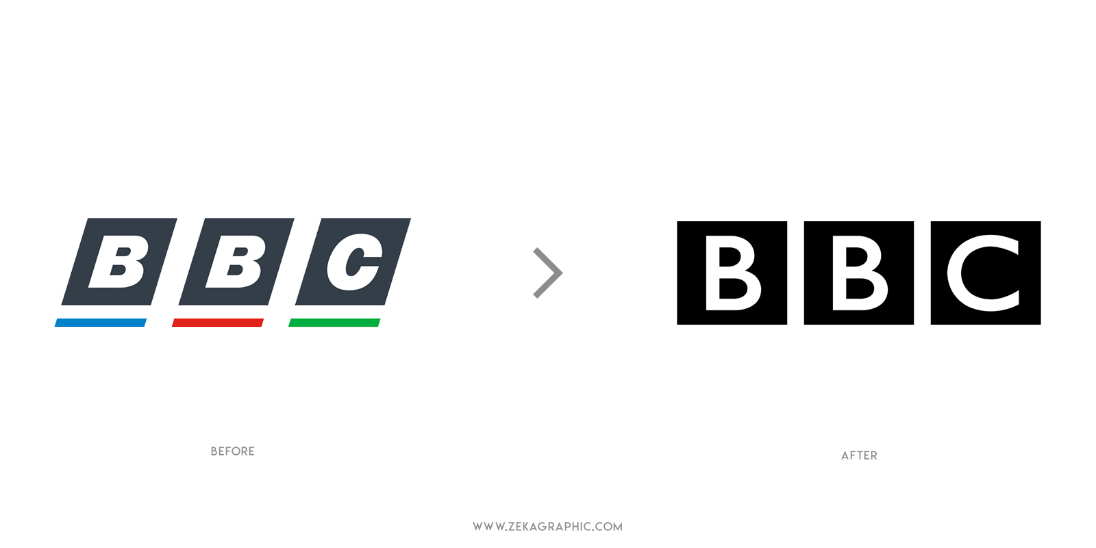
BBC is one of the most well-known brands if you think about media and news. Usually, BBC is associated with reliable and fresh information by the users and they wanted to preserve these attributes in their new brand logo.
The BBC had different logos since their history, but since the late 50s it hasn’t made any dramatic change to its logo to preserve recognition, the last change was made in 1997, and in this new version of the logo, they moved away from italic letters and simplified it.
The new BBC logo is simpler, using white light typography in contrast with black bold squares, the designers behind this logo were looking for minimalism (discover the 8 rules of minimalism) and used the squares to transmit unambiguity and reliability, characteristics really important for a news media if you want to learn more about shape psychology you can check this post!
The ANZ Logo Design was made when two large banks merged together forming the Australian and New Zealand Banking Group which is a joint venture company, being the biggest bank in New Zealand and the third-largest in Australia.
Knowing the magnitude of this company it’s not a surprise the amount of money they invested for their new logo design, which features the letters ANZ which is an abbreviation of their name. It’s well-noted the color psychology applied to this logo using white and blue to associate the company with stability, security, and safety, needed qualities for a bank company, if you want to learn more about color psychology, I have a post talking about it!
But the price not only includes a Logo Design, but the $15,000,000 was also invested in a huge marketing campaign which started in 2010 and ended in 2012.
Advertisment
Posten Norge is a Norweigan postal service owned by the state and it’s the only company with the right to distribute and deliver letters less than 50g across the entire country of Norway so they invested $55,000,000 in their new brand logo design.
The design is very straightforward being the logo design composed by a circle shape consisting of halves, one of which flows into the other to transmit the idea on how the letters are delivered from the sender to the recipient, accompanying this graphic element goes the words Posten Norge, which means Norway Post.
This new logo design was introduced in 2008 and this price also includes the fact that all of the post offices in Norway were rebranded with their new image, despite the high amount invested on this rebrand, the results show that it was a good investment.
Accenture was forced in 2001 to change their name from Andersen Consulting because they left Andersen Worldwide due to disputes with Arthur Andersen. The new company name Accenture comes from the phrase “Accent on the future”.
The new logos consist of the Brand’s name “Accenture” written in lowercase with an accent mark above it facing the right direction, the idea of that new logo design is to focus that the company is constantly striving for the future, growth and looking for development.
Despite these ideas, the new logo design was received with much criticism because it was very simple and it didn’t convey enough meaning. Despite his streamlined look, the new logo design was chosen after 50 different design options were rejected.
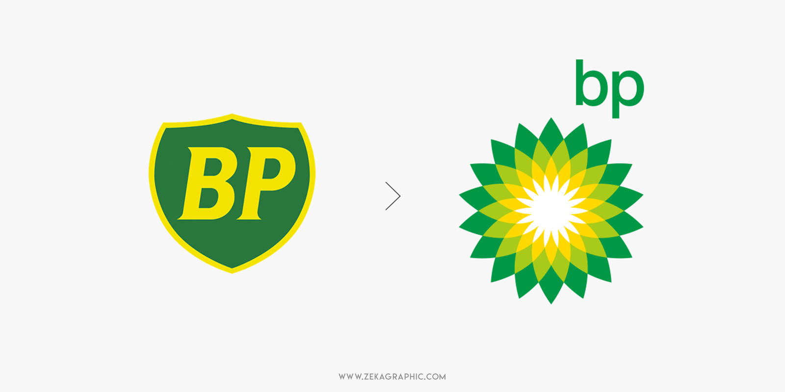
The second place for the most expensive logo design of all the time is for British Petroleum company redesign in 2000, and the price the British company paid for their new logo and marketing campaign is $210,000,000.
The idea about this logo design is to use color psychology and shapes to represent that the company is green and takes care of the environment as possible by using green and yellow as the main colors, and the logo shape resembles of a growing flower.
This Logo was received with a lot of criticism because they were trying to convince their customers about they were an eco and environmentally friendly company despite the fact they are making money with oil, ideas that can’t go well together, to add more fuel to the fire, BP suffered the most devastating oil spill in history in the Gulf of Mexico in 2010.
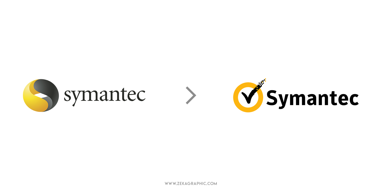
The first place for the most expensive logo design goes to Symantec, being the $1,280,000,000 they pay for their new logo and branding design, the highest price for a logo in history, but this price has a trick, this price also includes the purchase made by Symantec acquiring VeriSign company.
This acquisition by Symantec gains access to the company’s ideas and resources at the same time that the VeriSign logo, which was the famous checkmark. This checkmark represents a tick for the authentication of security certificates (SSL) for websites, which provides website security for online shops or e-commerce websites.
The tick mark is used in graphic design to transmit trustworthiness and Symantec included the VeriSign checkmark in their logo design to transmit security at the same time that the yellow color of the circle means continuity and stability of protection, all these elements together make you feel safe, trust and security.
Advertisment
As we have seen in this post, the most expensive logos came out from Rebranding projects from well-established companies, and for that companies is important to preserve their brand and identity images and move in new directions without losing their soul. Also, one key factor about these prices is that they also include the price of rebranding their offices and change their logo from everywhere which for that companies is a big investment.
To conclude that post it’s important to know that having the right branding design is essential for every company to transmit their philosophy and brand voice, that is why a good logo design is not an expense, it’s an investment for your brand. If you liked this post and want to learn more about Logo Design, you can check the 7 qualities for a Good Logo Design Post or you can read my other post about logo design.

If you found this post useful you might like to read these post about Logo Design Inspiration.
Advertisment
Written by
If you like this post share it on your social media!
Advertisment
Advertisment