Trends come and go, yet a handful of logos have remained recognizable for decades—or even centuries. While many brands redesign regularly, these visual identities have evolved carefully without losing what made them iconic.
The oldest logos still in use survived because they built strong recognition early on. Whether through typography, symbols, or distinctive shapes, they preserved the elements customers already trusted.
In this guide, we’ll explore 11 of the oldest logos still in use, see how they’ve evolved, and discover the design lessons behind their remarkable longevity.
Advertisment
A timeless logo isn’t one that never changes—it’s one that never loses its identity. The strongest brands refine their logos gradually while preserving the features people instantly recognize.
Most long-lasting logos share the same qualities: simplicity, distinctiveness, and adaptability. Instead of chasing trends, they evolve carefully as design standards change.
The examples below show that successful logos don’t survive by staying identical. They survive by changing only when necessary.
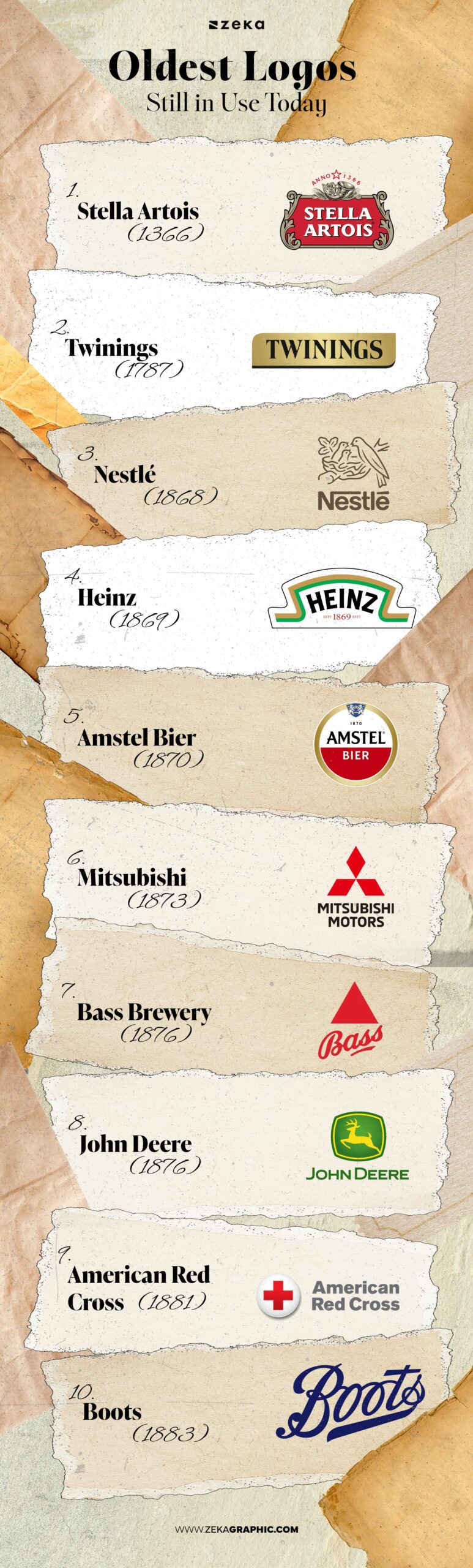
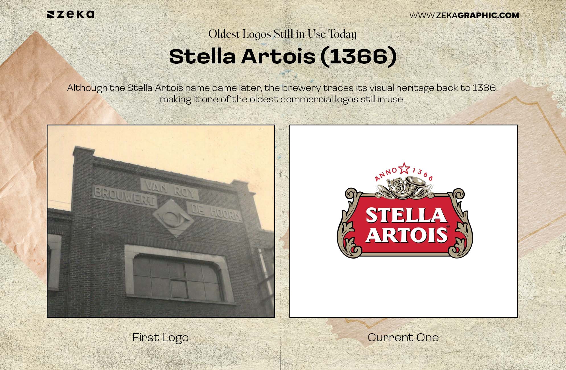
Although the Stella Artois name came later, the brewery traces its visual heritage back to 1366, making it one of the oldest commercial logos still in use.
Over the centuries, details have been refined, but the horn, shield, and traditional crest have remained central to its identity. Those historic elements continue to connect the brand with its brewing heritage.
Design lesson: Preserving recognizable symbols gives heritage brands lasting authenticity.
Advertisment
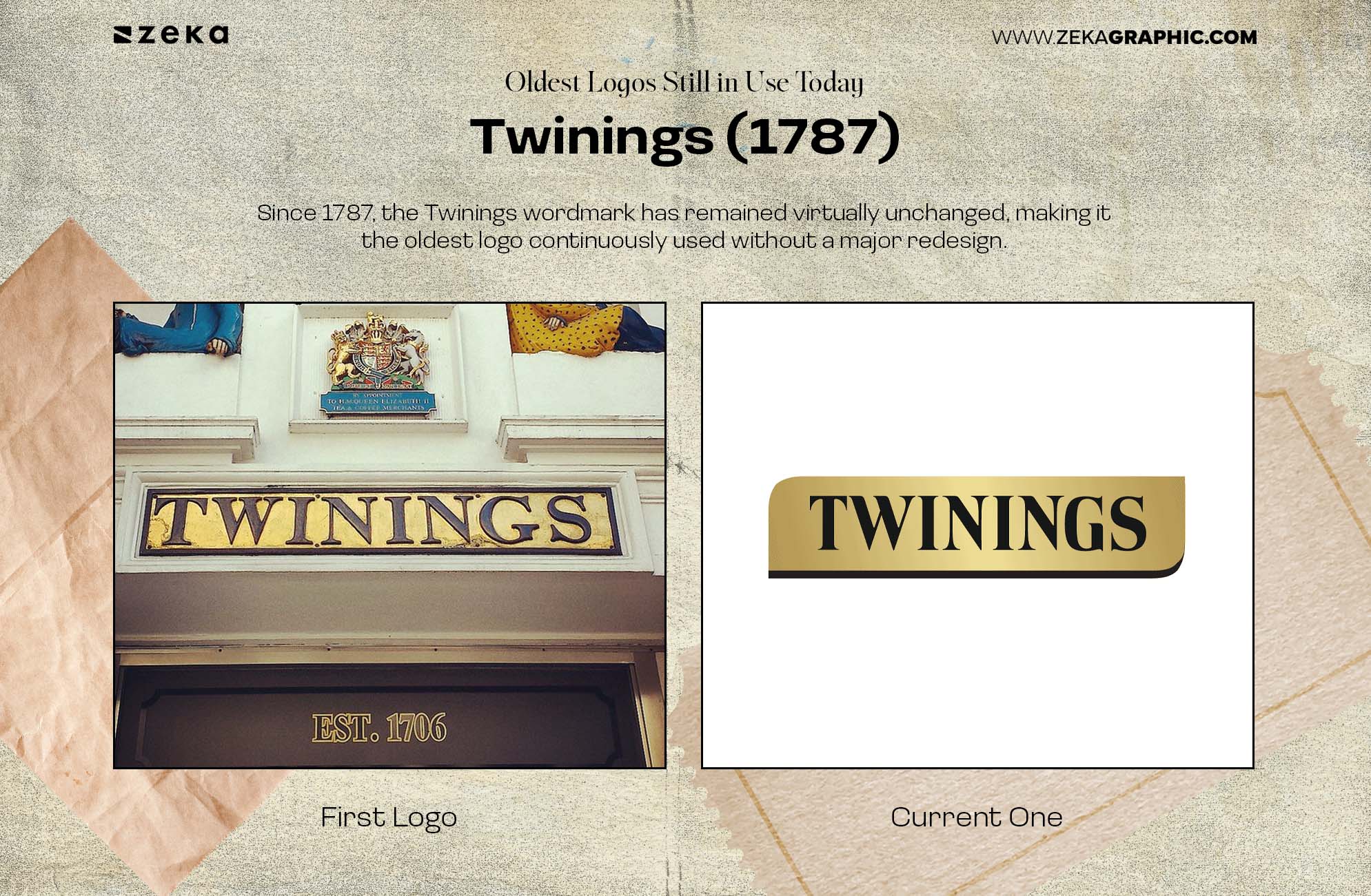
Since 1787, the Twinings wordmark has remained virtually unchanged, making it the oldest logo continuously used without a major redesign.
Its elegant typography has outlived countless design trends, proving that consistency can become one of a brand’s greatest strengths.
Design lesson: Sometimes the strongest redesign is no redesign at all.
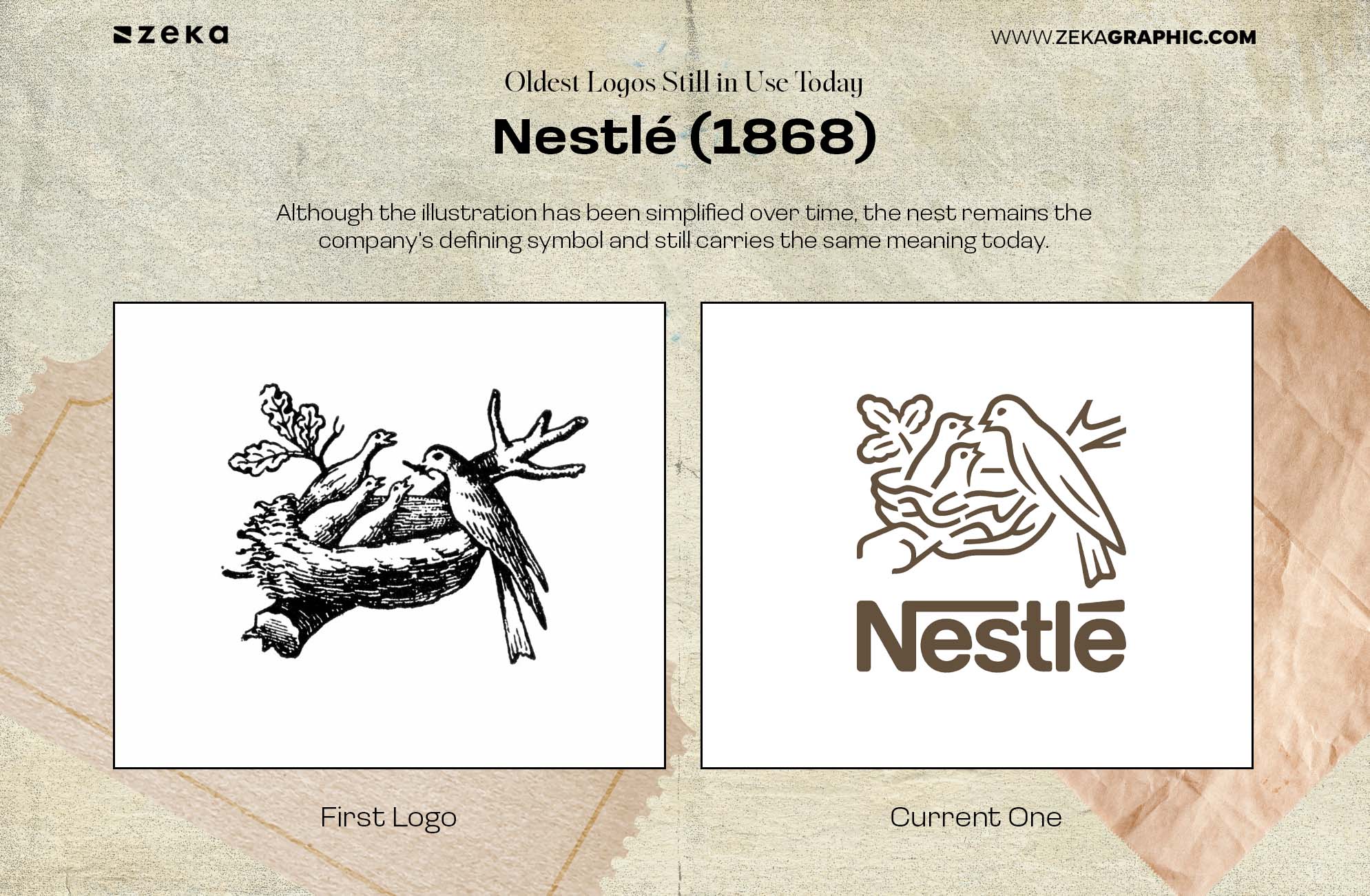
Nestlé takes its name from founder Henri Nestlé, whose surname means “little nest.” The original logo featured a bird’s nest to symbolize care, protection, and nourishment.
Although the illustration has been simplified over time, the nest remains the company’s defining symbol and still carries the same meaning today.
Design lesson: Great symbols can evolve visually without losing their original story.
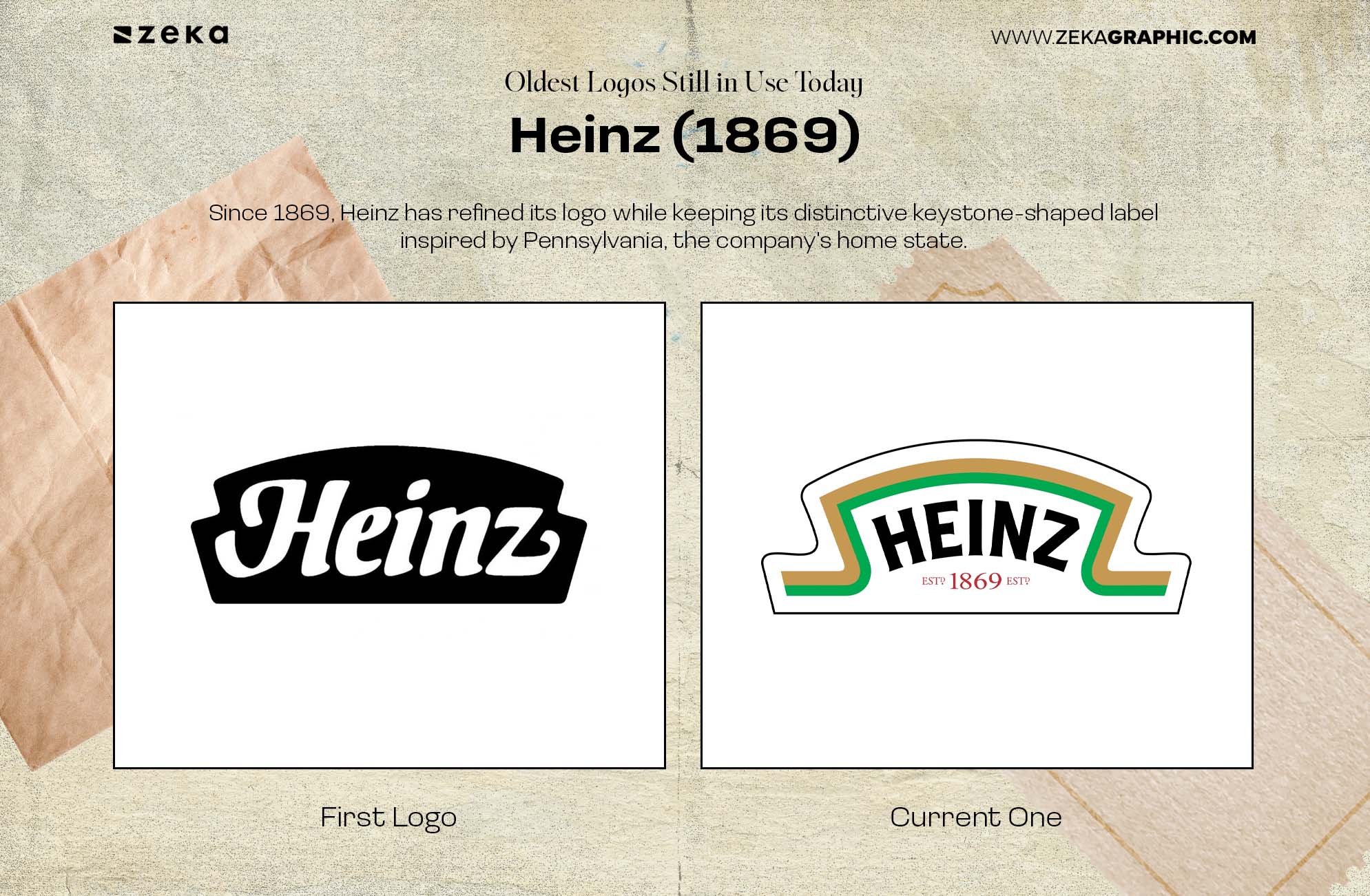
Since 1869, Heinz has refined its logo while keeping its distinctive keystone-shaped label inspired by Pennsylvania, the company’s home state.
That simple outline became a recognizable brand asset on its own, helping consumers identify Heinz products long before reading the name.
Design lesson: A distinctive shape can become just as memorable as a logo.
Advertisment
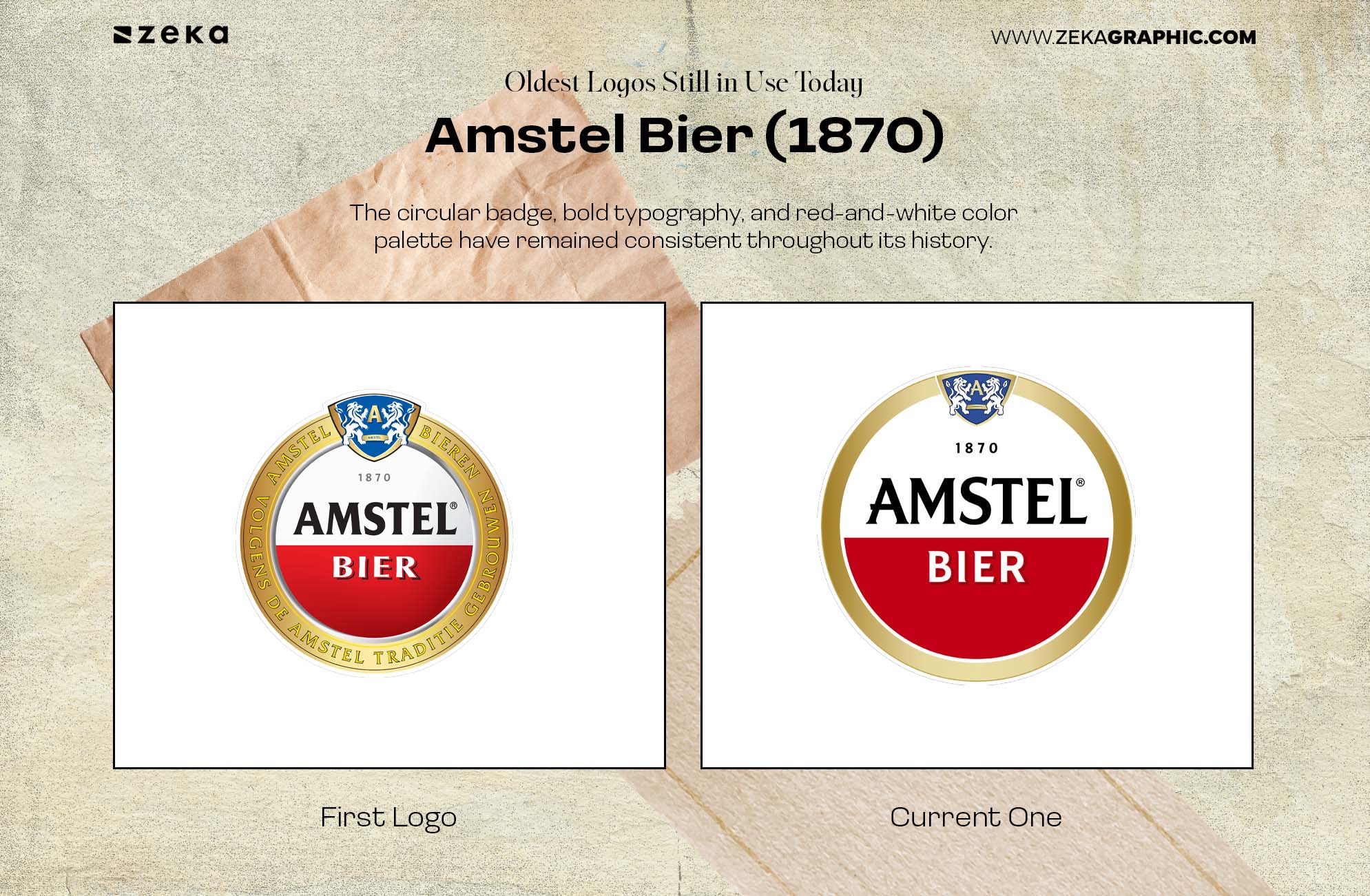
Since 1870, Amstel has modernized its logo without changing its core identity. The circular badge, bold typography, and red-and-white color palette have remained consistent throughout its history.
Small refinements have improved readability while preserving the familiar appearance that generations of consumers recognize.
Design lesson: Careful refinement keeps historic logos relevant without sacrificing recognition.
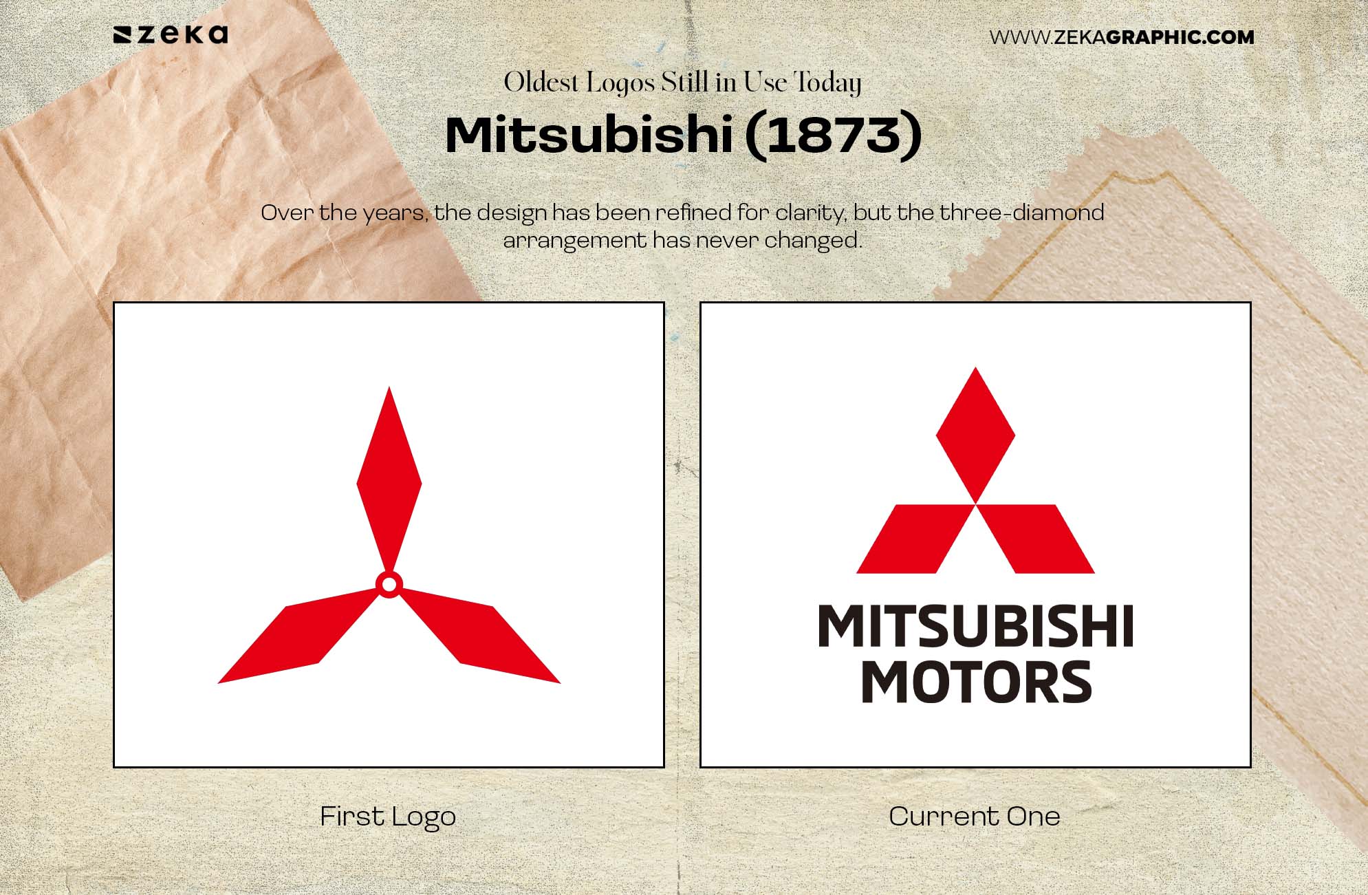
The Mitsubishi logo has remained remarkably consistent since 1873. Its three diamonds come from the combination of the founder’s family crest and the emblem of the Tosa clan, creating a symbol rooted in the company’s origins.
Over the years, the design has been refined for clarity, but the three-diamond arrangement has never changed. Its simple geometry makes the logo instantly recognizable across industries, from automobiles to heavy industry.
Design lesson: Simple geometric symbols often have the greatest long-term recognition.
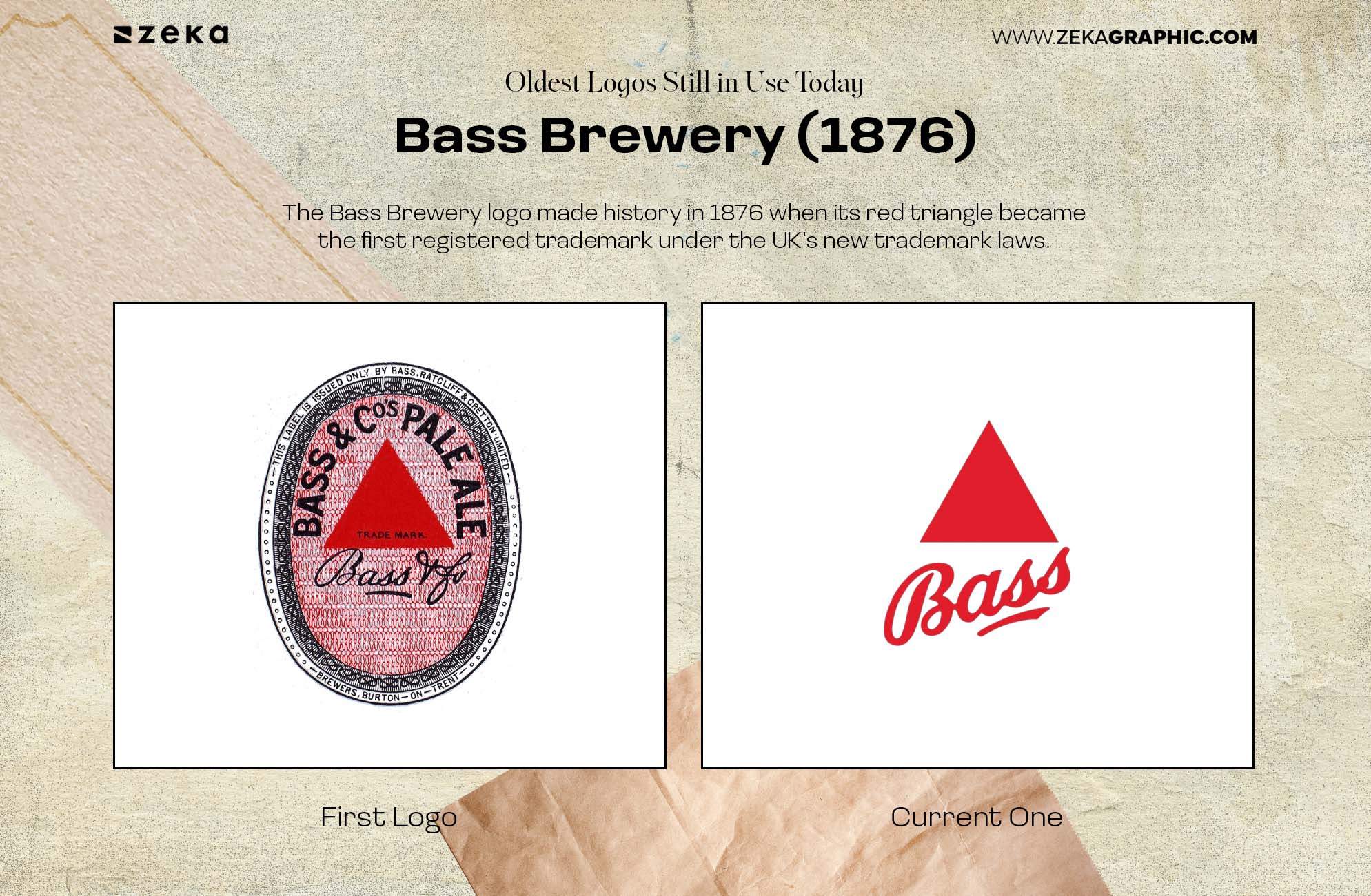
The Bass Brewery logo made history in 1876 when its red triangle became the first registered trademark under the UK’s new trademark laws.
The symbol is remarkably simple, yet it quickly became associated with the brand’s beer. More than a century later, the red triangle remains one of the oldest protected trademarks still in use.
Design lesson: A simple, distinctive symbol can become a powerful long-term brand asset.
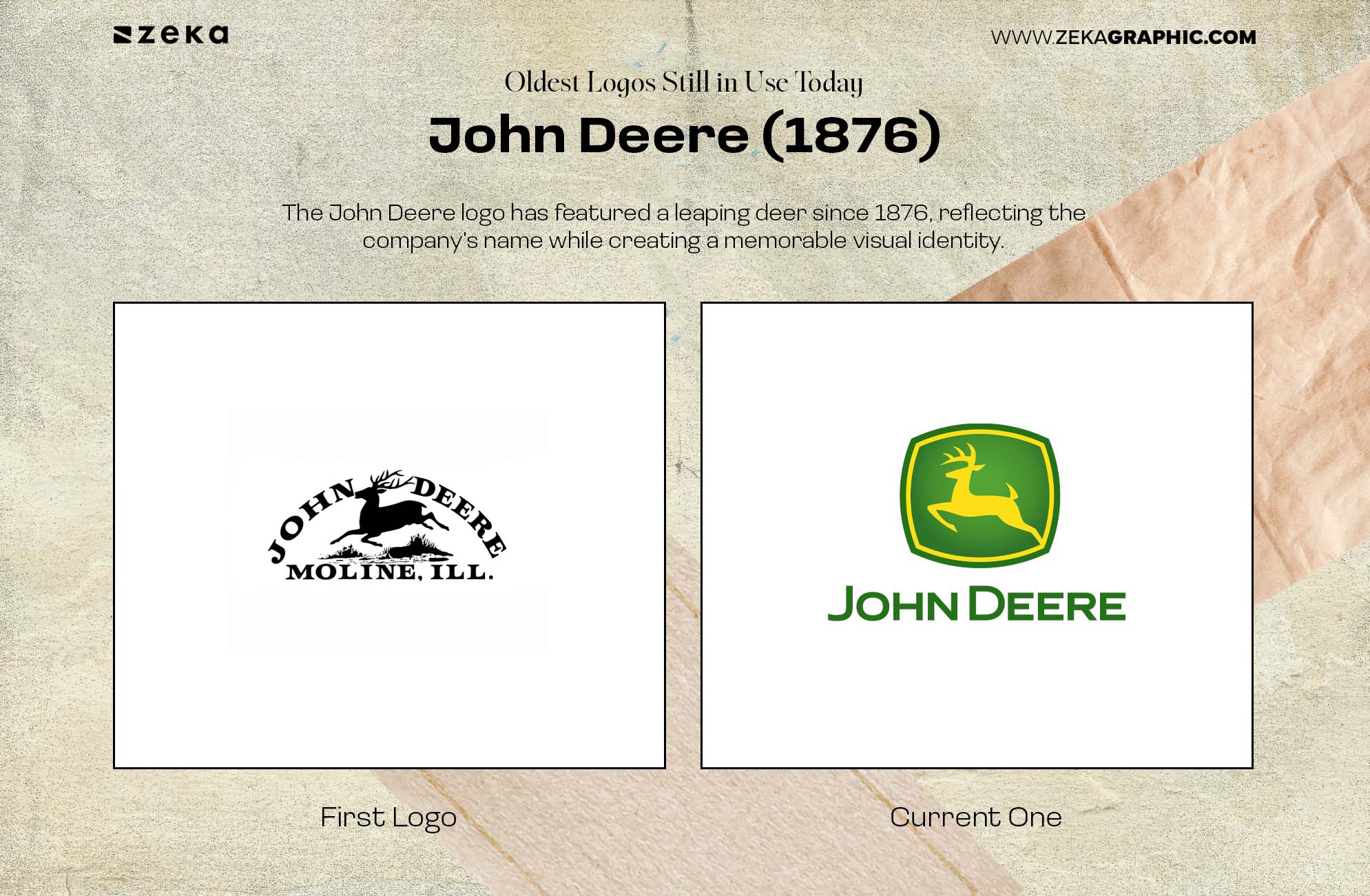
The John Deere logo has featured a leaping deer since 1876, reflecting the company’s name while creating a memorable visual identity.
Although the illustration has become cleaner and more modern over time, the deer has remained the defining feature of the brand. The consistent use of the symbol has helped John Deere build instant recognition across generations.
Design lesson: A strong symbol can outlast changing illustration styles.
Advertisment
The American Red Cross uses one of the simplest logos in the world: a red cross on a white background. Introduced in 1881, the emblem has remained virtually unchanged ever since.
Its strength comes from immediate recognition rather than complexity. The symbol communicates humanitarian aid across languages and cultures without relying on words.
Design lesson: The simplest symbols are often the easiest to recognize and remember.
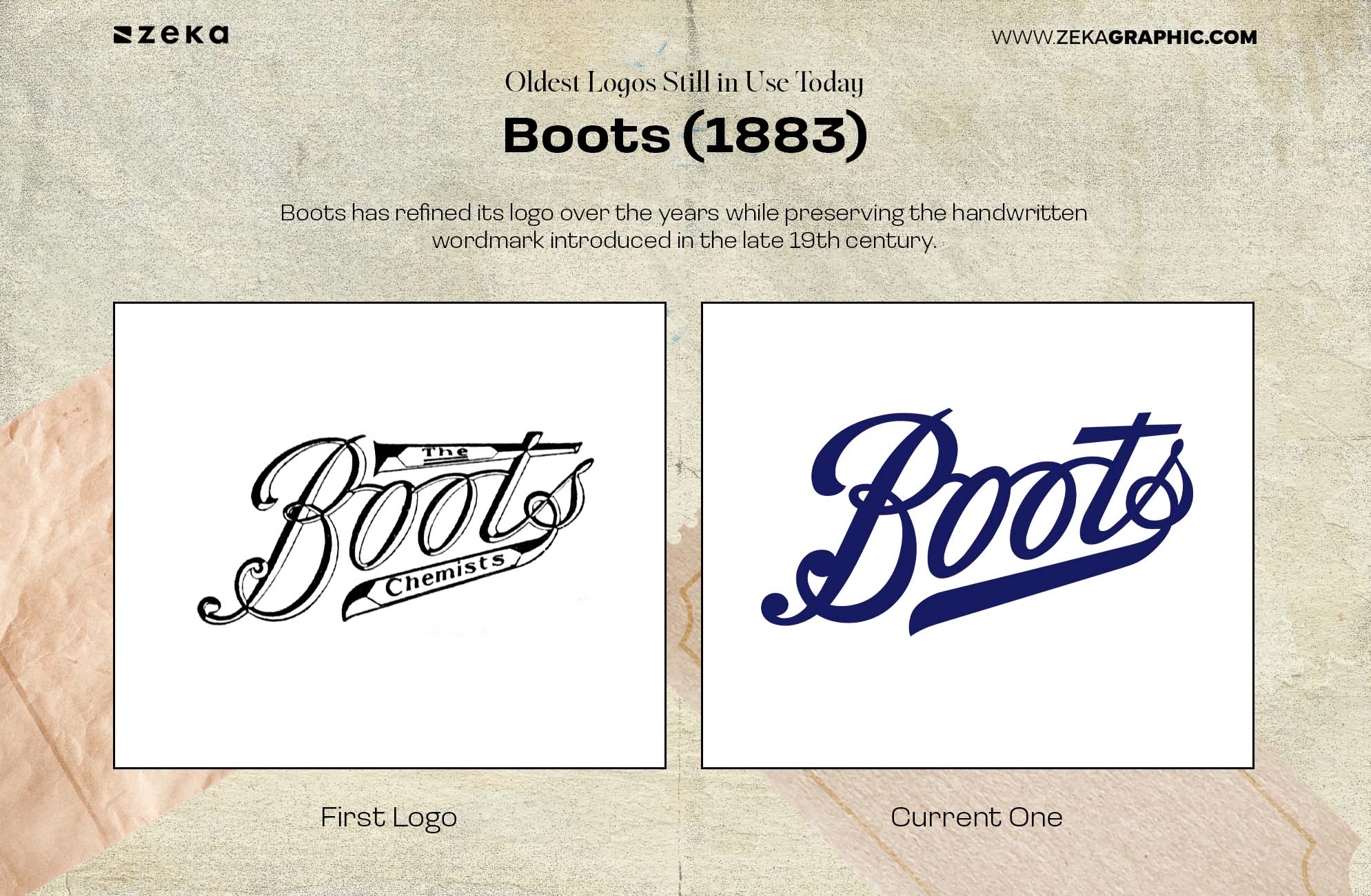
Boots has refined its logo over the years while preserving the handwritten wordmark introduced in the late 19th century. Its distinctive script has become one of the company’s strongest visual assets.
Minor updates have improved legibility, but the overall style remains instantly familiar. That consistency has helped Boots maintain recognition for well over a century.
Design lesson: A distinctive wordmark can become timeless when refined instead of reinvented.
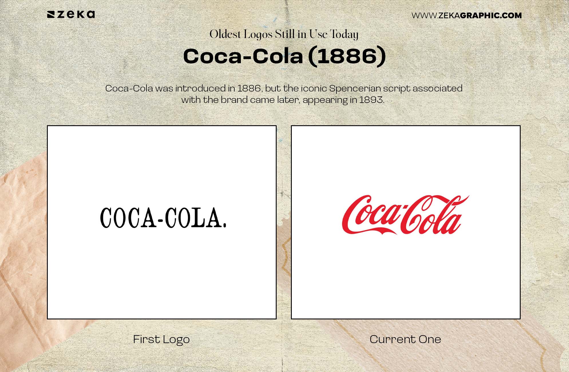
Coca-Cola was introduced in 1886, but the iconic Spencerian script associated with the brand came later, appearing in 1893. The original lettering was simpler, while the distinctive flowing script gradually became the defining feature of the identity.
Rather than constantly replacing its wordmark, Coca-Cola built recognition around its signature lettering and refined it over time. Today, the typography itself is one of the company’s most recognizable brand assets.
Design lesson: Memorable typography can become a brand’s most enduring symbol.
Looking at the oldest logos still in use, a clear pattern emerges: they evolved without losing their identity. While details were refined over time, the core symbol, shape, or typography remained familiar.
These brands also prove that longevity doesn’t come from following trends. It comes from building a distinctive identity that customers recognize year after year, then improving it carefully instead of starting over.
The strongest historic logos share a few key characteristics:
For designers, the lesson is simple: the goal isn’t to create a logo that looks modern today. It’s to create one that still feels recognizable decades from now.
Advertisment
The oldest logos still in use show that longevity isn’t about keeping a design frozen in time. The strongest identities evolve while protecting the symbols, shapes, and typography that people already recognize.
From Stella Artois and Twinings to Coca-Cola, these logos survived because they became more than visual marks. They became familiar parts of the brands themselves.
For modern designers, that’s perhaps the most valuable lesson: design for recognition first, then refine for relevance. A logo doesn’t need to look new every few years—it needs to remain meaningful, distinctive, and recognizable.
Advertisment
Pin it for later!
If you found this post useful you might like to read these post about Graphic Design Inspiration.
Advertisment
If you like this post share it on your social media!
Advertisment






Want to make your Business Grow with Creative design?
Advertisment

Advertisment