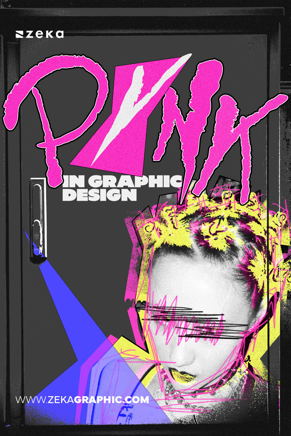
If you’ve ever tried to design something raw, angry, or anti-establishment—and ended up with a layout that felt messy, unreadable, or try-hard—you’ve already encountered the core misunderstanding around punk graphic design.
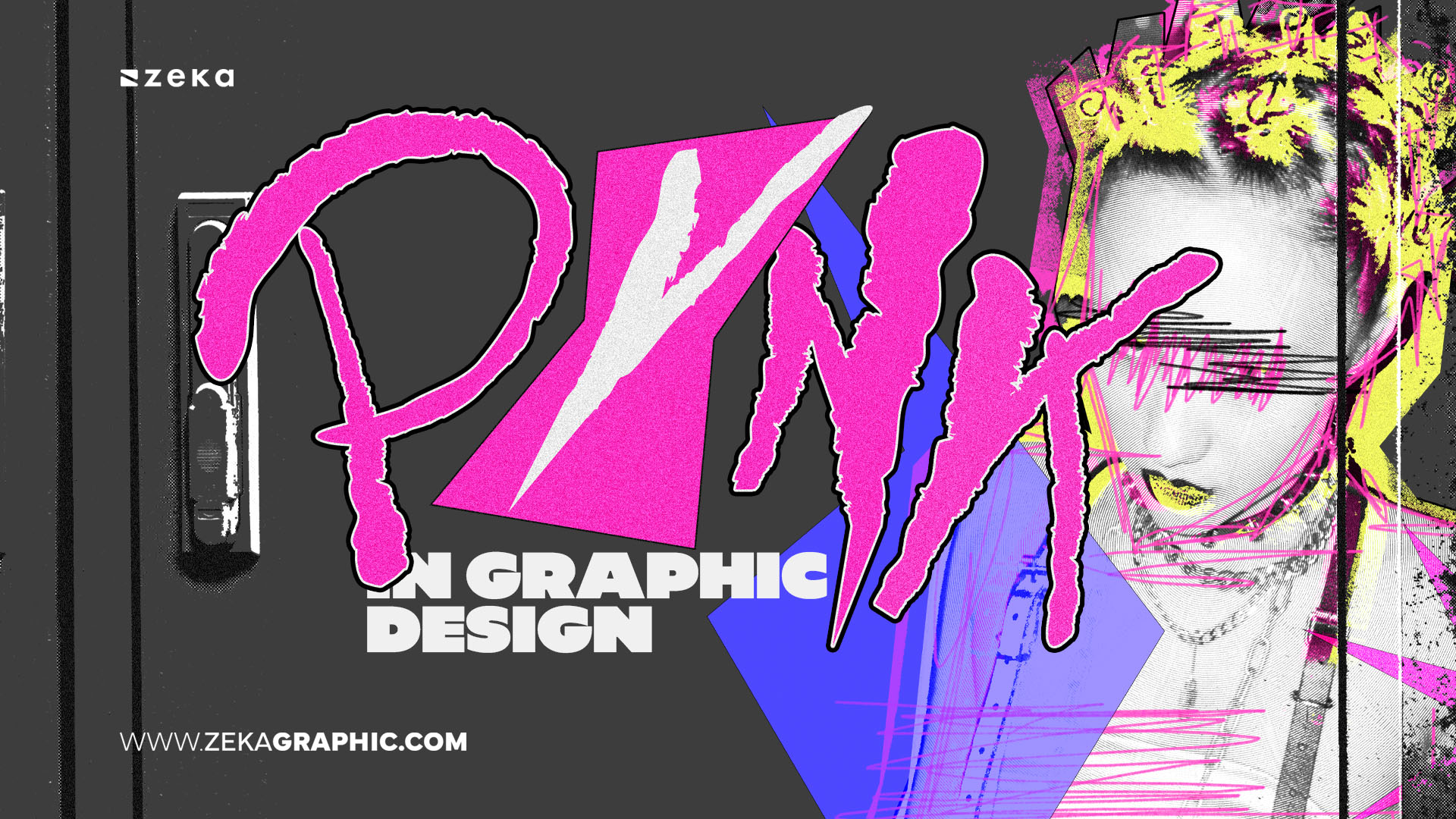
Punk is often mistaken for noise, grunge, or “breaking rules for the sake of it.” In reality, punk graphic design is a visual language of resistance. It communicates urgency, opposition, and refusal—intentionally. The chaos is never accidental. The roughness is the message.
Unlike other edgy or alternative styles, punk doesn’t aim to look cool or polished. It aims to reject polish entirely, especially when polish becomes a symbol of control, corporatization, or conformity.
This is why punk continues to resurface in moments of cultural saturation—digital sameness, AI-generated perfection, and over-optimized branding systems.
Advertisment
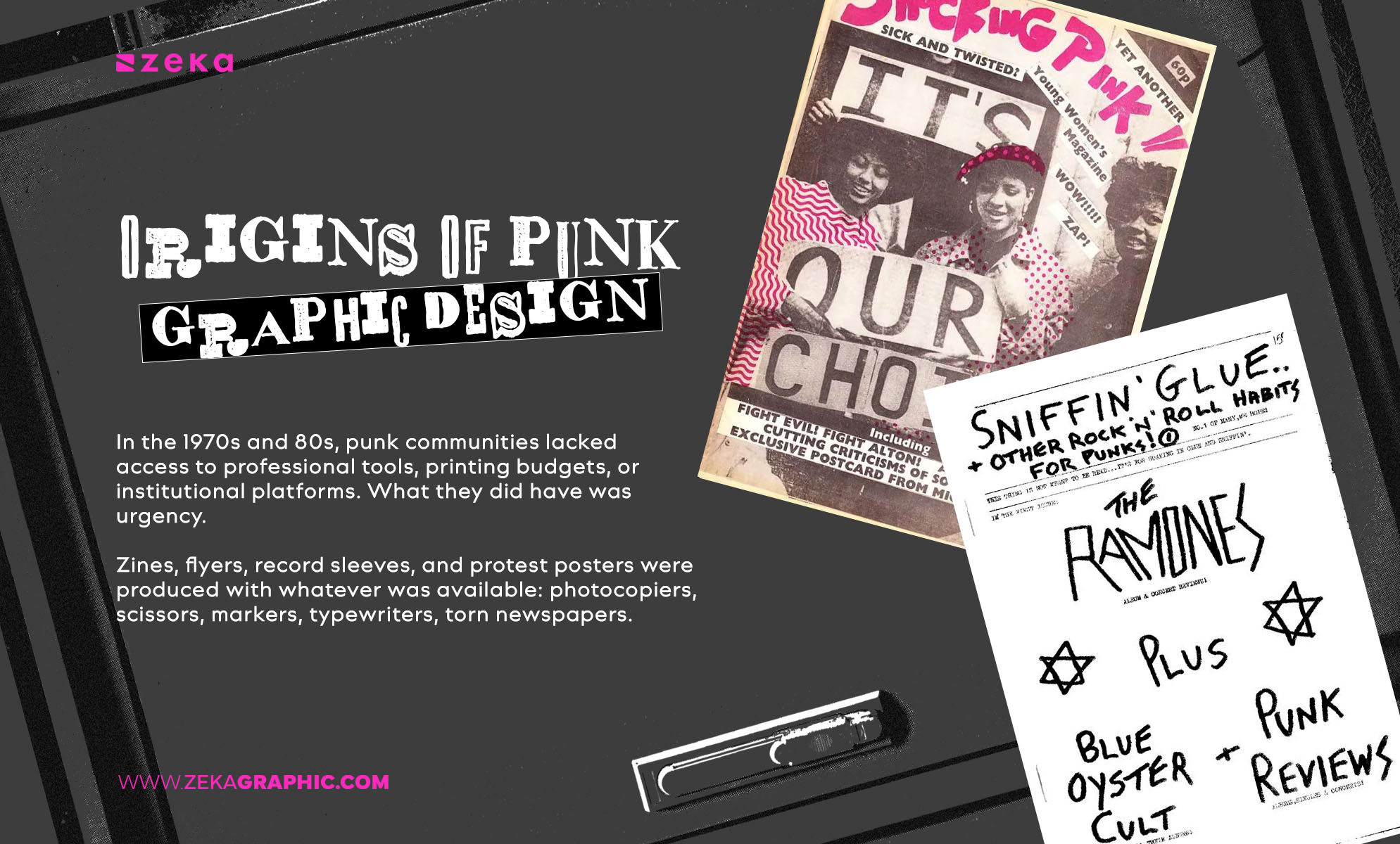
Punk graphic design didn’t begin in agencies or design schools. It emerged from necessity.
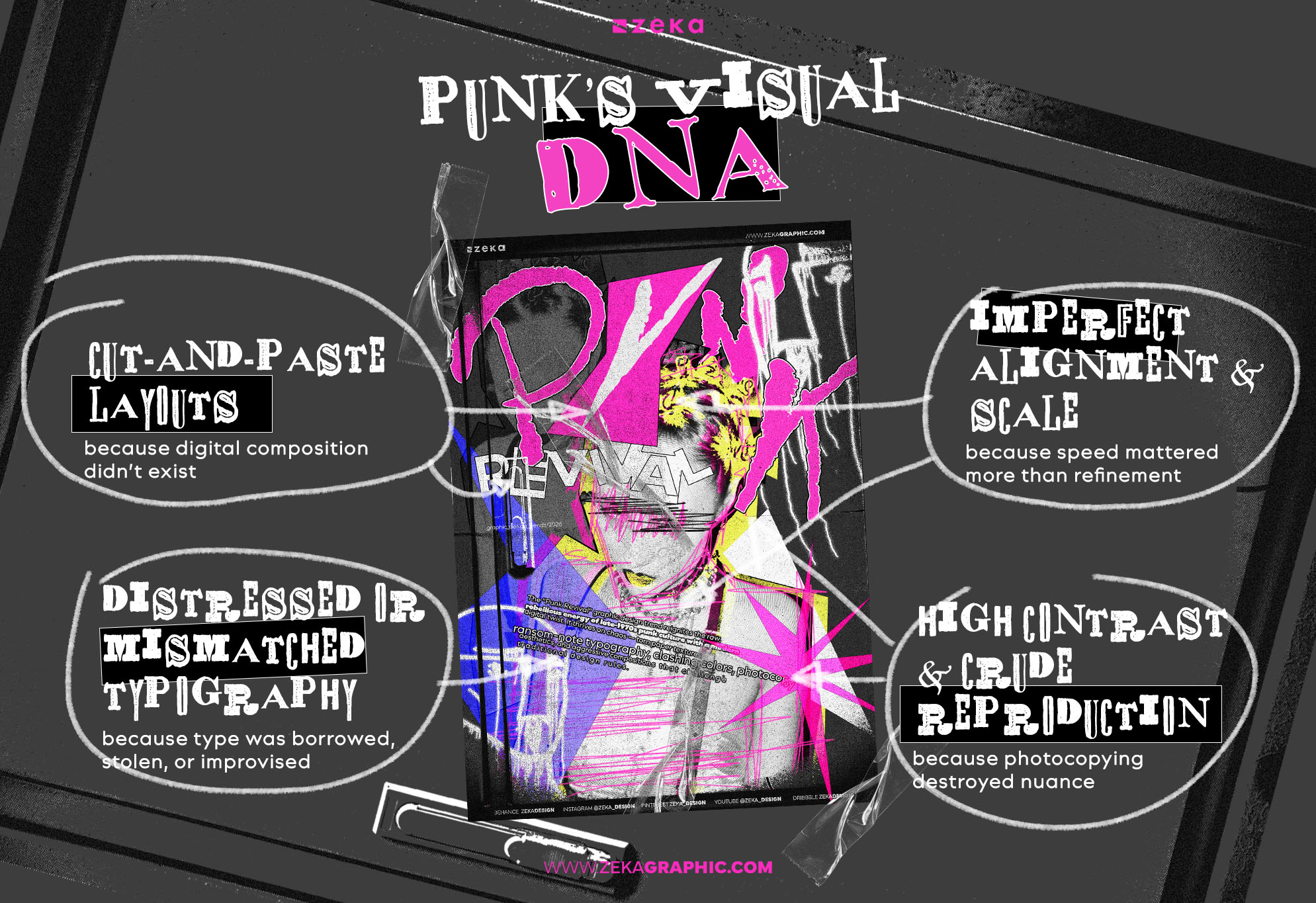
In the 1970s and 80s, punk communities lacked access to professional tools, printing budgets, or institutional platforms. What they did have was urgency. Zines, flyers, record sleeves, and protest posters were produced with whatever was available: photocopiers, scissors, markers, typewriters, torn newspapers.
This DIY context shaped punk’s visual DNA:
Crucially, these constraints weren’t later “stylized”—they were the style. Punk graphic design grew as a reaction against institutional aesthetics, commercial polish, and controlled messaging.
Punk graphic design is often labeled “bad design” by those judging it through traditional standards. That’s a category error.
Punk isn’t anti-design because it lacks rules—it’s anti-design because it rejects whose rules matter.
Traditional graphic design principles were historically tied to:
Punk deliberately disrupts these expectations. But—and this is critical—it does so with awareness. The designer understands hierarchy, balance, and contrast, then chooses to violate them to create tension.
This is where many attempts fail. Random disorder isn’t punk. Intentional opposition is.
Even the most chaotic punk poster relies heavily on contrast: light vs dark, large vs small, clean vs rough.
Advertisment
Punk graphic design is recognizable not because it follows a checklist—but because its visual decisions consistently signal resistance, urgency, and refusal. These principles act as identifiers, not rules to blindly copy.
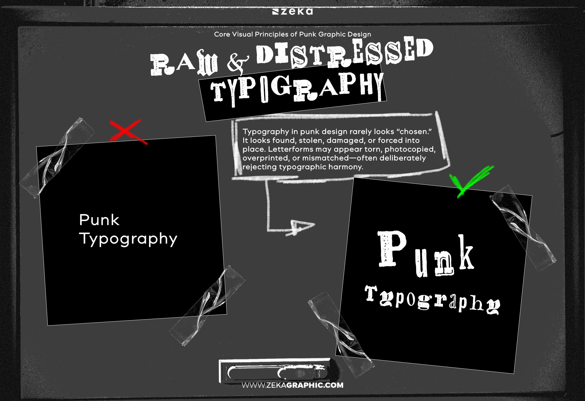
Typography in punk design rarely looks “chosen.” It looks found, stolen, damaged, or forced into place. Letterforms may appear torn, photocopied, overprinted, or mismatched—often deliberately rejecting typographic harmony.
This roughness isn’t about aesthetics alone. It communicates distrust of authority, polish, and institutional control. Clean, corporate typography would undermine the message entirely.
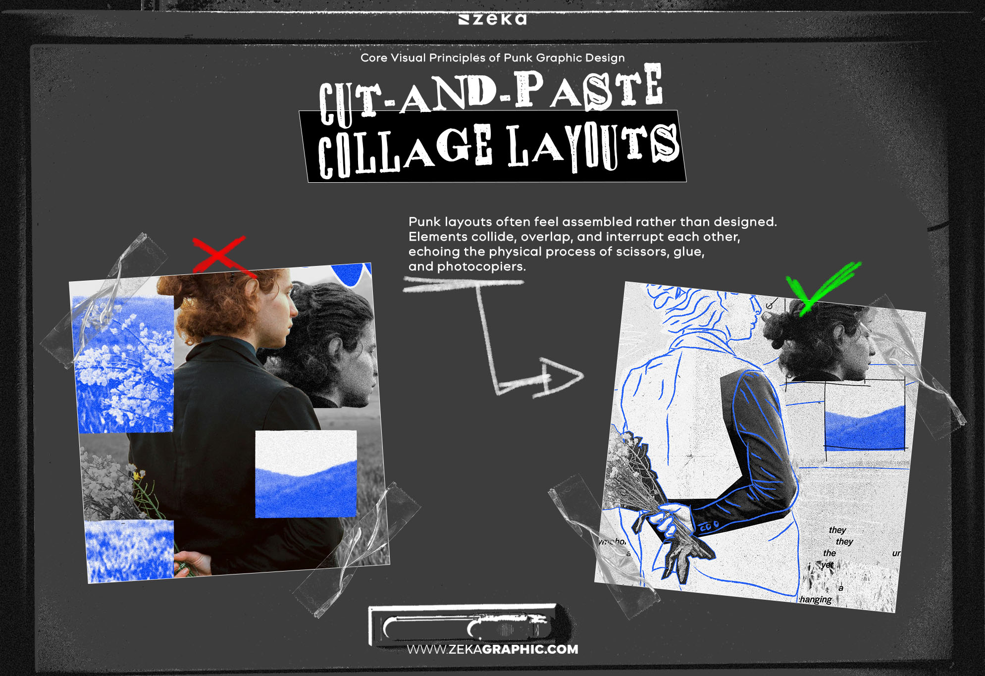
Punk layouts often feel assembled rather than designed. Elements collide, overlap, and interrupt each other, echoing the physical process of scissors, glue, and photocopiers.
This collage structure creates visual tension and immediacy. It feels urgent—unfinished on purpose. The layout doesn’t guide politely; it confronts.
Advertisment
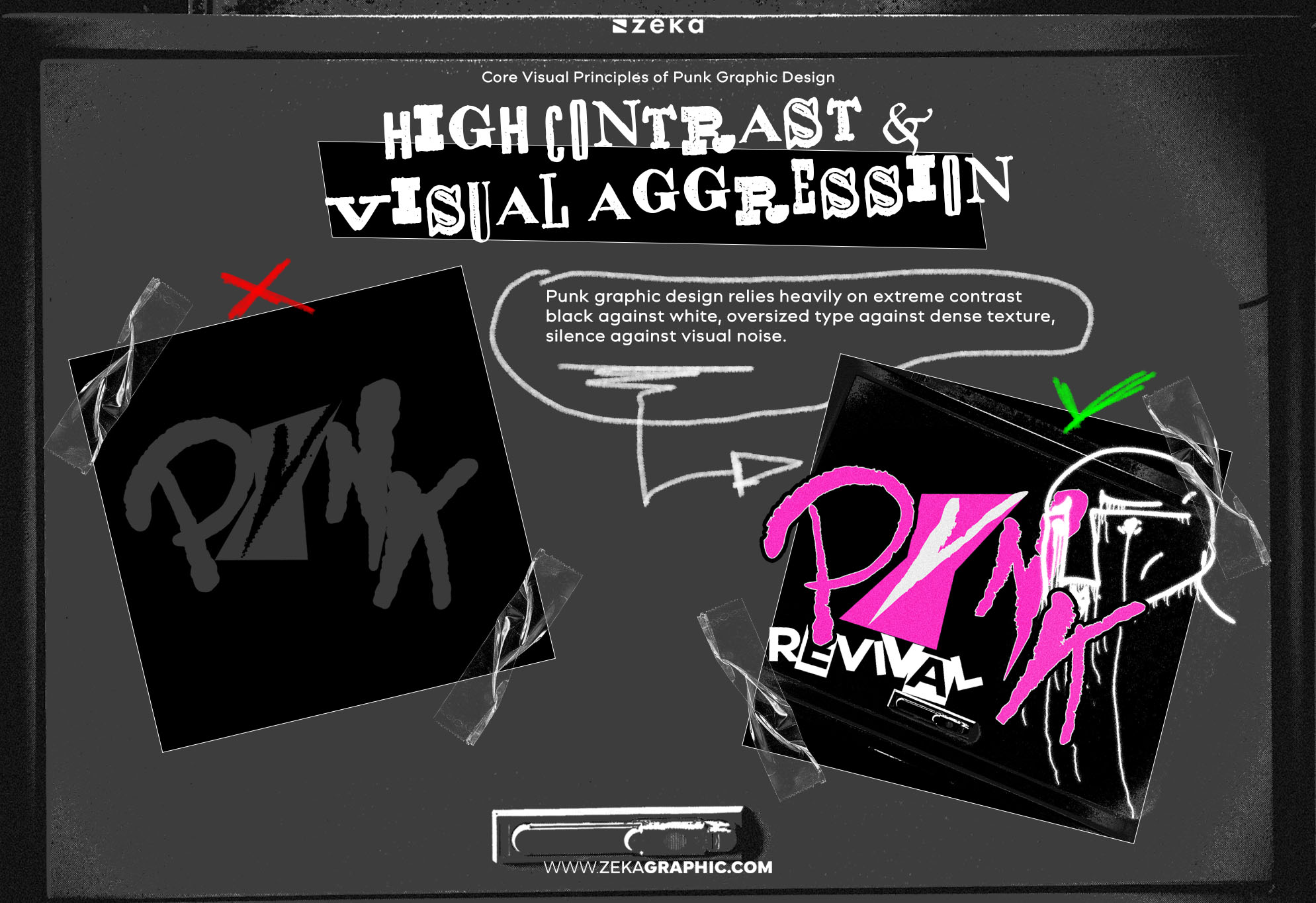
Punk graphic design relies heavily on extreme contrast—black against white, oversized type against dense texture, silence against visual noise.
This aggression forces attention. There’s no soft entry point. Contrast becomes a weapon: separating message from background, signal from noise.
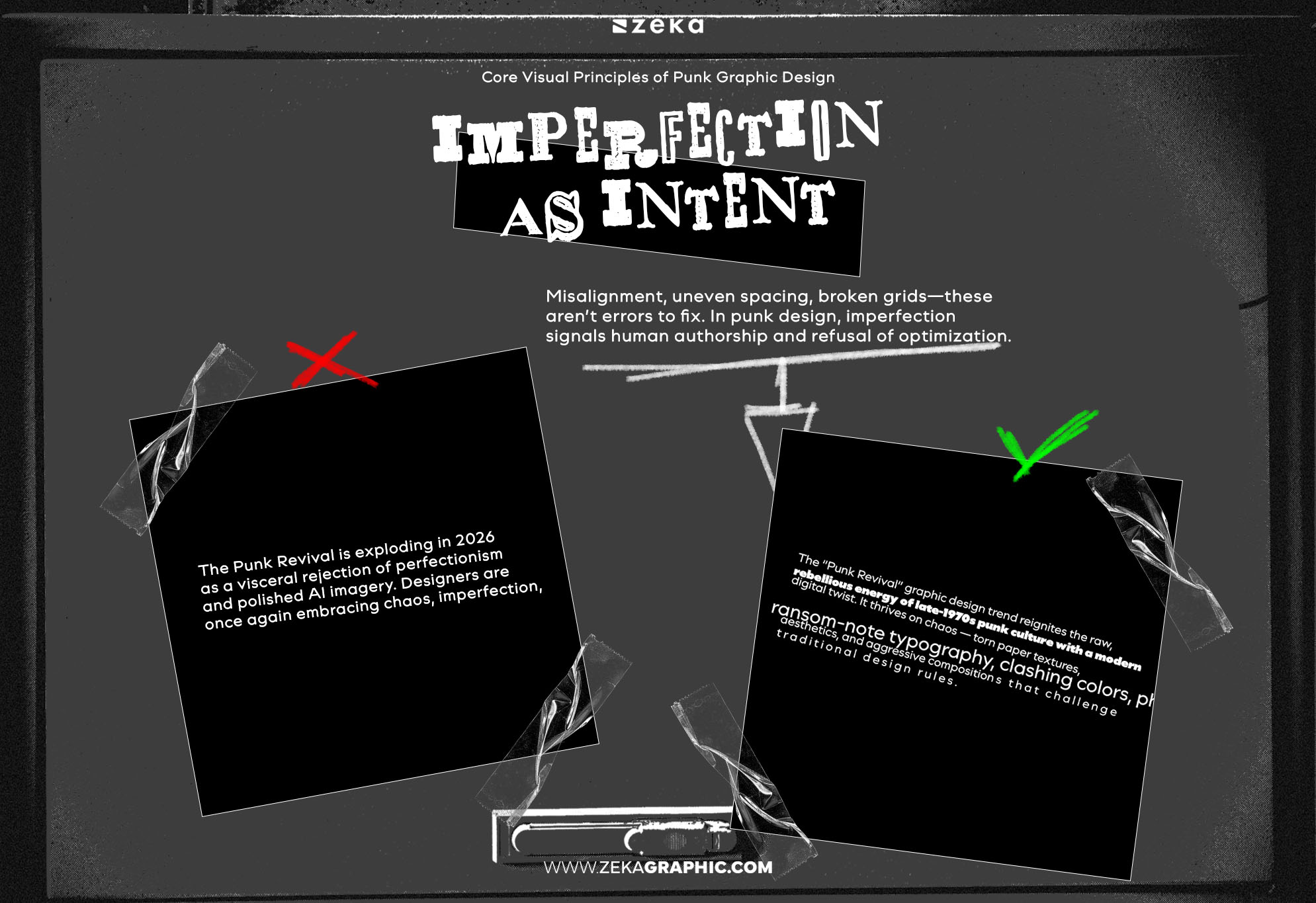
Misalignment, uneven spacing, broken grids—these aren’t errors to fix. In punk design, imperfection signals human authorship and refusal of optimization.
The work looks touched, manipulated, compromised. That friction is the message. Perfection would read as compliance.
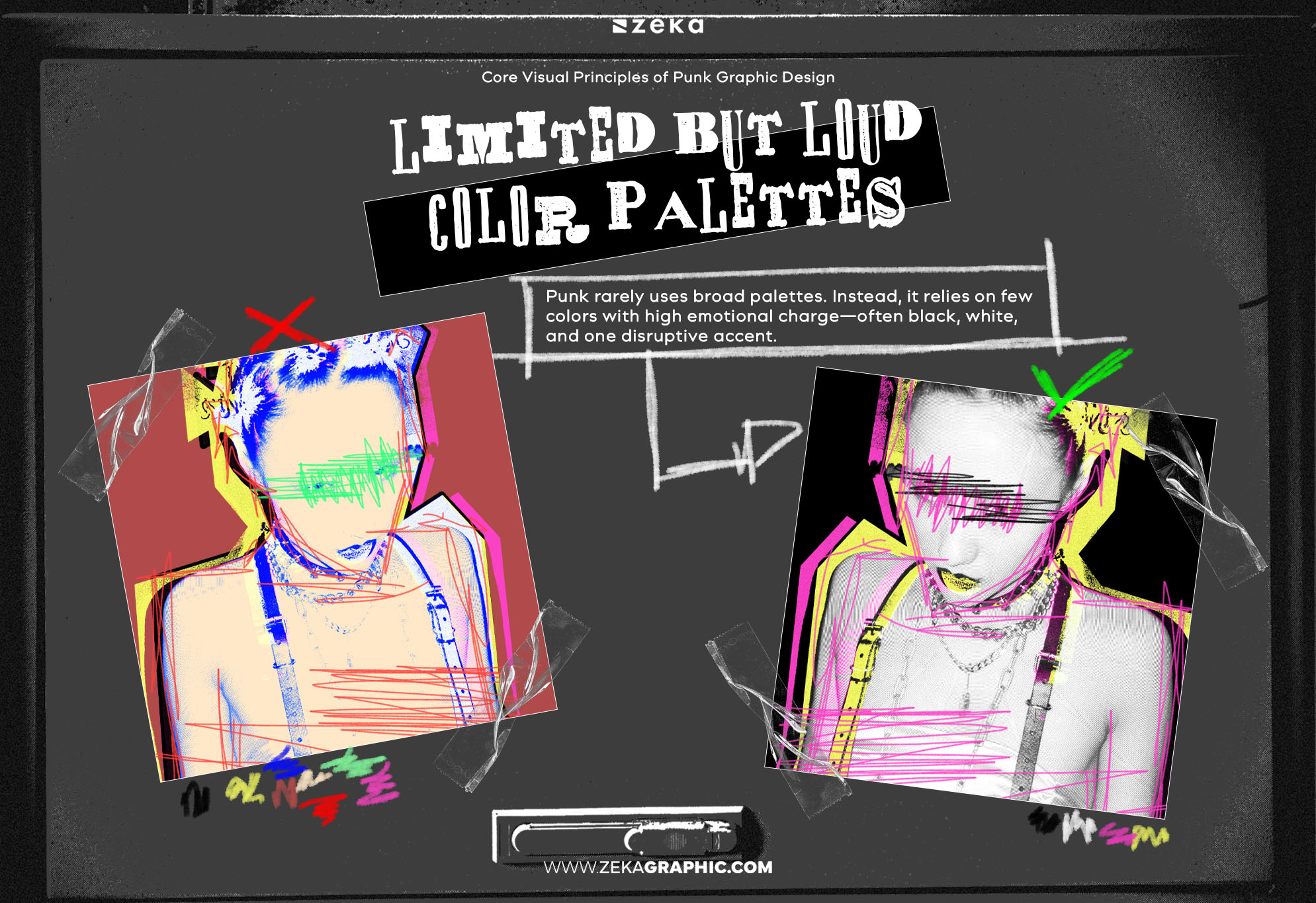
Punk rarely uses broad palettes. Instead, it relies on few colors with high emotional charge—often black, white, and one disruptive accent.
The restraint amplifies aggression. Color becomes symbolic rather than decorative, reinforcing urgency and opposition instead of visual harmony.
Advertisment
Punk graphic design wasn’t shaped by traditional “designers” in the institutional sense. It emerged from artists, editors, musicians, activists, and self-taught creators working outside commercial systems—often with no concern for longevity, consistency, or approval.
What unites these figures isn’t a shared visual style, but a shared position against authority:
Rather than design studios, punk’s visual language was built through zines, record sleeves, flyers, and underground publications.
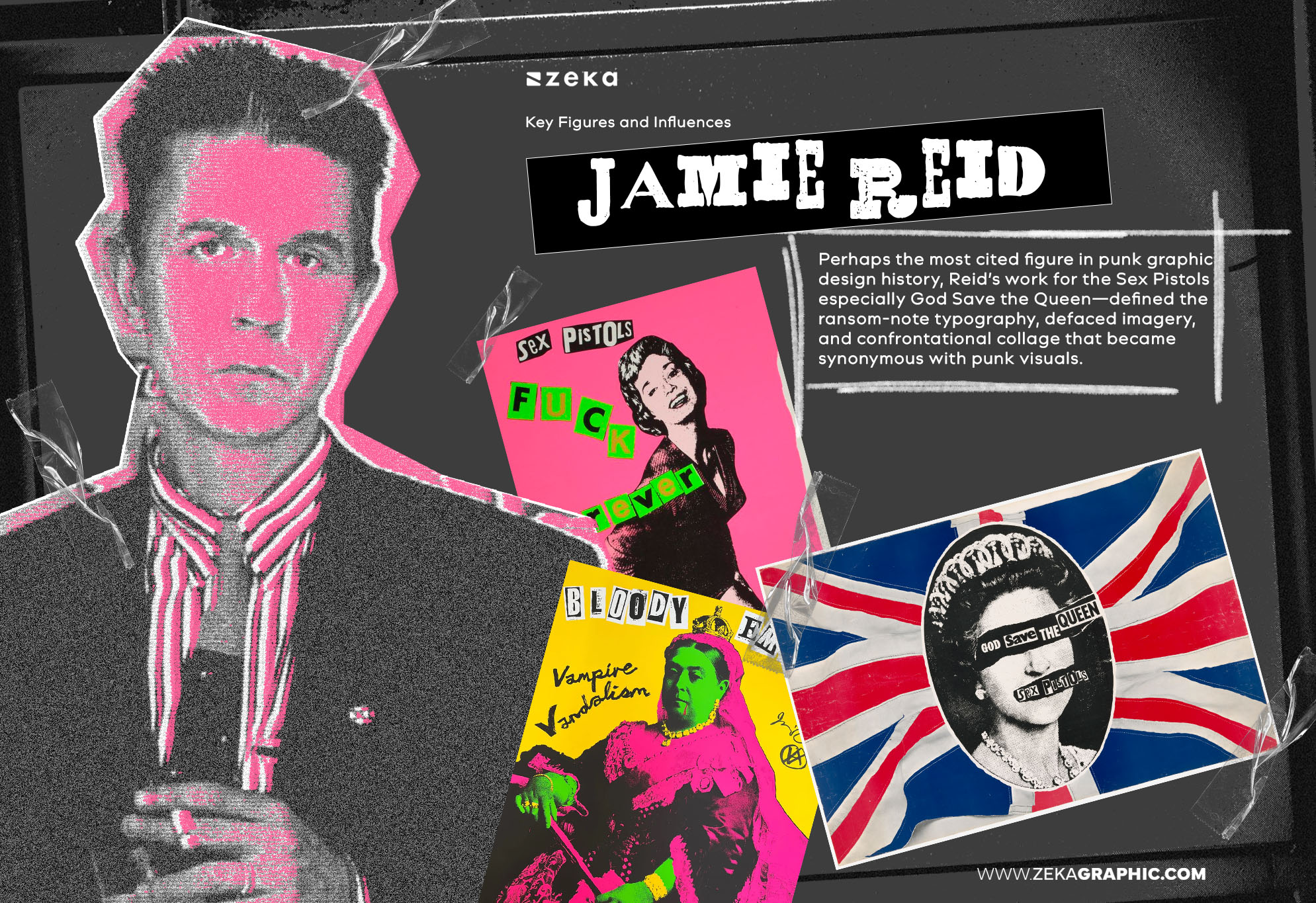
Perhaps the most cited figure in punk graphic design history, Reid’s work for the Sex Pistols—especially God Save the Queen—defined the ransom-note typography, defaced imagery, and confrontational collage that became synonymous with punk visuals. His work wasn’t decorative; it was openly antagonistic.
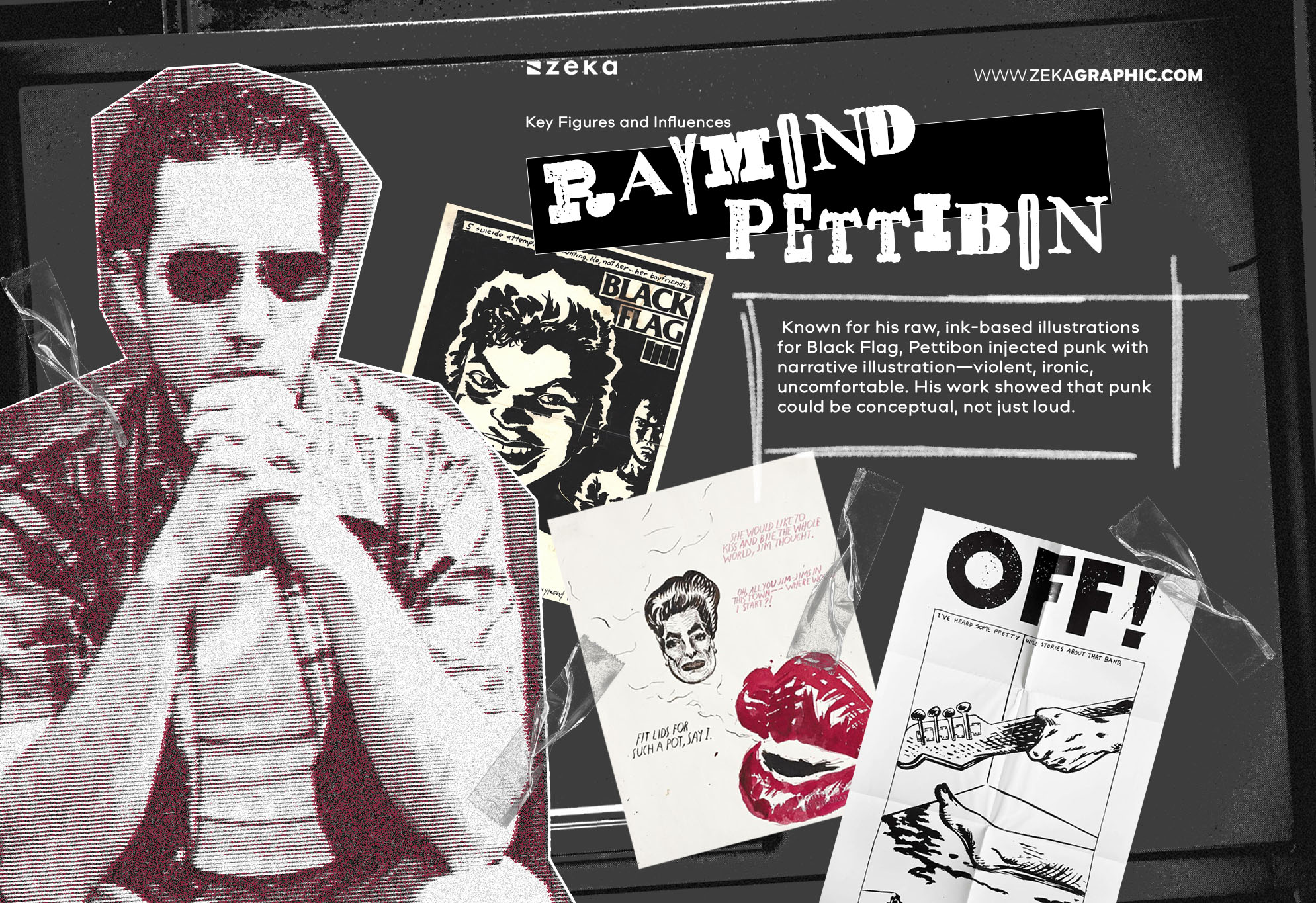
Known for his raw, ink-based illustrations for Black Flag, Pettibon injected punk with narrative illustration—violent, ironic, uncomfortable. His work showed that punk could be conceptual, not just loud.
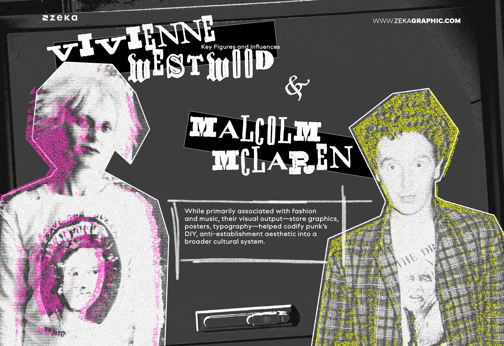
While primarily associated with fashion and music, their visual output—store graphics, posters, typography—helped codify punk’s DIY, anti-establishment aesthetic into a broader cultural system.
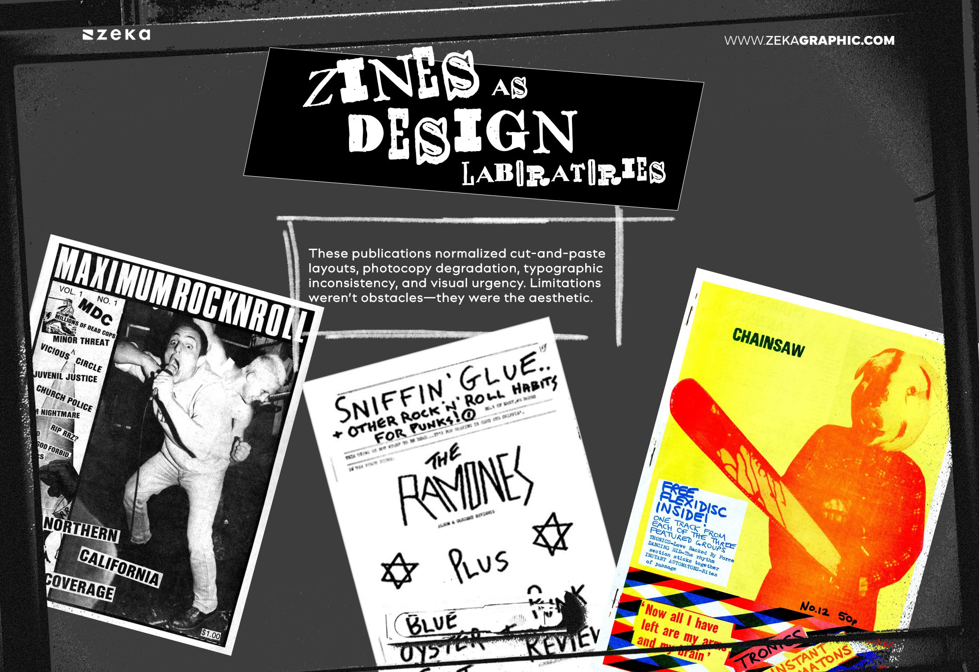
Punk graphic design evolved fastest in zines, not galleries:
These publications normalized cut-and-paste layouts, photocopy degradation, typographic inconsistency, and visual urgency. Limitations weren’t obstacles—they were the aesthetic.
Understanding these influences prevents shallow imitation. Punk isn’t about copying torn type or grunge textures—it’s about using visual language to challenge systems, not decorate them.
Advertisment
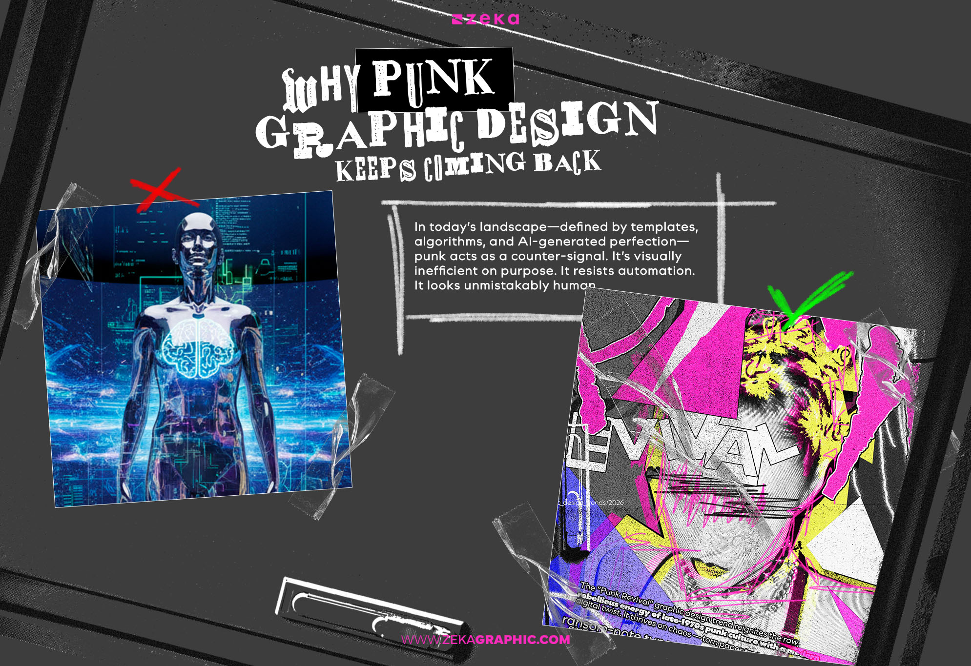
Punk graphic design resurfaces whenever design becomes too smooth, too optimized, too automated.
In today’s landscape—defined by templates, algorithms, and AI-generated perfection—punk acts as a counter-signal. It’s visually inefficient on purpose. It resists automation. It looks unmistakably human.
This resurgence isn’t nostalgia. It’s reaction:
Punk design thrives where designers want to reintroduce tension, authorship, and emotional friction into visual communication.
This is why it often overlaps with other anti-perfection movements.
Advertisment
Punk graphic design is powerful—but it is never neutral.
It introduces tension, friction, and attitude by design. That makes it highly effective in some contexts—and actively destructive in others.
The question isn’t “Does punk look cool here?” It’s “Does this project benefit from resistance?”
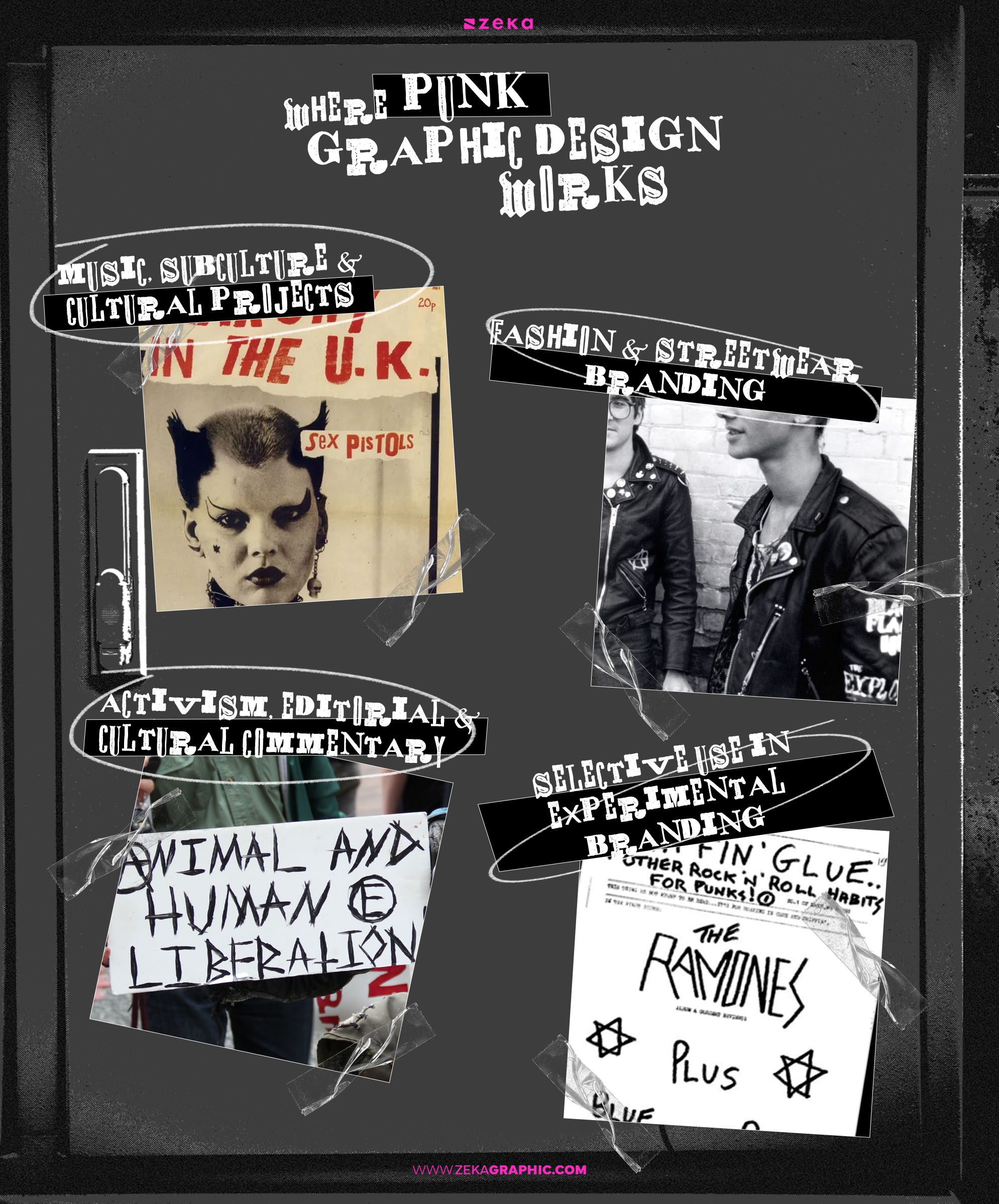
Music, Subculture & Cultural Projects
Punk thrives where identity, emotion, and immediacy matter more than polish. Album covers, gig posters, underground festivals, independent labels—these formats reward visual urgency. Punk works because the medium already accepts disruption as part of the message.
Fashion & Streetwear Branding
Especially brands rooted in counterculture, anti-luxury narratives, or political stance. Punk communicates independence instantly—often faster than words. In this context, inconsistency becomes a feature, not a flaw.
Activism, Editorial & Cultural Commentary
Posters, zines, independent magazines, protest visuals. Punk’s visual aggression aligns naturally with dissent. It compresses anger, urgency, and ideology into a single glance—something clean design often cannot do.
Selective Use in Experimental Branding
Punk can work as a layer inside a larger system. A campaign, a limited edition, a disruptive touchpoint. When used sparingly, it humanizes otherwise controlled brand structures without destabilizing them.
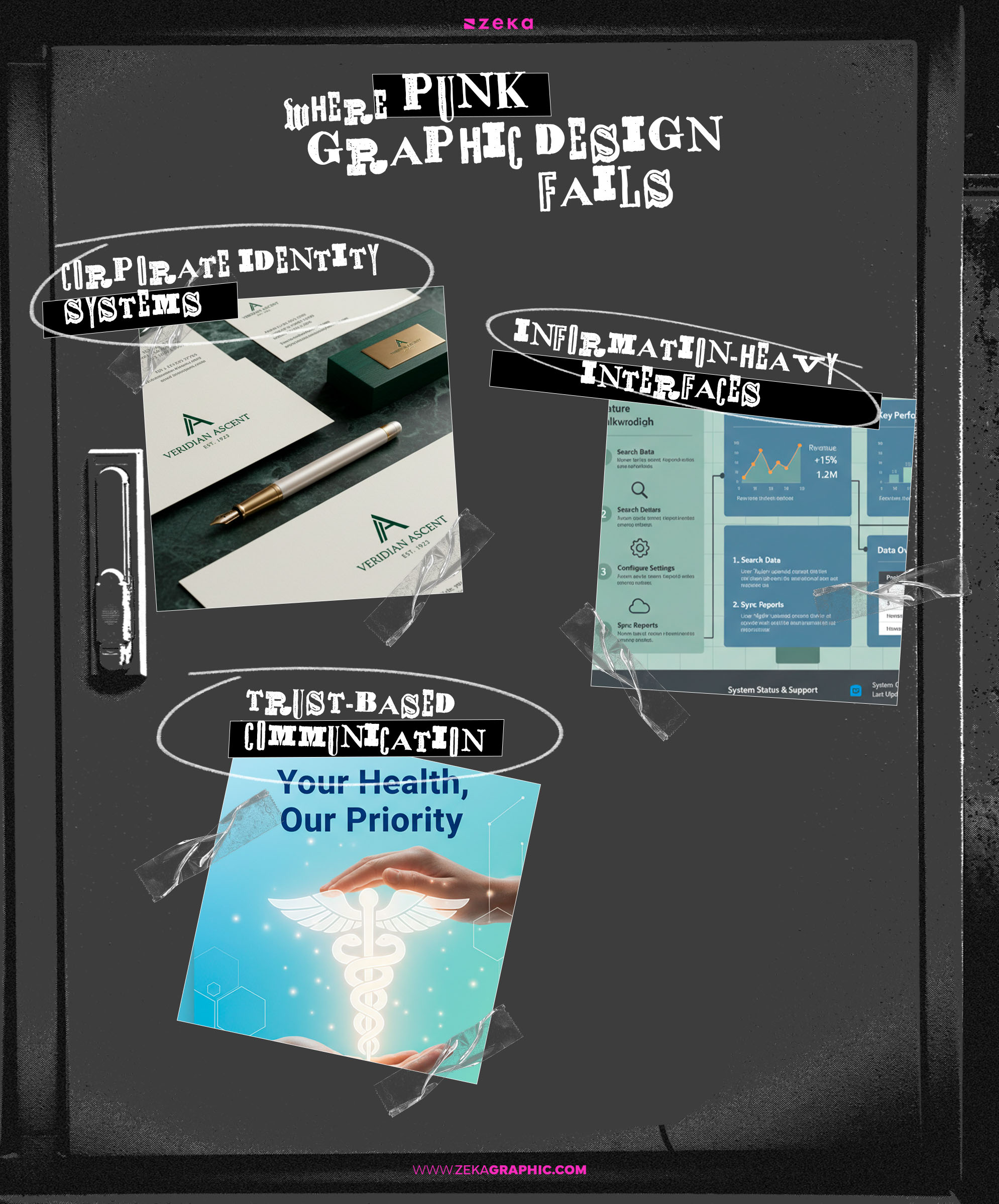
Corporate Identity Systems & Long-Term Branding
Punk resists consistency, scalability, and governance. That’s not a weakness—it’s the point. But it directly conflicts with systems that require predictability across years, teams, and platforms.
Information-Heavy Interfaces
Dashboards, SaaS platforms, data tools, instructional products. Punk increases cognitive load, breaks scanning patterns, and undermines usability. Even “controlled chaos” becomes friction in these environments.
Trust-Based Communication
Finance, healthcare, education, public services. Punk’s confrontational tone can signal instability, risk, or irresponsibility—exactly the opposite of what these sectors require.
Key takeaway:
Punk works when tension is intentional and aligned with purpose. It fails when chaos replaces clarity—or rebellion replaces strategy.
Advertisment
Punk graphic design stops being effective the moment it becomes accidental.
The most successful punk visuals feel chaotic—but are built on very conscious decisions.
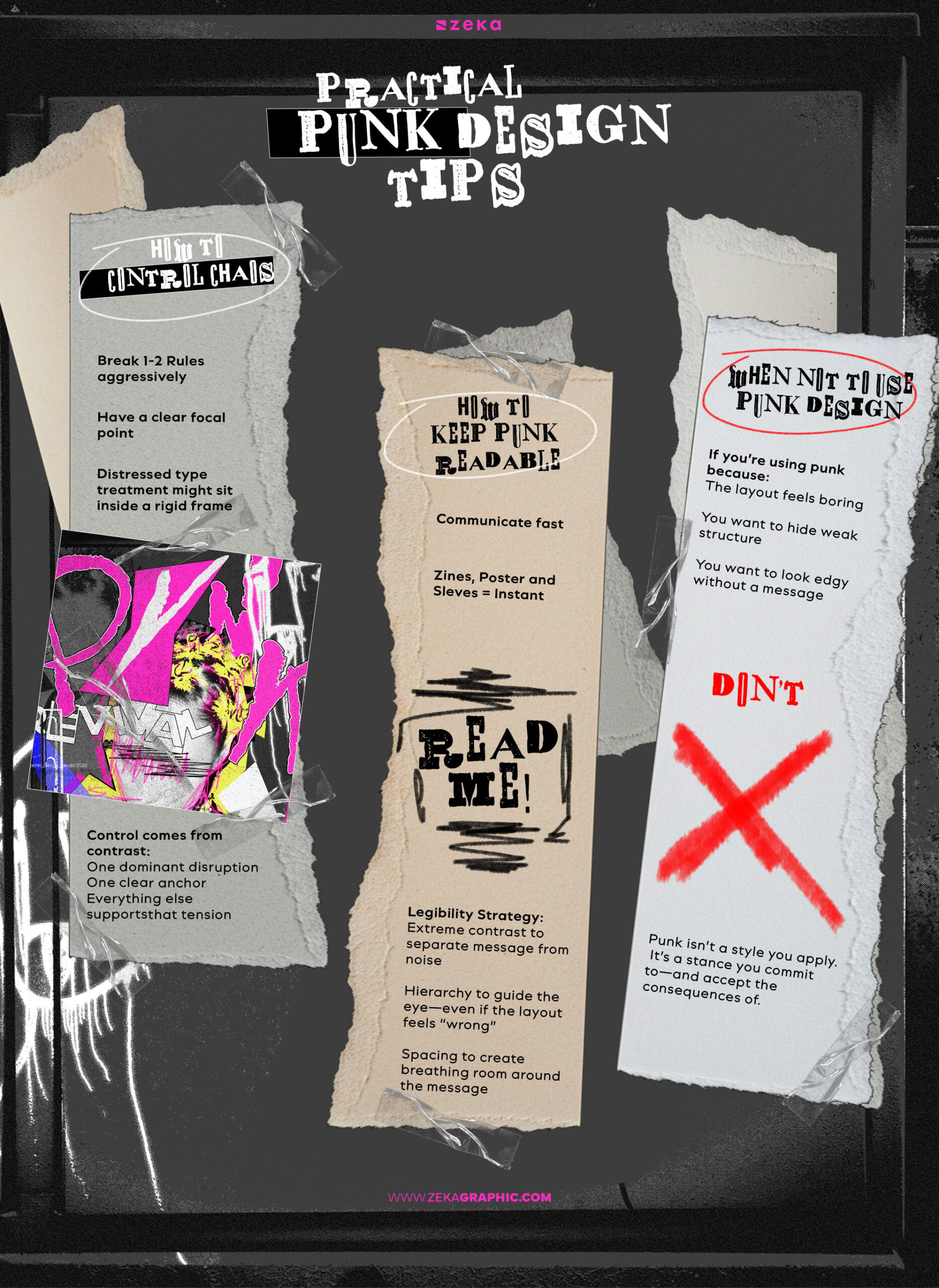
Never break everything at once.
Strong punk design usually violates one or two rules aggressively, while quietly respecting the rest. A chaotic layout might still have a clear focal point. A distressed type treatment might sit inside a rigid frame.
Control comes from contrast:
When everything screams, nothing is heard.
Punk has always communicated fast. Zines, posters, record sleeves—they were meant to be understood instantly.
Legibility is not optional; it’s strategic.
Use:
Rough doesn’t mean careless. Punk typography still directs attention—it just does it loudly.
If you’re using punk because:
Don’t.
Punk is not a visual shortcut. It amplifies intent—but it also exposes it. Without a reason to rebel, punk collapses into cliché.
Core principle:
Punk isn’t a style you apply.
It’s a stance you commit to—and accept the consequences of.
Advertisment
Contains Affiliate Links
Punk graphic design didn’t grow from textbooks—it grew from manifestos, zines, photo archives, and critical documentation. The most valuable books on punk aren’t “how-to” manuals. They’re cultural records that reveal why the visuals look the way they do.
These references are useful not for imitation—but for understanding mindset, context, and intent.
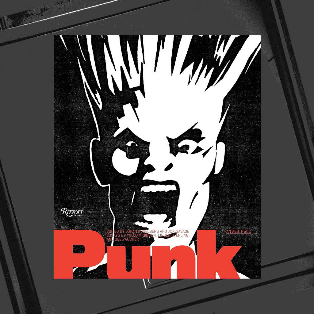
Punk: An Aesthetic — Johan Kugelberg
A visual archive documenting punk’s raw graphic language across posters, flyers, and zines. Less explanation, more evidence—exactly how punk should be studied.
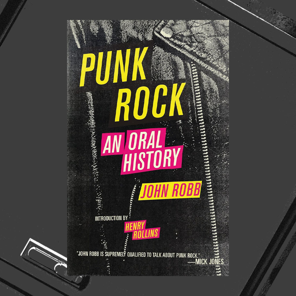
Punk Rock: An Oral History — John Robb
Not a design book, but essential context. Punk visuals can’t be separated from punk voices. This helps designers understand the urgency behind the imagery.
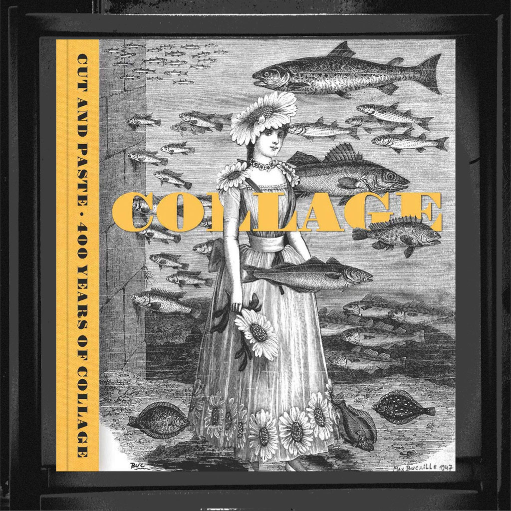
Cut and Paste: 400 Years of Collage — Patrick Elliott
Collage as rebellion didn’t start with punk—but punk weaponized it. This book connects historical collage techniques to punk’s cut-and-paste aggression.
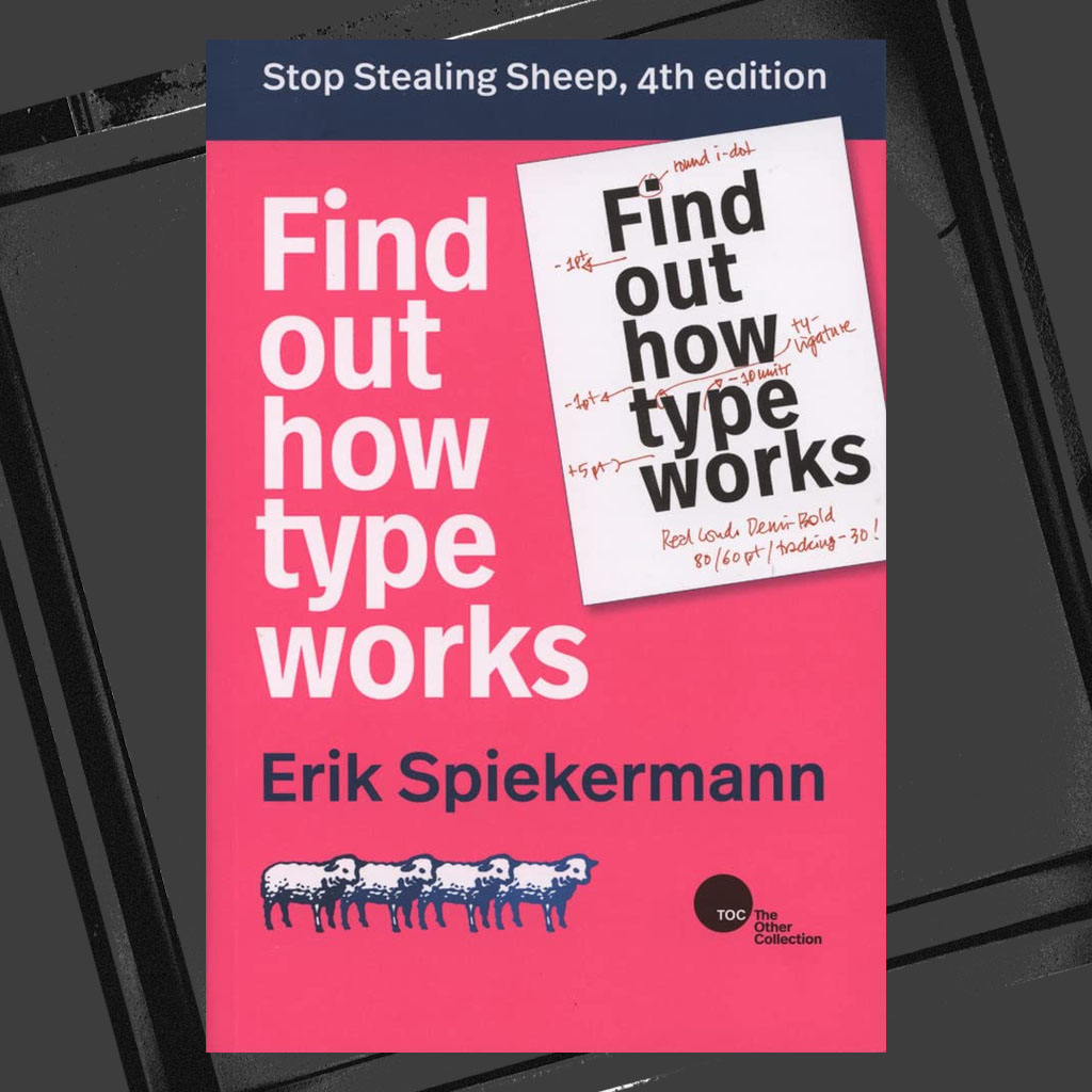
Stop Stealing Sheep & Find Out How Type Works — Erik Spiekermann
Not punk in style—but crucial in contrast. Understanding typographic rules is what allows punk designers to break them with purpose.
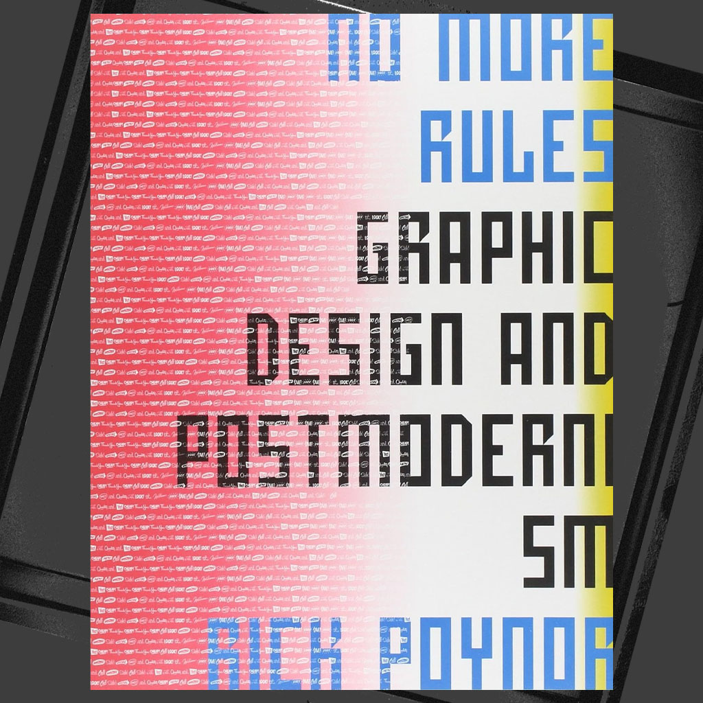
No More Rules: Graphic Design and Postmodernism — Rick Poynor
A critical bridge between punk, postmodernism, and anti-design movements. Essential for designers who want intellectual clarity—not just visual noise.
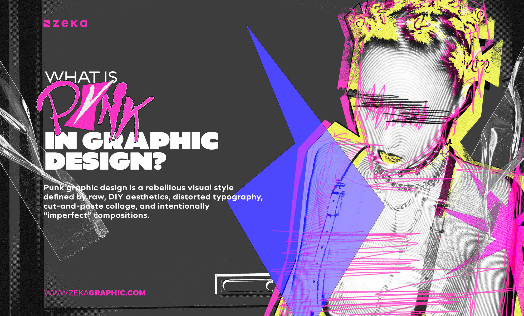
What is punk graphic design?
Punk graphic design is a visual language built on resistance. It uses disruption, imperfection, and rule-breaking to communicate urgency, identity, or opposition. Unlike decorative “edgy” styles, punk is driven by intent—every rough edge exists to serve a message, not an aesthetic trend.
Is punk graphic design the same as grunge design?
No. While they share visual overlap, their purpose is different.
Grunge often focuses on texture and mood, while punk focuses on communication and stance. Punk design is confrontational by nature—it pushes back, questions authority, and rejects polish as a value system.
Can punk graphic design be professional?
Yes—when it’s controlled.
Professional punk design is not messy; it’s deliberately unstable. Strong hierarchy, contrast, and readability still exist beneath the surface. What changes is the tone, not the intelligence of the layout.
Why does punk graphic design keep returning?
Because every era produces sameness.
When visual culture becomes too clean, too automated, or too optimized, punk resurfaces as a corrective force becoming a trend. Today, it’s reacting to AI-generated perfection, corporate minimalism, and algorithmic sameness—just as it once reacted to mass media and institutional power.
Should I use punk graphic design for clients?
Only when rebellion serves the message.
Punk is effective when tension, identity, or resistance is part of the brand’s voice. Used without purpose, it reads as costume. Used intentionally, it becomes one of the most direct and emotionally charged tools in a designer’s arsenal.
Advertisment
Punk graphic design is not about being loud for attention.
It’s about making friction visible.
At its best, punk clarifies rather than confuses. It strips away polish to expose meaning. It replaces perfection with urgency. And it reminds designers that visuals are not neutral—they carry values, positions, and consequences.
Thinking in punk terms doesn’t mean abandoning structure.
It means choosing which structures to challenge—and why.
When you approach punk as a system of decisions rather than a visual shortcut, it stops being chaotic and starts being precise. Dangerous, even—but purposeful.
From here, punk connects naturally to other expressive systems that treat design as language, not decoration.
Advertisment
Pin it for later!
If you found this post useful you might like to read these post about Graphic Design Inspiration.
Advertisment
If you like this post share it on your social media!
Advertisment


Want to make your Business Grow with Creative design?
Advertisment

Advertisment