Maintaining consistent color use is essential for creating a memorable and trustworthy brand. Whether your logo appears on a website, business card, or product label, using the exact same hue conveys reliability and professionalism. Customers quickly associate that color with your brand, which reinforces recognition and loyalty.
Every printing process, screen, or material has slight variations. That’s why achieving precise color consistency in branding matters—it ensures that your visual identity remains true across all platforms, no matter the medium. In this guide, we’ll explore how PMS ensures your brand colors stay consistent and impactful.
Advertisment
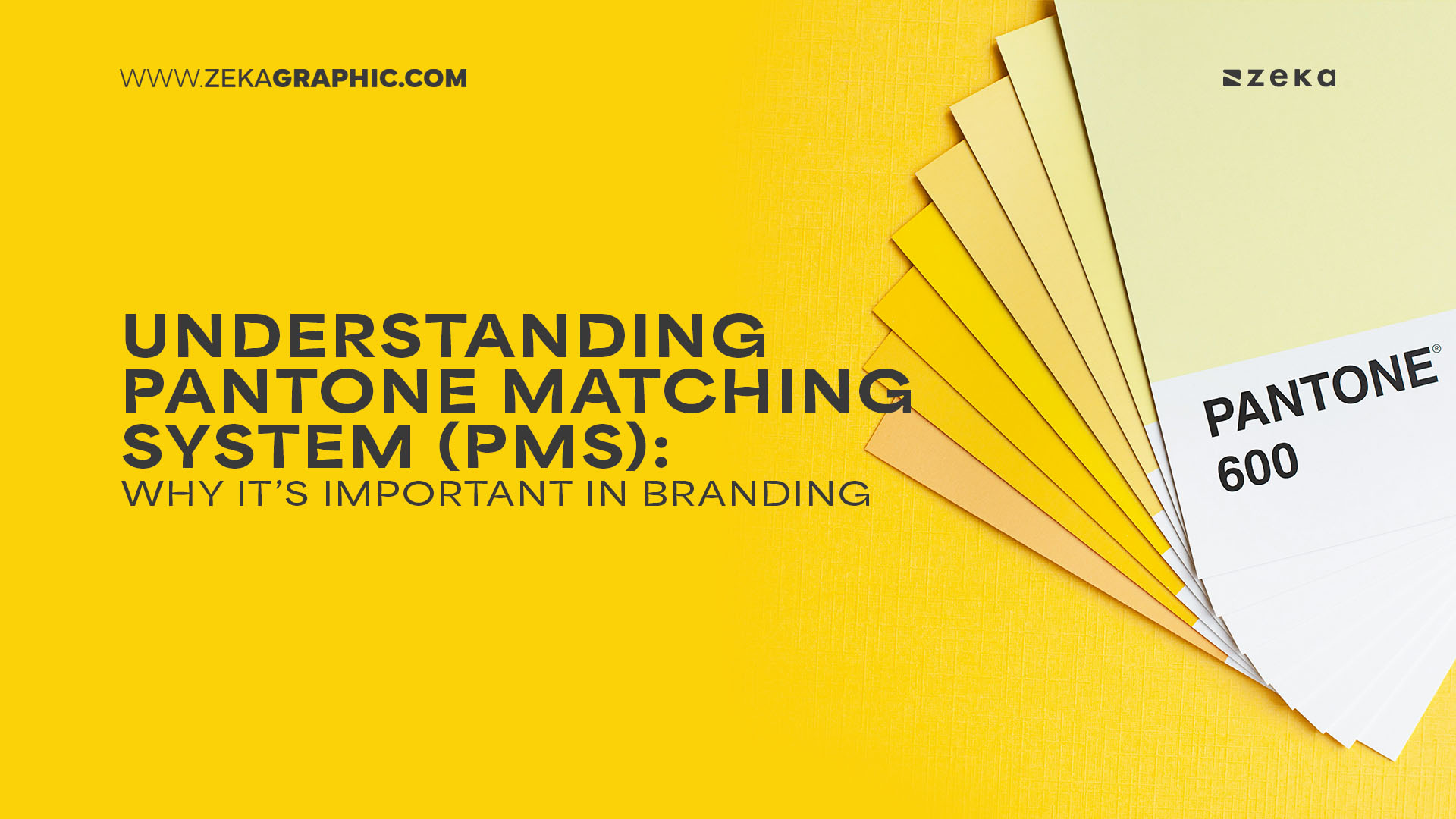
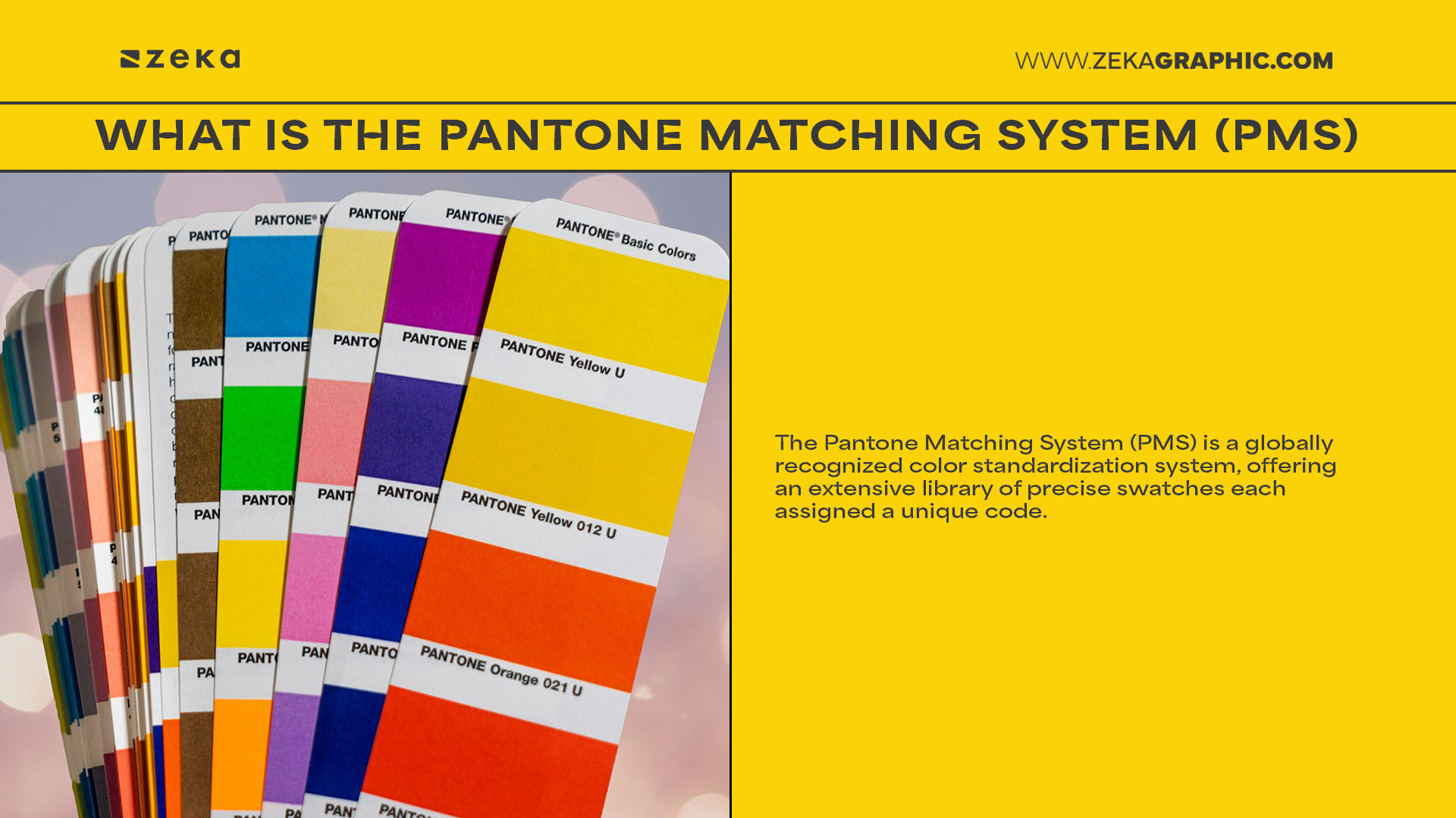
The Pantone Matching System (PMS) is a globally recognized color standardization system, offering an extensive library of precise swatches each assigned a unique code. Think of it as a universal color language—using PMS lets designers, printers, and manufacturers share an exact color reference, regardless of equipment or material.
Whether you’re printing letterheads, packaging, or signage, PMS ensures your chosen hue is reproduced accurately every time. This trusted system simplifies communication and reduces guesswork, making it indispensable for achieving effective color harmony across physical mediums.
Advertisment
When working on brand identity, packaging, or marketing collateral, choosing the right color format is essential. Each system—Pantone, CMYK, RGB, and HEX—serves a different purpose depending on the medium and output. Understanding the difference between Pantone and RGB or CMYK will help you deliver consistent and professional results in both print and digital.
Let’s break down the key formats and how Pantone stands apart:
Advertisment
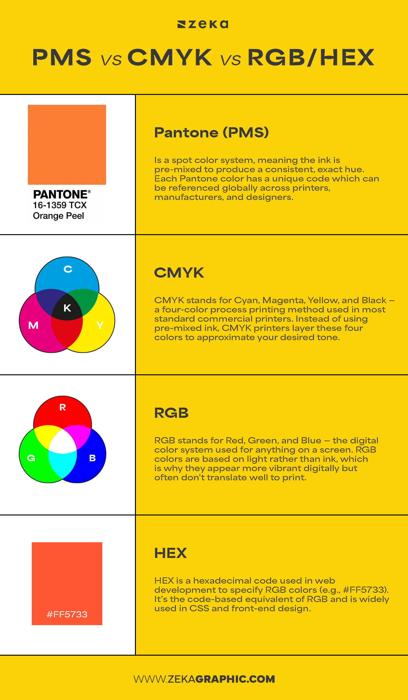
Pantone (also known as the Pantone Matching System or PMS) is a standardized spot color system used in print design that ensures consistent color reproduction by assigning unique codes to pre-mixed inks—ideal for branding and physical products.manufacturers, and designers. It ensures that your Coca-Cola red or Tiffany blue looks the same whether it’s printed on a T-shirt, box, or billboard.
✅ Best for: Physical print materials like packaging, branded merchandise, and signage
✅ Advantages: High color accuracy, no unexpected print shifts, consistent brand identity
CMYK stands for Cyan, Magenta, Yellow, and Black — a four-color process printing method used in most standard commercial printers. Instead of using pre-mixed ink, CMYK printers layer these four colors to approximate your desired tone. While flexible, it’s prone to variations due to ink quality, paper type, and press calibration.
✅ Best for: Mass-printing (magazines, brochures, flyers)
✅ Limitations: Color shifts can occur; less precise than Pantone for brand-critical colors
RGB stands for Red, Green, and Blue — the digital color system used for anything on a screen unlike CMYK which is used for print. RGB colors are based on light rather than ink, which is why they appear more vibrant digitally but often don’t translate well to print.
✅ Best for: Web design, apps, presentations, and screens
✅ Limitations: Cannot be printed accurately; screen brightness and calibration affect perception
HEX is a hexadecimal code used in web development to specify RGB colors (e.g., #FF5733). It’s the code-based equivalent of RGB and is widely used in CSS and front-end design.
✅ Best for: Web and interface design
✅ Limitations: Doesn’t apply to print, no real-world color swatches
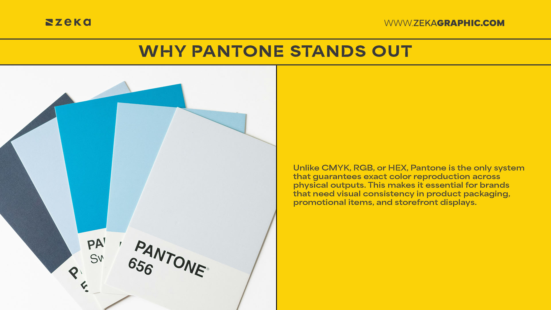
Unlike CMYK, RGB, or HEX, Pantone is the only system that guarantees exact color reproduction across physical outputs. This makes it essential for brands that need visual consistency in product packaging, promotional items, and storefront displays. CMYK can simulate Pantone colors but often fails to match them precisely. RGB and HEX, meanwhile, are optimized for screen use and should be converted carefully when translating to print formats.
Key Takeaways:
When in doubt, use Pantone for logos, packaging, and print assets, and RGB/HEX for anything digital. For commercial print runs, you might convert Pantone to CMYK—but be sure to test the outcome.
Pro Tip: Tools like Pantone Color Bridge let you compare PMS colors with their CMYK/RGB equivalents—perfect for cross-medium projects.
Advertisment
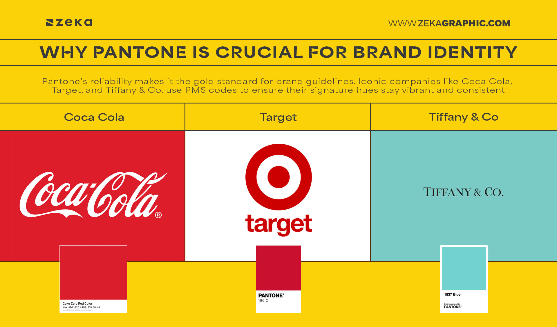
Pantone’s reliability makes it the gold standard for brand guidelines. Iconic companies like Coca Cola, Target, and Tiffany & Co. use PMS codes to ensure their signature hues stay vibrant and consistent—from packaging to signage worldwide.
By specifying PMS colors in your brand guidelines, you ensure that agencies, suppliers, and partners can reproduce your identity exactly—reinforcing brand continuity and visual trust at every touchpoint.
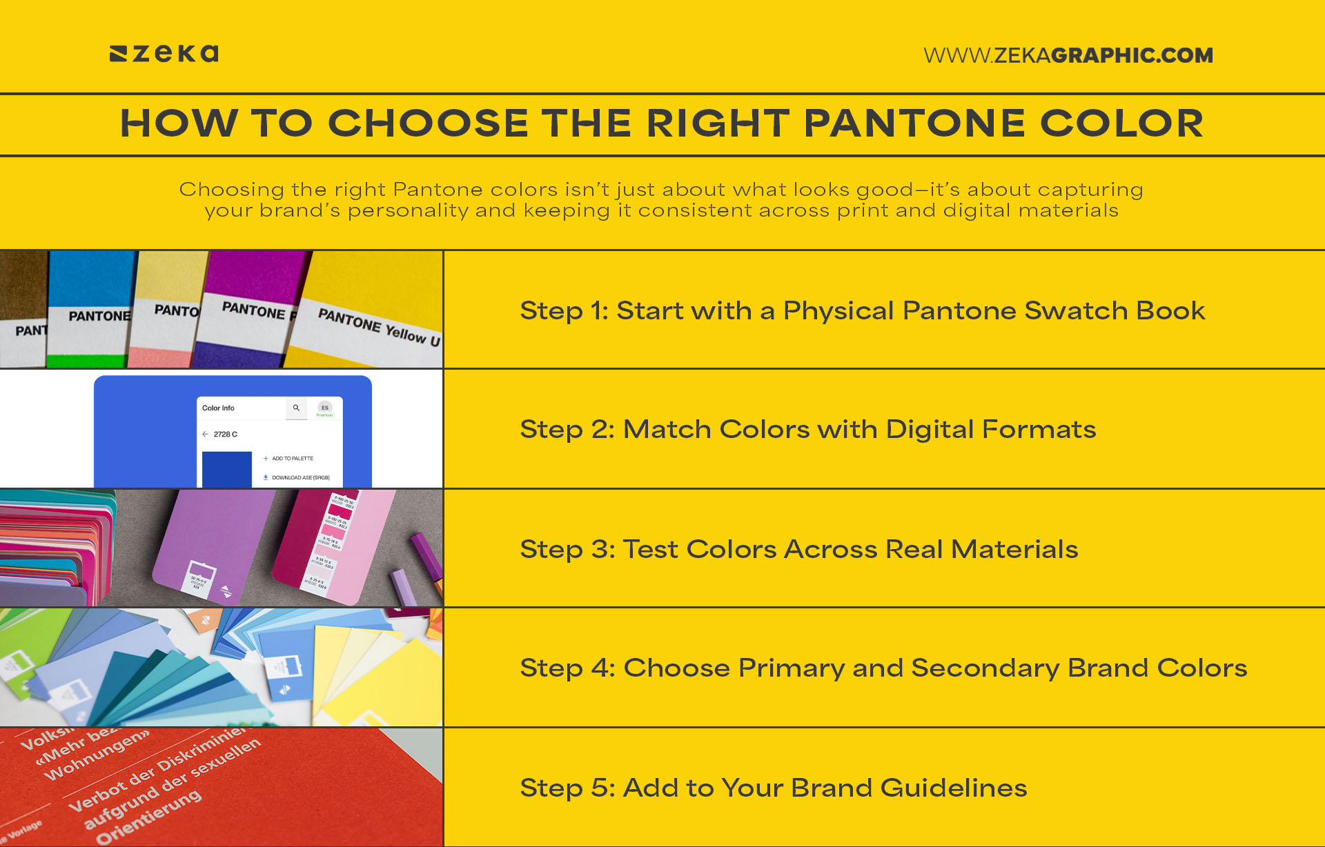
Choosing the right colors isn’t just about what looks good—it’s about capturing your brand’s personality and keeping it consistent across print and digital materials. Here’s a step-by-step guide to finding the perfect Pantone swatches for your brand:
Contains Affiliate Links
Use a physical Pantone Formula Guide or Color Bridge Guide under natural daylight conditions. This allows you to see the true pigment on paper—far more reliable than on-screen previews. Choose colors that reflect your brand’s tone: is it energetic, calm, luxurious, or minimalist?
Once you’ve selected your physical swatch, use Pantone Connect (available as an Adobe plugin or web app) to find the exact RGB, HEX, or CMYK equivalents. This is especially useful when bridging the gap between print and digital use—helping you keep brand colors consistent across web, apps, and social media.
Apply your chosen Pantone swatches to different mockups or real samples—think paper types, packaging surfaces, textiles, and signage. Colors may shift slightly depending on texture or material. Testing early ensures your hues stay consistent under different production conditions.
Once you’ve tested your options, lock in 1–2 primary Pantone colors and 2–3 supporting swatches. Make sure each one has a clear purpose—primary for logos and core visuals, secondary for accents, backgrounds, or packaging.
Document your final Pantone choices (including their CMYK, RGB, and HEX conversions) inside your brand guidelines. This becomes the reference point for designers, printers, and developers, ensuring visual consistency across all future touchpoints.
By following this color selection workflow and leveraging tools like Pantone Connect, you’ll build a color palette that reflects your brand’s personality, resonates emotionally with your audience, and performs reliably from screen to print.
Advertisment
One of the most crucial steps in ensuring color consistency across digital and print platforms is learning how to convert RGB, HEX, and CMYK to Pantone colors. If you’ve ever seen a vibrant screen design look dull or inaccurate in print, poor color conversion is likely the reason. Pantone offers a standardized, physical color guide, which digital formats can only approximate.
To convert screen-based colors to Pantone, you’ll want to use tools like Pantone Connect, Adobe Illustrator’s “Recolor Artwork”, or online converters like RGBtoPantone.com. Simply input your color in HEX, RGB, or CMYK and the tool will suggest the closest Pantone match. Keep in mind: always review Pantone swatches under proper daylight or neutral lighting, as on-screen previews vary depending on your monitor settings.
💡 Pro Tip: When working with physical print, request a Pantone proof from your printer to ensure final output accuracy before large-scale production.
Quick Color Conversion Workflow:
Color conversions aren’t just a technicality—they’re the backbone of professional brand identity. They bridge the gap between screen and substrate, ensuring the visual integrity of your brand remains intact across every platform.
Working with Pantone goes beyond just picking swatches. There’s a growing ecosystem of Pantone tools and resources that help graphic designers maintain accuracy, speed, and color confidence in their workflow.
Start with Pantone Connect, a powerful platform that integrates directly with Adobe Creative Cloud. It allows you to search for PMS colors, convert from HEX or RGB, and build palettes directly inside Illustrator or Photoshop. For hands-on accuracy, the Pantone Formula Guide (coated and uncoated) is essential—it’s the industry standard reference for spot colors and the most reliable way to see how ink will print.
Other helpful tools include:
Having the right Pantone resources makes it easier to apply brand colors consistently, whether you’re designing business cards, social posts, or packaging.
Advertisment
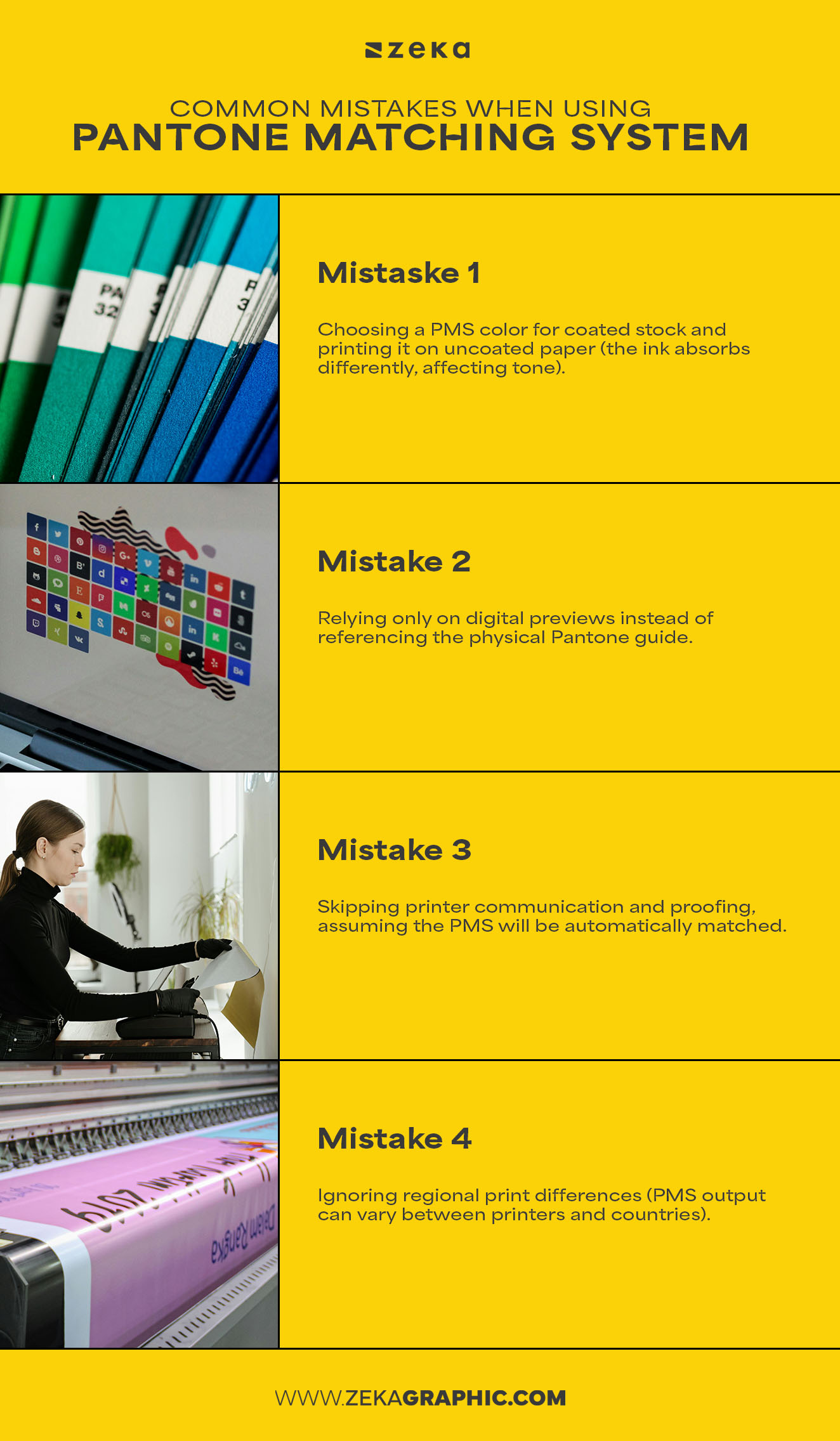
Even seasoned designers can make costly mistakes with Pantone in branding, especially when transitioning from digital to print. These errors can lead to off-brand materials, costly reprints, or brand inconsistency that weakens trust.
Some of the most common Pantone mistakes include:
Always double-check your Pantone code, confirm the material and finish, and request a print sample when working with new vendors.
Preventing these issues starts with intentionality and clarity. Know your brand’s Pantone numbers, include them in your brand guidelines, and educate collaborators and clients about using them correctly.
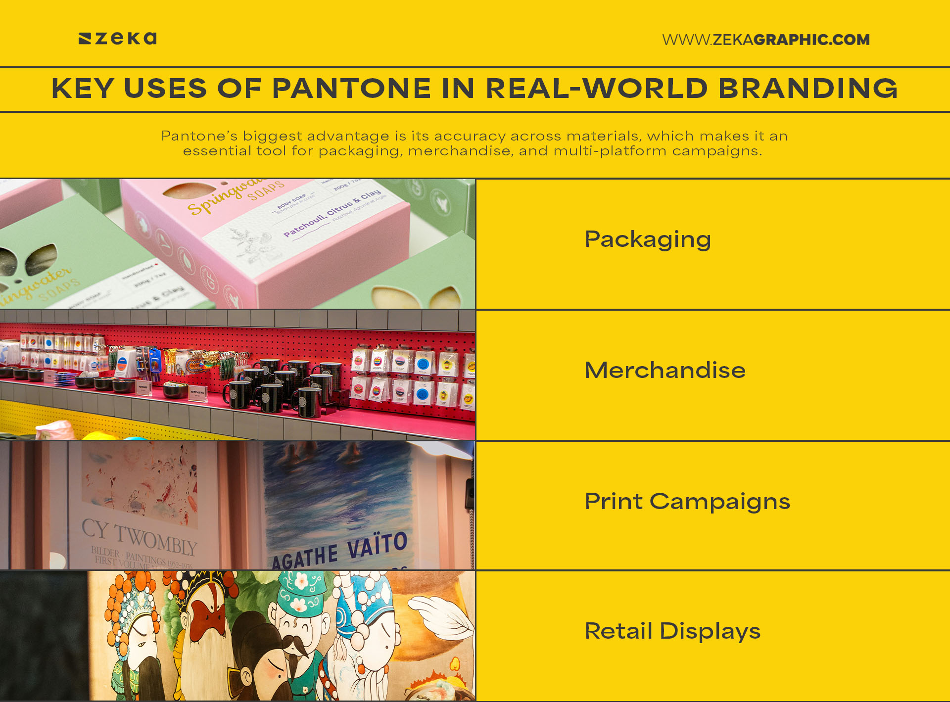
Pantone’s biggest advantage is its accuracy across materials, which makes it an essential tool for packaging, merchandise, and multi-platform campaigns. When a brand color is used across paper, plastic, fabric, and metal—it must remain visually consistent. That’s where PMS comes in.
Major brands like Coca-Cola, UPS, and Tiffany & Co. use PMS to standardize their color across global campaigns. Whether it’s a matte box, a glossy sticker, or an embroidered polo shirt—Pantone ensures that their brand red or blue doesn’t vary from country to country or medium to medium.
Key Uses of Pantone in Real-World Branding:
Advertisment
As designers, we’re not just making things look good—we’re building experiences that are remembered. The Pantone Matching System is more than just a technical asset; it’s a strategic tool that ensures brand color consistency across every customer touchpoint.
When you use Pantone in branding, you send a message of reliability, quality, and professionalism. Clients notice it, printers appreciate it, and customers feel it—even if they can’t name it. Mastering PMS means you’re thinking like a brand guardian, not just a visual artist.
To help you start, consider creating a Pantone-based brand color guide, test print a small run of materials, or explore a PMS library in Adobe Illustrator. Over time, you’ll gain confidence in specifying and defending your color decisions across teams and platforms.
If you found this post useful you might like to read these post about Graphic Design Inspiration.
Advertisment
Written by
If you like this post share it on your social media!


Advertisment

Advertisment