You hired a second designer six months ago. Since then, your marketing site buttons look different from the ones in the app. The purple in your emails doesn’t match your homepage. Nobody did anything wrong – there just isn’t a shared design system. And the graphic design principles you thought were settled keep shifting weekly.
That is exactly what we are going to fix here. We will show you seven strategies that actually work for building a design system your team won’t abandon after the first quarter. You will also get five reasons it is worth the effort and three mistakes that kill most systems before they hit 18 months.
Advertisment
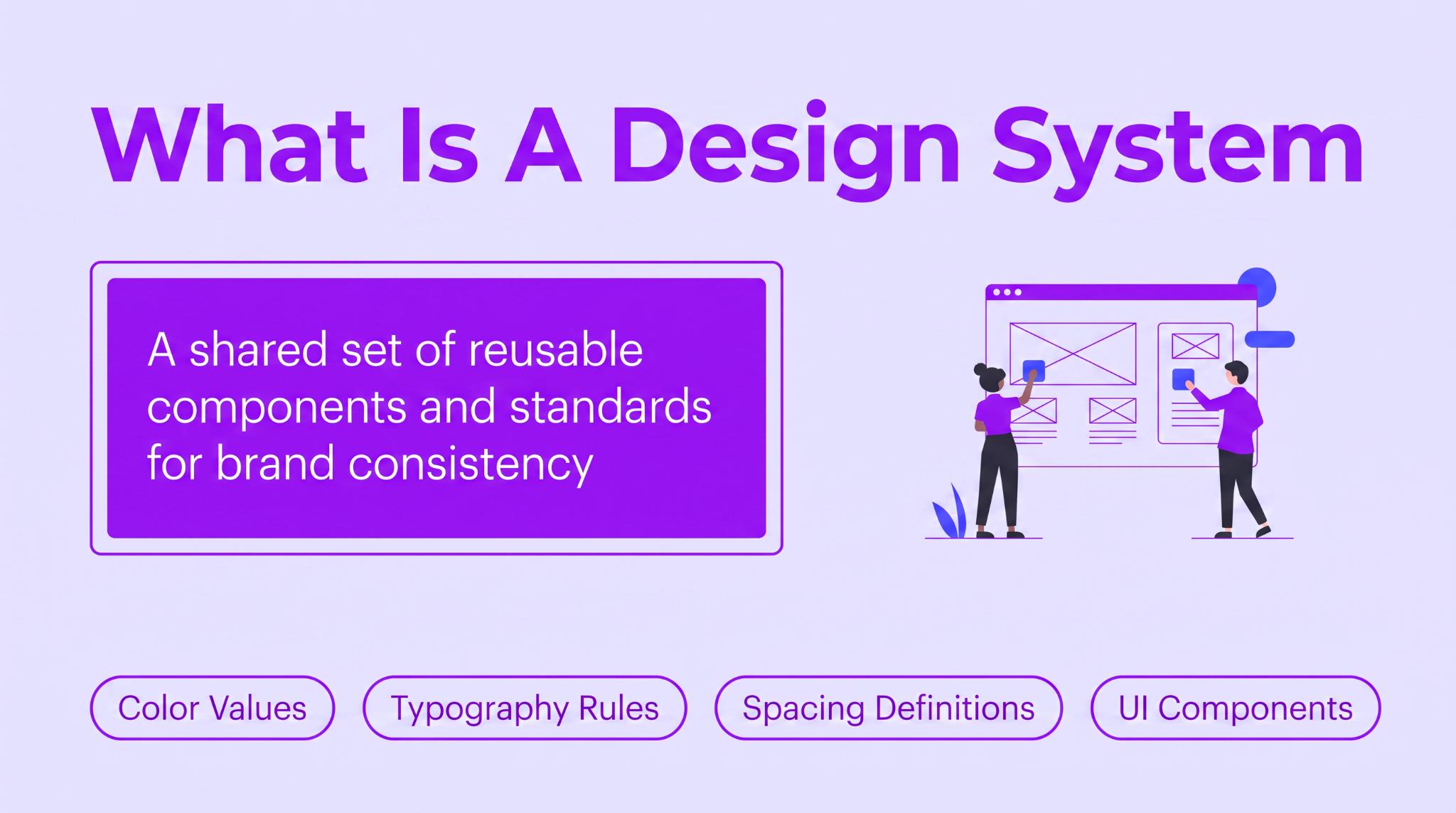
A design system is a shared collection of reusable UI components and standards that control how your brand looks across every touchpoint. It covers color values and typography rules. Spacing definitions and UI elements are alongside those. But the part most teams neglect is the documentation… the reasoning behind each choice, not just the hex codes.
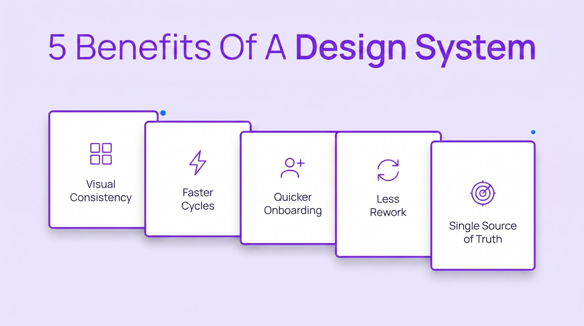
The upfront work isn’t small. But brands that push through it notice the returns within a month.
Your website and your Instagram ads pull from the same file. When someone updates a button color, it shows up everywhere – not in one random corner of the product. Nobody is guessing which purple is “the right one” or whether the logo needs 24px of breathing room or 32.
The result is a consistent visual appearance no matter where customers encounter your brand. That consistency makes it easier to get more traffic from your marketing efforts because every visitor lands on a page that feels familiar.
Your designer doesn’t rebuild a pricing card every time a new landing page goes up. It already exists. Same for the developer – no fresh CSS needed. Both get the same component and move on. Pages that used to take a week now take two days. This lets teams focus their design efforts on new problems.
Someone new joins Monday. By Wednesday, their work looks like it came from someone who has been there a year. The system tells them exactly what to use – no ambiguity about spacing or which version of the icon set is current.
Handoffs get cleaner when both sides reference the same component library. A developer checking padding finds the answer right there instead of asking the designer. Same goes for a shifted border radius. No ticket needed. The answer is there before the question comes up. Shared references also streamline workflows by reducing unnecessary clarification between teams.
Your color palette says the primary brand color is #9B24FF. But someone on the team used #8B1FE0 last month, taken from an outdated Figma file. Unlike traditional style guides, a well-maintained system kills that kind of drift. Over time, those standards become the brand’s shared design language across every product. If the value isn’t in there, it doesn’t get used.
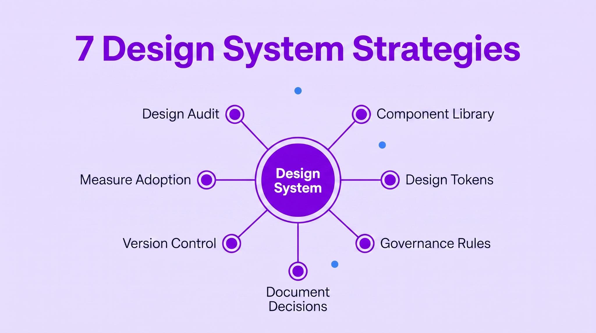
Most attention goes to the component library, but the teams that keep their design system running long-term built habits around it, not just assets. These strategies cover the structural work and the daily practices that help a brand scale without losing identity.
That audit becomes the starting point for the rest of the design process. Skipping it is how you end up building something that fixes problems you don’t actually have. You need to see what is there first. Which pages use conflicting spacing. Where button styles drifted from the original brand guidelines. You can’t fix what you haven’t mapped.
Accessibility gaps are more common than most teams think. A 2025 audit found that 94.8% of home pages had detectable WCAG violations. Finding those during your audit keeps bad patterns from getting into every future page.
Marketplaces get hit harder by this than almost any other site type. Every new listing category adds a template. Seller dashboards look nothing like buyer browse pages. The business grows by adding categories – not by rebuilding old ones. So the visual gap between sections keeps widening without anyone noticing until a redesign forces a full template count.
Business For Sale runs a marketplace where owners list businesses for sale across dozens of Australian industries. A café listing in Melbourne and a logistics operation in Perth share the same card layout. Trust badges land in the same spot on every page. Pricing tiers carry the same visual weight regardless of the package.
Consistency across hundreds of live listings didn’t happen by accident. Someone mapped every existing template before building anything new. The audit showed where seller profiles had drifted from buyer-facing pages and where badge placements shifted between sections. Once documented, those gaps got addressed in one pass instead of page by page over six months.
For any platform managing high-volume content, the audit decides whether new categories inherit real brand standards or just whatever the last person happened to build.
Advertisment
A component library on one person’s laptop is barely a library at all. If the developer can’t get to components without asking the designer to export something, it is not doing its job. It needs to be somewhere everyone can search and pull from… design and engineering both. The accompanying design pattern library documents the pattern language behind those reusable components.
Subscription commerce sites face a version of this challenge. They aggregate products from dozens of brand partners into one catalog. Each brand has its own packaging aesthetic and visual identity. The component library has to make every product feel like it belongs on the same site while still letting individual brands stand out enough for customers to tell them apart.
Scentbird’s monthly fragrance subscription is a good example of the kind of catalog where consistency matters. The platform brings together fragrances from a wide range of designer and niche brands, yet customers still browse them within a single shopping experience. Product cards need to accommodate different brand imagery and product names without making the catalog visually inconsistent.
That is where a shared component library and design pattern library become valuable. Instead of creating a different layout for every new brand, teams can rely on reusable components and established patterns that consistently present products while still allowing each brand’s imagery to remain recognizable.
As more partner brands are added, the catalog can grow without introducing unnecessary design variations. The result is a browsing experience that is consistent even as the range of products continues to expand.
A developer writes padding: 16px into one file. Another developer copies it into a different file. Six months later, the brand updates its standard padding to 20px. Now somebody has to find every hard-coded 16px and swap it. Tokens fix that. They store the value once and give it a name. Every file references the name instead of the raw number.
Zeroheight’s 2026 report found that 86% of design systems now include tokens. If yours doesn’t, you are in a shrinking minority.
Token Category | What It Controls | Example |
Color | Brand palette values | primary: #9B24FF |
Typography | Font families and sizes | heading: Inter, 24px |
Spacing | Padding and margins | card-padding: 16px |
Border | Radius and stroke width | button-radius: 8px |
Shadow | Elevation and depth | card-shadow: 0 2px 8px |
eCommerce catalogs are where tokens prove themselves. When a product catalog has hundreds of variants, every card needs to display pricing and buttons identically. One person tweaks padding for a new category. Someone else uses a slightly different font weight for discounted prices. Within a few months, the catalog starts to look disjointed.
You can see why consistency matters by looking at large product catalogs like Golf Cart Tire Supply. On its wheels and tires category pages, product cards present pricing, sale prices, product images, and CTA buttons in a consistent layout despite covering different wheel sizes and tire types.
That kind of uniform presentation makes it easier for shoppers to compare products without the page feeling visually uneven. As catalogs grow, a design token system helps maintain that consistency. Whether a business adds a handful of products or an entirely new category, new product cards can inherit the same spacing, typography, colors, and pricing styles.
Tokens absorb new content without anything looking off. Add 50 new SKUs next month and every card gets the same spacing and price display, which helps keep every new product page visually cohesive.
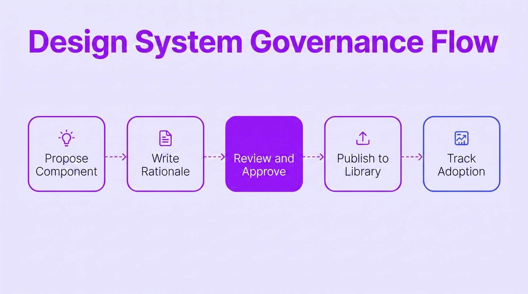
Without governance, the whole thing turns into a shared folder that everyone edits, but nobody maintains. One person adds a component variant. Another modifies an existing one without telling anyone.
A few months later, there are three versions of the same card, and nobody knows which is current. Governance gives every team a unified language for making UI design decisions.
Loyalty platforms have a governance challenge most SaaS products don’t face. The brand shows up in a customer’s digital wallet and on their lock screen. It appears at the point of sale and inside confirmation emails. Each touchpoint gets built by a different team. Without governance rules for how the brand appears in each context, the experience fragments.
BonusQR’s digital loyalty app is a good example of a product where this matters. The platform supports branded loyalty experiences across QR code interactions, digital stamp cards, loyalty landing pages, and customer communications. Although those experiences appear in different contexts, they still need to be like parts of the same product rather than separate interfaces.
That is why products like this benefit from clear contribution and governance rules. Designers and developers need shared guidelines for reusable components and interconnected patterns so new features or branded experiences don’t introduce unnecessary visual inconsistencies.
Without that separation, every white-label deployment would introduce layout issues the core team has to trace and fix individually.
Most system documentation just lists values. The heading is 24px Inter. The primary button has an 8px radius. But nobody wrote down why. Maybe the typography hierarchy was tested against accessibility requirements. Maybe someone just picked what looked good.
Either way, when the person who made that call leaves, the reasoning goes with them. Well-known systems like Google’s Material Design document not only what to build but also why those decisions were made.
When the system changes without a version tag, nobody knows what happened. One team uses last quarter’s button component without knowing it changed. Another adopted the update but has no record of what shifted. Versioning gives everybody a reference point while the system keeps moving.
Even something small like updating font pairings or icon sizing needs a tagged release. Otherwise, there is no way to tell if a visual difference is intentional or an error nobody caught.
Building a system and then not tracking whether anyone uses it is pointless. You need data showing which components are going into production and which ones are being skipped. The moment someone higher up asks if the budget is worth it, “I think people like it” isn’t going to cut it.
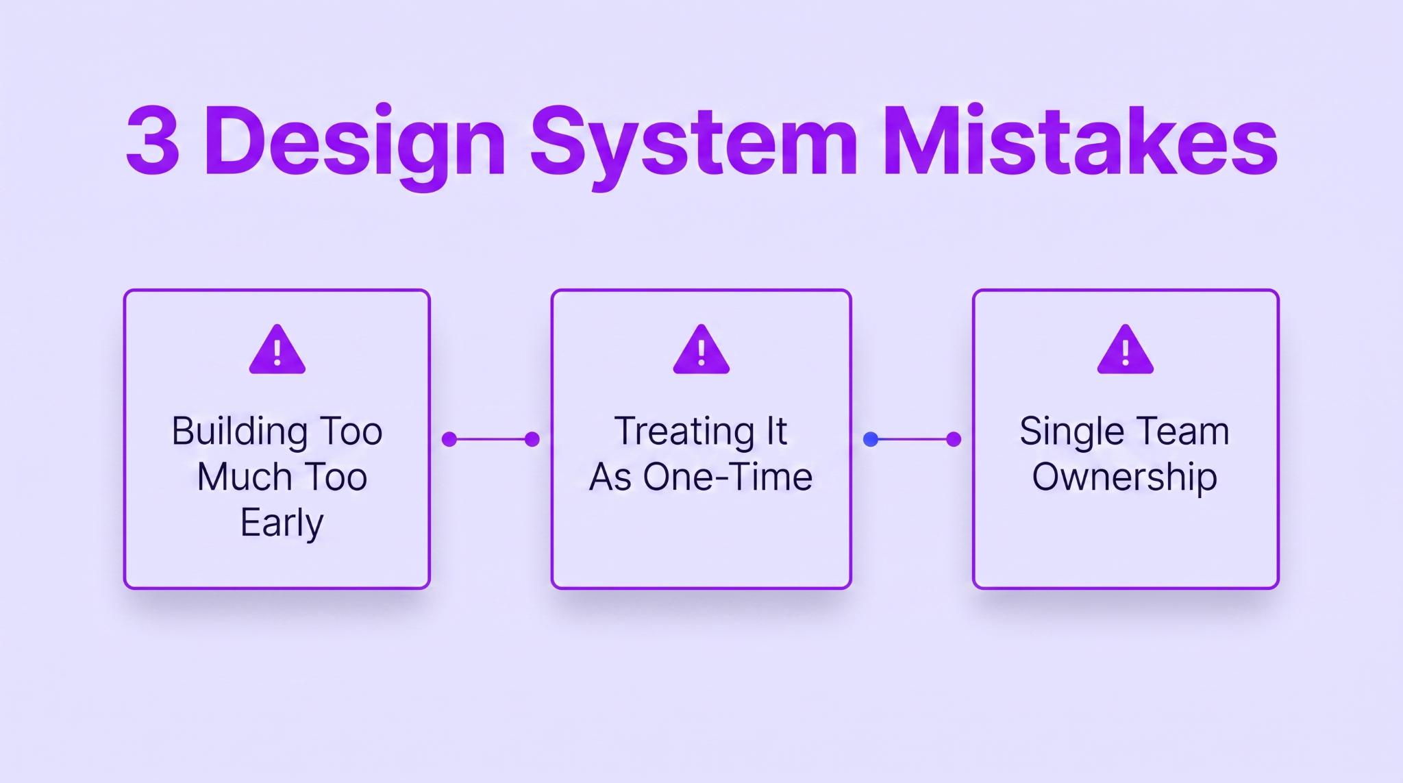
Good intentions don’t protect a system from bad execution. These three mistakes show up all the time. And they are avoidable once you know what to watch for.
You would think it is smart to build the whole system before releasing it. Cover every edge case. Get it perfect. But a 200-component library nobody has used in a real project is just an untested theory. Work goes into components that products never end up needing. The stuff that IS needed never gets built because nobody asked real teams what they wanted.
How to Fix: Ship with 10-15 components pulled from the pages your team uses most. New components only get added when a real project actually needs them. Unused components get archived after 90 days – dead weight slows search.
Ship it once and move on… that is how most systems die. The product keeps changing. New features need components that weren’t part of the original build. If the system doesn’t keep up, teams quietly stop checking it and start building their own stuff again. Give it a year and the same inconsistencies are back.
Only 40% of design systems stay active past 18 months. Almost always because the team treated launch day as the finish line.
How to Fix: At least one person needs standing responsibility for maintaining and updating the system. Hold monthly sessions where product teams flag gaps and request new components. Publish a quarterly roadmap, so teams know what is coming and stop building around gaps.
When the design team builds the system alone, the components end up reflecting how designers work, not how the rest of the company uses the brand. Developers open the coded version and find it doesn’t match Figma. Marketing tries the approved palette and realizes it is missing the shades they need for small brand touches in campaign materials.
How to Fix: At least one developer and one marketer belong on the governance team. Run quarterly sessions with cross-functional teams where engineering and marketing share what’s broken. Both design and development sign off before components go into the user interface library.
Advertisment
These strategies don’t follow a strict order. They run in parallel once a design system goes live. The audit comes first because you can’t build on what you haven’t mapped. From there, systematic design keeps every future change aligned with the same standards.
Governance and token management strengthen each other after that, and the documentation ties both to specific decisions. What matters most is keeping the system staffed after launch.
At Zeka Design, I build the visual identity that goes underneath a brand’s system – logo design and brand standards grounded in research. I have a graphic design studio based in Valencia, and the type decisions and color systems we set become the building blocks your component library references. Get in touch now.
Advertisment
Pin it for later!
If you found this post useful you might like to read these post about Graphic Design Inspiration.
Advertisment
If you like this post share it on your social media!
Advertisment



Want to make your Business Grow with Creative design?
Advertisment
Advertisment