An architectural 3d visualization and rendering company does more than reproduce walls, windows, and furniture from technical plans. It translates an unbuilt place into a scene that a buyer can understand and feel. Blueprints explain structure, but they rarely communicate comfort, status, calm, or energy. Color does that work quickly. A warm lobby can suggest welcome and care, while a cool glass office can signal order and efficiency. These reactions vary, yet they shape how viewers read a project.
For developers, architectural design visualization and 3d rendering services are therefore part of the sales process, not just the design process. A carefully controlled palette helps an architect present intent, helps an investor see market fit, and helps a buyer picture daily life. The render becomes a promise about the future. Its colors decide whether that promise feels believable.
Advertisment
Color reaches the viewer before most spatial details are studied. Research published in Management Decision reports that people can form an initial judgment within 90 seconds, with color accounting for roughly 62% to 90% of that early assessment. The figures come from marketing research, not property sales, so they are not a direct conversion formula. But the principle is useful: color is fast, emotional, and difficult to ignore.
A skilled 3d render service uses that speed with restraint. Soft neutrals can reduce visual noise and make a floor plan feel clear. Darker tones may suggest privacy or prestige. Brighter accents can direct attention toward a reception desk, retail display, terrace, or shared amenity. Context still matters. Culture, age, personal taste, and the building’s purpose all affect interpretation, so artists test palettes against the intended audience rather than applying fixed color stereotypes.
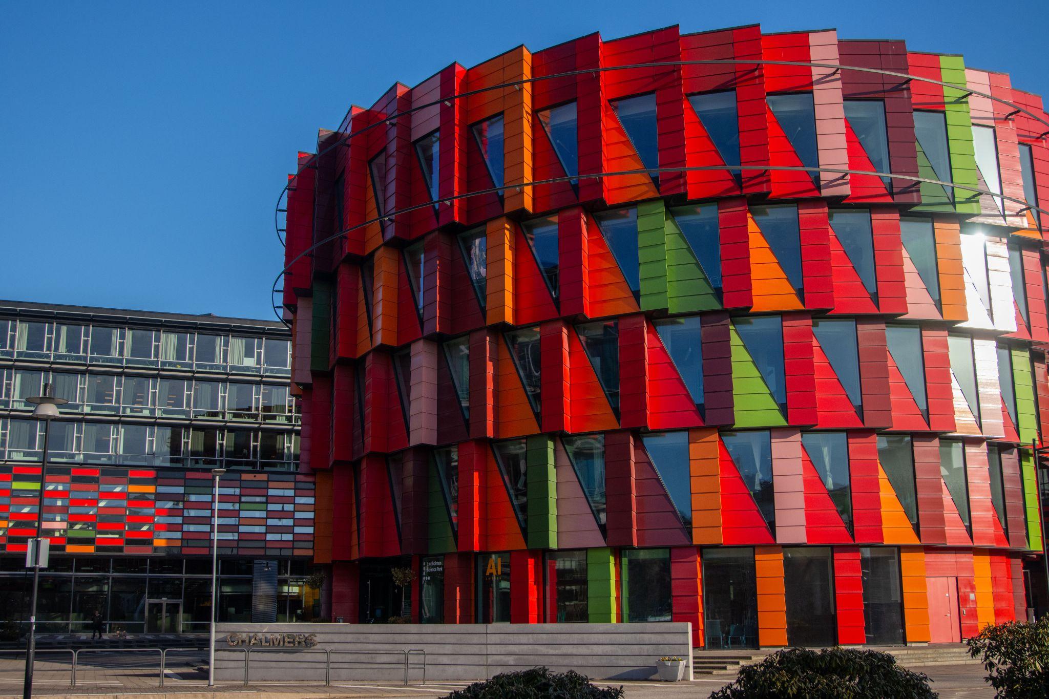
Light changes color before the viewer consciously notices it. On the Kelvin scale, a source near 2700K to 3000K reads as warm, while light around 5000K to 6500K appears cooler and closer to crisp daylight. A 2021 study tested 33 participants across six combinations of warm or cool white light and white, red, or blue interiors. Cool light increased perceived brightness, while the preferred result depended on the surface color. That finding matters because a 3d rendering service cannot choose lighting and materials as separate decisions.
Warm light can make wood, stone, and fabric feel intimate. Cool light can sharpen metal, glass, and white surfaces, supporting a cleaner or more technical mood. Artists also control direction, contrast, and the softness of shadows. The same room may feel calm at dawn, active at midday, or exclusive at blue hour. The geometry has not changed. The emotional reading has.
Advertisment
Golden-hour scenes are common in residential marketing because they connect architecture with the idea of returning home. Low sunlight creates warm oranges and soft yellows, while long shadows reveal depth without making the scene harsh. Interior lamps can glow behind windows at the same time, linking the public exterior with private domestic life. In 3d architectural visualization rendering, this balance is carefully staged rather than left to chance.
Artists decide how much warmth the scene can carry before white walls turn orange or natural stone loses its real character. They may lower the contrast around the planting, soften reflections on the glazing, and keep the sky slightly cooler so the building remains the focal point. Small human details also matter: a lit dining table, a bicycle near an entrance, or movement on a balcony. Used with care, these cues support safety and a sense of belonging without making the image sentimental.
A color never appears alone. Its material changes the message. Gray concrete may feel solid, restrained, and urban, while gray boucle fabric feels soft and domestic. Brown on polished stone suggests weight and expense; the same brown on oak suggests warmth and familiarity. A 3d architectural rendering company must therefore model reflectivity, roughness, grain, and surface variation as carefully as hue.
This is where technical accuracy supports psychology. Brushed brass needs controlled highlights, not a flat yellow fill. Timber needs subtle tonal differences so it does not look printed. Fabric absorbs light, while glass carries reflections from other parts of the scene. When these properties are correct, the viewer can almost predict how a surface would feel. Artists then balance tactile signals across the frame. Too many glossy materials can make a home feel cold. Too many matte earth tones can make a commercial interior appear dull. The strongest palette usually includes contrast, but it keeps that contrast tied to the building’s purpose.
After the base render is complete, color grading gives the image a consistent visual language. The process is similar to film grading. Artists adjust white balance, contrast, saturation, shadow tint, and highlight roll-off. They may also use LUTs (Look-Up Tables) as a starting point, then refine the result by hand. Professional 3d architectural rendering services use grading to align separate views so a campaign feels like one project rather than a collection of unrelated images.
The target audience guides the grade. A luxury penthouse may use controlled blacks, warm highlights, and low saturation to create a sense of restraint. A suburban family development may keep skin tones, greenery, and daylight more natural. An urban creative hub may use stronger contrast and selective color accents. Good grading does not hide weak materials or inaccurate lighting. It supports the design story while keeping finishes credible enough for clients, planning teams, and buyers to trust what they see.
Sustainability is often communicated through a familiar visual vocabulary: soft greens, clay and sand tones, muted gray, natural timber, daylight, and visible planting. These choices can suggest health, reduced environmental impact, and a closer relationship with nature. But 3d architectural visualization services should avoid using green as a substitute for proof. Solar shading, passive ventilation, material sourcing, landscape design, and water management need to be visible where they are part of the actual project.
Color can then organize those facts into a coherent mood. Low-saturation greens feel calmer than bright synthetic greens. Warm timber can soften technical features such as photovoltaic panels or exposed services. Daylight can show that a wellness space feels open without making every surface pure white. The aim is not to paint a project as sustainable. It is to help viewers recognize how environmental decisions affect daily experience, from natural light in a workspace to shaded outdoor routes in a residential community.
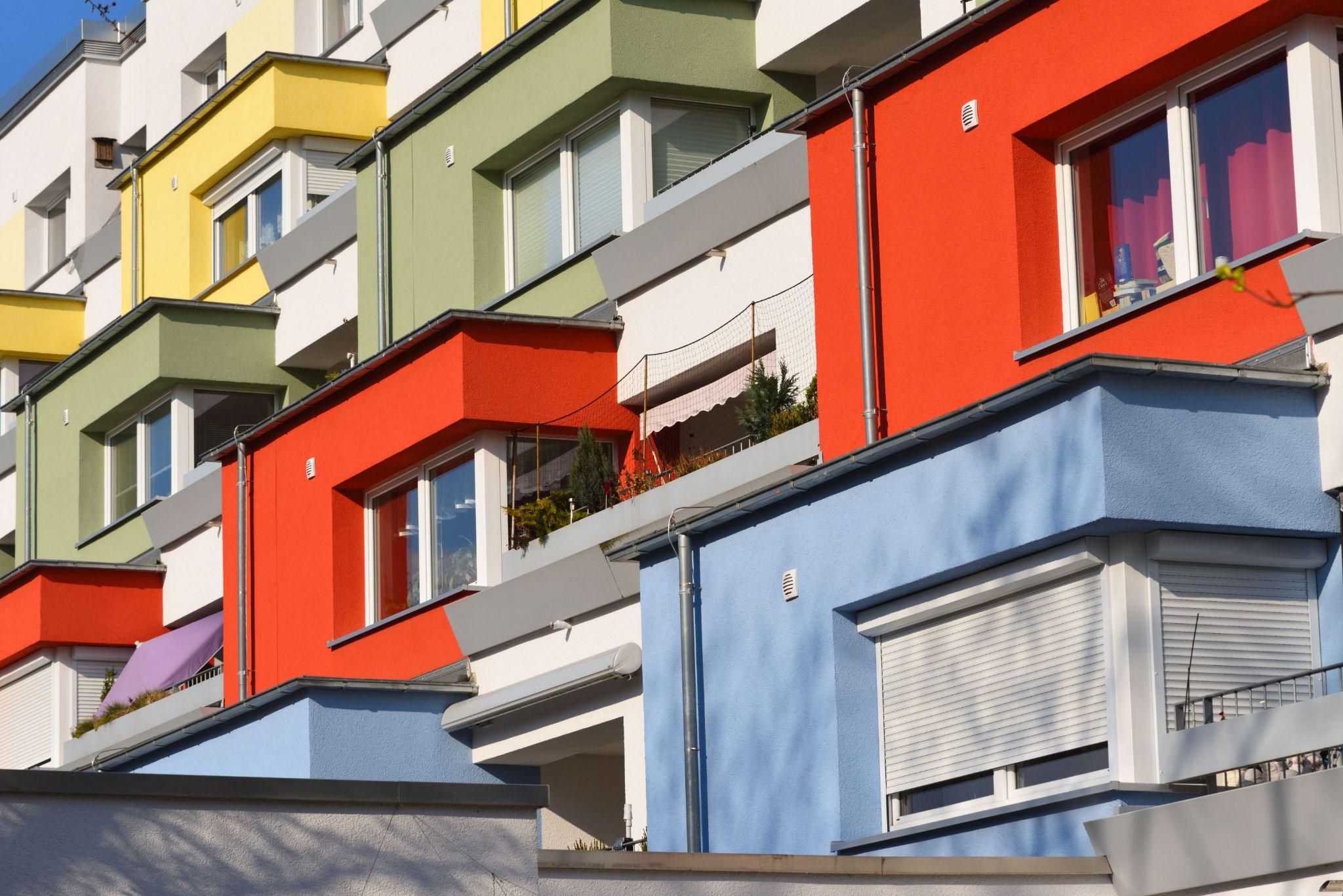
A 3D rendering agency adjusts its color strategy based on the decision it needs to support. Hospitality visuals sell atmosphere and service. Healthcare visuals must reduce uncertainty and show hygiene without feeling clinical. Office visuals need to balance focus, identity, and human activity. The following three approaches show how the same principles shift across sectors:
Advertisment
Successful visualization combines measured geometry with an understanding of how people respond to light, material, and color. The technical model establishes what can be built. The visual treatment explains what the place may feel like once people use it. That distinction matters when buyers are comparing several developments, investors are reviewing risk, or planning teams are trying to understand an unfamiliar proposal.
The commercial case is also practical. In the National Association of Realtors’ 2025 staging survey, 83% of buyers’ agents said staging made it easier to picture a property as a future home. Another 29% of agents reported a 1% to 10% increase in offers for staged homes, while 49% of sellers’ agents saw shorter market time. These figures do not measure CGI directly, but they show the value of clear emotional presentation. Strong architectural rendering services apply the same lesson before construction begins. A capable 3d rendering company turns accurate design data into a persuasive, honest experience. And that is the lasting value of an architectural 3d visualization and rendering company.
Advertisment
Pin it for later!
If you found this post useful you might like to read these post about Graphic Design Inspiration.
Advertisment
If you like this post share it on your social media!
Advertisment




Want to make your Business Grow with Creative design?
Advertisment

Advertisment