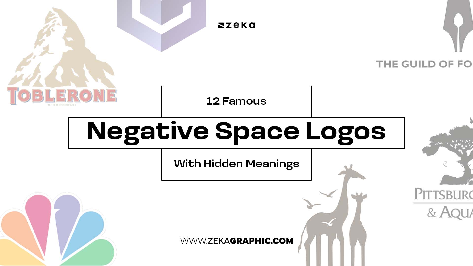
Some logos communicate more than one idea at the same time.
Through clever use of negative space, designers hide symbols, messages, and visual concepts inside otherwise simple logos. Once viewers discover the hidden element, the design becomes far more memorable.
That’s why many of the most iconic brands use negative space logo design. Instead of adding complexity, they use empty space to communicate more with less.
The examples below show how some of the world’s best-known logos use hidden meanings to strengthen branding and visual communication.
Advertisment
Before reviewing these logos, it’s important to understand exactly what a Negative Space Logo is, and it is a logo which uses the empty space around or between shapes to create a secondary image, symbol, or message.
Instead of treating empty space as background, designers make it part of the concept itself and the result is a logo that communicates multiple ideas without adding extra elements.
The best negative space logos remain clear at first glance while rewarding viewers who take a closer look.
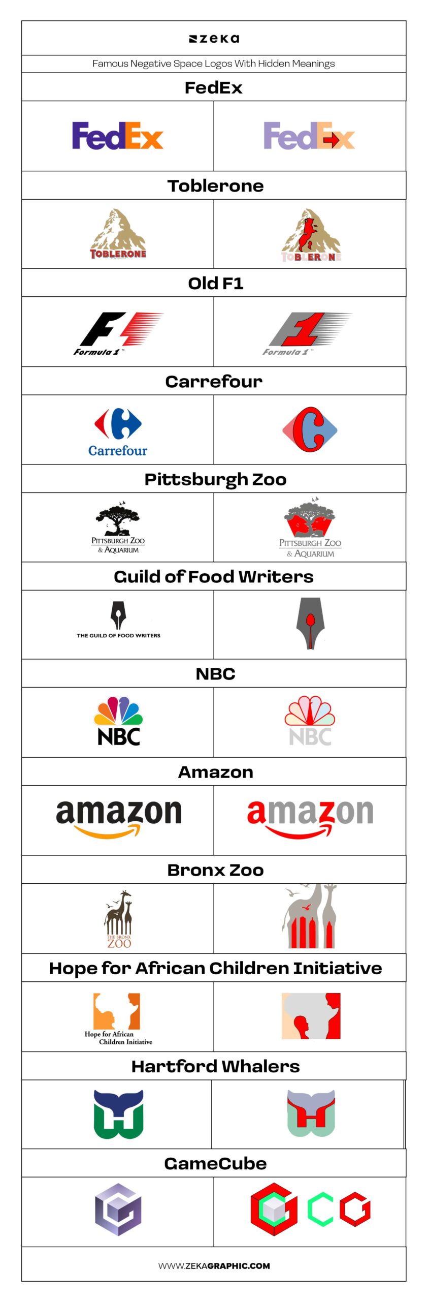
Let’s start the list, with the most famous example,the FedEx logo. Between the letters E and x, the empty space forms a subtle arrow. Once discovered, it’s almost impossible to unsee, which is one reason the logo remains so memorable.
The hidden arrow communicates movement, direction, speed, and efficiency—qualities that align perfectly with a global shipping company. It’s a reminder that the strongest negative space logos don’t hide random images; they reinforce the brand’s core message.
Advertisment
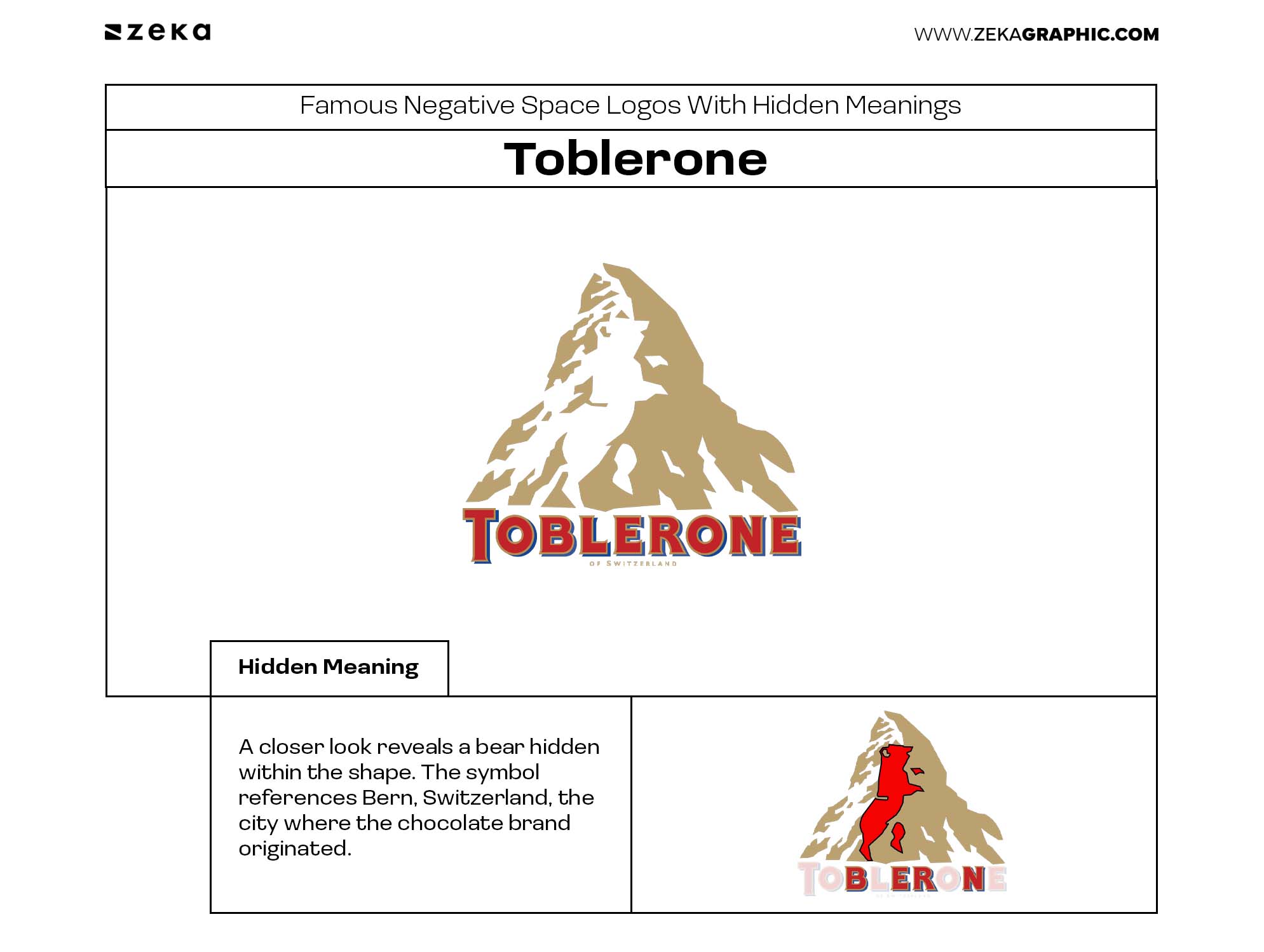
Most people immediately recognize the mountain in the Toblerone logo, but a closer look reveals a bear hidden within the shape. The symbol references Bern, Switzerland, the city where the chocolate brand originated and a place strongly associated with bears.
What makes this logo effective is that the hidden element adds meaning without competing with the primary symbol. It demonstrates how negative space can be used to incorporate history, geography, and brand identity into a single design.
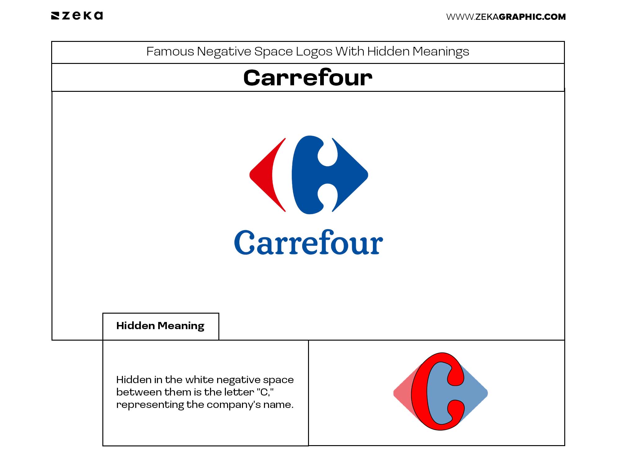
At first glance, the Carrefour logo appears to be two colored arrows pointing in opposite directions. Hidden in the white negative space between them is the letter “C,” representing the company’s name.
The logo is a great example of restraint. Instead of placing the initial directly in the design, it lets viewers discover it naturally, making the identity feel both clever and memorable.
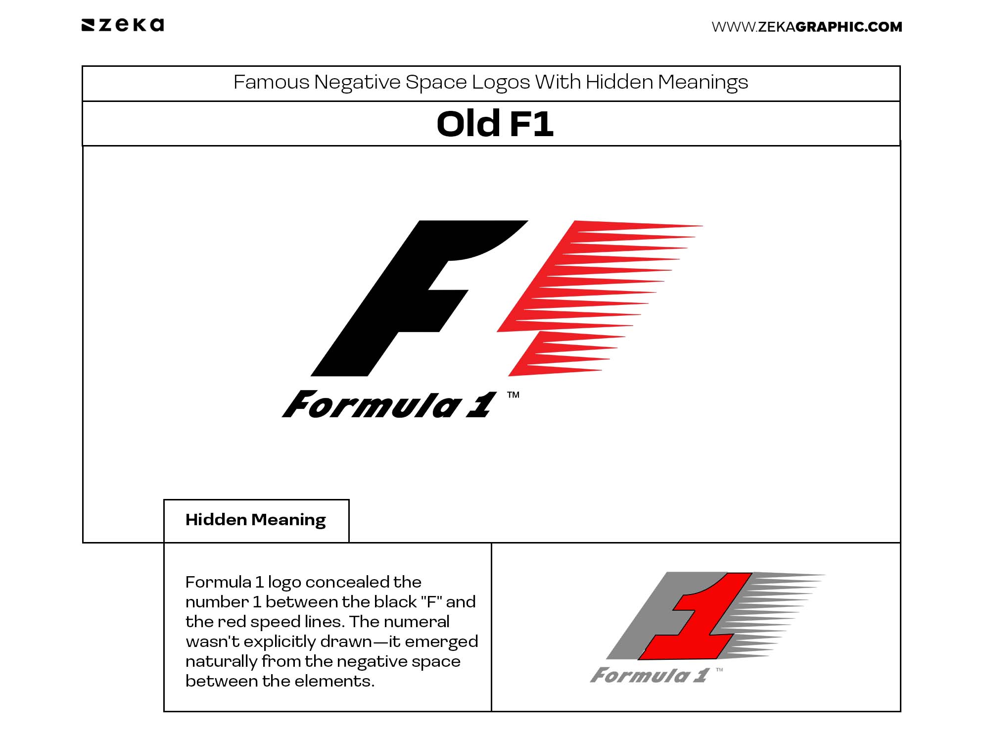
Before its redesign in 2017, the original Formula 1 logo concealed the number 1 between the black “F” and the red speed lines. The numeral wasn’t explicitly drawn—it emerged naturally from the negative space between the elements.
The concept reinforced the brand name while also suggesting speed and motion. It’s often cited as one of the best negative space logos because the hidden meaning feels integrated into the design rather than added as a visual trick.
Advertisment
The Pittsburgh Zoo logo is often cited as one of the most clever examples of negative space logo design because it combines multiple images into a single symbol.
At first glance, viewers see a tree. Looking closer, the negative space on each side reveals a gorilla and a lion facing one another. The design communicates nature, wildlife, and diversity without adding unnecessary complexity.
The logo demonstrates how negative space can create layers of discovery while still remaining clear and recognizable at first glance.
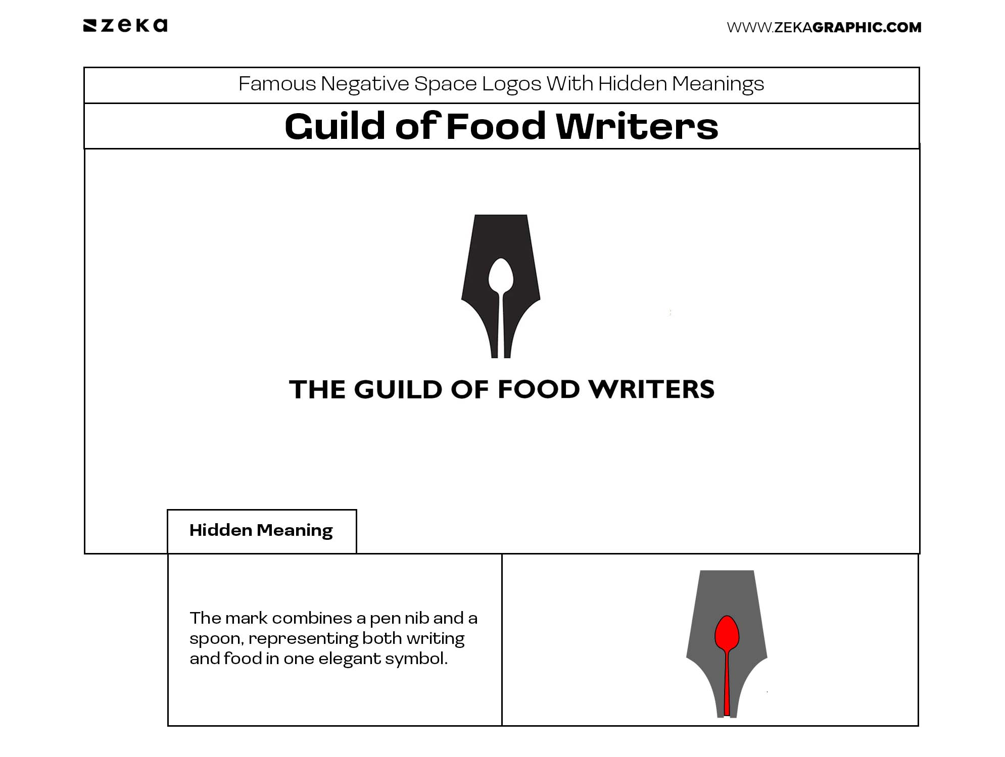
The Guild of Food Writers logo is a perfect example of communicating multiple ideas through a single shape.
The mark combines a pen nib and a spoon, representing both writing and food in one elegant symbol. Neither concept feels forced, and both remain instantly recognizable once discovered.
Its success comes from how naturally the two ideas merge together, proving that effective logo design often solves multiple communication problems with a single visual solution.
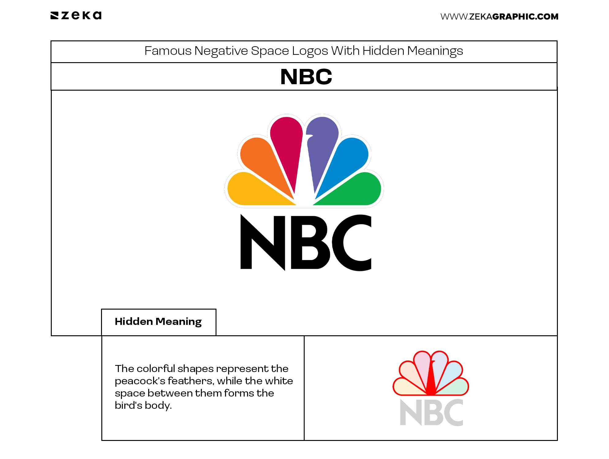
The NBC logo uses negative space to create one of television’s most recognizable symbols.
The colorful shapes represent the peacock’s feathers, while the white space between them forms the bird’s body. Without that empty space, the peacock wouldn’t exist, making the negative space essential to the design rather than simply decorative.
It’s a great example of how removing shapes can be just as important as adding them, allowing a logo to communicate more while remaining clean and instantly recognizable.
The Amazon logo is a simple example of how negative space can reinforce a brand message.
The curved arrow beneath the wordmark connects the letters A and Z, suggesting that Amazon sells everything from A to Z. At the same time, the arrow resembles a smile, adding a subtle sense of customer satisfaction and friendliness.
By communicating multiple ideas with a single shape, the logo remains both functional and memorable without relying on visual complexity.
Advertisment
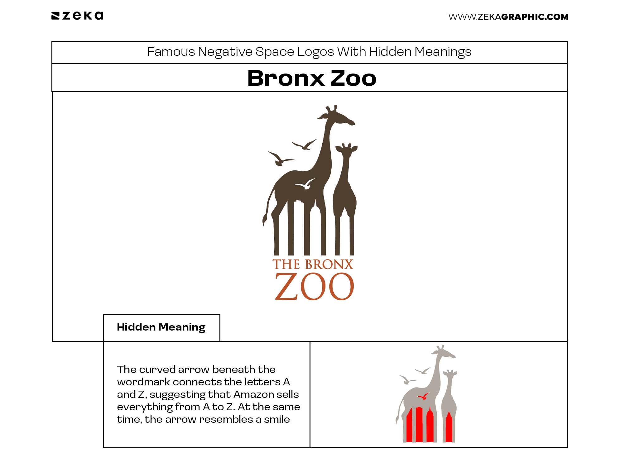
The Bronx Zoo logo looks like two giraffes standing side by side. Between their legs, however, the negative space forms the silhouette of New York City’s skyline, subtly connecting the zoo to its urban location.
The hidden city transforms a simple animal logo into a stronger brand story. It shows how negative space can combine place, identity, and symbolism without adding extra visual elements.
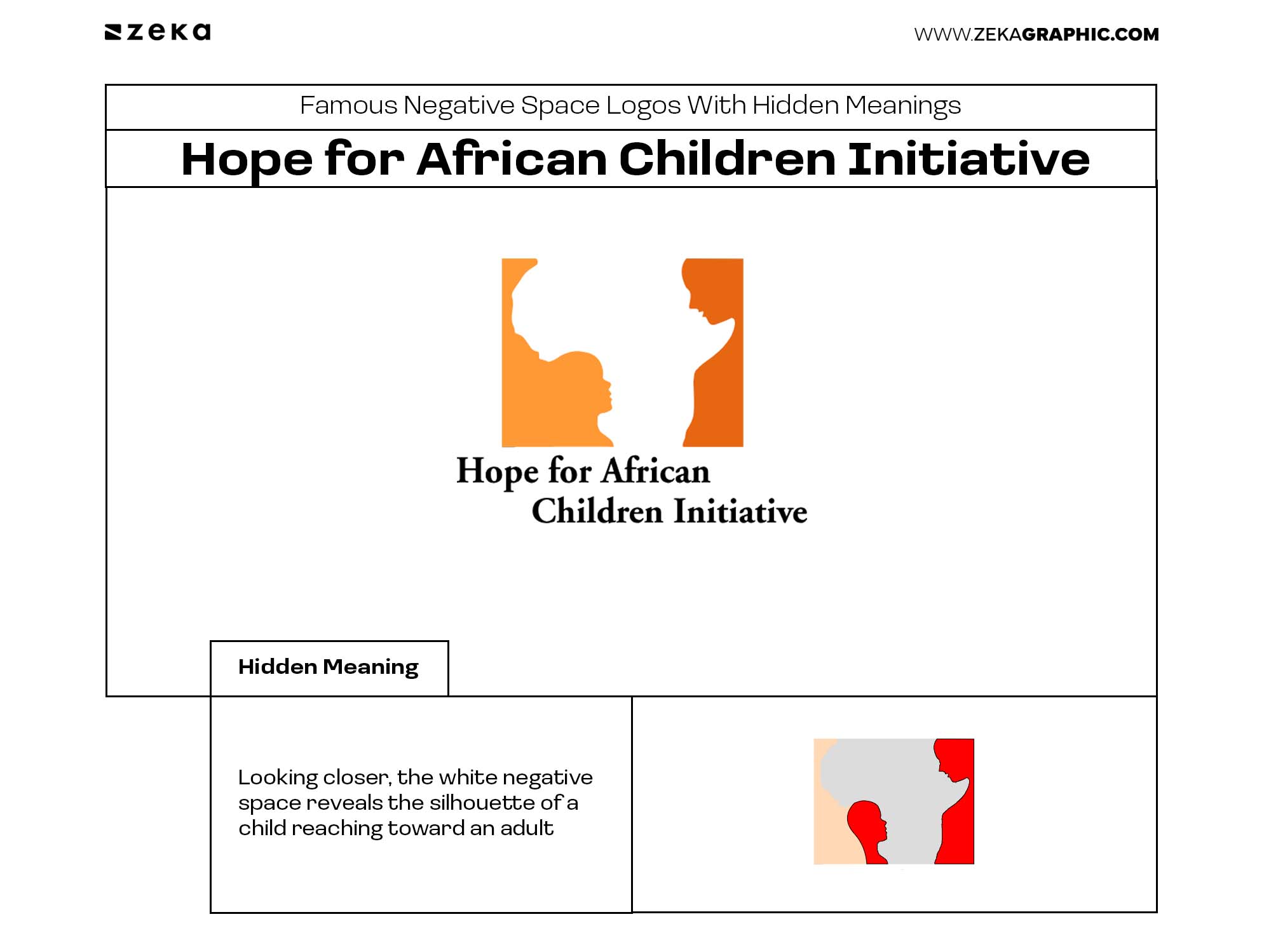
The Hope for African Children Initiative logo uses negative space to communicate its mission through a single, meaningful symbol.
At first glance, the logo depicts the outline of the African continent. Looking closer, the white negative space reveals the silhouette of a child reaching toward an adult, reinforcing the organization’s focus on supporting children across Africa.
The design shows how negative space can communicate location, purpose, and emotion at the same time, creating a logo that is both memorable and deeply connected to the brand’s mission.
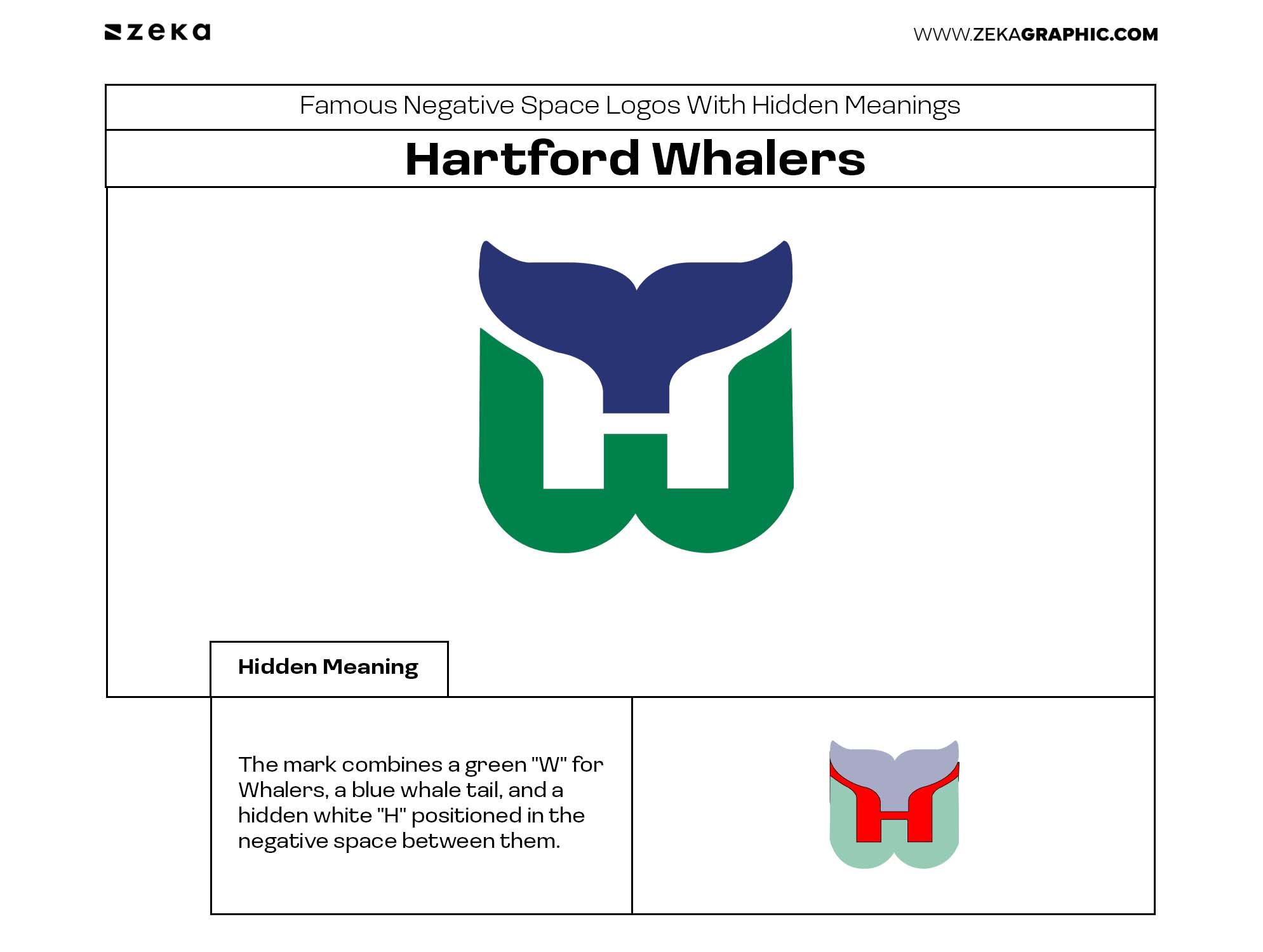
Many designers consider the Hartford Whalers logo one of the smartest sports logos ever designed.
The mark combines a green “W” for Whalers, a blue whale tail, and a hidden white “H” positioned in the negative space between them. The solution is so elegant that all three elements remain visible without competing for attention.
Its enduring reputation comes from achieving what every great logo strives for: maximum meaning with minimal visual effort.
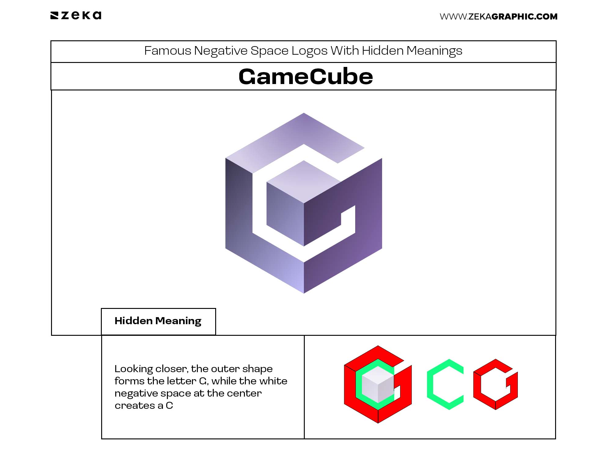
The Nintendo GameCube logo is a clever example of how geometry and negative space can communicate more than one idea at once.
At first glance, the symbol appears to be nothing more than a three-dimensional cube. Looking closer, the outer shape forms the letter G, while the white negative space at the center creates a C, subtly referencing the console’s initials without using a traditional wordmark.
The design demonstrates how negative space can transform a simple geometric icon into a memorable brand identity. Rather than relying on extra details, it uses a single, well-constructed shape to communicate multiple layers of meaning, making it one of the most elegant examples of hidden-letter logo design.
Advertisment
After looking at these famous negative space logos, a clear pattern emerges: the hidden element is never the main goal. The strongest designs work as logos first and reveal a second idea only after closer inspection. In many ways, they also demonstrate what makes a good logo design—clear, memorable, and built around a strong concept rather than unnecessary complexity.
The most successful negative space logos share five characteristics:
For graphic designers, these examples demonstrate an important lesson: great logo design is rarely about adding more. It is often about finding smarter ways to use what is already there.
Advertisment
Pin it for later!
If you found this post useful you might like to read these post about Graphic Design Inspiration.
Advertisment
If you like this post share it on your social media!
Advertisment


Want to make your Business Grow with Creative design?
Advertisment

Advertisment