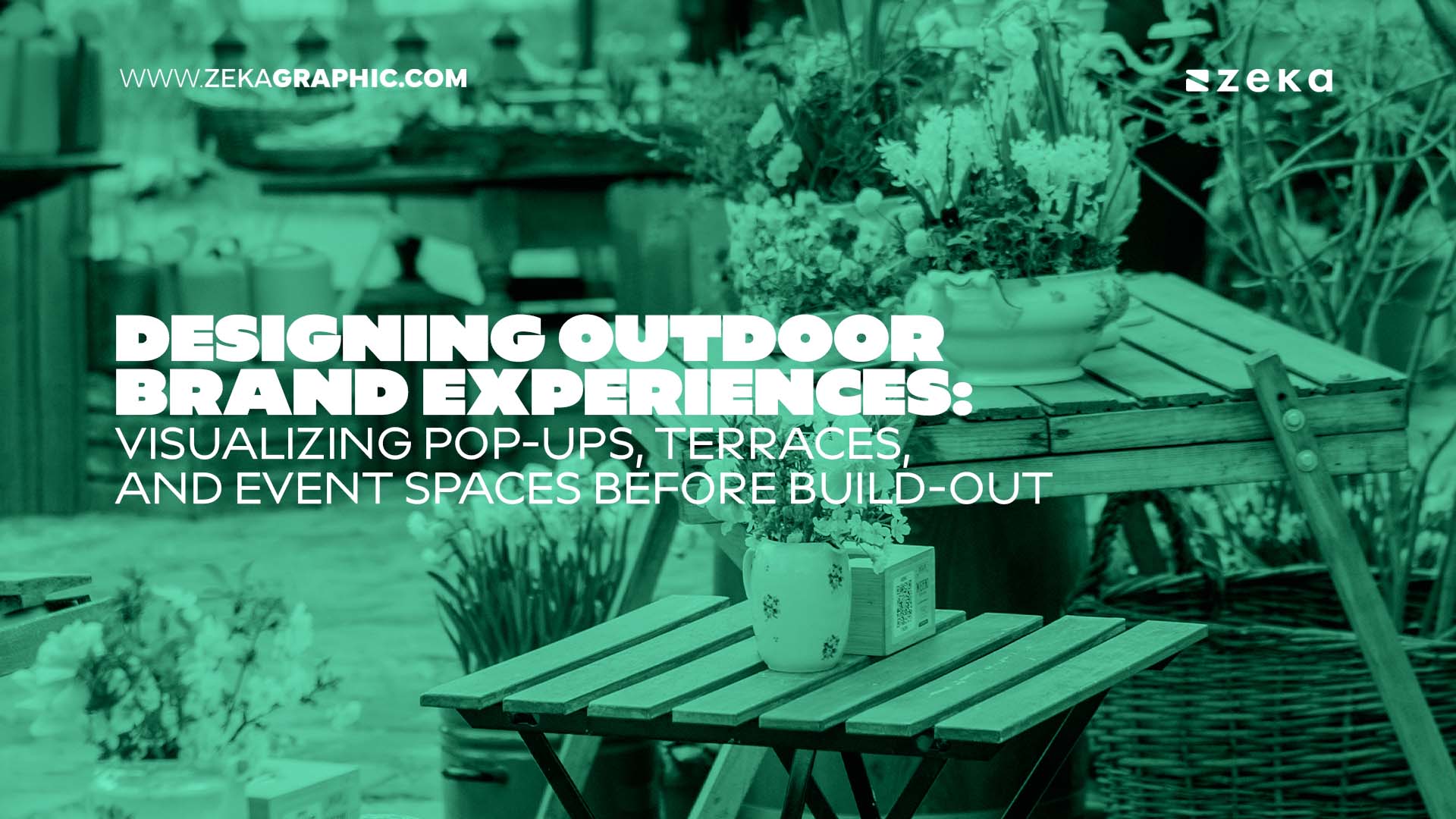
Designing Outdoor Brand Experiences: Visualizing Pop-Ups, Terraces, and Event Spaces Before Build-Out

Designing Outdoor Brand Experiences_ Visualizing Pop-Ups, Terraces, and Event Spaces Before Build-Out

Outdoor brand spaces have to work before anyone arrives. A pop-up needs a clear footprint, a terrace needs atmosphere, and an event space needs smooth movement.


The best way to achieve that is to visualize the space before construction begins. Garden design software can help designers experiment with styles, customize materials, and test planting, furniture, paths, lighting, and structures. It makes outdoor planning more precise and gives clients something concrete to review.


Now let’s check out some practical tips that you can use while making your own projects. 

Advertisment

Design Around the Real Location

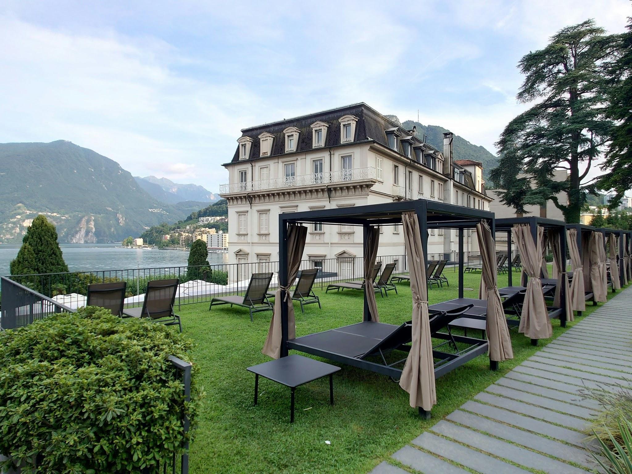
A convincing visualization should respond to its surroundings. Show nearby buildings, pavement, existing vegetation, entrances, and important sightlines. A concept that looks excellent in isolation may feel completely wrong once placed beside the actual architecture.


Scale matters too. Include surrounding structures and people so clients can understand the installation’s true size.


Consider the location from several practical angles:

  • How visible is the space from the street?
  • What existing elements compete for attention?
  • Where do people naturally approach?
  • Which views should remain open?
  • How does the installation connect with its surroundings?
Design Around the Real Location

Design for Weather From the First Sketch

Outdoor concepts must survive conditions that indoor brand spaces can ignore.


Show shade structures, rain protection, drainage areas, and weather-resistant materials in the visualization. If the installation runs for several weeks, consider how plants and materials will look later.


Sun direction also matters. A terrace that looks perfect in a morning render may become uncomfortable in the afternoon.


Add shadows to your visual studies. Check how they affect seating, displays, signage, and photography.


Lighting deserves the same treatment. Test the space after dark, not just during daylight. Warm lighting can make a terrace inviting, while poorly positioned fixtures can create glare.

Build a Repeatable Outdoor Brand System

The most successful outdoor experiences are rarely one-off ideas. They establish a visual system that can evolve.


Create rules for colors, materials, signage, planting, furniture, lighting, and branded structures. Then adapt those rules to each location.


A city terrace might use the system with compact furniture and vertical planting. A festival installation might open it up with larger structures and stronger graphics.


The identity stays recognizable without making every location identical.


That balance is the real goal. The space should feel unmistakably connected to the brand, while still responding to its surroundings.

Give Clients Something Concrete to Approve

A moodboard can establish direction, but clients eventually need to understand the actual space.


Present a focused set of visuals that answer practical questions. Show the overall layout, key visitor views, material combinations, branded elements, and lighting.


Include people at a realistic scale. Empty renders can make compact spaces appear much larger than they are.


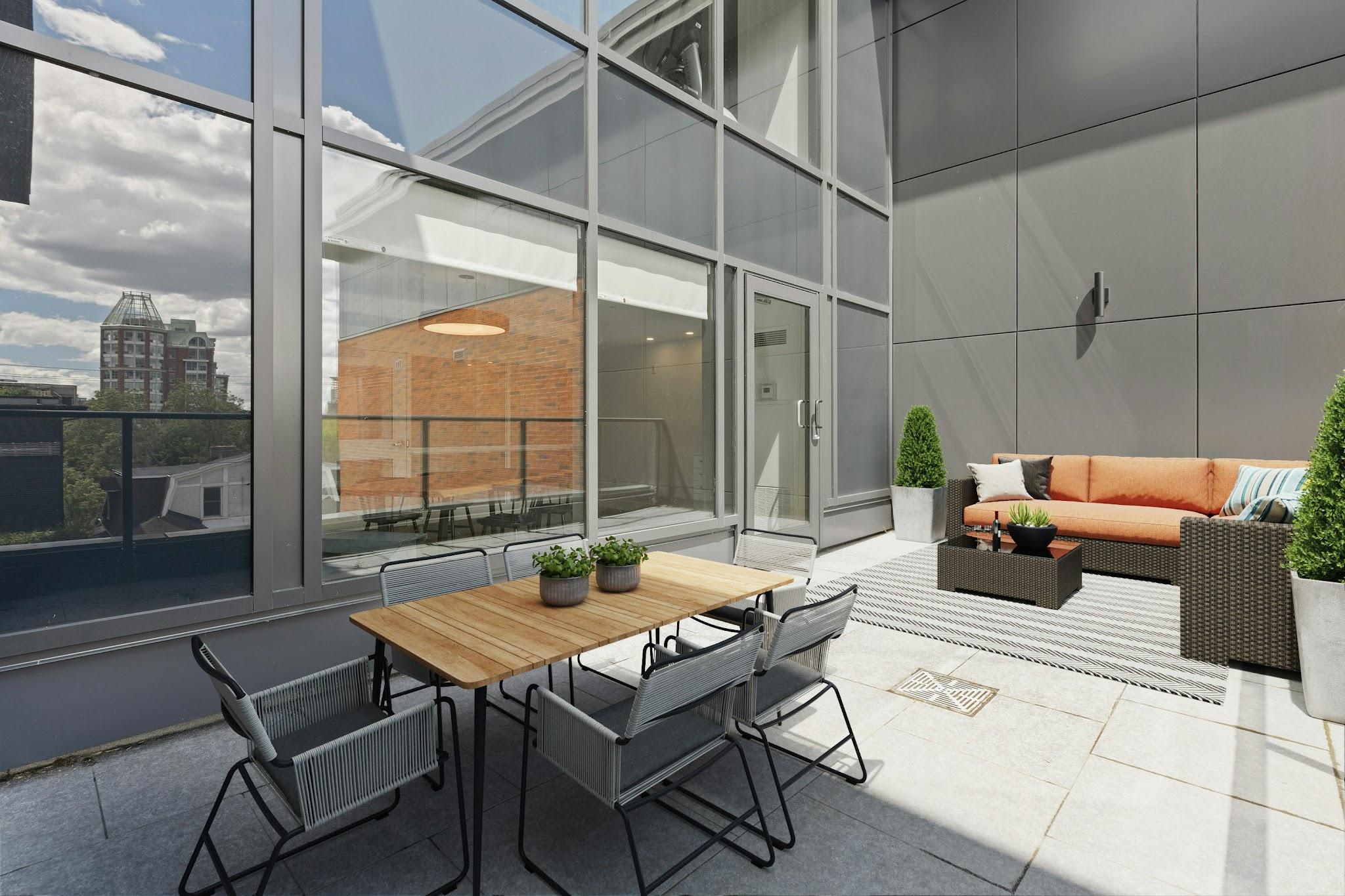
It is also useful to show capacity. A terrace with twenty seats communicates more clearly than a render containing vague furniture clusters.


For event spaces, show different states. A daytime setup, busy guest view, and evening version can reveal how flexible the concept really is.

Give Clients Something Concrete to Approve

Common Mistakes

There are a few common pitfalls when visualizing and planning outdoor brand spaces. Avoid these mistakes before hitting render:


  1. Using indoor furniture in outdoor renders.
    It’s better to avoid visualizing sleek indoor fabrics that would instantly ruin or stain in a sudden downpour misleads clients.
  2. Testing lighting only in daylight.
    Outdoor spaces change drastically after dark. Forgetting to generate evening or nighttime renders can result in poorly positioned fixtures that create blinding glare for guests or leave key branded elements in total darkness.
  3. Forgetting about multilingual visitors.
    Public and event spaces often serve people who speak different languages. Use clear symbols and carefully structured text to reduce unnecessary language barriers. 
  4. Too many visual elements.
    Combining multiple colors, fonts, patterns, and graphic effects can quickly make a system feel chaotic. Choose a limited visual language and use it consistently across the space.
  5. Poor color choices.
    Avoid combinations that look attractive on screen but become difficult to distinguish outdoors. 

Advertisment

Wrapping Up

The strongest outdoor brand spaces are designed with both creativity and control. Visualization gives teams room to test ideas, solve practical problems, and refine the experience before anything is built. When the concept looks convincing on screen and works from every angle, the path to a successful build becomes much clearer.

Advertisment

Pin it for later!

Visualizing Outdoor Brand Experiences_ Pop-Ups, Terraces & Event Spaces

If you found this post useful you might like to read these post about Graphic Design Inspiration.

Advertisment

If you like this post share it on your social media!

Share on facebook
Share on twitter
Share on pinterest
Share on vk
Share on telegram
Share on whatsapp
Share on linkedin

You Might Be Interested On These Articles

Advertisment

Latest Post

Want to make your Business Grow with Creative design?

Advertisment

Advertisment