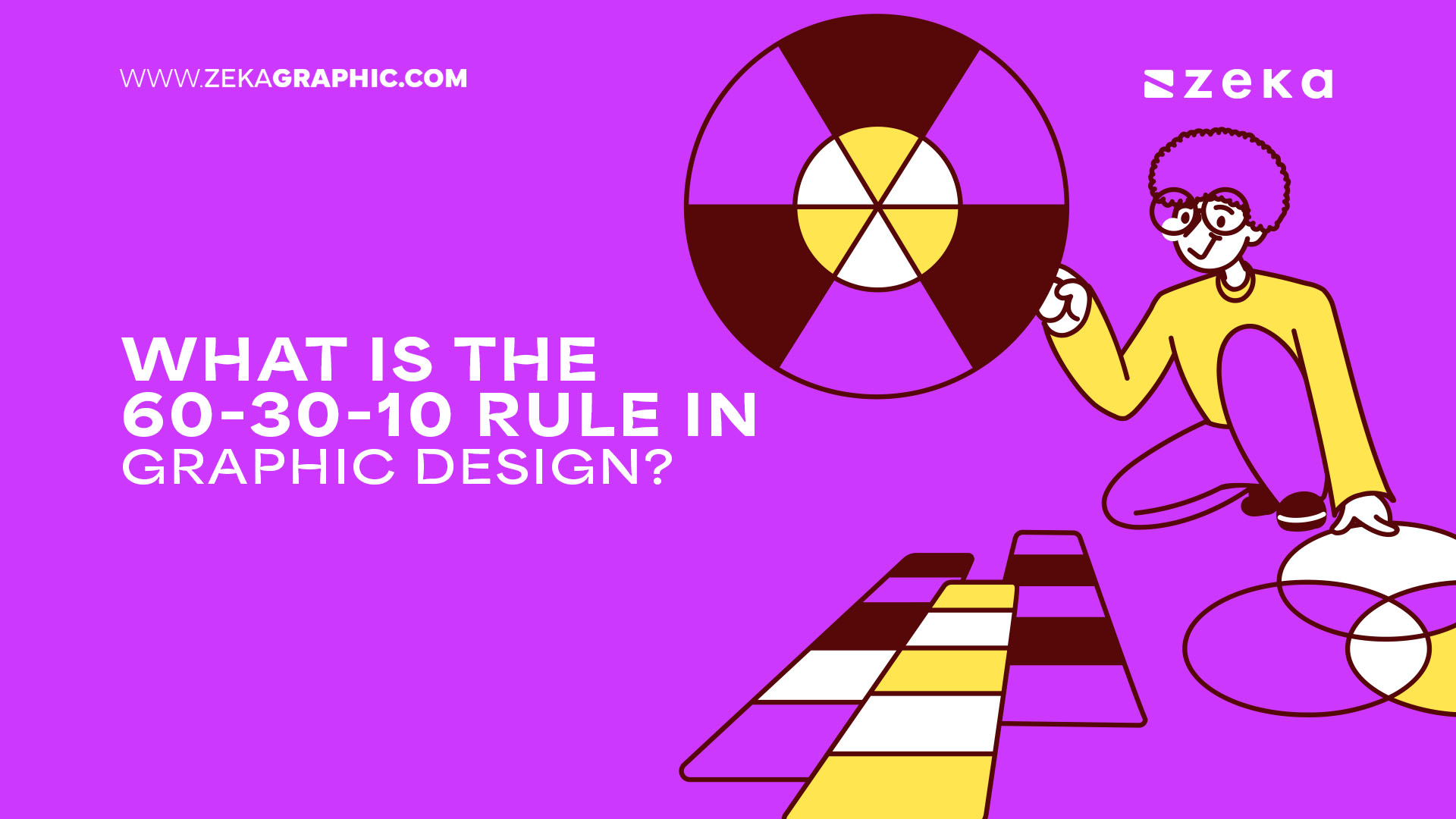
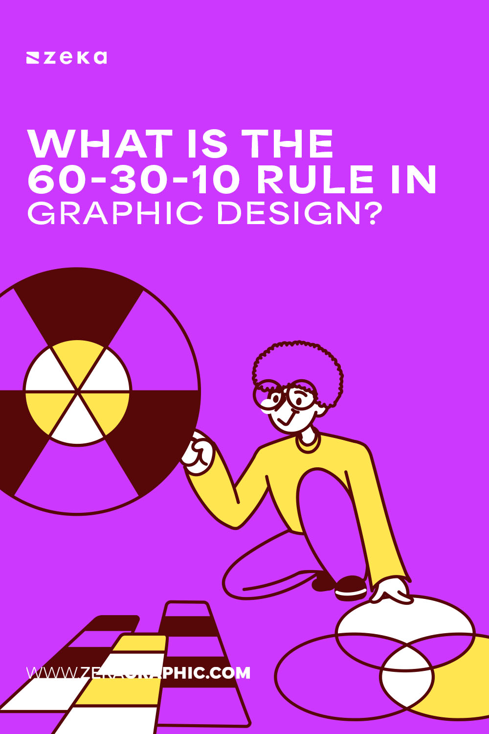
The 60-30-10 rule in graphic design is a simple yet powerful color harmony technique that helps designers create balanced and visually appealing layouts. It originated in interior design but translates beautifully into graphic work, offering a structure that enhances visual hierarchy and focus.
This rule is especially helpful for beginners wondering what does the 60-30-10 rule mean in practical terms. It provides clarity when building a cohesive color story and reduces the risk of chaotic or dull palettes. Whether you’re designing a brand identity, website, or packaging, applying this ratio brings instant balance.
Why It Works:
Advertisment
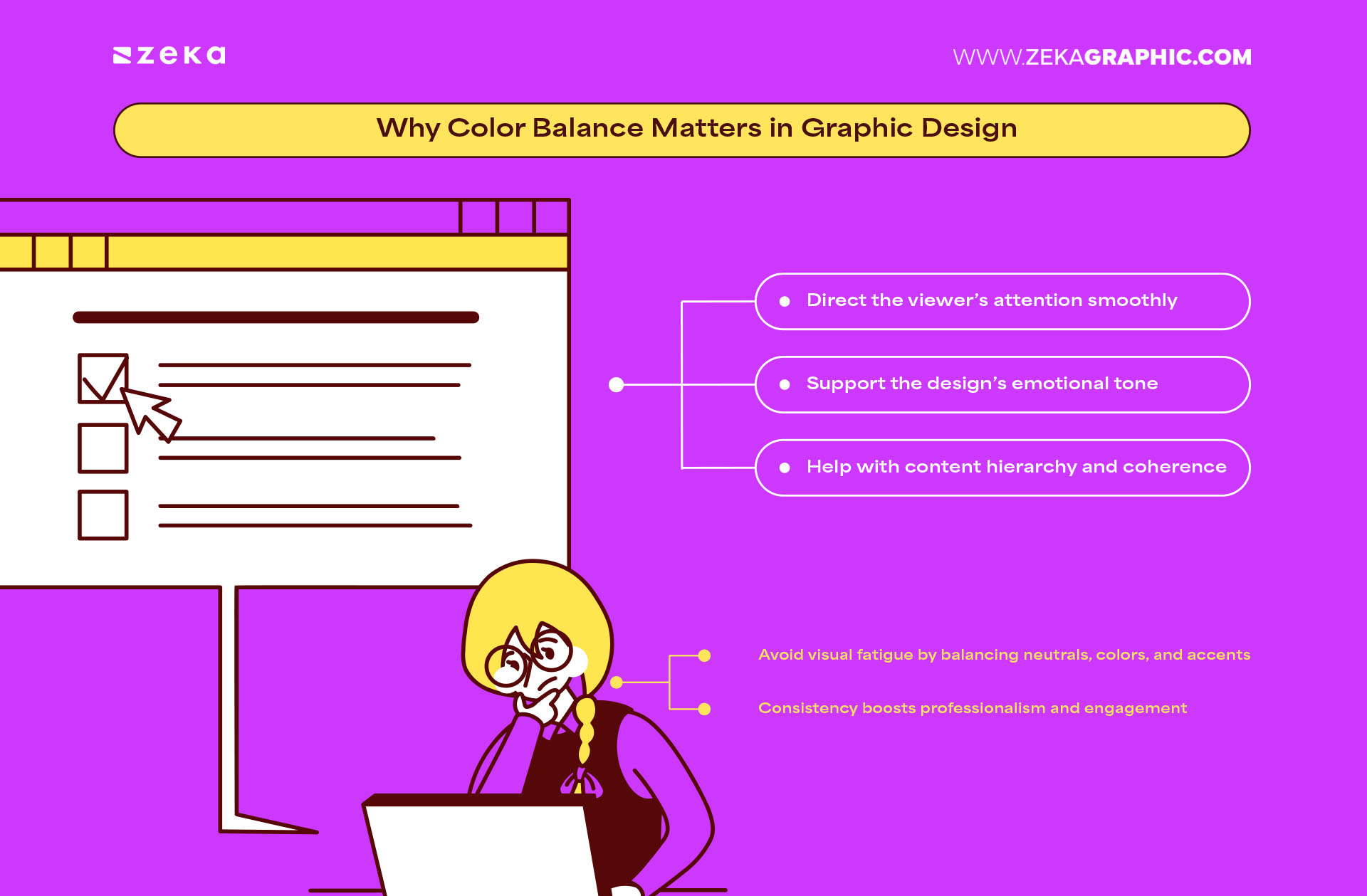
In any visual composition, color balance in design plays a crucial role in how the audience perceives your message. The human eye naturally seeks order and harmony, and well-proportioned color usage satisfies that instinct.
When there’s too much of one color or too little of another, the entire layout can feel disjointed. That’s why understanding why color harmony is important is a core skill for any graphic designer. Balanced designs improve readability, focus, and even brand trust.
Balanced color schemes:
In real-world design scenarios — whether it’s a landing page, social media post, or presentation deck — implementing proper balance in graphic color schemes transforms user experience from “just looking” to “emotionally connecting.”
Key Takeaways:
Advertisment
Let’s break down the graphic design color ratio to understand how it works practically:
If you’re not sure how to split colors in design, start by assigning roles to each — background, primary text, highlight.
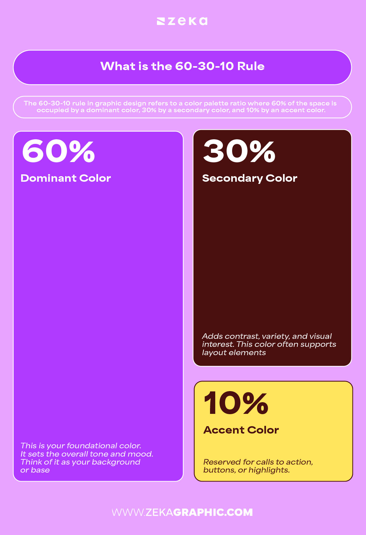
Pro Tip: Neutrals work well for your 60% base. Brighter or deeper tones can serve as impactful 10% accents.
Advertisment
Selecting the right palette for the 60-30-10 rule is both a creative and strategic process. If you’re wondering how to pick a color palette for 60-30-10, start with your design’s purpose — is it elegant, playful, bold, or calming?
To apply the rule effectively:
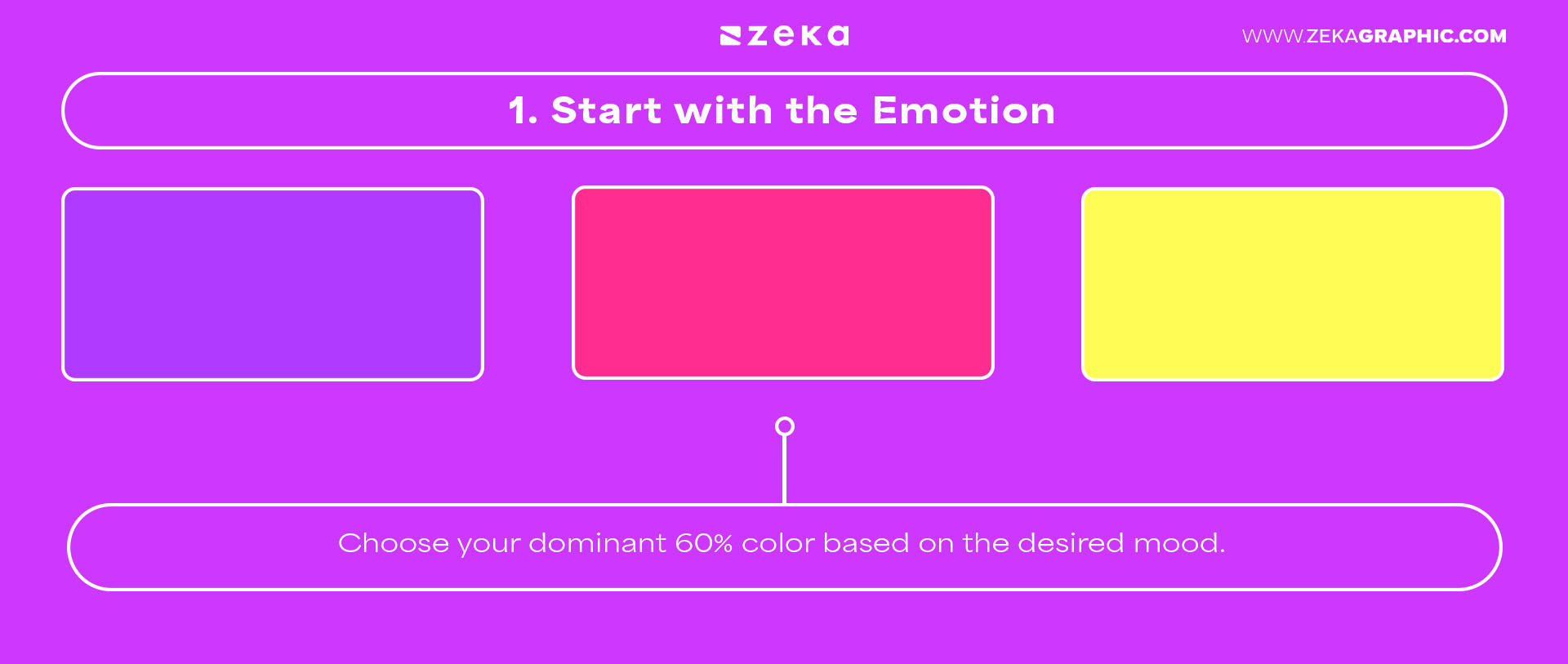
2. Find a Complement: Pick a secondary 30% color that contrasts or complements.
3. Add Energy: Use the 10% accent to energize or direct attention.
Here are tips for best color combos for branding:
Advertisment
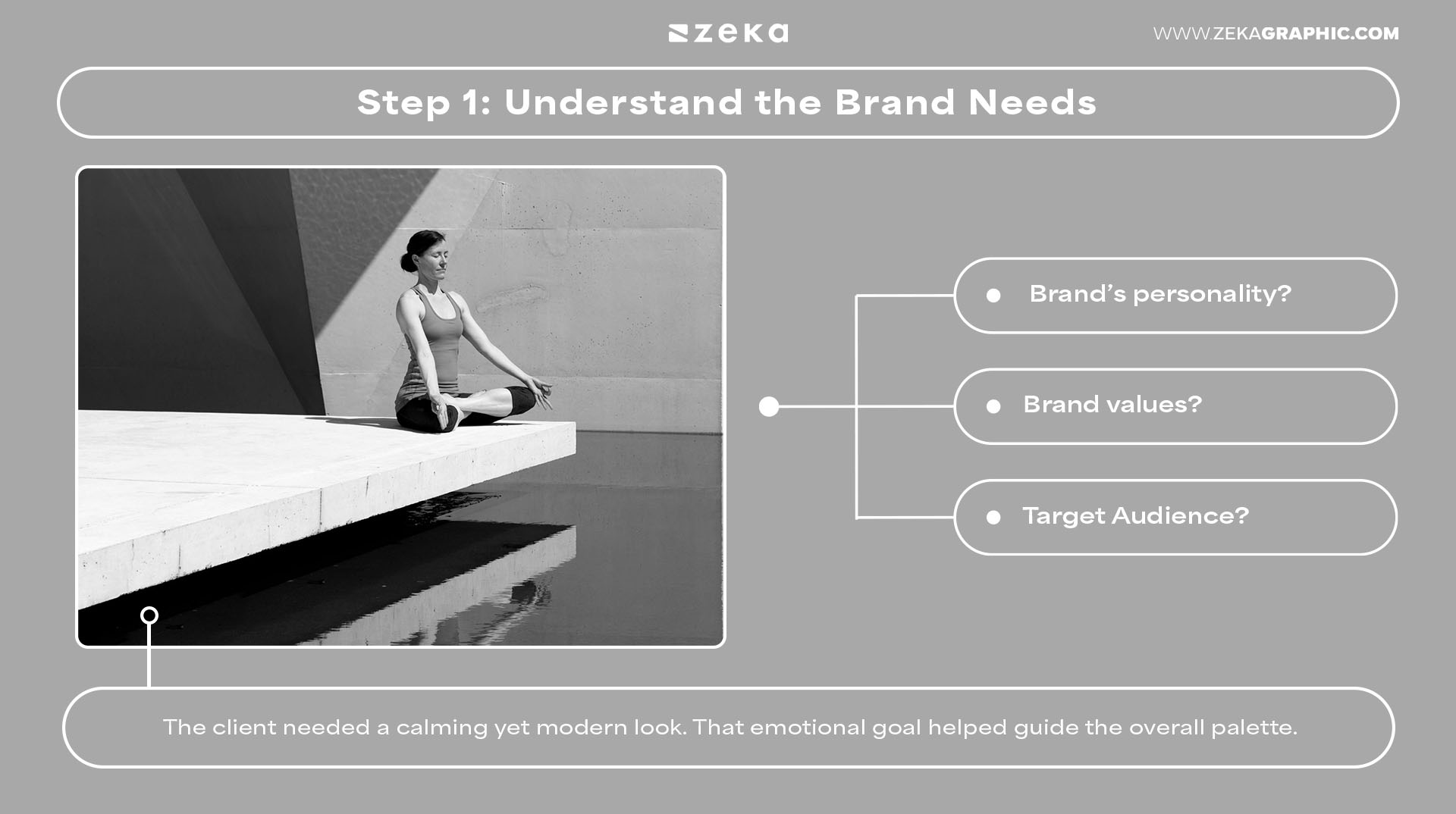
As designers, applying the 60-30-10 rule isn’t just about theory — it’s a practical part of how to build balanced, visually impactful work. Let me walk you through how you can apply the 60-30-10 in a design project with this example. By breaking down each step of our process, you’ll get a clear view of how to make intentional color decisions that enhance clarity, hierarchy, and brand identity.
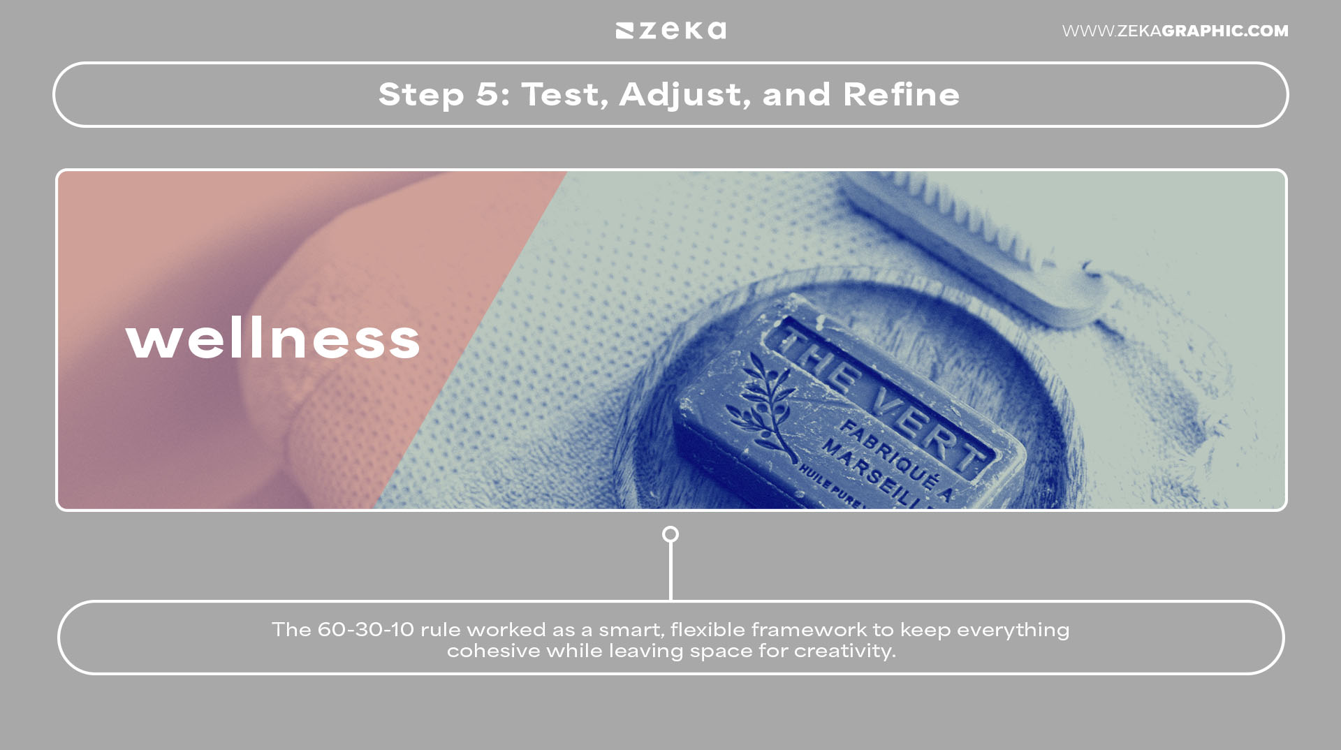
Before touching any colors, I always start by clarifying the brand’s personality, mission, and target audience. In this case, I was working on a wellness brand that wanted to feel calming yet contemporary. That emotional direction immediately shaped how I would approach the palette — color wasn’t just decoration; it was storytelling.
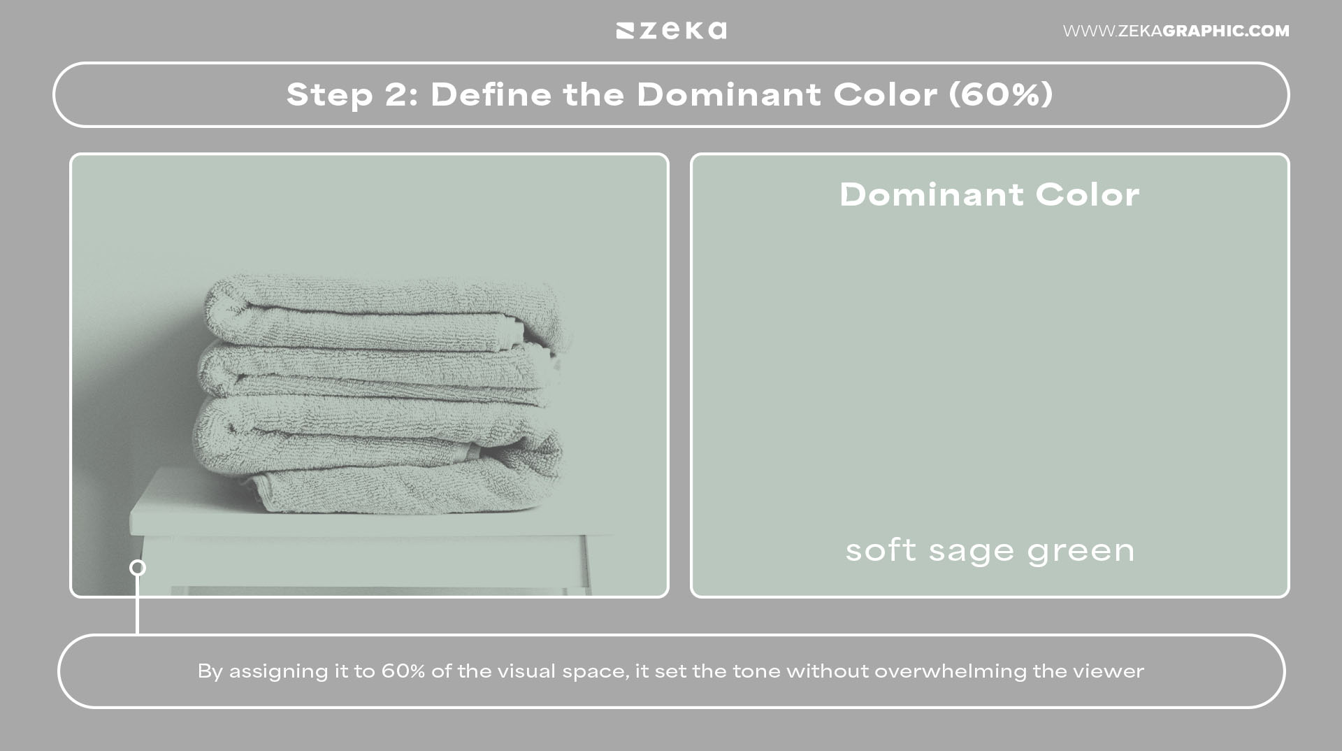
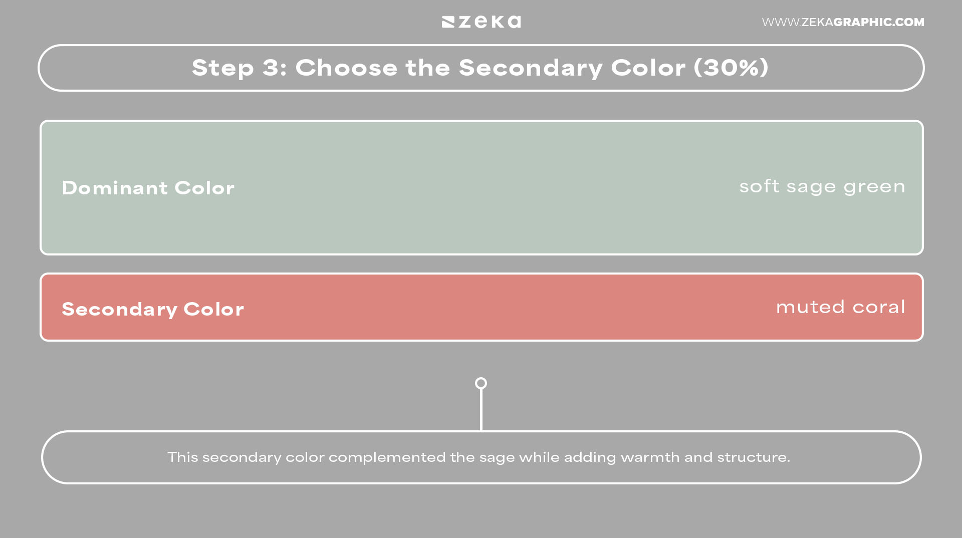
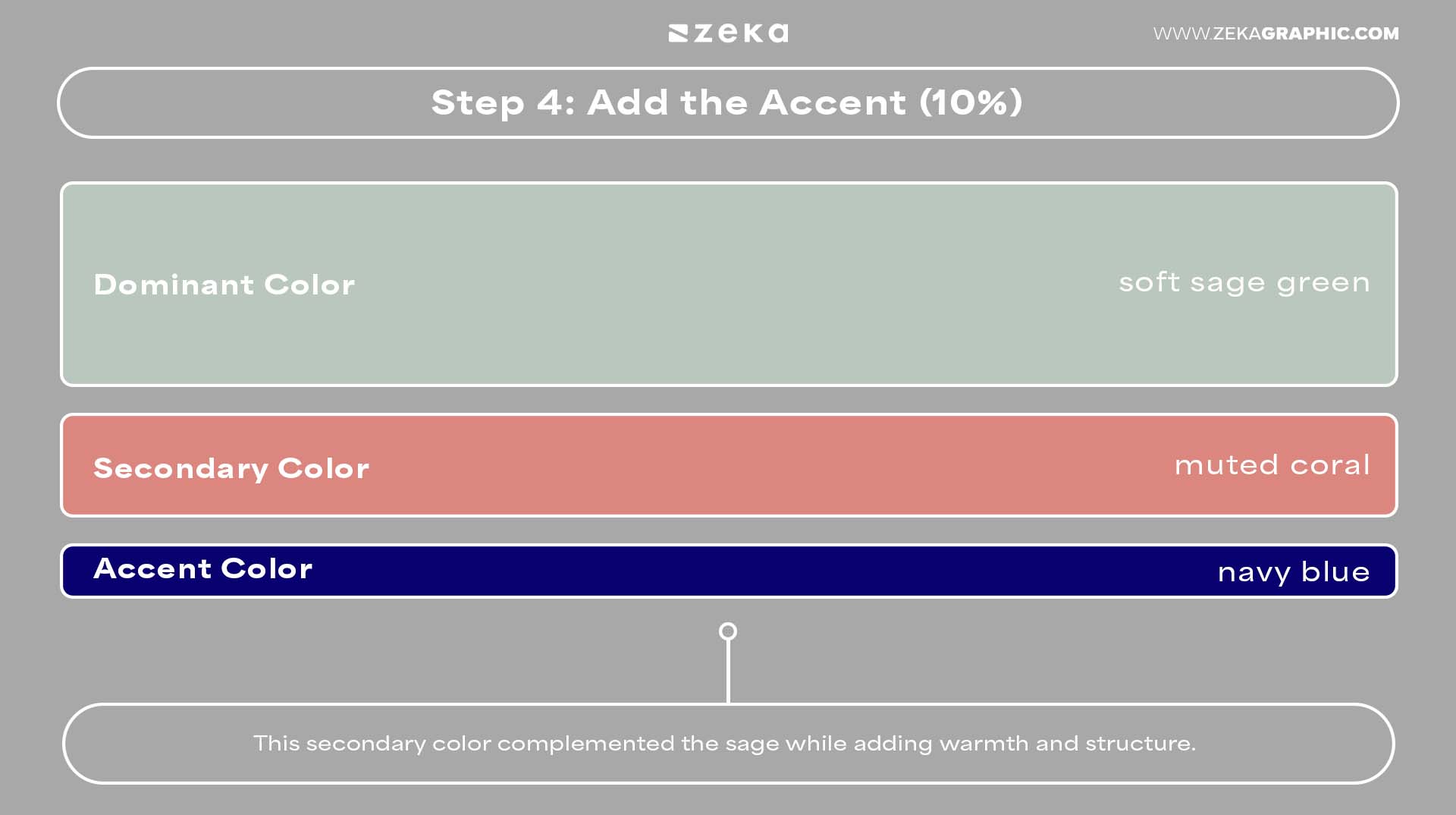
For the dominant tone, I chose a soft sage green. It served as the foundation for brand materials, backgrounds, and large graphic areas. Taking up around 60% of the visual space, it gave the identity a sense of calm, clarity, and breathing room. It felt trustworthy, but not clinical — perfect for wellness.
To complement the sage, I introduced a muted coral as the secondary color. This showed up in subheadings, social media templates, and accent shapes. It added warmth and balance while still allowing the dominant green to lead. The coral made the system feel more human without overpowering the design.
Finally, I chose a deep navy blue for the accents — call-to-action elements, icons, and logo details. Using it in just 10% of the layout helped highlight key moments and interactions, giving the identity a sense of contrast, depth, and confidence. This was the color that brought focus and sharpness to the entire system.
Once I applied the color system to the full brand kit — from the presentation deck to mockups — I refined the saturation and brightness to ensure accessibility and harmony. The 60-30-10 rule worked as a smart, flexible framework to keep everything cohesive while leaving space for creativity.
In the end, this approach delivered a brand identity that felt intentional, professional, and emotionally resonant. That’s the power of designing with structure — even when working with color.
Advertisment
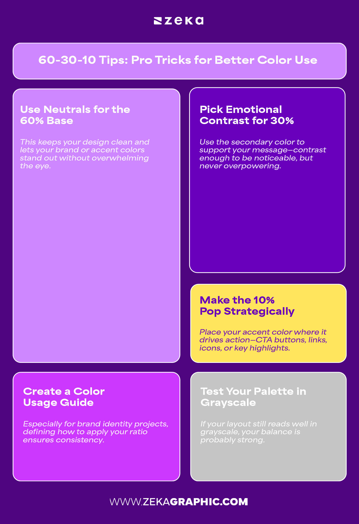
Mastering color theory isn’t just about knowing the rules—it’s about applying them with intention. Here are practical tips and design tricks to help you make the most of the 60-30-10 rule in your creative work:
Bonus Insight: Try using color palette tools like Coolors or Adobe Color to test 60-30-10 combinations before you commit.
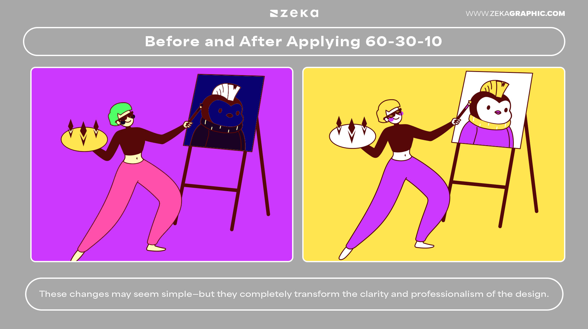
Visual learning is key in design. Let’s explore a side-by-side comparison of two layouts: one that ignores color balance entirely, and one that applies the 60-30-10 rule with intent.
Before:
After (Using 60-30-10):
These changes may seem simple—but they completely transform the clarity and professionalism of the design.
Try This: Take one of your old projects and redesign it using the 60-30-10 rule. Notice how much more intentional your layout feels.
Advertisment
Simplicity is often the secret to brilliance in design. When you understand how to use the 60-30-10 rule intentionally, you’re not just throwing colors onto a canvas—you’re crafting a visual hierarchy, creating balance, and directing user attention with precision.
What’s beautiful about this rule is that it’s timeless, versatile, and scalable. Whether you’re designing a logo, website, poster, or pitch deck, this color ratio helps you make smarter choices without overthinking the process.
Remember:
The more you apply this rule, the more intuitive it becomes. Start using it in your next project, and you’ll immediately see how color can work for you instead of against you.
If you found this post useful you might like to read these post about Graphic Design Inspiration.
Advertisment
Written by
If you like this post share it on your social media!


Advertisment
Advertisment


