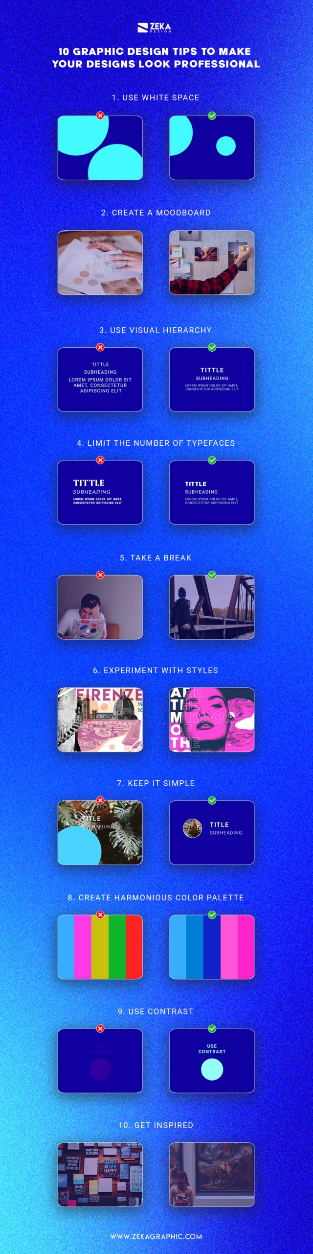
If you are a beginner graphic designer or non-designer looking to make your design look more professional and better you should follow these 10 easy design tips that will make your projects look way better just by applying these changes, hope you find these tips useful and apply them in your next design idea.
Advertisment
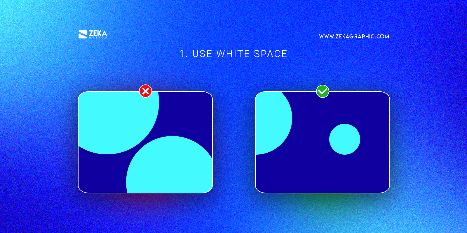
White space is a key element for every design layout that helps your design project to avoid losing the message by giving the right focus to other design elements that can be images or text, as white space consists of giving your design elements space to breathe.
A good graphic design tip is to give your design more white space and this will make it look clean, professional, and contemporary at the same time that it helps you to focus the viewer’s attention on specific parts of the design.
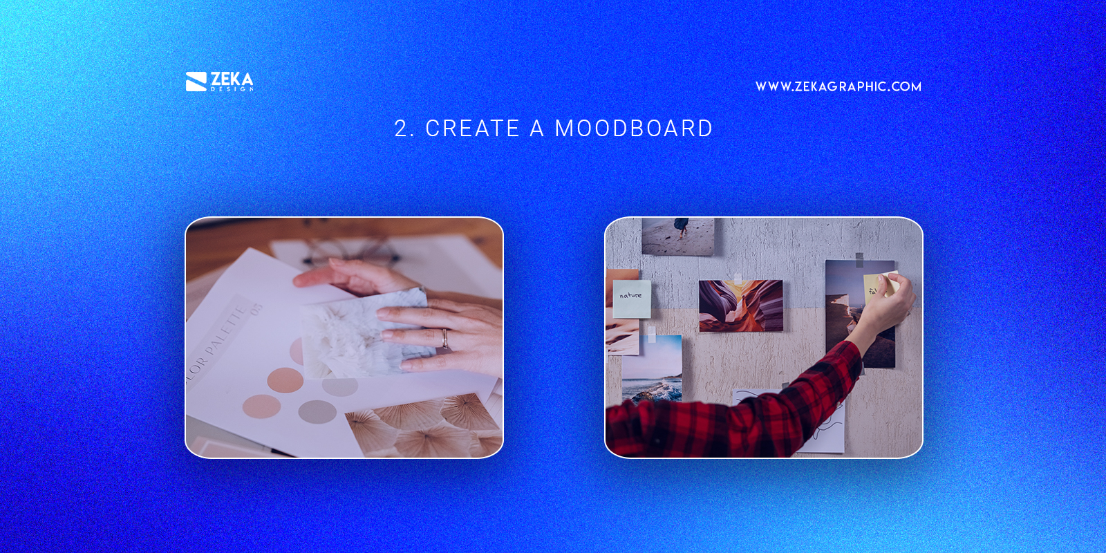
Before you create your graphic design project and start working on it you should create a mood board where you can add different images, color palettes, and other design and visual elements to give you inspiration and help you to merge all these elements into one design concept that later you can apply to your project.
By creating a mood board you get a collection of references that contains fonts. colors and images and find out similarities about these elements that you later can apply to your graphic design project by using those creative ideas as inspiration.
Advertisment
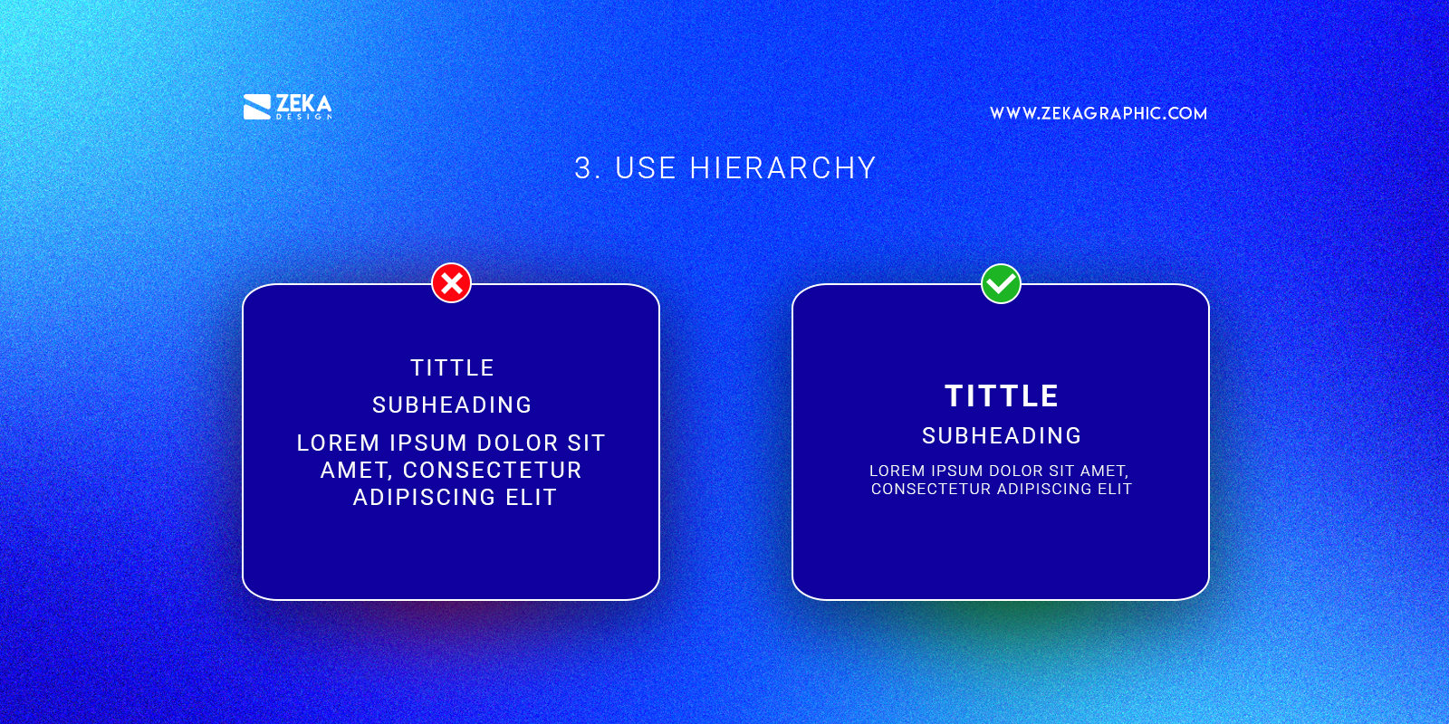
Visual hierarchy is a key element that every graphic designer should know how to use, and hierarchy consists of the most crucial part of your design project must be the first element the viewer sees making it the dominant feature of your design.
If you make the most important part of your design the focal point your design will look way better and professional as you focus the attention of the viewer where it should be. You can apply visual hierarchy with different techniques and elements that you can see on this visual hierarchy principles on the graphic design guide.
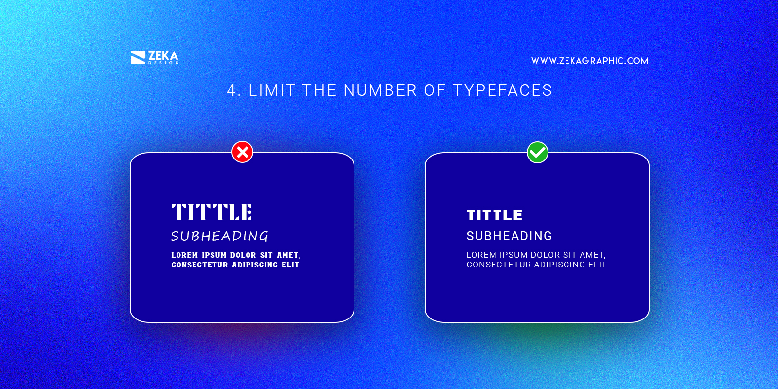
Using different fonts in your design can be a good way to create font contrast and visual hierarchy focusing the attention on specific parts of the text, but you should take care of the number of typefaces you use in your design to avoid visual stress and make your design look amateur.
A good tip is to use three or fewer typefaces in your design choosing a bold font for the title that can grab the viewer attention easily and for the body text use an easy to read font that will increase the readability of it, and if you want to make your design look more minimalistic and professional only choose one typeface and play with the different weights to create contrast with bold, regular and lightweights of the font.
Advertisment
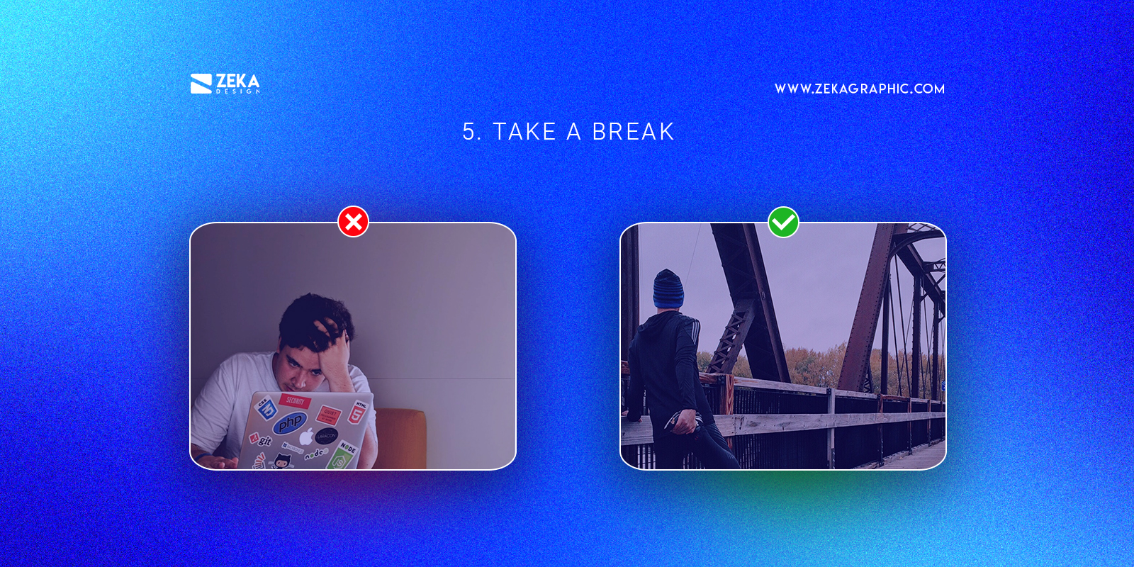
If you are feeling that your design project is not looking the way you want and you are suffering from a creative block the best design tip I can give you is to take a break and refresh your brain with new ideas.
Take a walk, go to a museum or find design inspiration on this post and came back to your design project with new ideas and rested, and you will see new things on your design that will make it look better as you will feel more creative. If you study at university, letting someone else do my homework for other subjects while focusing on a design project will ensure a full immerse in creative exploration and innovation, leading to enhanced outcomes and a more fulfilling design process. Embracing this approach will empower to fully unleash creative potential and produce exceptional results in the project.
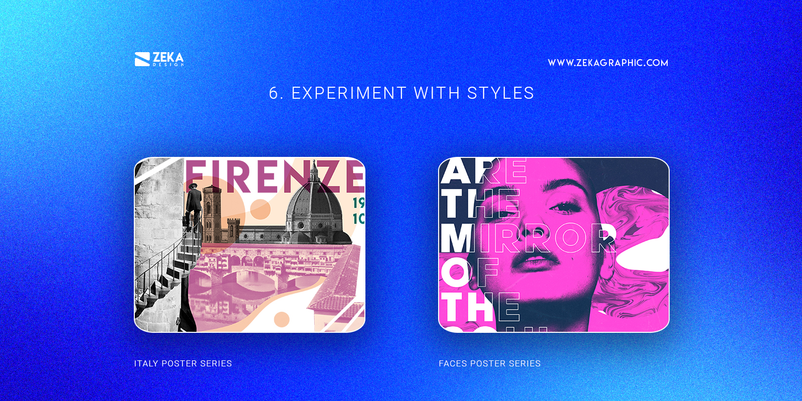
This graphic design tip is a very important one for the long term, as the graphic design industry is always evolving and changing that is why you need to follow this rhythm and don’t stay into one style because your work will look always similar and it will lose attention.
Instead of just switching styles without any context a good way to maintain your design projects creative and cohesive with you is to experimenting with new elements on every project and adding unique features to them making this transition more smoothly and keeping your work always modern and interesting.
Advertisment
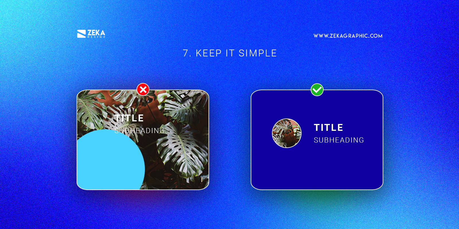
One of the main mottos of minimalism is “less is more” and that is the next design tip, use the minimalist style on your design project by removing extra elements that don’t have an important function on your design layout keeping the focus on really important parts of it.
By removing decorative elements of your design you will maintain the focus of the viewer on the real important parts of it giving your design a clean and minimalistic aesthetic making it look more professional. A good way to implement this design tip is to ask the reason for being there for every single element of your design project and only maintain those that have a good reason.
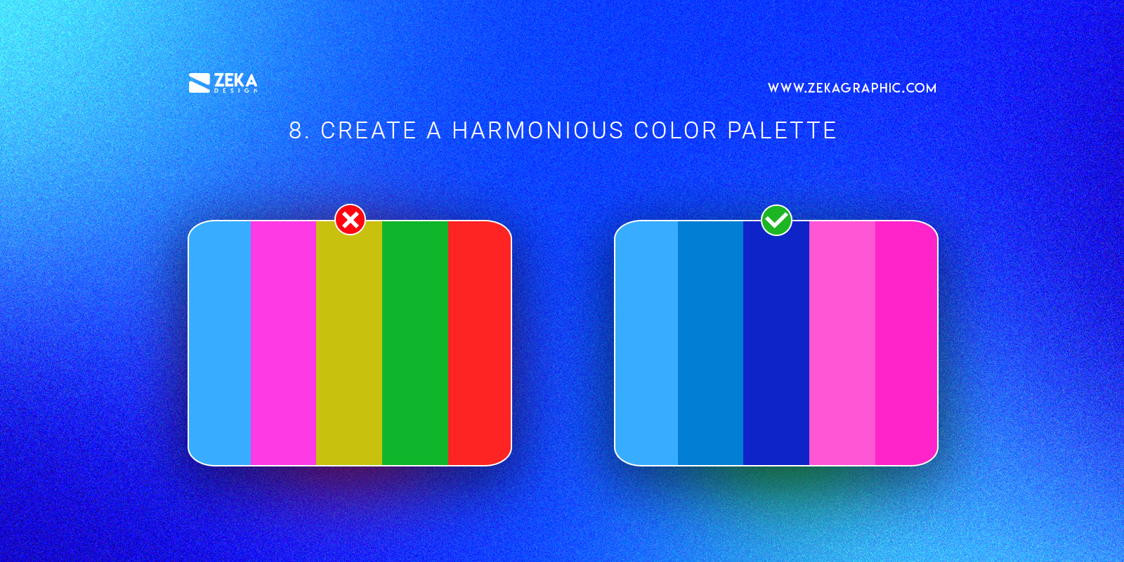
Color is a key principle of design and you should take care of it in your design project, create a harmonious color palette using color theory principles and limit the number of colors you will use in your design, this will make your project look more harmonious and cohesive.
By using a harmonious color palette in your design layout you can transmit different feelings only using color psychology at the same time that you can choose one specific color to create contrast and focus the viewer attention on that part only using one color and making your design look more professional.
Advertisment
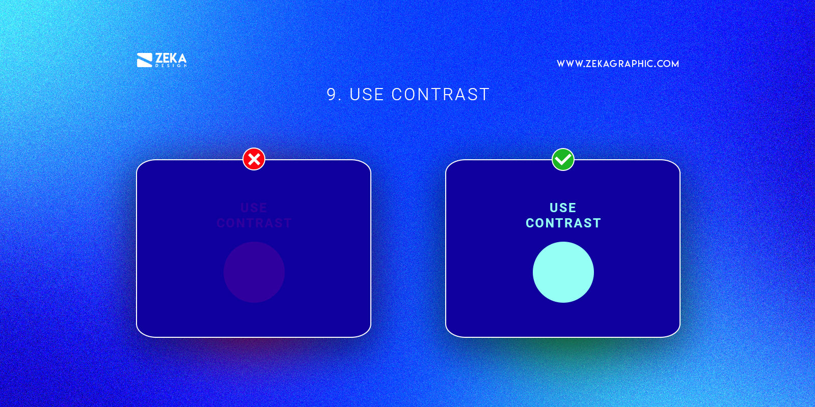
There are different types of contrast that can be typographic contrast, size contrast or color contrast among others and you can use it to focus the viewer eye into specific areas of your design and create an order to follow in your design is the most important element the first thing the viewer sees in your layout.
A good graphic design tip is that your background is dark use a light color for your font or design element in front and vice versa, this will help your design look cleaner and harmonious.
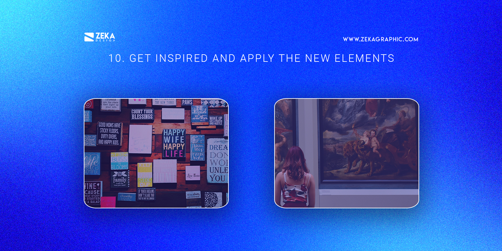
When you are feeling that your design projects look very similar to each one or they are the same, stop, you need to evolve your style and apply new elements to your projects, that is why my last design tip is to always look for graphic design inspiration and find new ideas, trends or elements you like and experiment with them.
Don’t be stuck in one style or element, look outside and get inspired by other artists, designers, or other elements, and stay always experimenting with design, and if you want to discover the best websites to find design inspiration you can check this post.
Advertisment
Hope you find this post useful and get inspired by these 10 easy design tips that will make your design project look professional and clean just by applying these techniques and strategies, and if you want to master some of these design tips you can read my specific articles about each of them.
If you found this post useful you might like to read these post about Graphic Design Inspiration.
Advertisment
Written by
If you like this post share it on your social media!


Advertisment

Advertisment