Good design rarely happens by accident.
The layouts that feel clear, balanced, and engaging usually follow a set of core principles that shape how information is organized and understood.
These graphic design principles help designers create structure, guide attention, and communicate with intention.
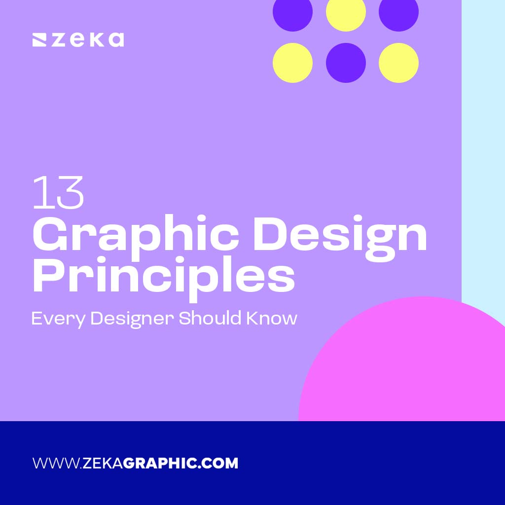
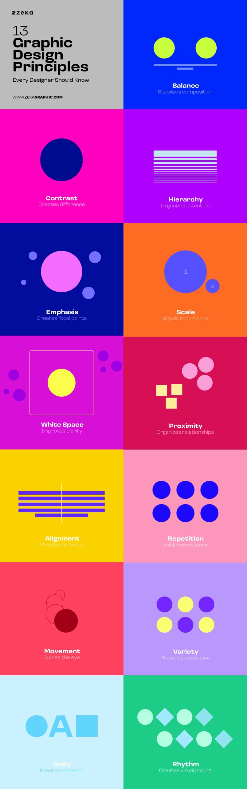
In this guide, you’ll learn the 13 essential principles of graphic design, how they work, and how designers combine them to create effective layouts.
Advertisment
First of all, we need to understand what graphic design principles are. Graphic design principles are the foundational rules that govern how visual elements work together. They explain why certain designs feel clear, balanced, or engaging—while others feel confusing or unfinished.
Rather than telling you what to design, principles help you understand how viewers perceive visual information. They act as a decision-making framework that designers rely on—often intuitively—to organize content, guide attention, and communicate meaning.
If design elements (color, type, shape) are the building blocks, graphic design principles are the logic that connects them.
Think of principles as visual grammar. You don’t need to consciously think about them every time—but without them, communication breaks down.
Now, we are ready to check them one by one and how to apply them.
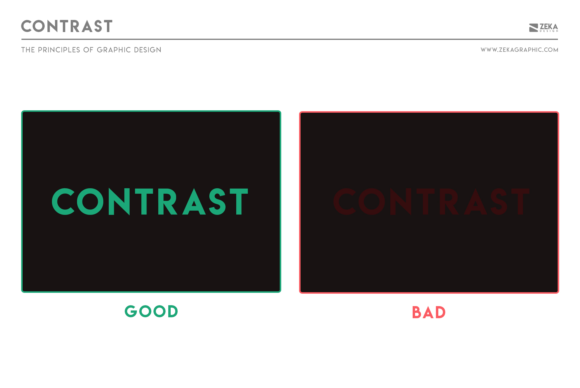
Contrast is the principle of difference—between colors, sizes, shapes, spacing, or styles. It helps elements stand apart so viewers can quickly understand what matters most.
Without contrast, layouts feel flat and difficult to scan because nothing clearly signals priority.
Contrast is one of the most well-known Graphic Design Principles as designers use it to make decisions visible: what should stand out, and what should recede.
Types of Contrast in Graphic Design:
How to apply contrast
For example, if you create a graphic design with a text, and the background of your design is Dark, then the text color needs to be in a light color to make it easier to read.
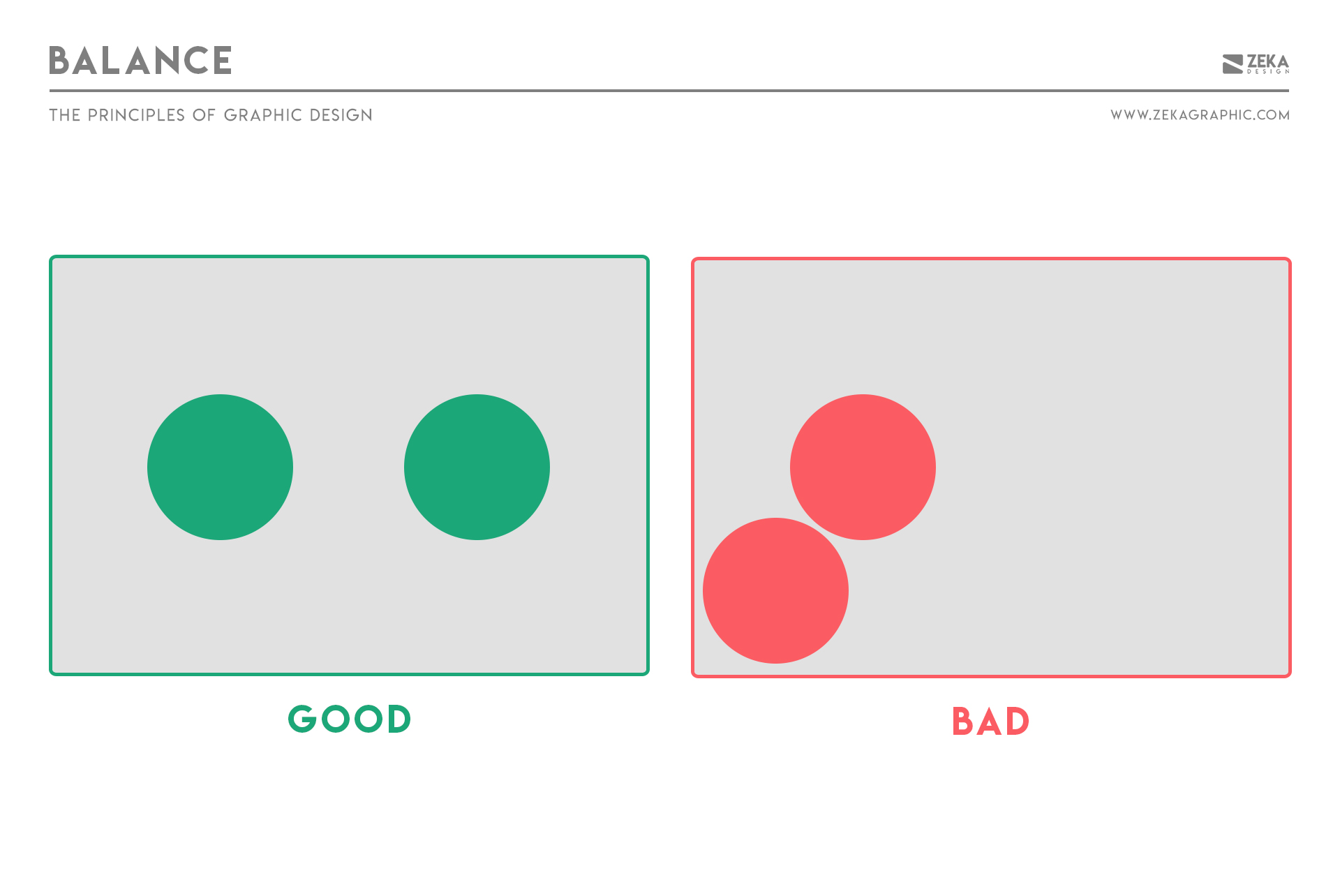
Balance is how visual weight is distributed across a layout. A balanced design feels stable and intentional even when it isn’t perfectly symmetrical.
Visual weight is influenced by size, color, contrast, density, and placement. Because these elements attract different levels of attention, designers use them to create equilibrium across a composition rather than relying on perfect visual mirroring.
There are several ways designers create this stability:
When designing a logo, balance plays a crucial role in making it visually appealing and professional. If you’re creating a logo for your brand, consider using a free logo maker to achieve the right balance and ensure a polished final design.
How to apply balance
Advertisment
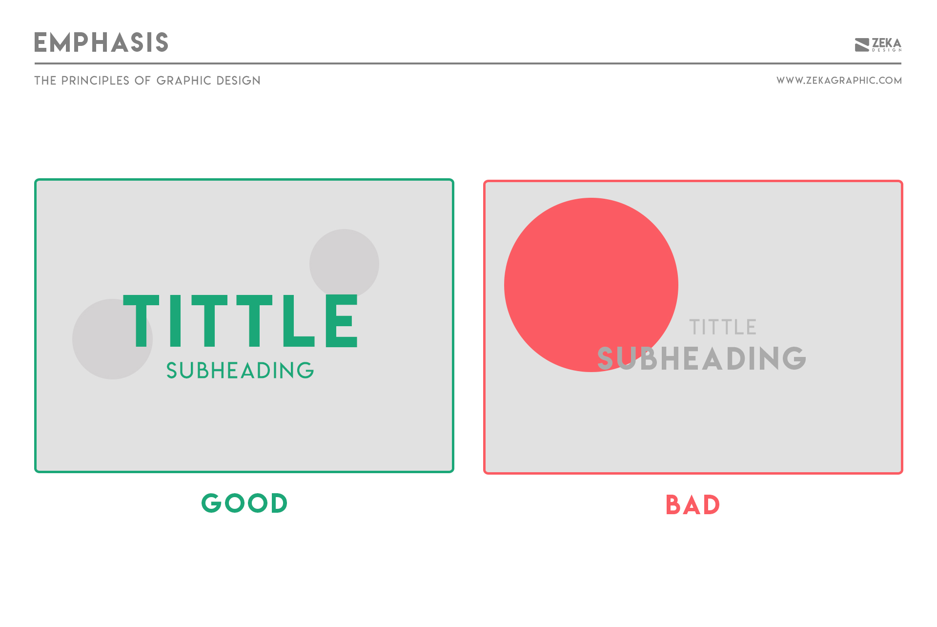
Emphasis is the principle of creating a focal point. It defines where attention should begin and what the design is primarily communicating.
Without emphasis, designs feel directionless as viewers don’t know where to look or which message matters most, which weakens clarity and impact.
Designers approach emphasis through prioritization rather than addition. One element is deliberately elevated, while others play supporting roles. Strong emphasis is less about making something louder and more about making everything else quieter.
How to apply emphasis
This concept is also widely applied in marketing and branding strategies by agencies like Digital Nomads HQ, where creating visual hierarchy ensures that key messages capture attention immediately.
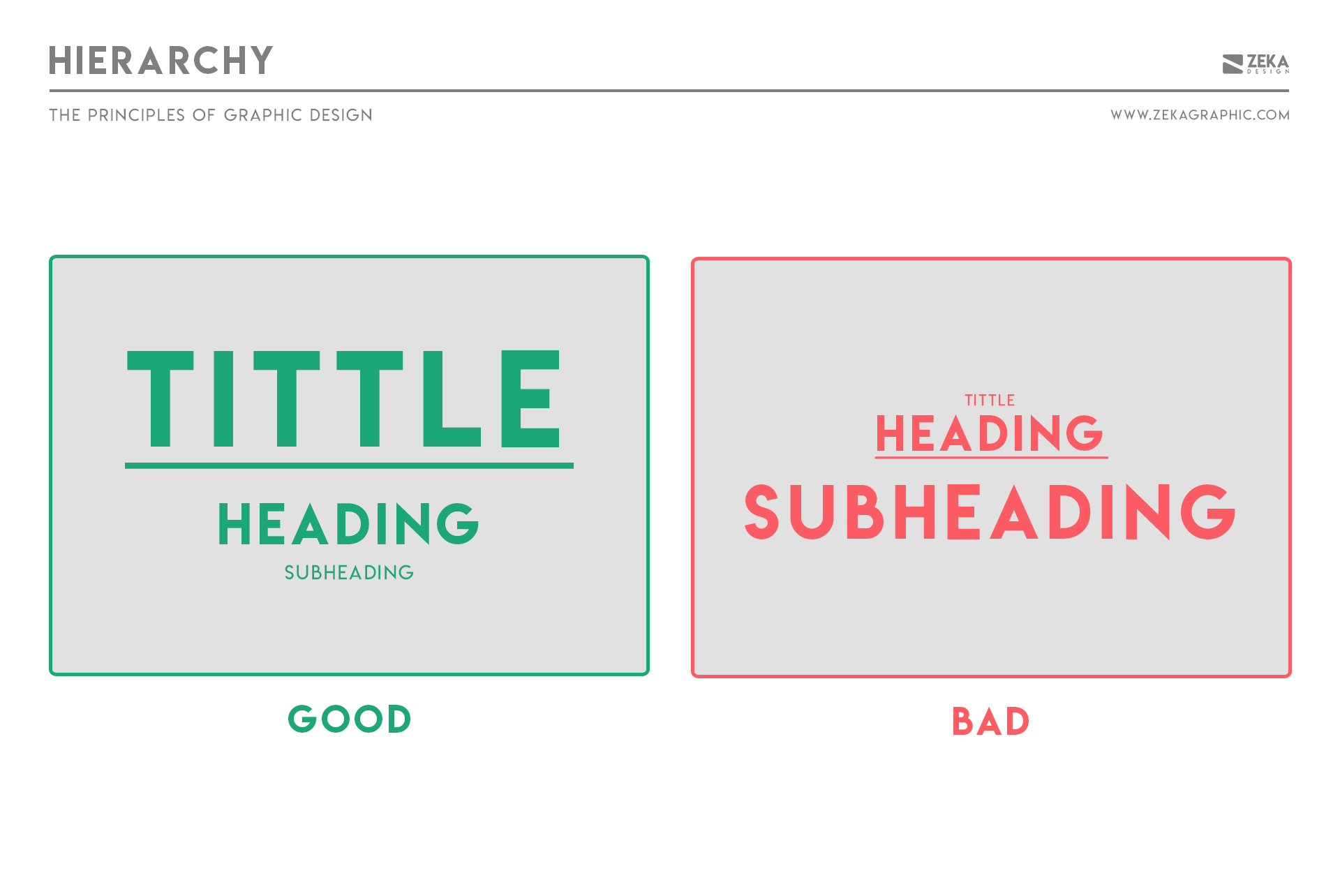
Hierarchy controls the order in which information is seen. It answers a fundamental question in every design: where should the viewer look first, second, and third?
Without hierarchy, users don’t know what’s important. They scan randomly, miss key information, or disengage entirely because nothing clearly guides their attention.
Attention is guided using different Types of Hierarchy:
How to apply hierarchy
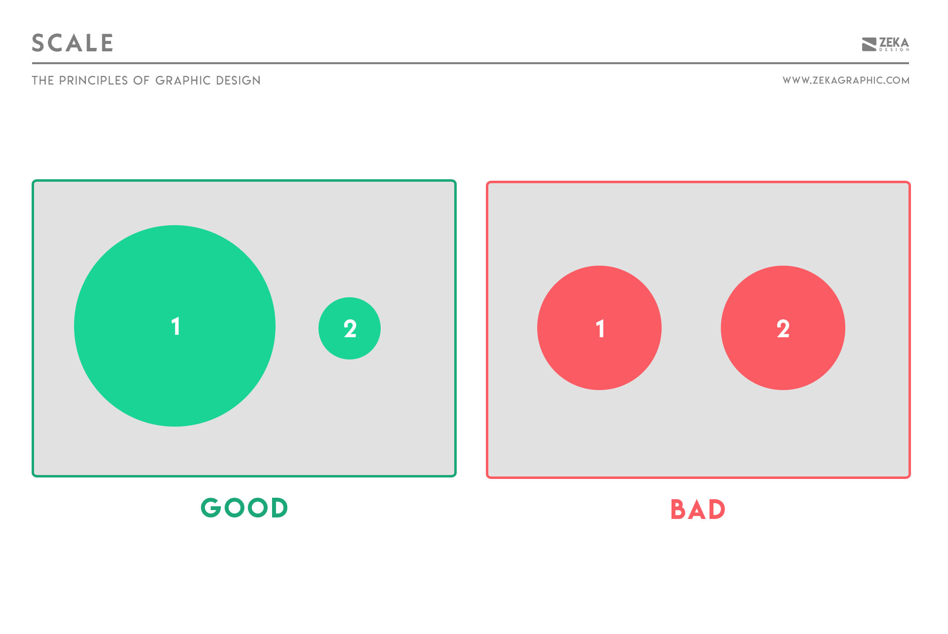
Scale refers to the relative size of elements and how differences in size communicate importance, hierarchy, and emphasis.
Without scale variation, everything competes equally, making it difficult for anything to stand out.
Designers use scale to answer a simple but critical question: what should be noticed first?
Larger elements naturally attract attention, but scale is most effective when it’s used intentionally and in relation to surrounding elements rather than in isolation.
How to apply scale
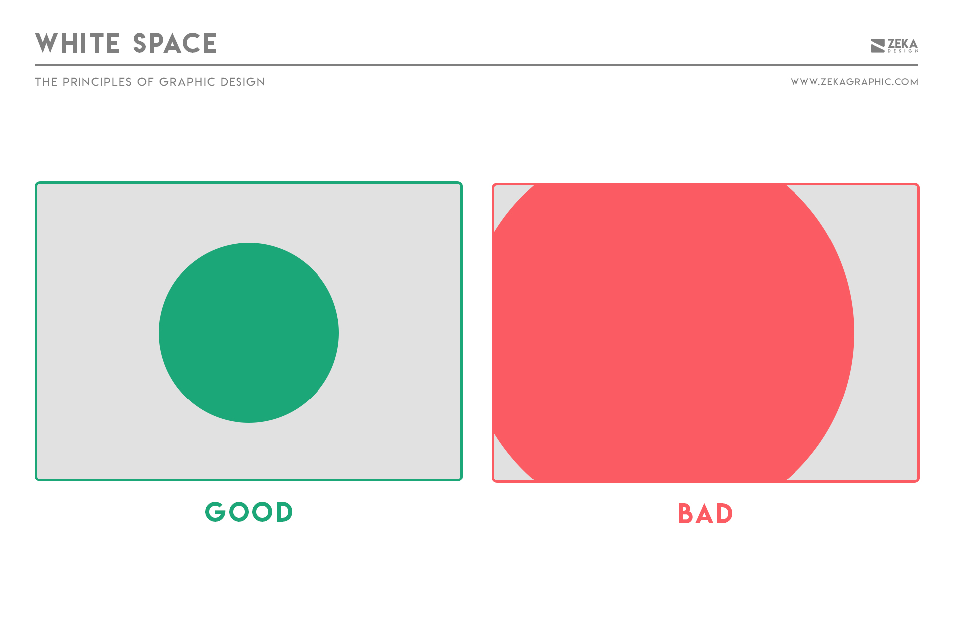
White space—also known as negative space—is the space between and around elements. It isn’t empty or wasted; it’s an active part of the design that shapes how content is perceived.
White space improves readability, reduces cognitive load, and increases focus. Designs with sufficient breathing room feel more intentional, refined, and easier to understand because information has space to exist.
Designers treat white space as a tool for emphasis and clarity operating it at multiple elements:
How to apply white space
Advertisment
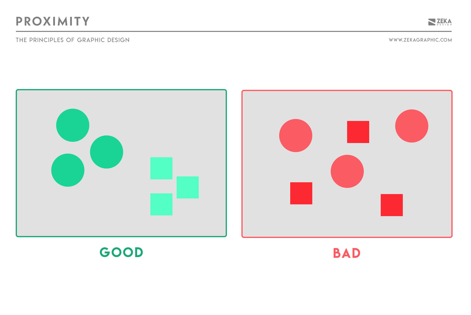
Proximity is the principle that elements placed close together are perceived as related and it’s one of the simplest and most powerful ways to organize information.
Elements placed near each other are naturally perceived as connected and ignoring proximity creates clutter and confusion, as the viewer struggles to understat which element belong together.
How to apply proximity
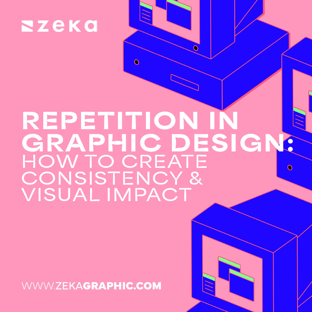
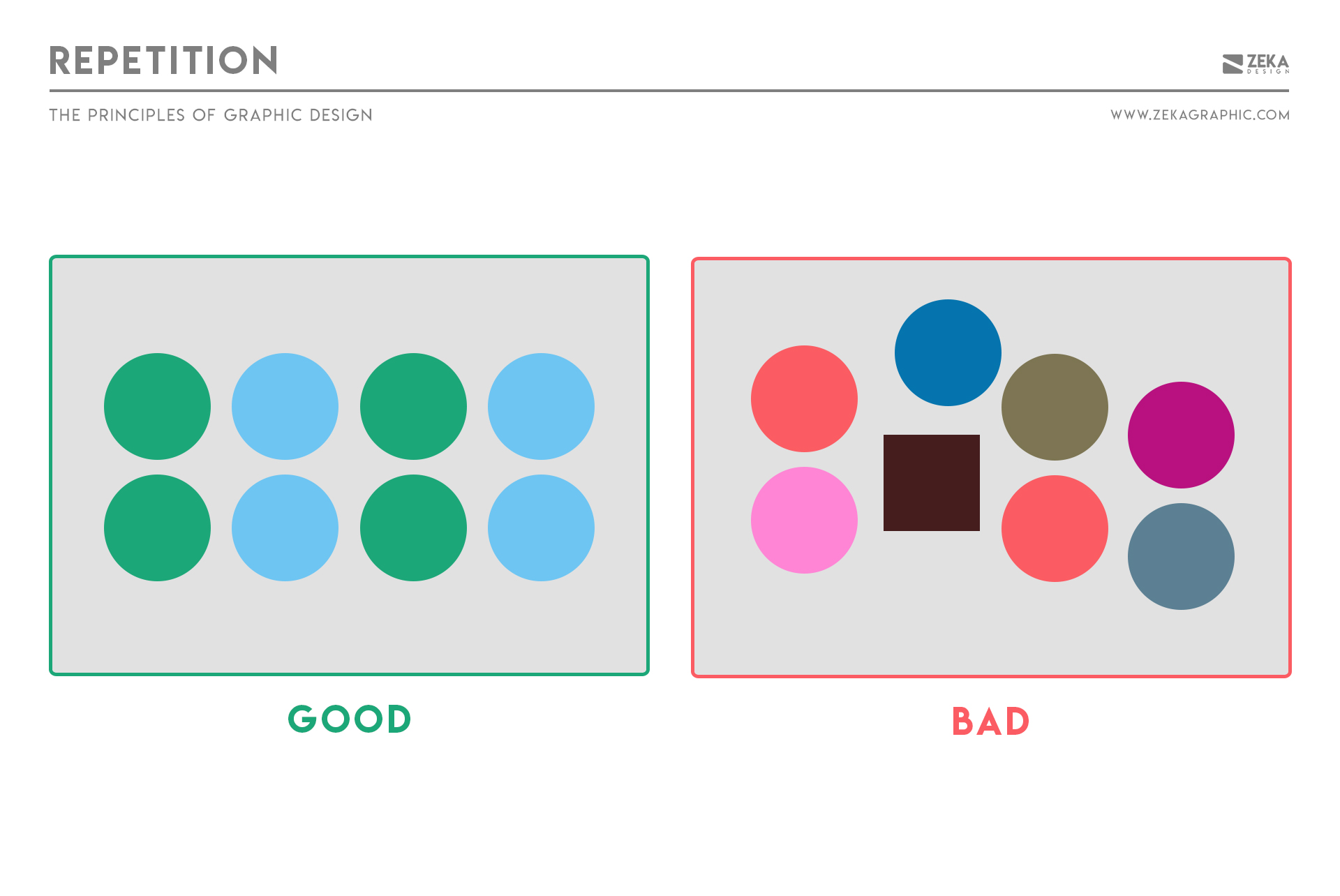
Repetition creates consistency by deliberately reusing visual elements across a layout.
When colors, shapes, spacing, or typography repeat, users recognize patterns faster and navigate content more easily, this reduces cognitive effort and helps layouts feel deliberate rather than accidental.
Designers use repetition to signal belonging and system logic by repeating elements like:
Over time, repetition turns isolated design choices into a recognizable visual language.
How to apply repetition
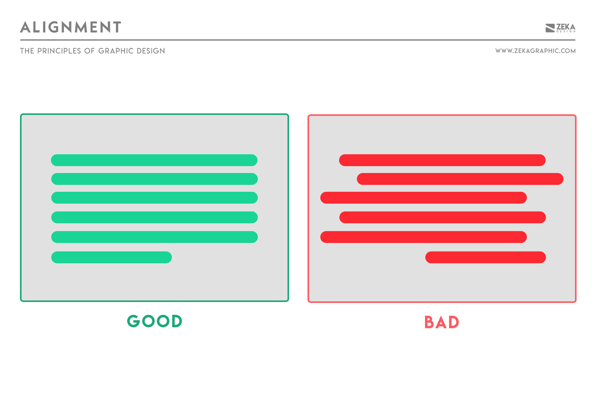
Alignment ensures that elements relate to each other visually. It creates an invisible structure that organizes content into a cohesive, readable whole.
Without alignment, layouts feel chaotic and unprofessional, even when everything else looks polished as misalignment breaks visual relationships and forces viewers to work harder to understand the layout.
Common approaches include:
How to apply alignment
Choose one alignment logic early and use it consistently. Strong alignment often goes unnoticed—but its absence is obvious.
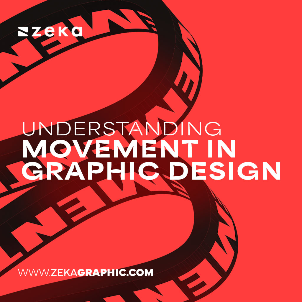
Movement describes how a viewer’s eye travels through a composition. Even in static designs, thoughtful visual flow can create a sense of motion and progression.
Without movement, layouts feel rigid or static. When movement is present, designs guide attention, increase engagement, and encourage viewers to continue exploring the content.
Designers create movement using
Rather than forcing attention, movement gently leads the eye from one element to the next, creating a natural viewing path.
How to apply movement

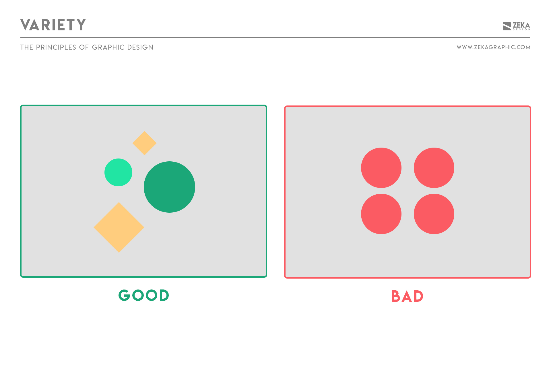
Variety keeps a design visually engaging by introducing controlled differences across a composition to maintain visual interest and prevent monotony.
While repetition creates consistency, variety ensures the composition doesn’t become predictable or mechanical if every element behaves the same way.
Designers create variety through changes in:
In practice, variety works best alongside repetition: one creates structure, the other keeps that structure dynamic.
How to apply variety
Introduce variation in one or two visual attributes while keeping the overall system consistent.
Examples include:
Good variety creates interest without breaking cohesion.
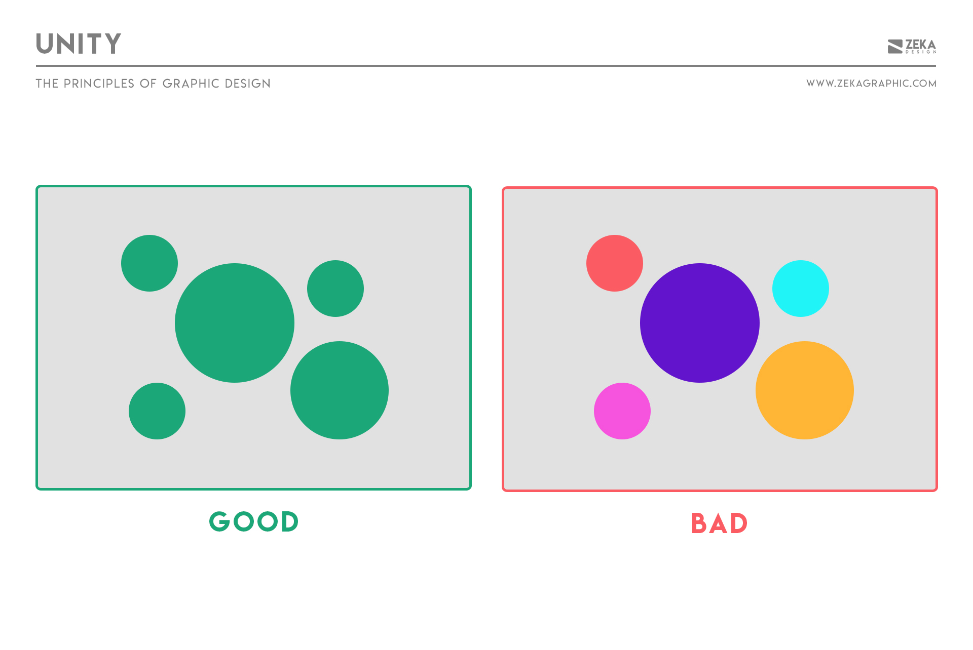
Unity is the principle that ensures all elements feel like they belong together. It creates the sense that a design works as one complete system rather than a collection of unrelated parts.
A design can use strong typography, color, or imagery individually and still feel disconnected if those elements don’t support the same overall direction.
Unity isn’t created by a single technique as it emerges when principles like repetition, alignment, hierarchy, and balance reinforce the same visual goal.
How to apply unity
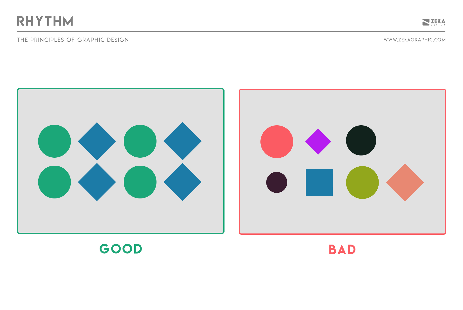
Rhythm creates visual pacing and sense of movement through repetition with variation. It guides the eye through a layout and makes elements feel connected rather than randomly placed.
Without rhythm, compositions feel disjointed. With it, designs feel smooth, intentional, and easier to navigate.
Designers think of rhythm as visual tempo and create it by repeating elements like spacing, shapes, color, or patterns while introducing subtle variation to avoid monotony.
There are several types of rhythm in design that designers can experiment with:
How to apply rhythm
Advertisment
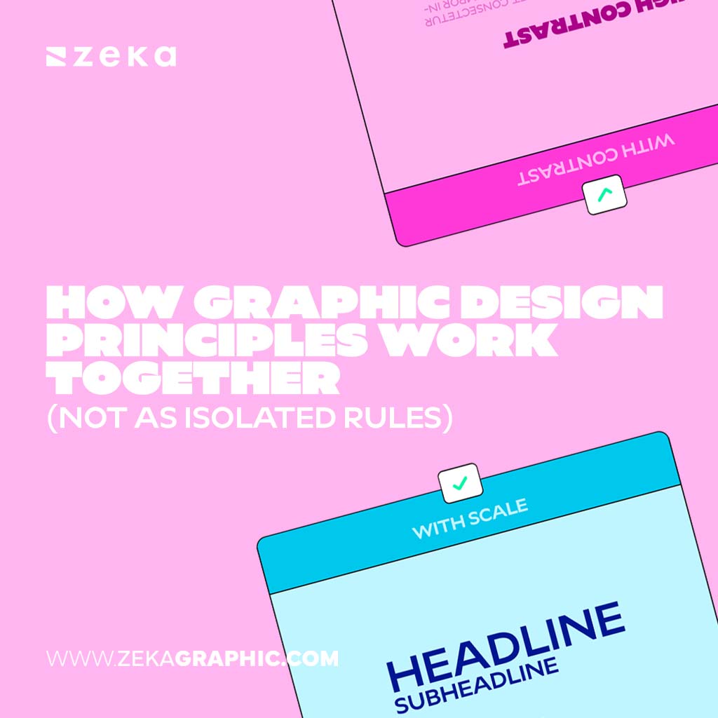
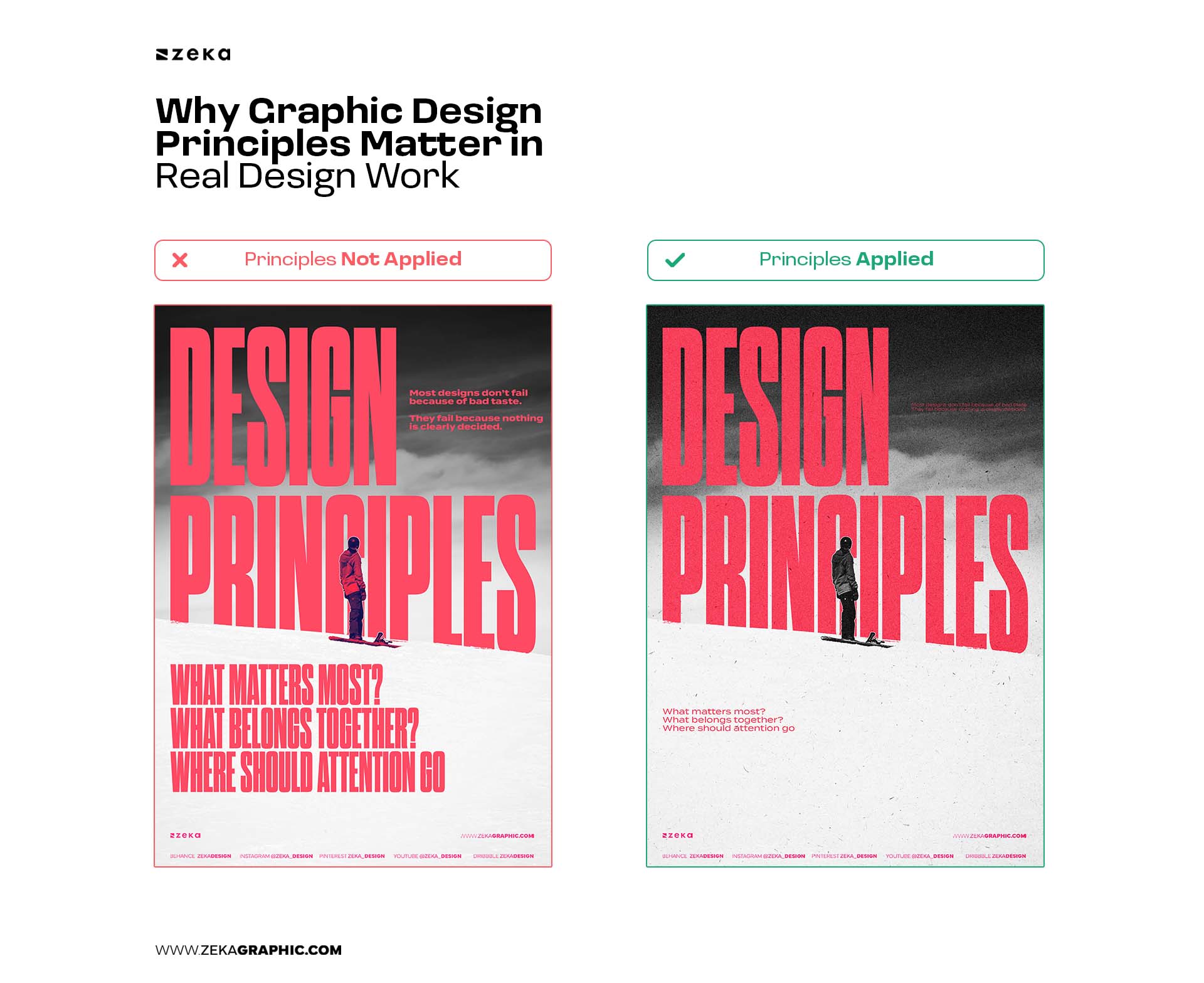
Graphic design principles are not isolated rules applied one at a time. They work as a connected system, where each decision affects the others.
A design rarely succeeds because of perfect contrast, balance, or hierarchy alone. It works because these principles reinforce one another.
For example:
Experienced designers don’t ask:
“Am I using contrast correctly?”
They ask:
“Does this decision make the message clearer?”
That’s the difference between rule-following and design thinking.
Different projects demand different priorities. One layout may rely heavily on hierarchy, while another depends on rhythm or balance.
The goal isn’t applying every principle equally—it’s knowing which ones should lead.
What are the main graphic design principles?
The main graphic design principles include contrast, balance, alignment, hierarchy, repetition, proximity, white space, scale, emphasis, movement, variety, unity, and rhythm. Together, they explain how visual elements are organized to communicate clearly and effectively.
How many graphic design principles are there?
There’s no single fixed number. Different books and schools list different principles, but these 12-13 principles are the most widely accepted and used in modern graphic design across digital and print contexts.
Are graphic design principles rules or guidelines?
Graphic design principles are flexible guidelines, not strict rules. They help designers make informed decisions, but they’re meant to adapt to context, goals, and constraints—not limit creativity.
Is color a graphic design principle?
Color is often mentioned alongside graphic design principles, but technically it is a design element, not a principle. It is one of the building blocks designers use. Principles such as contrast, hierarchy, and emphasis describe how color (and other elements) are applied to create structure, clarity, and meaning in a design.
What is the difference between design principles and design elements?
Design elements are the building blocks (color, type, shape, space).
Design principles explain how those elements are used together to create meaning, structure, and clarity.
Do graphic design principles apply to digital and print design?
Yes. Graphic design principles are universal, but their application changes based on medium. Digital design may emphasize hierarchy and interaction, while print relies more on layout and physical spacing.
Which graphic design principle is most important?
There’s no single “most important” principle. However, visual hierarchy often plays a central role because it organizes how all other principles guide attention and understanding.
Advertisment
Graphic design principles aren’t meant to be memorized—they’re meant to be understood and applied.
When treated as a system, they become practical tools for solving design problems: deciding what stands out, what belongs together, and how information should flow.
For beginners, this creates clarity and confidence. For experienced designers, it sharpens decision-making and helps explain design choices with intention.
Think of this article as your map.
The deeper guides are the routes.
Study them, apply them, and over time these principles will stop feeling like theory—and start becoming instinct.

If you found this post useful you might like to read these post about Graphic Design Inspiration.
Advertisment
Written by
If you like this post share it on your social media!


Advertisment

Advertisment
Advertisment