Logo design function is more important than just look good and pretty, actually, your brand logo is a crucial part of your brand and identity design system and the function of a good logo design is to represent your brand values and communicate to your customers what is your brand about.
Besides the 7 qualities for a good logo design you can go as creative you want when designing your logo, but there are some basic do’s and don’ts you need to know before start designing a brand logo that will help you create a professional and relevant logo, let’s see what are these basic principles when designing a logo.
Advertisment
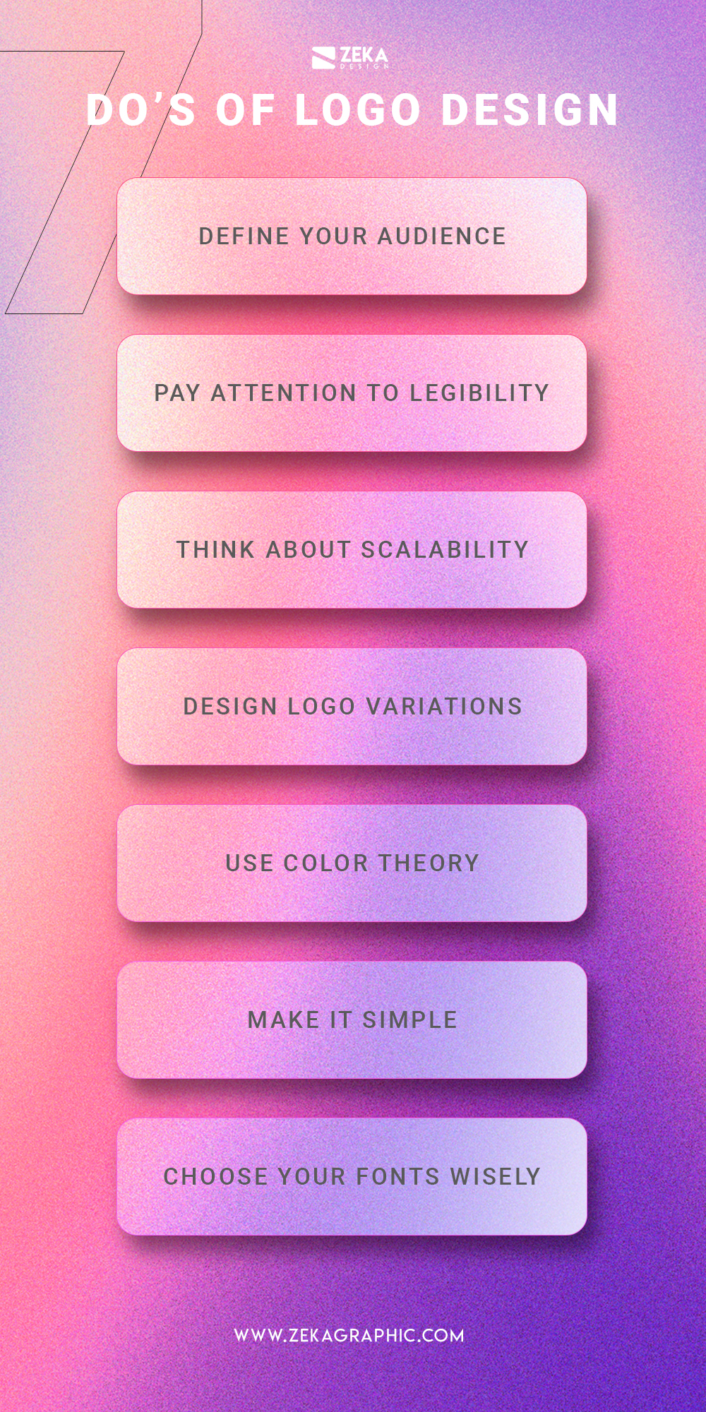
The first do actually starts before designing a logo but at the same time is the most important part of a creative process when designing a logo, and it’s to make a good research and define correctly your target audience. As mentioned in the introduction the main part of a logo is to attract your possible customers and make your brand relevant for them, that is why before starting sketching your logo is important to define who will be your audience and how to attract their attention using color theory, symbols or fonts.
A good way to study your perfect audience is to analyze your competitors, what are they doing, what fonts, colors, and shapes they are using for their logos, and use this information to create a better logo that engages with your ideal client.

The viewer will only see your logo design for a couple of seconds, that is important to know when you design a logo because you only will have that time for the client to memorize your brand, that is why you need to make it easy for your audience.
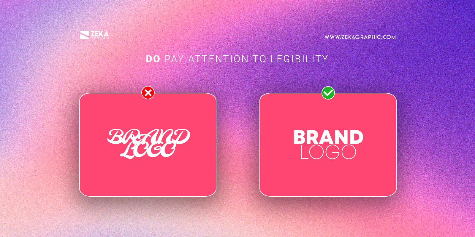
You can have the best logo and really eye-catching but if your brand name can’t be readen the customers will be discouraged to interact with your brand, that is why you need to make sure that your brand name is easy to read so check your logo multiple times and if you have some troubles reading your brand name change the font used for one simpler that will increase readability.
As I mention in the first do, research is a crucial part of a successful brand identity project, before start designing your logo you should make sure where it will be used websites, social media avatars, or printed banners, and consider this information in the design process.
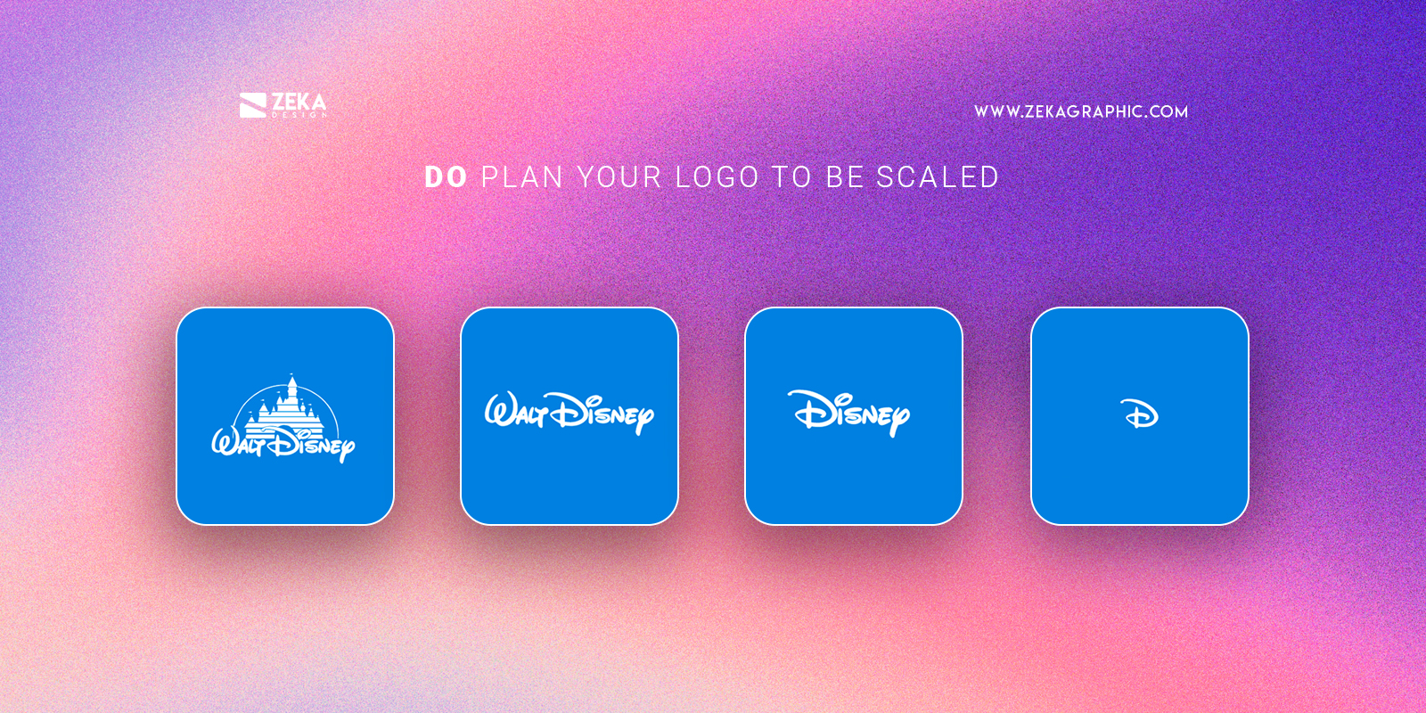
To make sure your logo will look good on any scale you should create different logo variations depending on the scale with more or less detail depending on the space it will be placed, to avoid legibility problems use a less detailed version of the logo for small spaces.
Advertisment
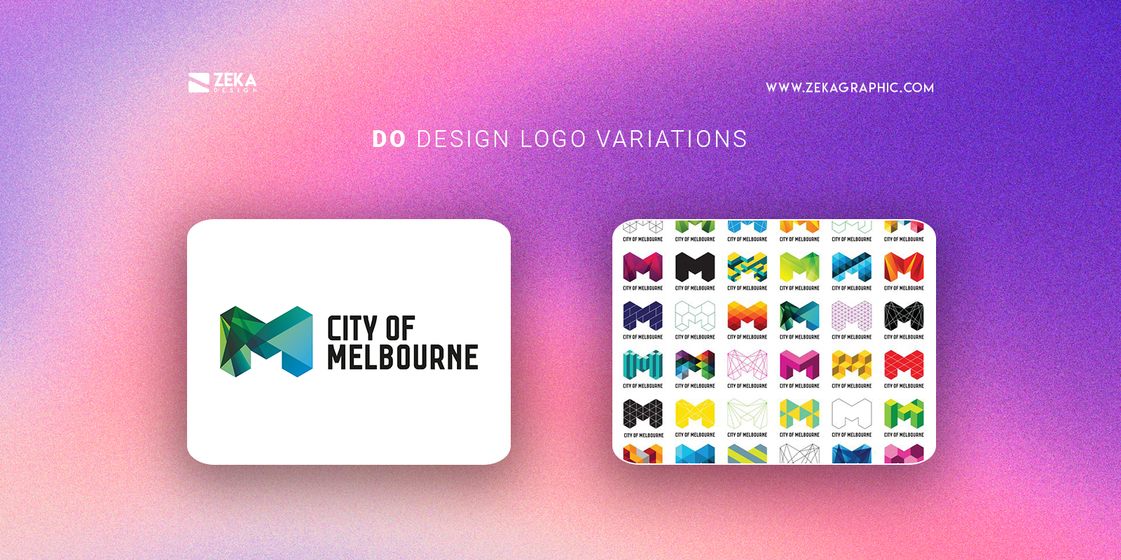
When you design your brand logo it’s important to make sure that it looks good in any circumstance and environment, that is why you need to make vertical, horizontal, and square versions of the logo to make sure every place your logo will be it will fit there.
Also, you should think about color when designing your logo, create different color versions of your logo for black/white printing, one color, and think about different situations your logo will be and which color will be suited best for it, to make things more clear you should indicate all this informations and indications in your brand style guide, and if you want to learn more about it you can read this post.
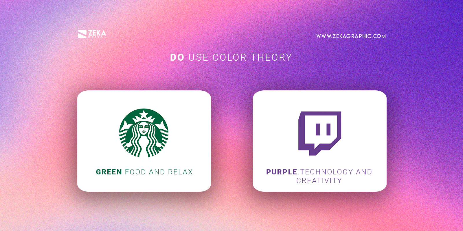
Colors are a powerful tool for graphic designers and a key principle in design as they have their own meaning and can transmit different feelings and emotions, that is why is important to study color psychology in logo design (you have a complete guide here) and to understand the meaning of different colors, and later using color theory (you can check this guide here) to combine them creating a harmonious color palette.
Applying color psychology to your brand logo is a really powerful tool as you can transmit different messages and emotions using the color that the viewer will automatically associate with your brand, think about what emotions you want your customers to feel when they look at your brand logo?.
Advertisment
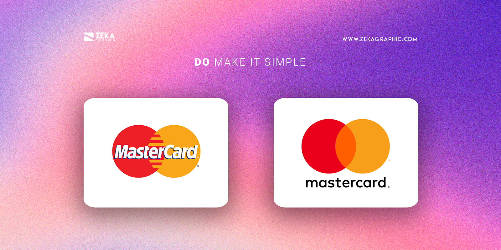
As I early mentioned in this post the viewer only will have some second to look at your brand logo and you need to use that time to make it easier for the viewer to memorize your logo design, that is why is important to follow minimalist graphic design rules and keep things simple.
A good graphic design tip to make your brand logo simple is following the minimalist graphic design rules and once you finish your logo design, try to remove elements without changing the meaning of your logo, making this process you will remove all extra elements and maintain the core meaning of your logo making it easier for the audience to memorize it.
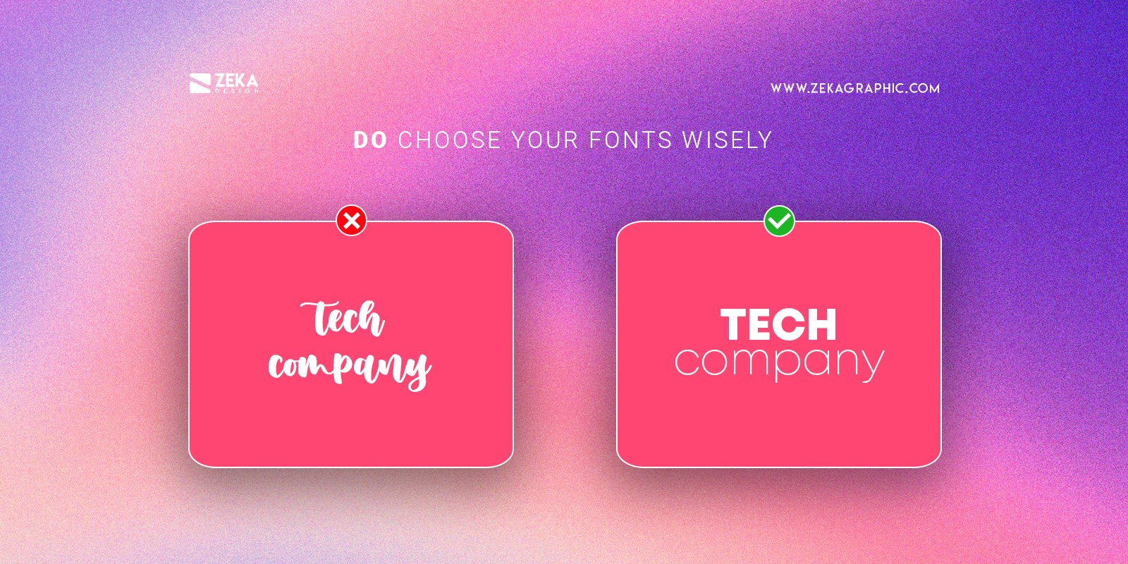
Font pairing is really important when you design a logo as it happens with shapes or color, every font has his own meaning and character, some of them can be bold and strong and other can be elegant and thin, that is why you should choose a font combination that describes better your brand values.
To make it easier to choose a font for your brand logo you can check this post where I show the psychology of fonts and it will help you to understand the difference between San Serif or Slab Serif when choosing a font for your logo.
Advertisment
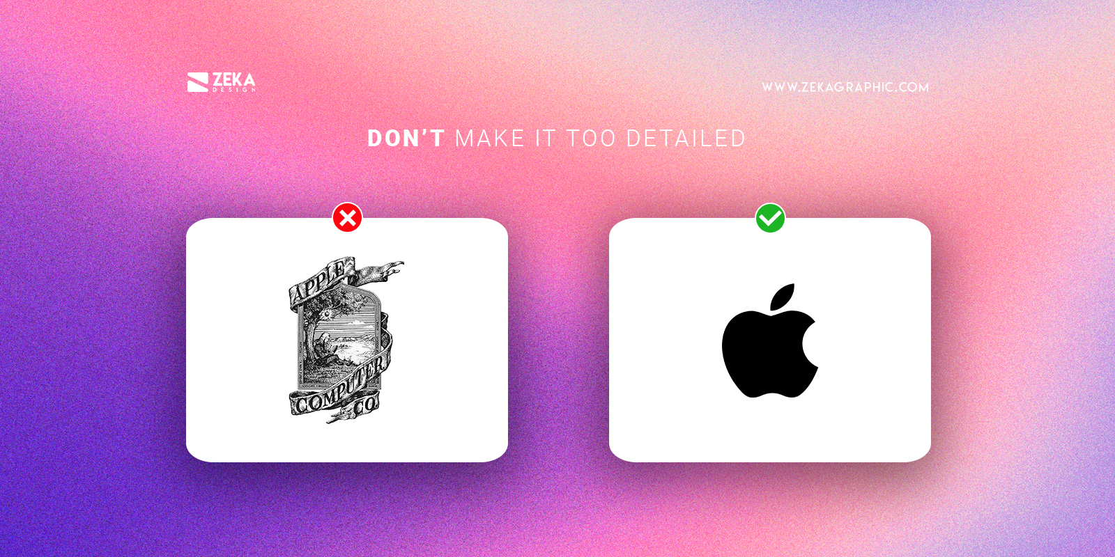
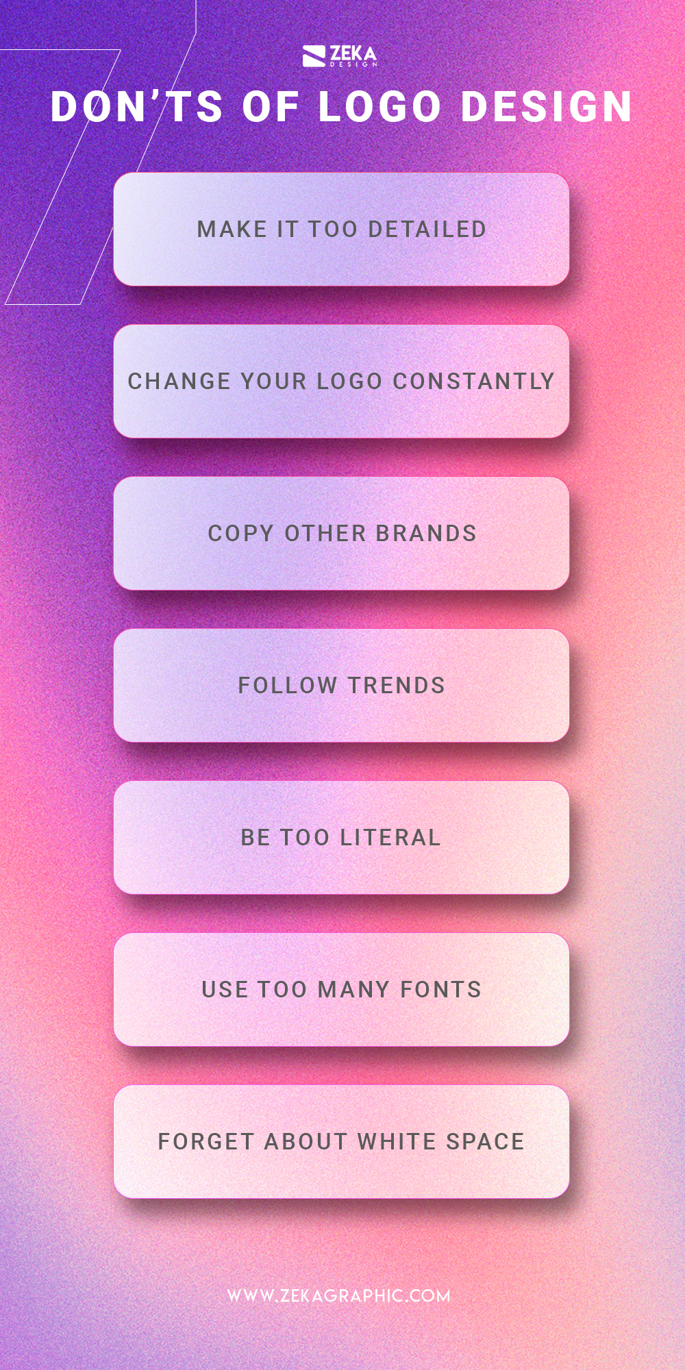
The first don’t when designing a logo is to understand what is the logo function, and it’s to represent your brand and help the viewers to associate it with your brand values and products, that is why the first rule when designing a logo is to make it as simple as possible, that is why you should avoid creating too complex or detailed logos as they will be more difficult for the viewer to memorize at the same time that they will look ugly in small sizes or one-color tint.
A really useful tip for designing simple and minimalist logo designs is to start designing it only using one color and once you have finished adding your brand colors, using this technique you will avoid saturating your design with too many elements or colors. Another useful tip to design minimalist logos is once you have finished your design try to remove elements from your logo that will no affect the main message.
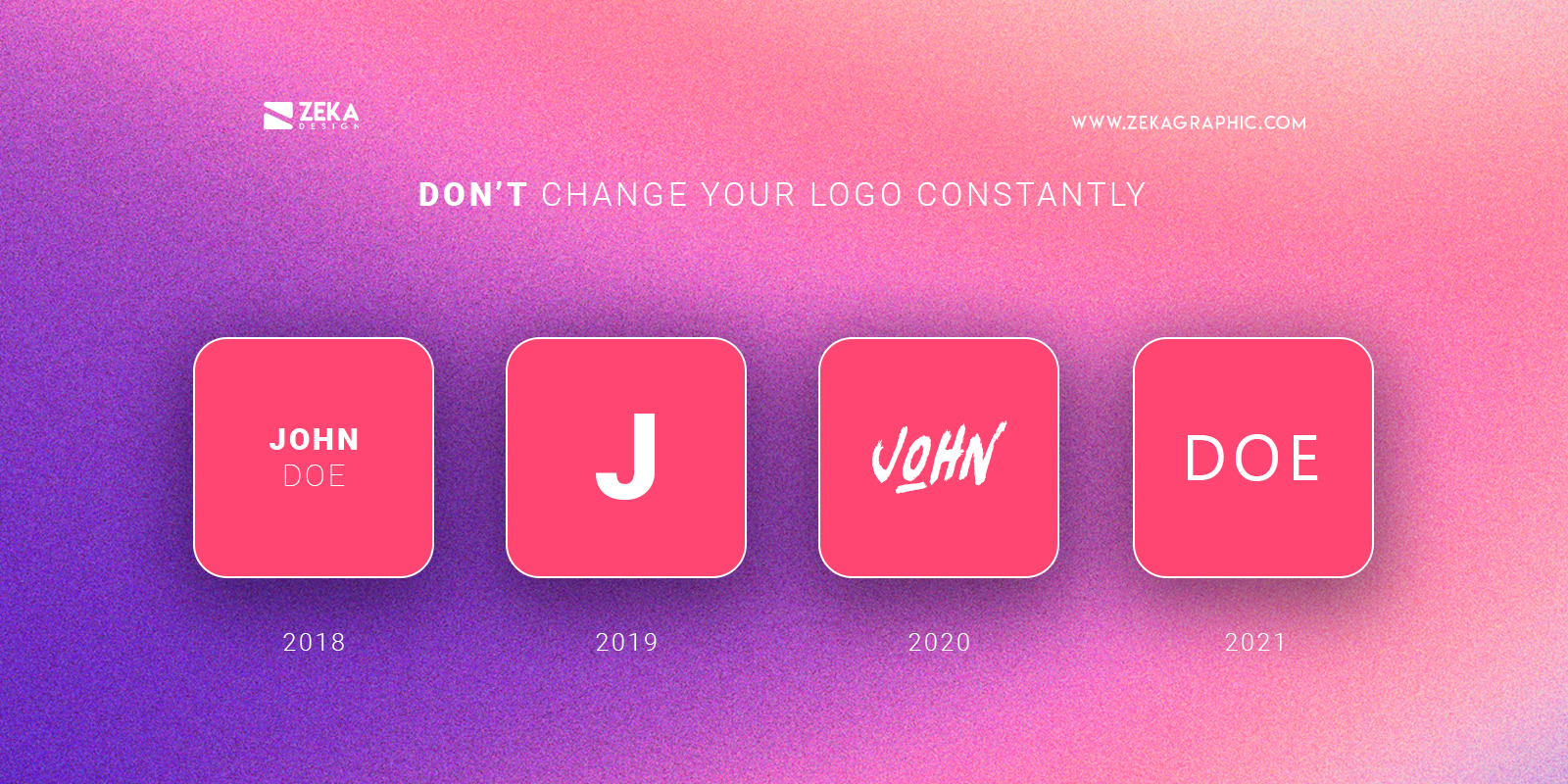
The function of a good logo design is to stay timeless and make your brand recognizable through times, that is why you should keep your logo as much as possible and if it’s already perfect don’t touch it to keep your brand consistent and assure your brand logo is recognizable.
If you keep changing your brand logo constantly this will confuse customers as they will not recognize your brand if you have made drastic changes over and over. And don’t forget that when you make a logo rebrand you also can make minor changes to make it better keeping the same look and feel of the original without making drastic changes.
Advertisment
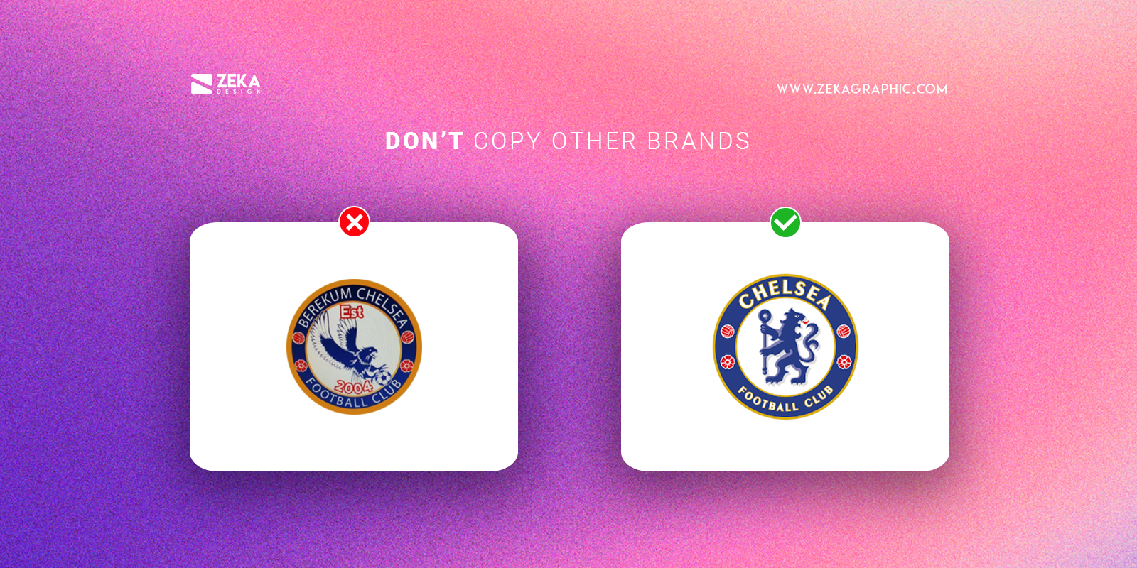
The whole purpose of making a good logo design is to make your brand relevant and differentiate it from your competitors, that is why this don’t is very logical, don’t copy other brands as you will fail into the first logo design goal as you will not be able to differentiate yourself from your competitors.
By copying already existing brands you will also get a lot of negative publicity and can have legal problems with copyright so don’t copy other brands, taking inspiration from other designers and brands is good and necessary but be yourself and showcase your unique brand values.
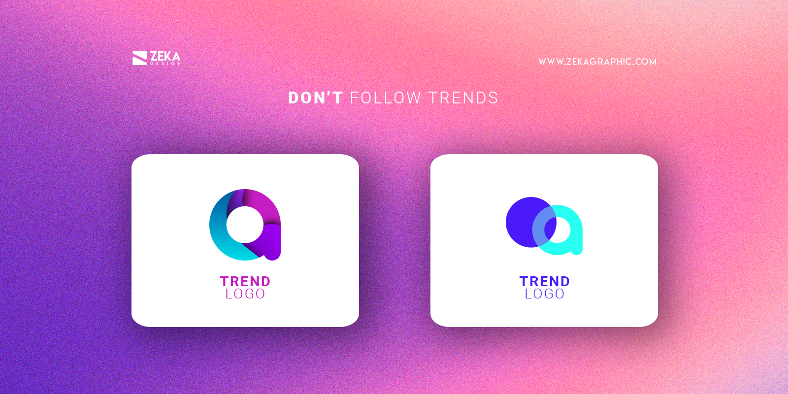
Graphic design is an always changing industry and it’s important to stay informed about new trends or appearing styles, some of these trends can become statements and stay for a long but many of them will disappear the next year, that is why is better to avoid following these trends when designing your brand logo because it can become obsolete really fast.
Instead of just following graphic design trends get inspired by them but keep focused on what you want with your logo design and what are the brand values and message you want to transmit with it.
Advertisment
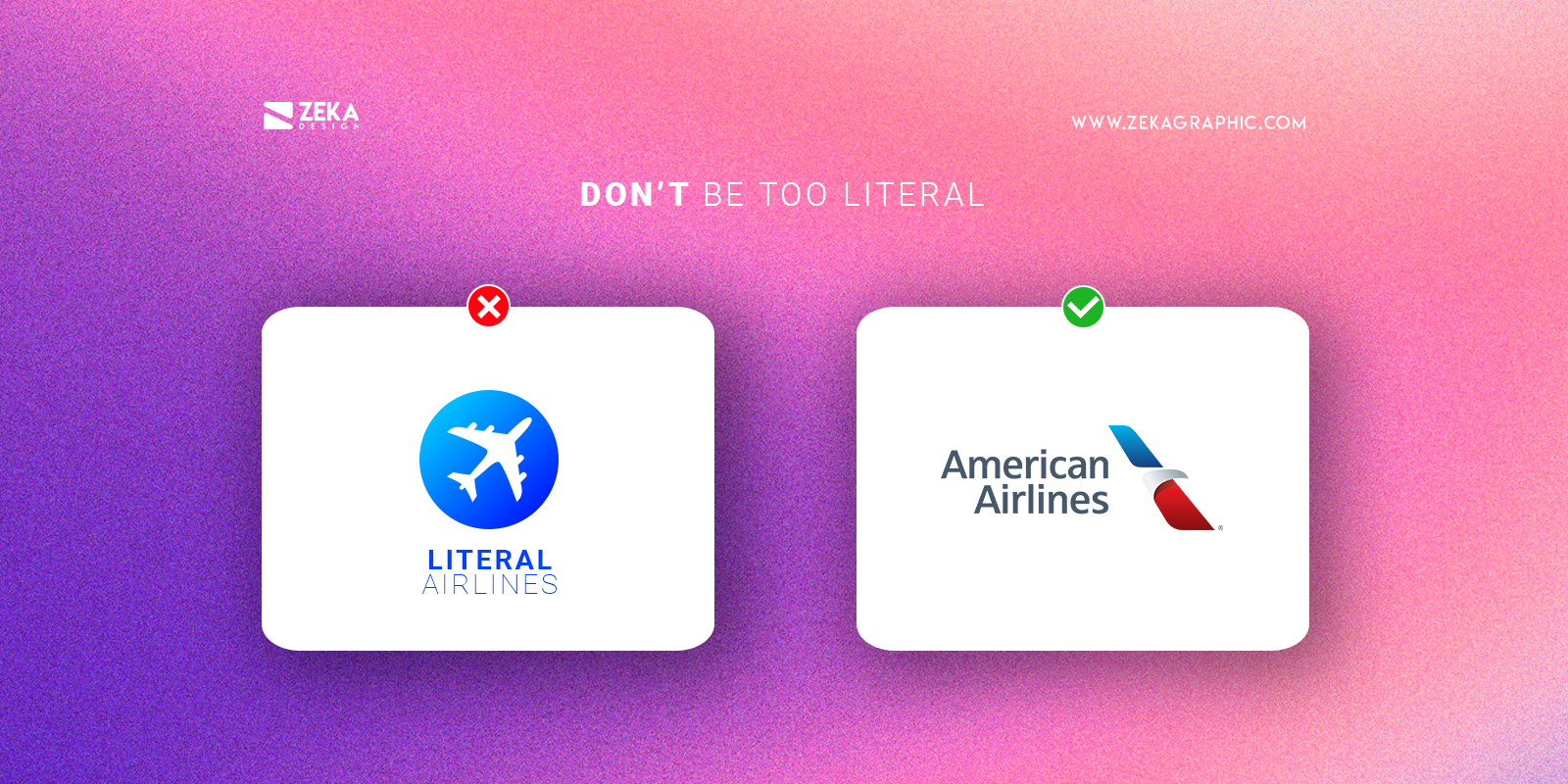
Think about an airplane company, how many companies you know are using an airplane in their logo design? too many right, if you are too literal with your logo design and incorporate obvious elements you can easily fall into creating a boring and ordinary logo design that will not help you differentiate from your competitors.
Be more creative in design a brand logo and explore different ways to transmit your purpose and brand values without being too literal, you can use color psychology and shape psychology to transmit different feelings and if you want to see different types of logo design you can check this post.
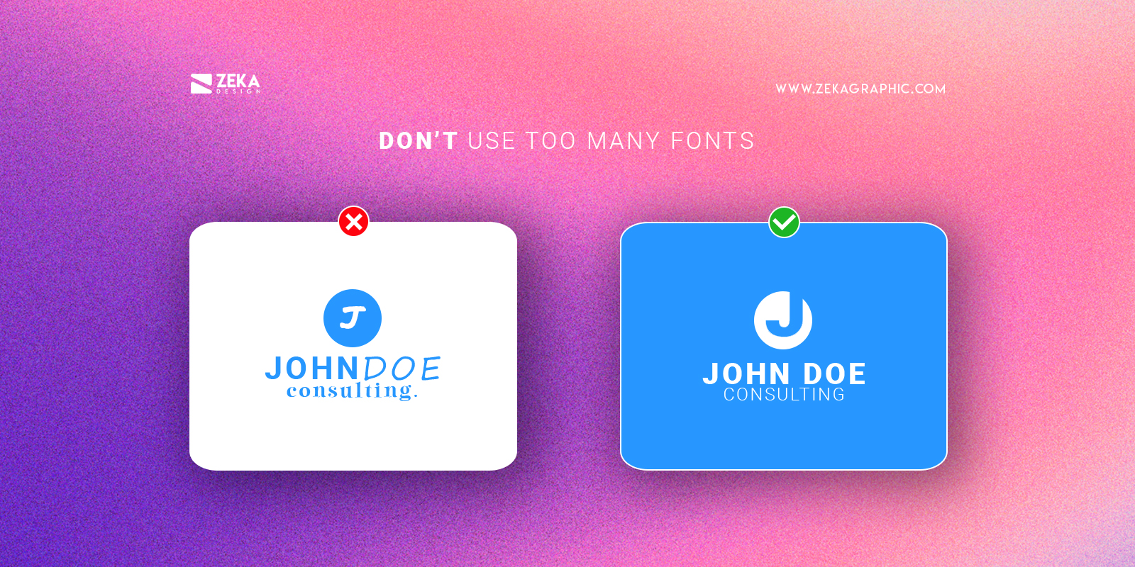
As already mentioned in this post, every font has its own meaning and character that is why if you use too many fonts for your logo design you can create a confusing message for the viewer at the same time that you fall into the first don’t by adding too many elements to your logo.
There is a golden rule when choosing fonts for your design project and it’s to keep the maximum amount of fonts to two, and for logo designs, you can use only one and play with weight and size, check my post about typographic hierarchy to learn more about how fonts interact with each other and help you choose your fonts.
White space or negative space is a really powerful tool in graphic design as it is also a design element you can use for your logo design. think about brands like FedEx or NBC that applied this technique directly into their brand logo and the result is great.
At the same time don’t forget about macro white space, giving your logo design room to breathe and having distance from other visual elements will make it more visible and give your logo more importance and emphasis.
Advertisment
Hope you find this post useful and get inspired by these 10 easy design tips that will make your design project look professional and clean just by applying these techniques and strategies, and if you want to master some of these design tips you can read my specific articles about each of them.
If you found this post useful you might like to read these post about Graphic Design Inspiration.
Advertisment
Written by
If you like this post share it on your social media!
Advertisment
Advertisment