If nothing stands out in your design, weak size relationships are often part of the problem.
When everything is roughly the same size, the eye has no instructions. It doesn’t know where to start, what matters most, or what can be ignored. The result is a design that feels flat, even if every individual element is well designed.
Scale is one of the fastest ways to fix this because it creates clearer visual relationships without adding more elements or decoration.
This article treats scale as what it actually is: attention control as scale helps viewers understand what matters most
Advertisment
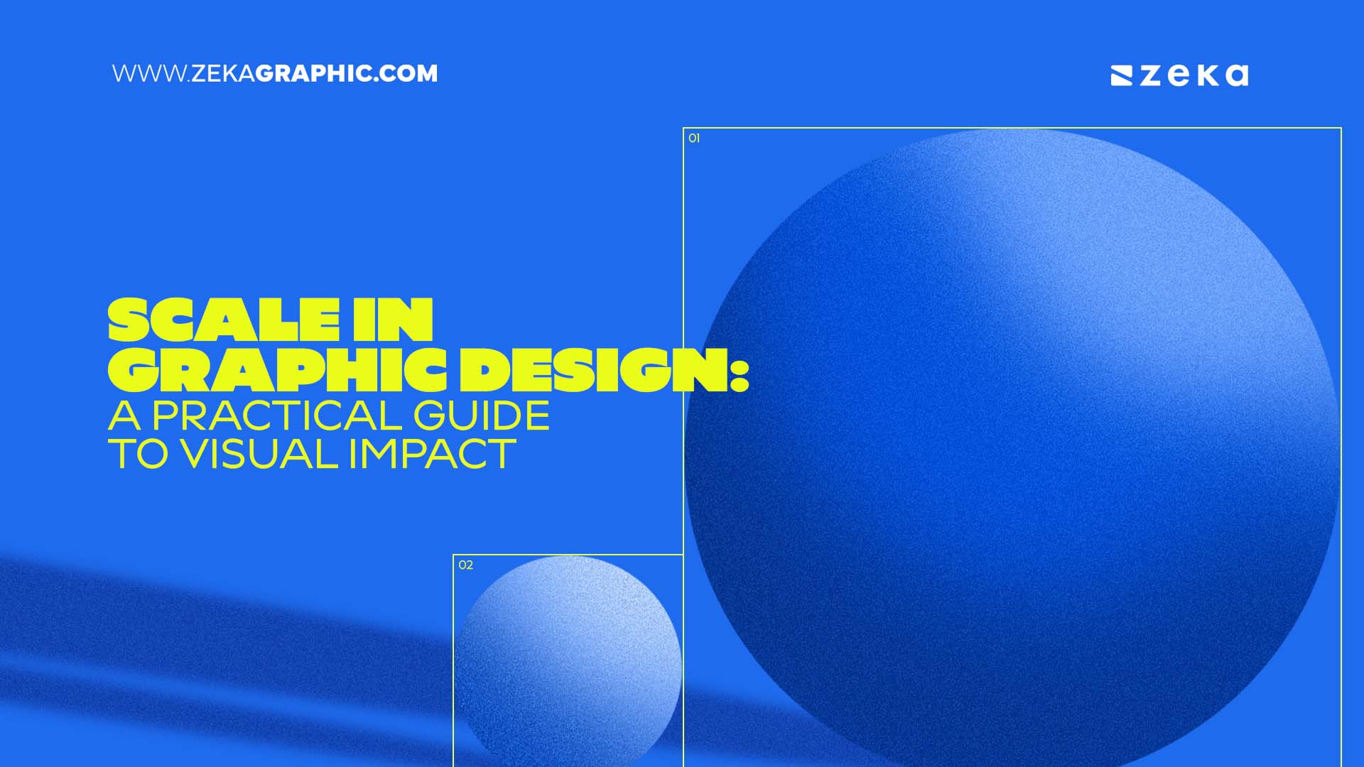
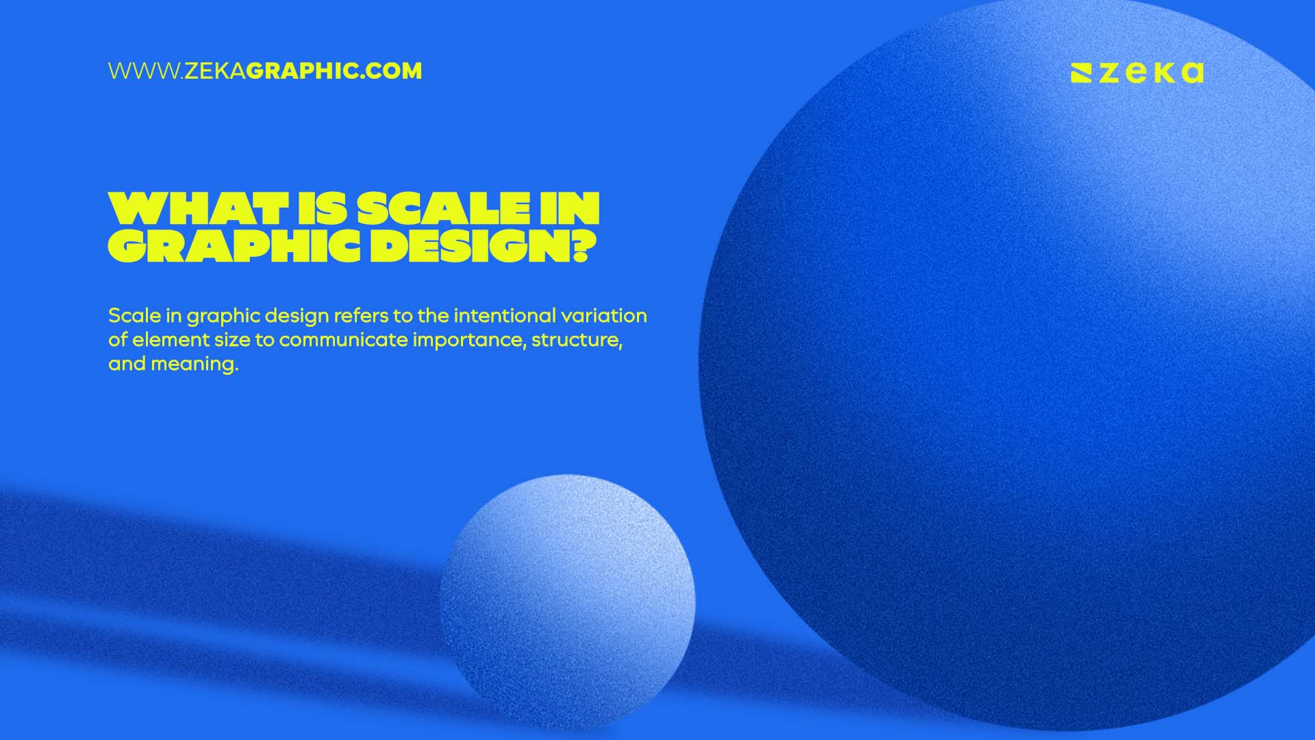
First, we need to understand what scale actually is, and it refers to the intentional variation of element size to communicate importance, structure, and meaning. As a fundamental graphic design principle, scale helps designers organize information, establish hierarchy, and guide attention through a composition.
It’s not just about making something “big” or “small.” It’s about how sizes relate to each other.
A headline only feels large if the surrounding text is smaller. A focal image only feels dominant if everything else steps back. Scale is always relative — it only works in comparison.
Problems appear when size relationships become too similar. Without clear differences, hierarchy weakens and the layout loses focus.
Scale controls:
Scale matters because it solves a problem the viewer will never articulate but always feels:
“Where am I supposed to look?”
When scale is used deliberately, it does three critical things.
It creates hierarchy without explanation
Viewers don’t read layouts. They scan them. Size is one of the first signals the brain processes. Larger elements are assumed to be more important — instantly, without effort.
It prevents visual competition
When everything is similar in size, elements compete instead of cooperate. Scale allows one element to lead while others support. Without it, the design feels noisy even if it’s minimal.
It increases perceived confidence
Clear scale differences make layouts feel more intentional and confident.
Advertisment
Before fixing scale problems, it helps to understand the different ways scale is used in design.
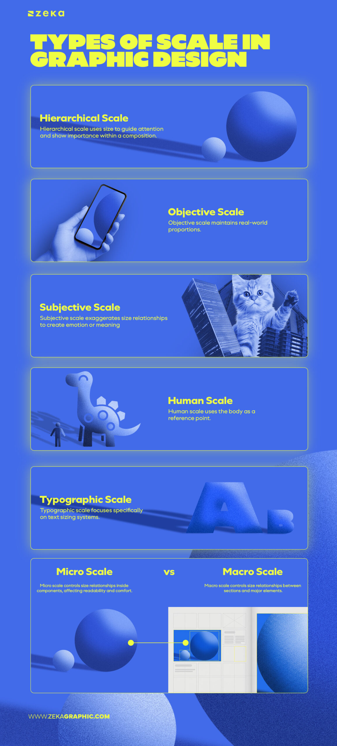
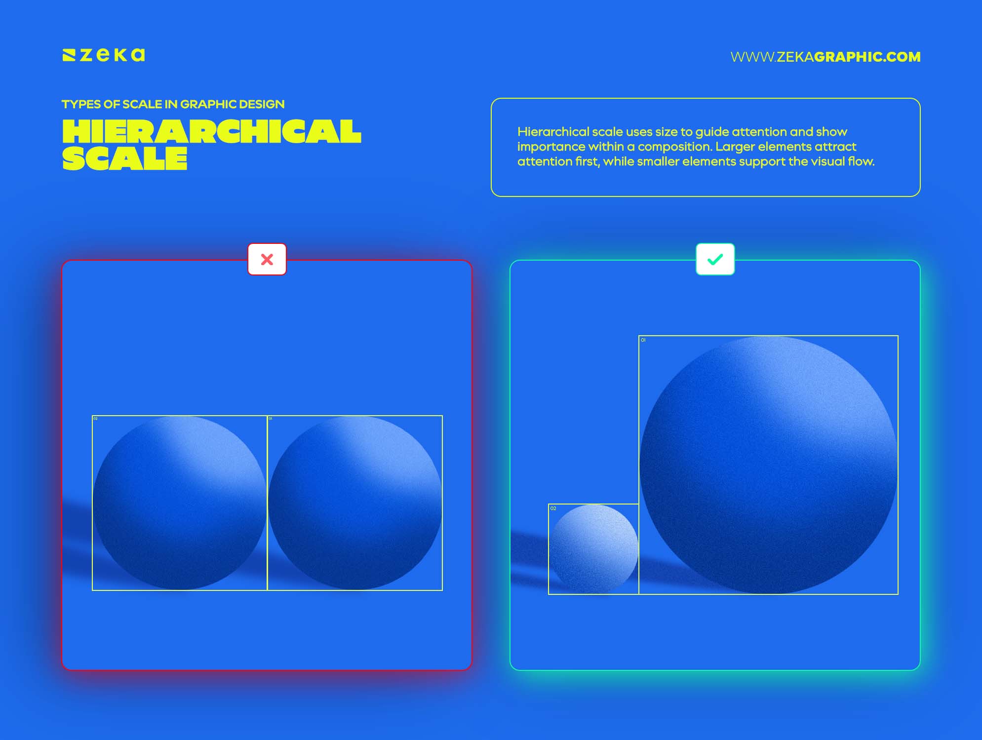
Hierarchical scale uses size to guide attention and show importance within a composition. Larger elements attract attention first, while smaller elements support the visual flow.
This type of scale appears in posters, websites, interfaces, packaging, and editorial layouts where viewers need a clear starting point.
Hierarchical scale answers one question: What matters most right now?
It’s the backbone of editorial layouts, interfaces, posters, and presentations.
Objective scale maintains real-world proportions. It’s used when accuracy matters more than expression — maps, diagrams, technical layouts, architectural plans or blueprint designs.
Here, scale communicates trust and precision rather than attention.
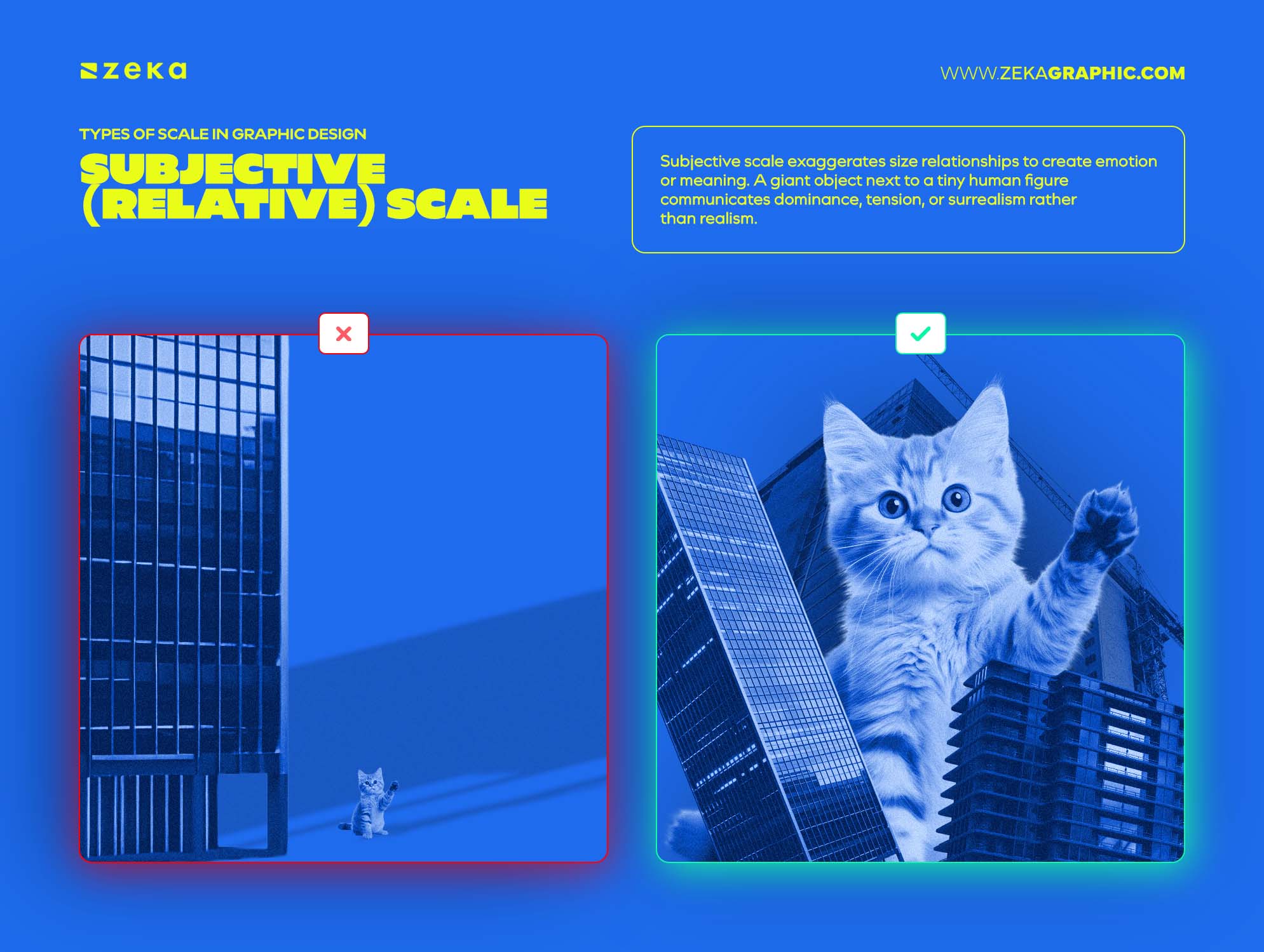
Subjective scale exaggerates size relationships to create emotion or meaning. A giant object next to a tiny human figure communicates dominance, tension, or surrealism rather than realism.
This type of scale is common in posters, conceptual illustration, and expressive branding.
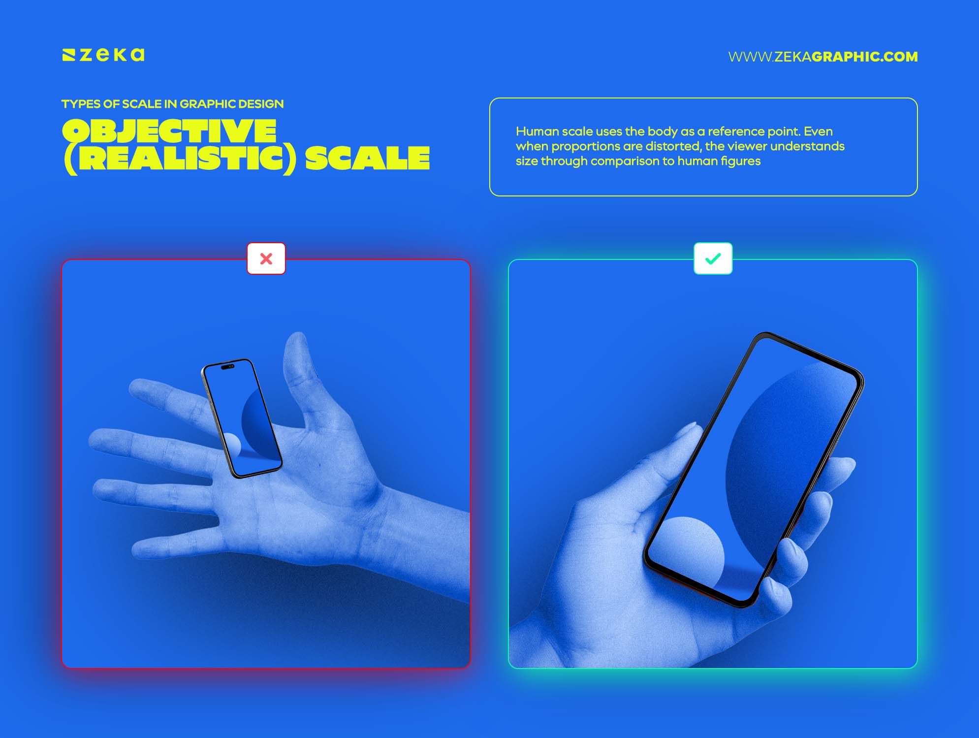
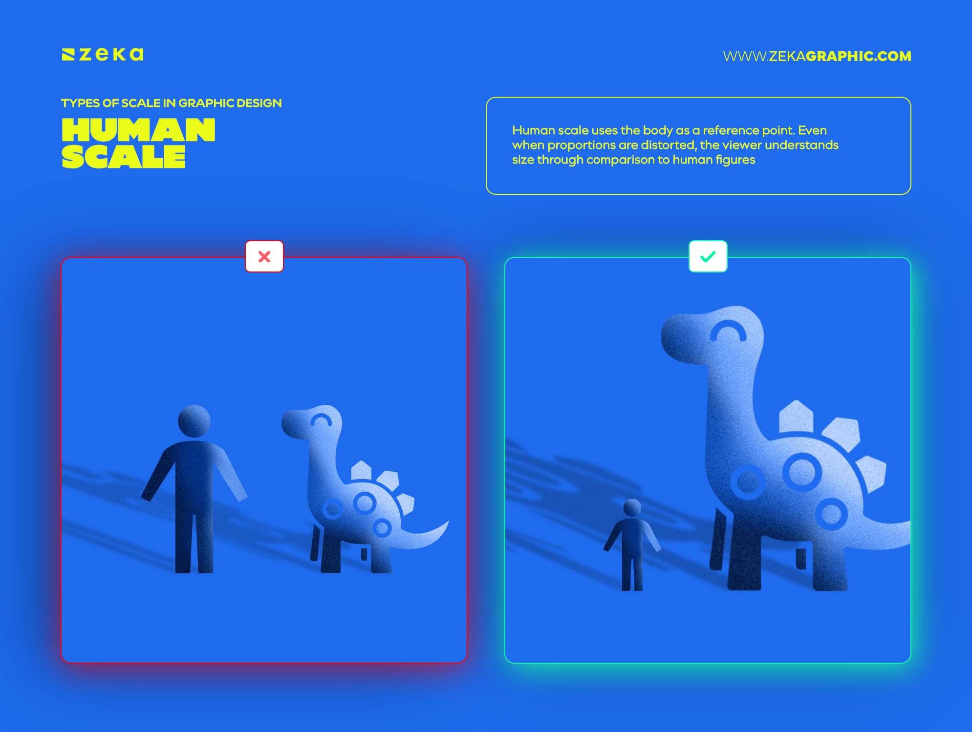
Human scale uses the body as a reference point. Even when proportions are distorted, the viewer understands size through comparison to human figures, hands, faces, or familiar objects.
This makes scale immediately relatable — or intentionally unsettling when broken.
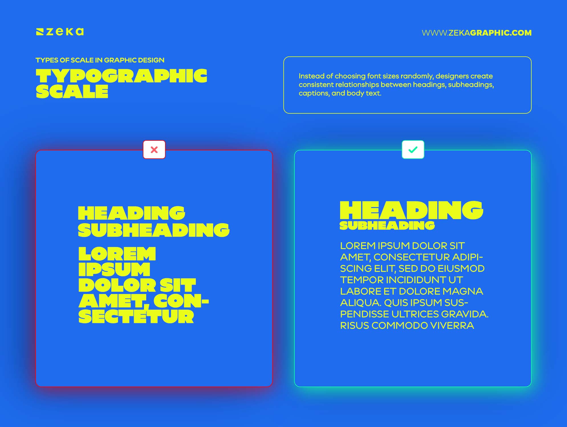
Typographic scale focuses specifically on text sizing systems. Instead of choosing font sizes randomly, designers create consistent relationships between headings, subheadings, captions, and body text.
A strong typographic scale improves readability, creates rhythm, and helps long-form content feel organized and easier to scan.
Advertisment
Designers often say: “The scale is correct… but something still feels off.”
That usually means scale is working at one level, and failing at the other.
Scale doesn’t operate in a single dimension. It works simultaneously inside elements and between elements. When those layers are out of sync, the layout may function technically while still feeling awkward or unclear.
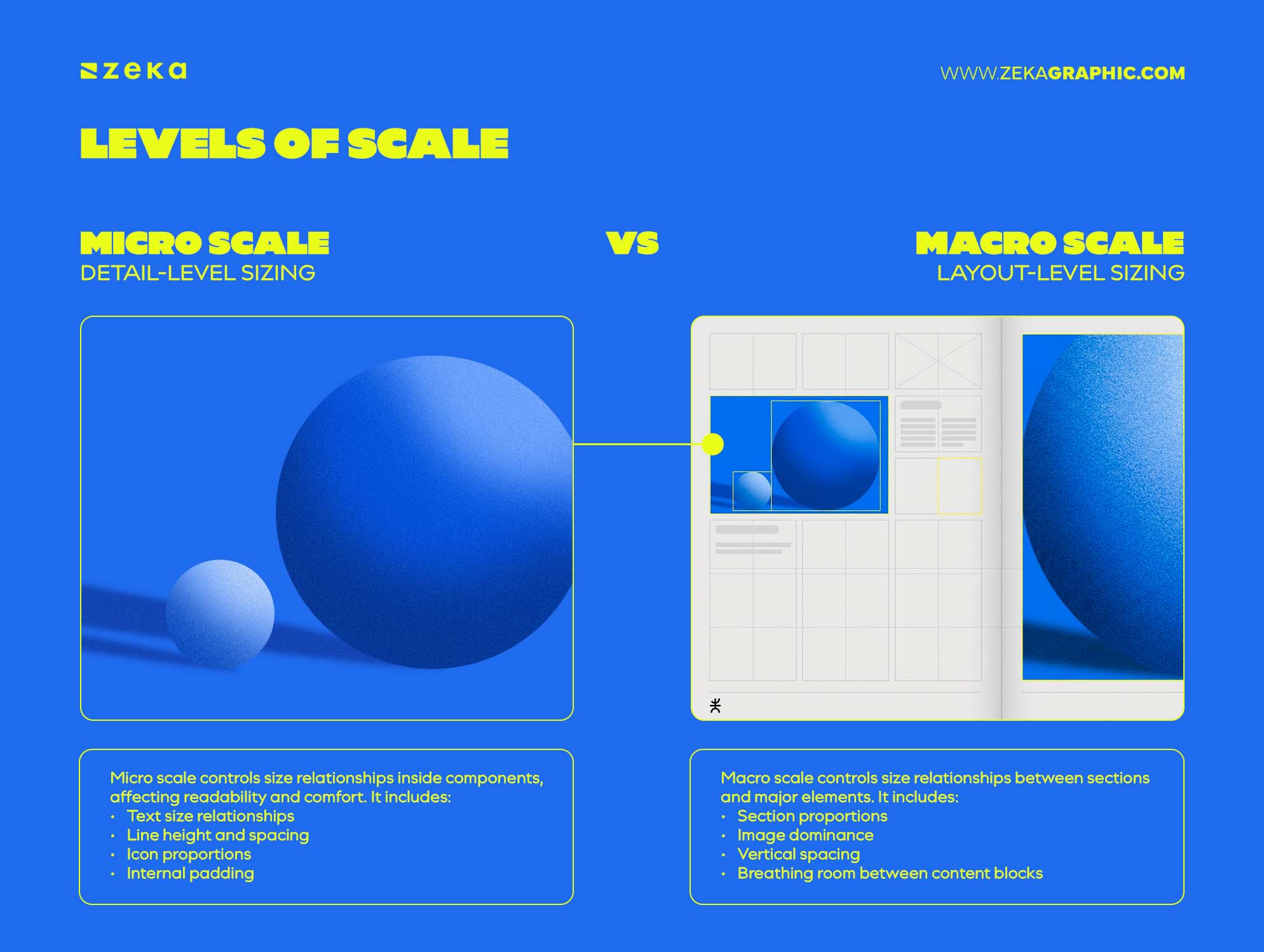
Micro scale controls size relationships inside components, affecting readability and comfort.
It includes:
Common signs of weak micro scale:
If increasing line height or padding improves clarity, the issue is usually micro scale.
Macro scale controls size relationships between sections and major elements. It shapes hierarchy, flow, and visual rhythm.
It includes:
Common signs of weak macro scale:
If increasing spacing or strengthening dominance improves clarity, the issue is usually macro scale.
Many scale problems come from fixing the wrong level first.
Advertisment
Once hierarchy works, scale becomes expressive.
Creative scale works best when size choices feel intentional and unmistakable. A common mistake is playing too safe with size differences.
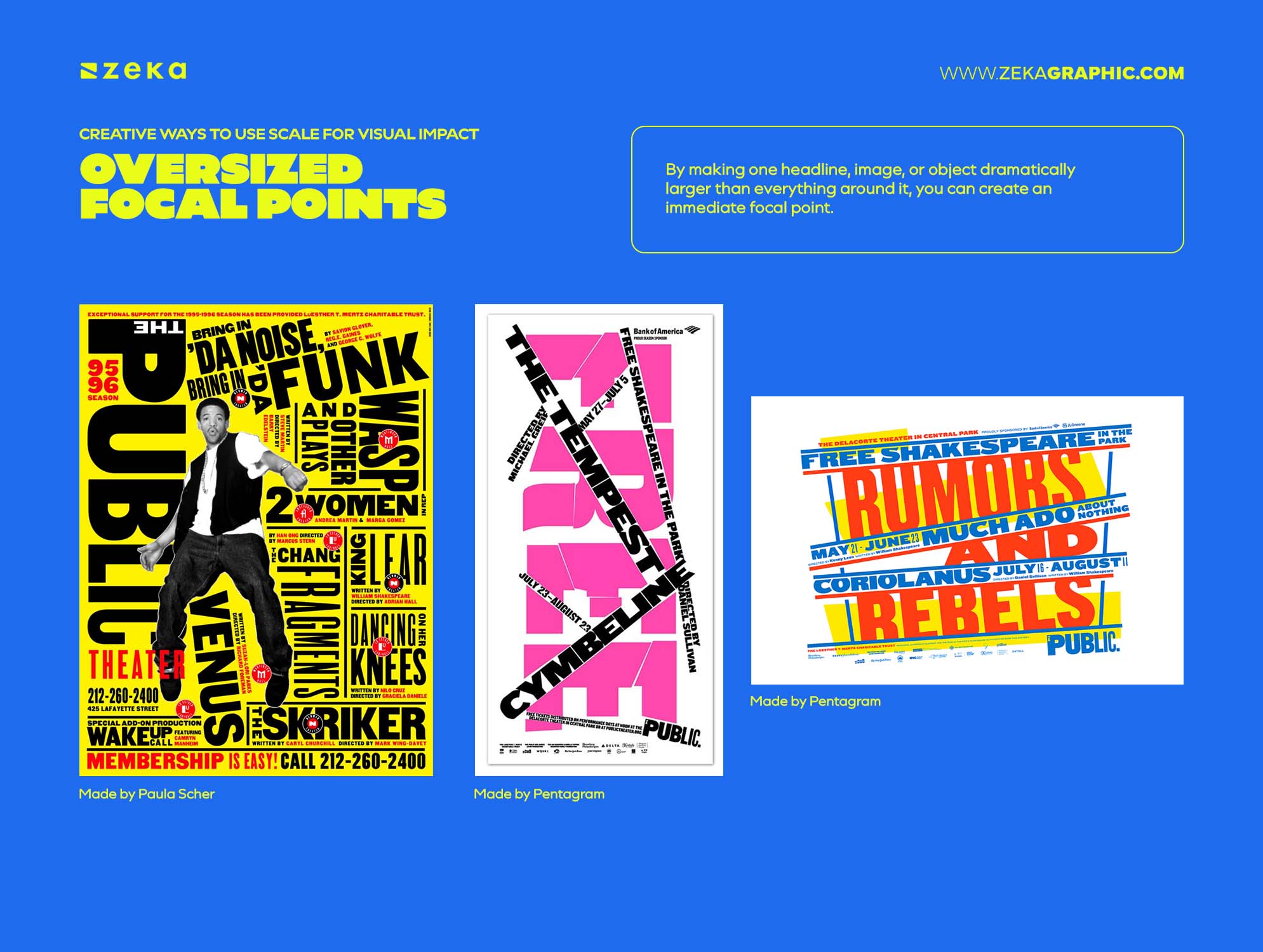
Oversizing a single element is one of the fastest ways to create visual impact because by making one headline, image, or object dramatically larger than everything around it, you can create an immediate focal point. Paula Scher’s poster designs often use typography at an extreme scale, allowing the text itself to become the dominant visual element rather than relying on illustrations or decorative effects.
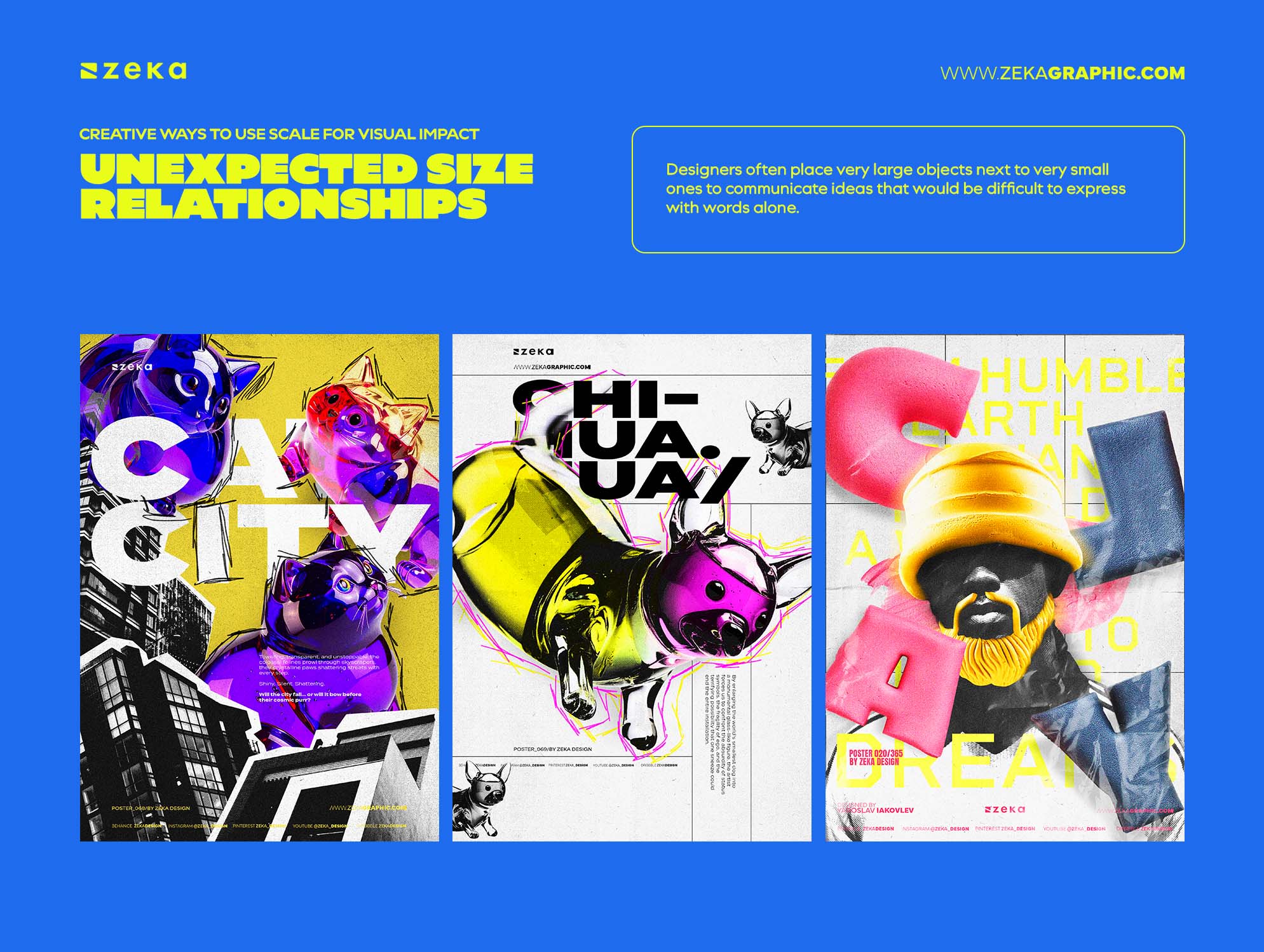
Exaggerated size differences can create surprise, tension, or curiosity. Designers often place very large objects next to very small ones to communicate ideas that would be difficult to express with words alone. This approach is common in conceptual advertising and surreal poster design, where a tiny human figure beside a massive object can suggest power, isolation, or importance.
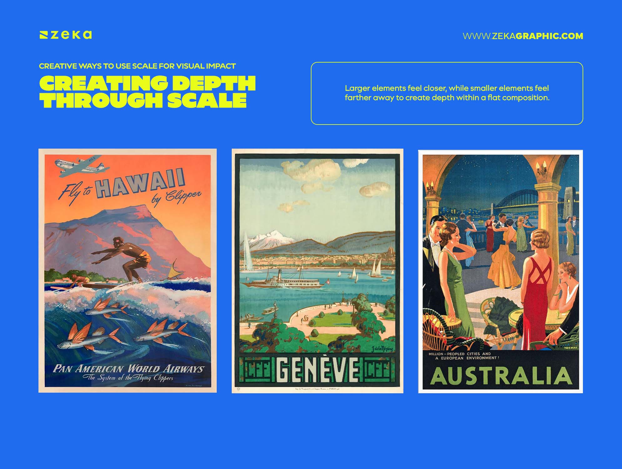
Larger elements feel closer, while smaller elements feel farther away, you can use this natural perception to create depth within a flat composition. Many movie posters and travel advertisements combine large foreground elements with smaller background elements to create a stronger sense of space and visual immersion.
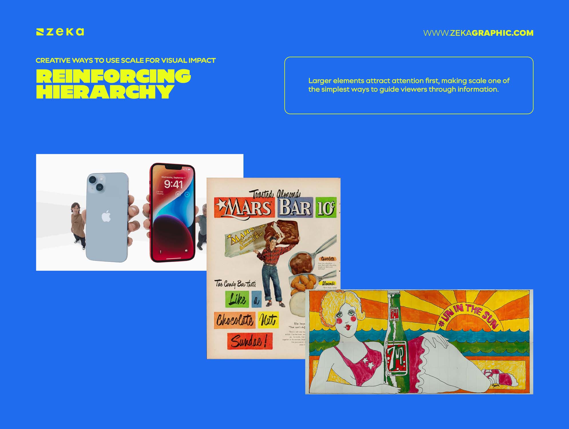
Size naturally signals importance as larger elements attract attention first, making scale one of the simplest ways to guide viewers through information. Apple advertising campaigns frequently use oversized product photography paired with minimal supporting text, allowing the product itself to become the primary focus.
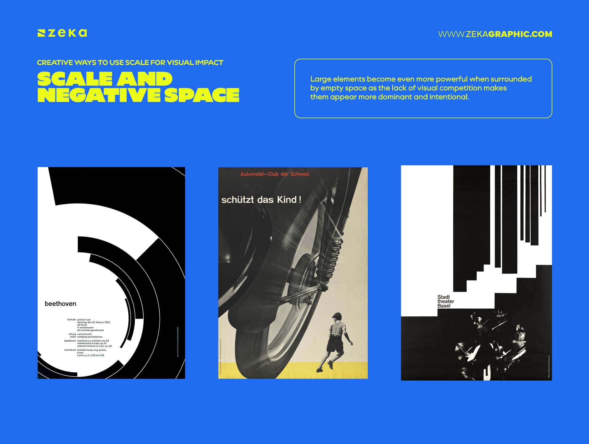
Large elements become even more powerful when surrounded by empty space as the lack of visual competition makes them appear more dominant and intentional. This principle is a hallmark of Swiss poster design, where dramatic size relationships and generous negative space create impact without relying on decoration.
When used intentionally, scale can transform a simple layout into something memorable without increasing complexity.
Advertisment
Flat layouts usually suffer from weak size relationships rather than weak ideas. Most scale problems come from hesitation and overly cautious sizing decisions
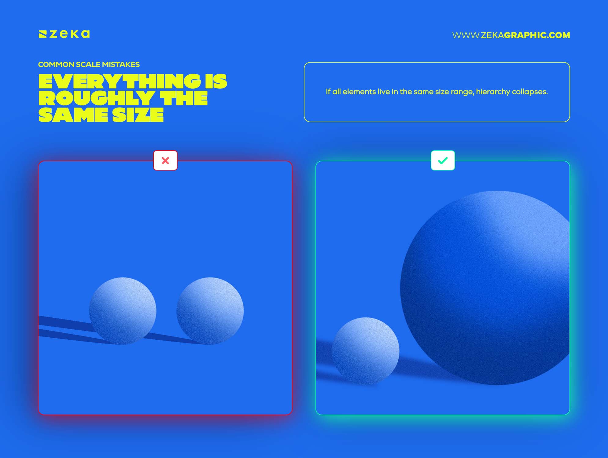
Everything is roughly the same size
If all elements live in the same size range, hierarchy collapses.
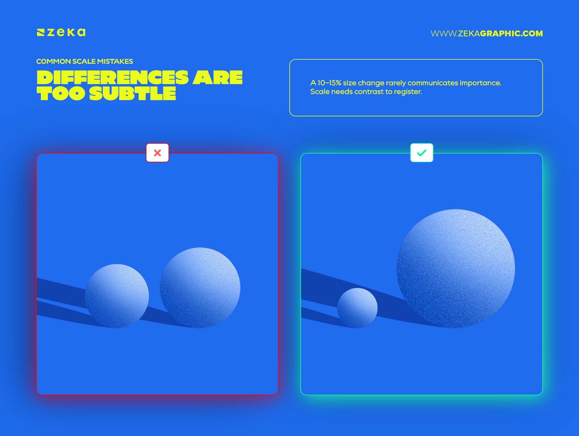
Differences are too subtle
A 10–15% size change rarely communicates importance. Scale needs contrast to register.
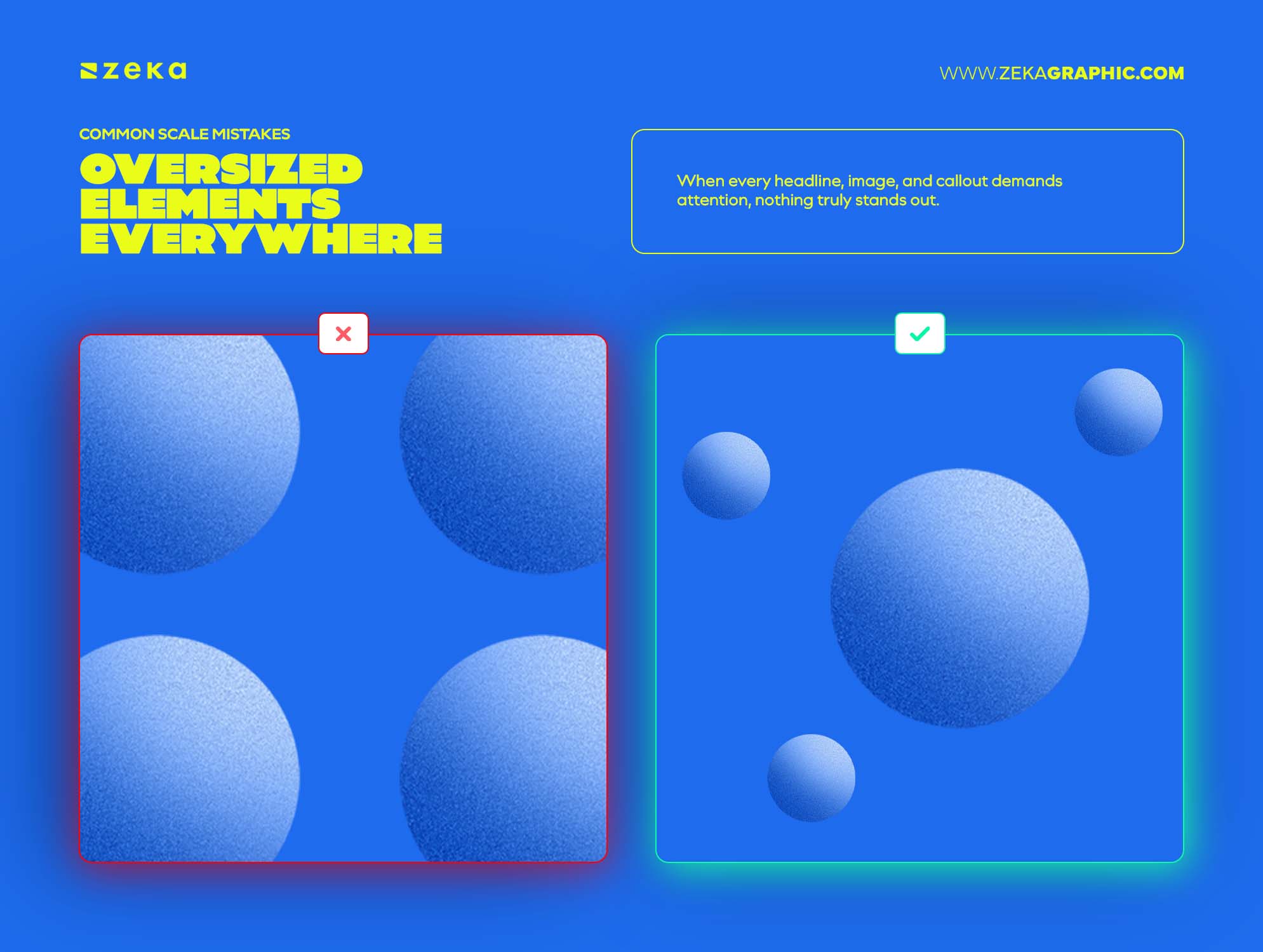
Oversized Elements Everywhere
Making multiple elements large at the same time weakens the effect of scale. When every headline, image, and callout demands attention, nothing truly stands out.
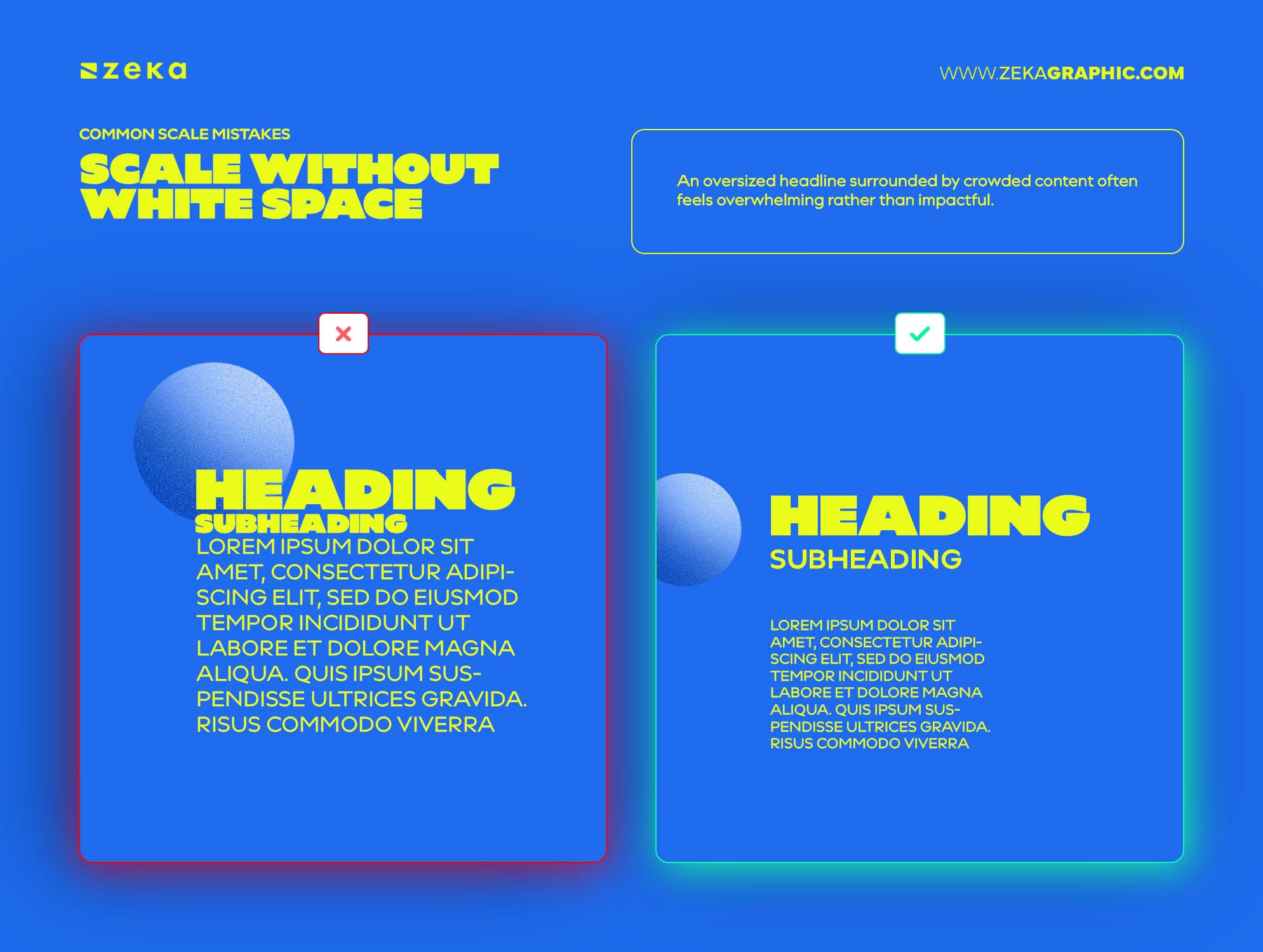
Scale Without White Space
Large elements need room to breathe. An oversized headline surrounded by crowded content often feels overwhelming rather than impactful.
Advertisment
Scale feels intuitive until hierarchy stops working. This framework helps simplify the decision-making process.
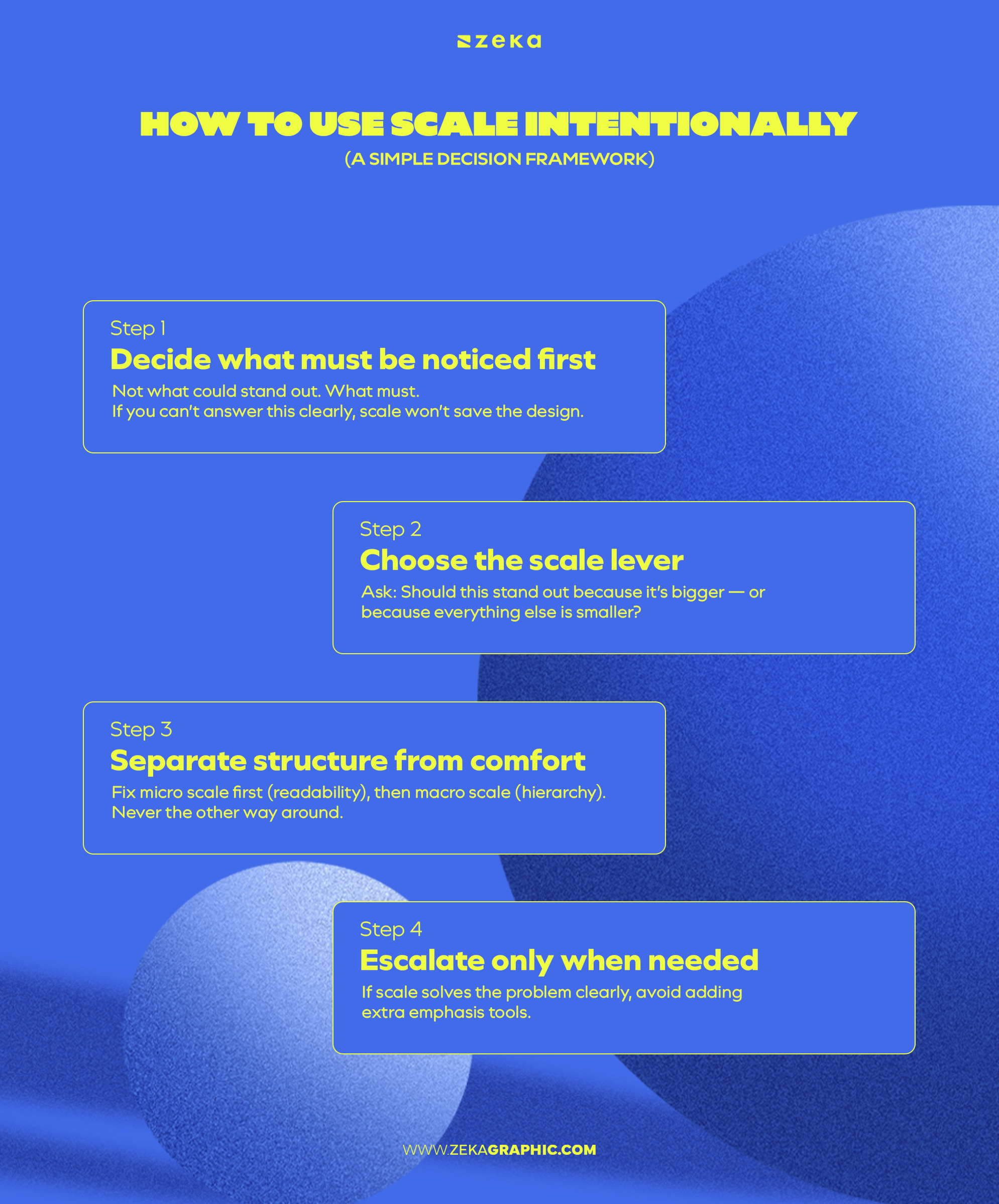
Step 1: Decide what must be noticed first
Not what could stand out. What must.
If you can’t answer this clearly, scale won’t save the design.
Step 2: Choose the scale lever
Ask: Should this stand out because it’s bigger — or because everything else is smaller?
Both work. Mixing them without intent weakens the effect.
Step 3: Separate structure from comfort
Fix micro scale first (readability), then macro scale (hierarchy).
Never the other way around.
Step 4: Escalate only when needed
If scale solves the problem clearly, avoid adding extra emphasis tools.
If not, introduce supporting tools — contrast, color, or emphasis — intentionally.
Advertisment
Is scale the same as size?
No. Size is absolute. Scale is relative.
Size describes how big something is. Scale describes how big something feels compared to everything else around it.
A headline can be large but still have weak scale if everything else is also large. Scale only works when there’s contrast between elements.
Can scale replace color or contrast?
Sometimes — and often more cleanly.
Scale creates emphasis without adding extra visual variables, making it one of the cleanest hierarchy tools.
When scale isn’t enough, contrast or color can support it — but scale is often the first and simplest lever to pull.
How much scale difference is “enough”?
Enough to feel immediately clear.
If viewers have to look closely to notice a difference, the scale contrast is too small. Effective scale should feel immediately noticeable, not subtle.
A good test:
If reducing the size difference doesn’t change hierarchy, the original difference wasn’t doing any work.
Can scale be subtle?
Yes — but only when hierarchy is already clear.
Subtle scale works best in refined systems where:
If hierarchy already feels weak, subtle scaling usually won’t create enough contrast to fix it.
Advertisment
Scale helps viewers understand what matters first.
When size relationships are clear, layouts feel easier to navigate, more confident, and more intentional. When everything competes equally, hierarchy weakens and important information gets lost.
Used deliberately, scale can:
Good scale decisions don’t come from making everything large.
They come from creating meaningful differences between elements.
If you found this post useful you might like to read these post about Graphic Design Inspiration.
Advertisment
Written by
If you like this post share it on your social media!


Advertisment

Advertisment